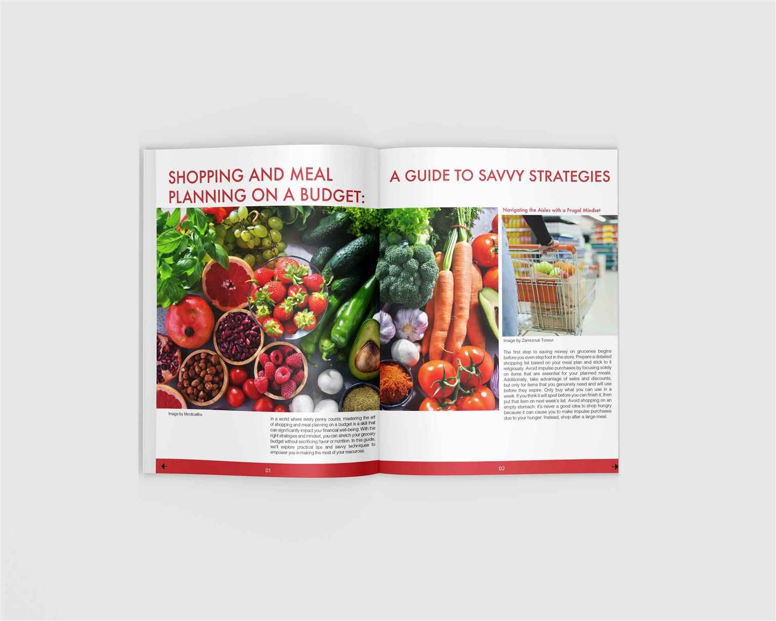
Design. Create. Inspire.
Looking to start your career in Art and Design?
From beginners to experts, VCAD is here to cultivate future design leaders.
Choose a creative career path that allows you to realize your dreams, get started today.
Apply Now
Vancouver
Calgary
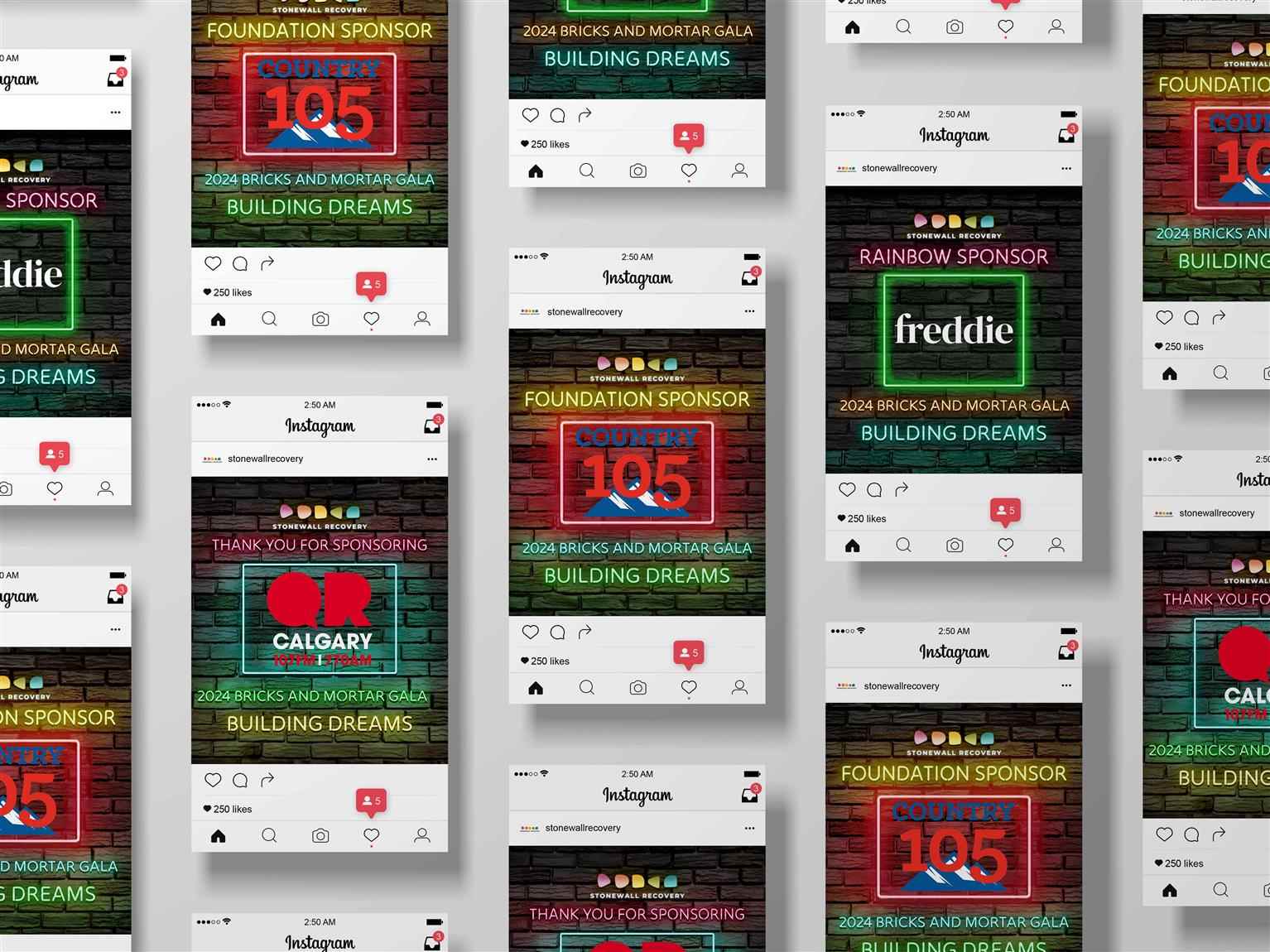
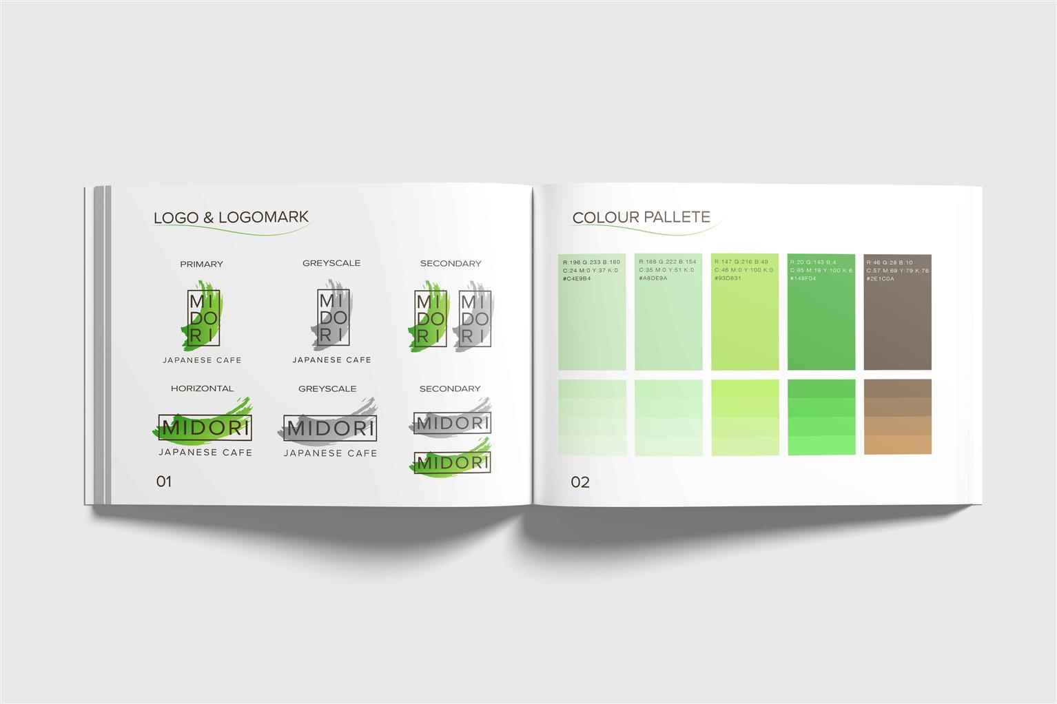
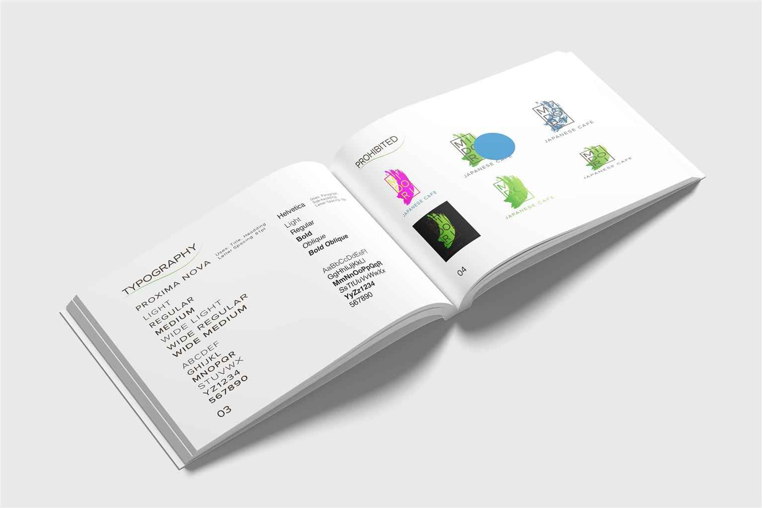
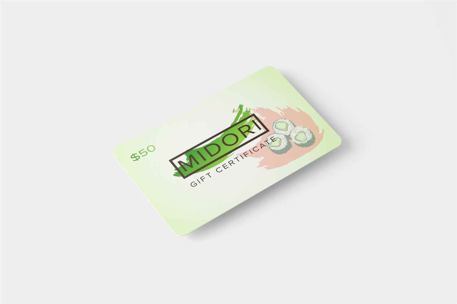
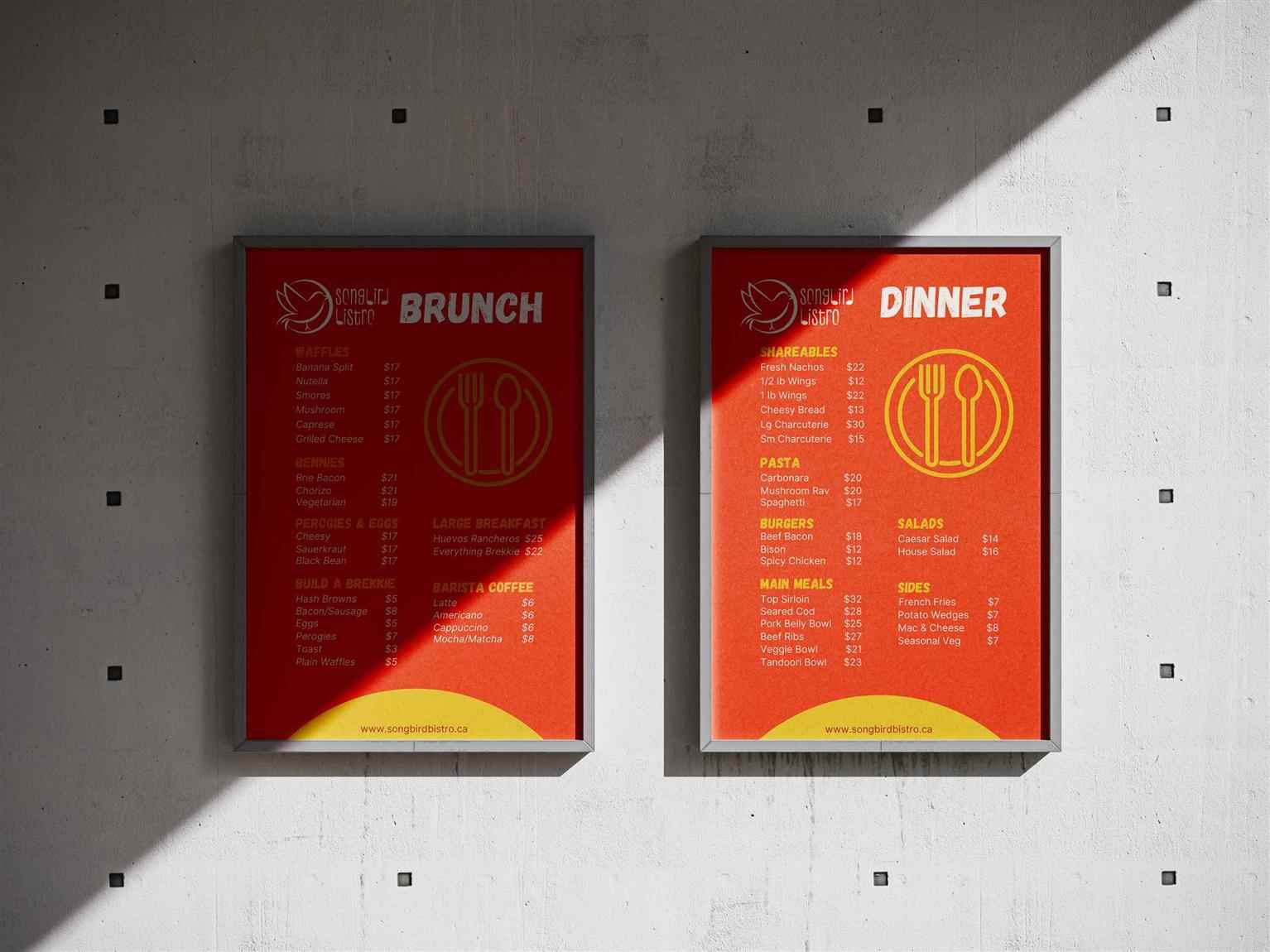
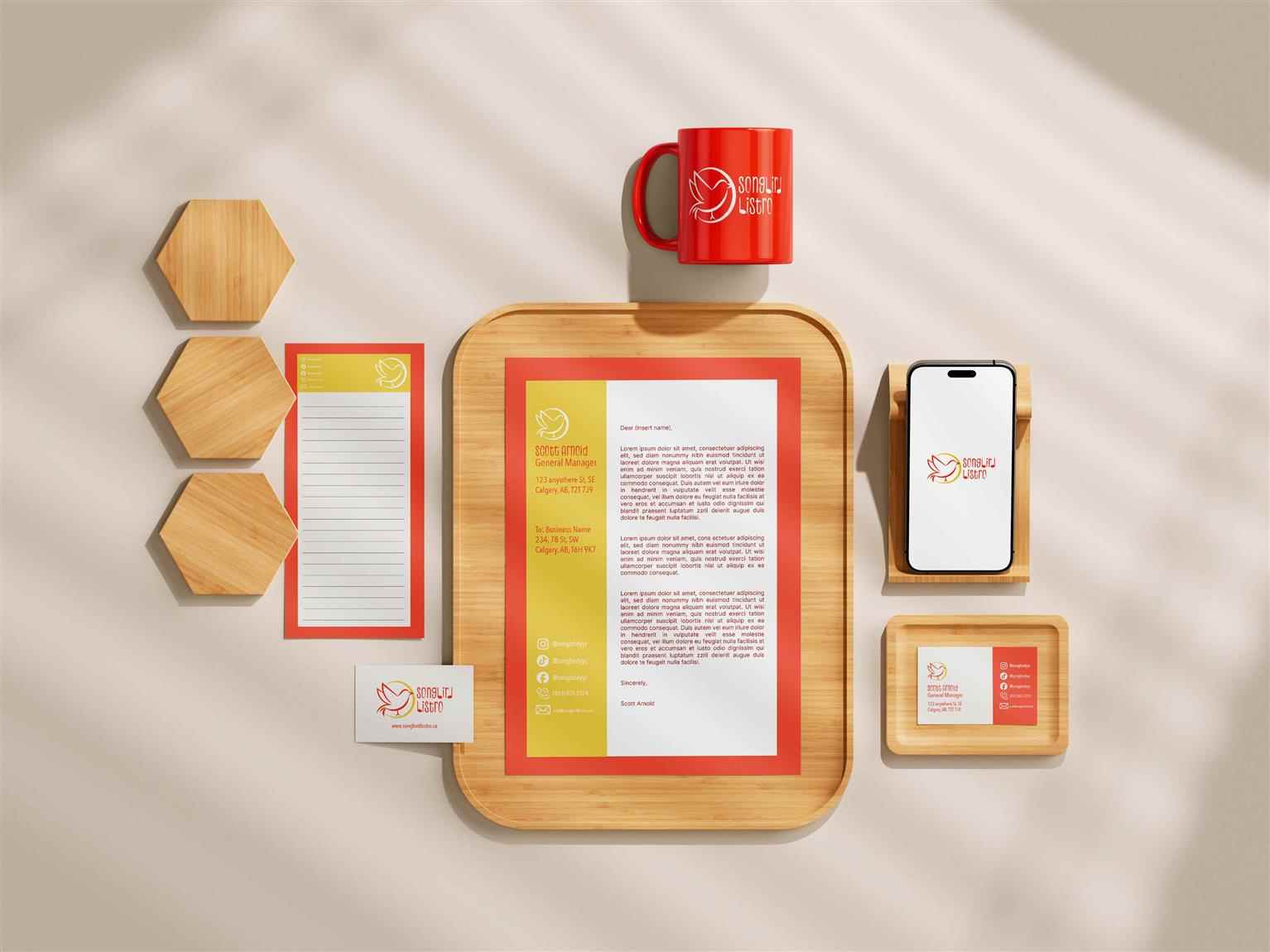
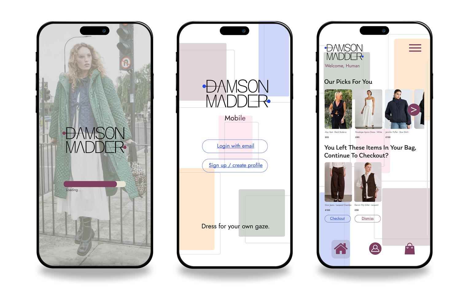
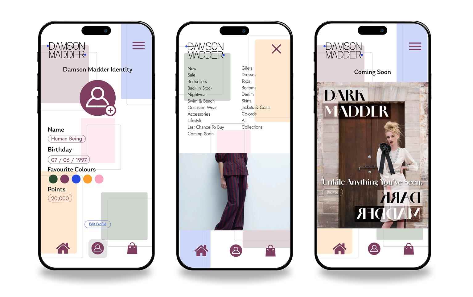
Portfolios
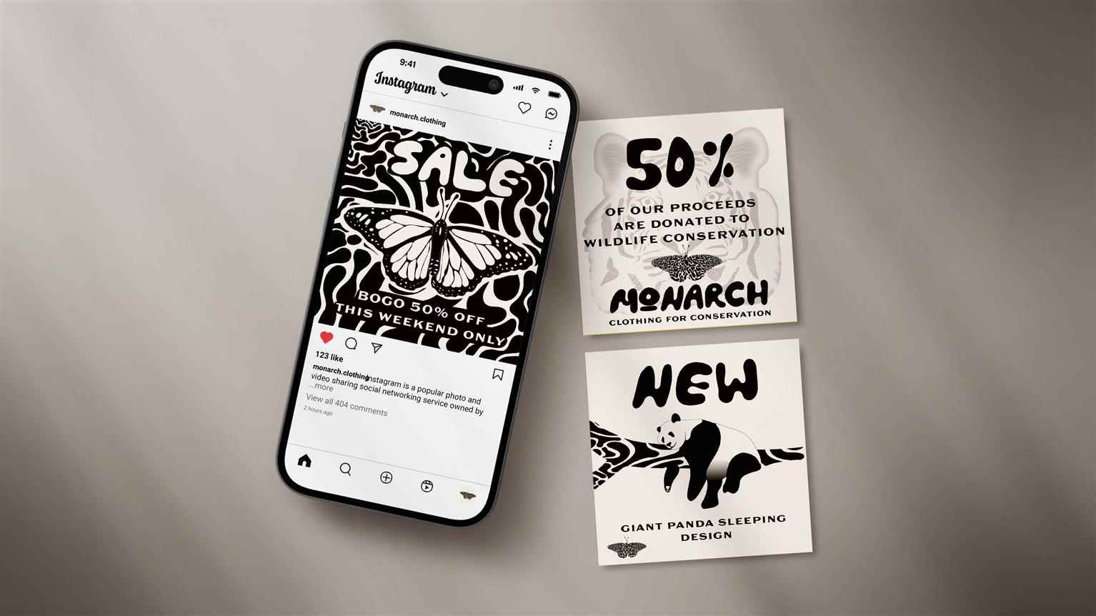
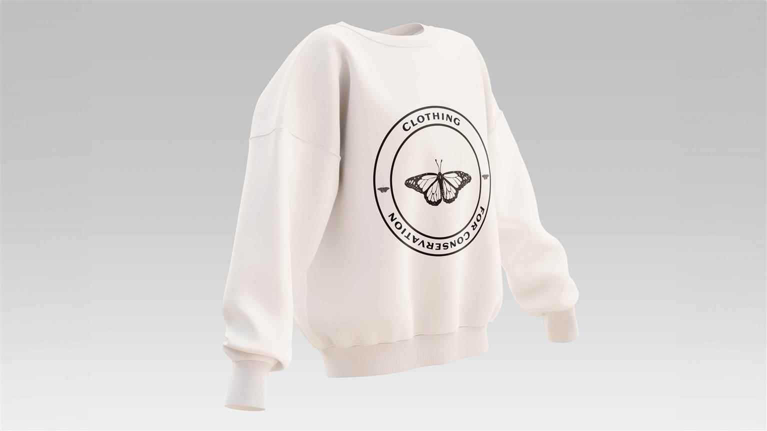
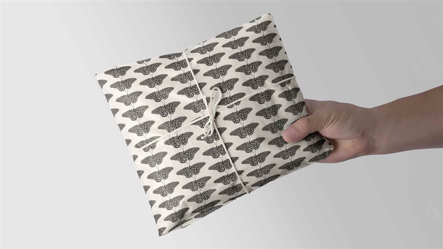
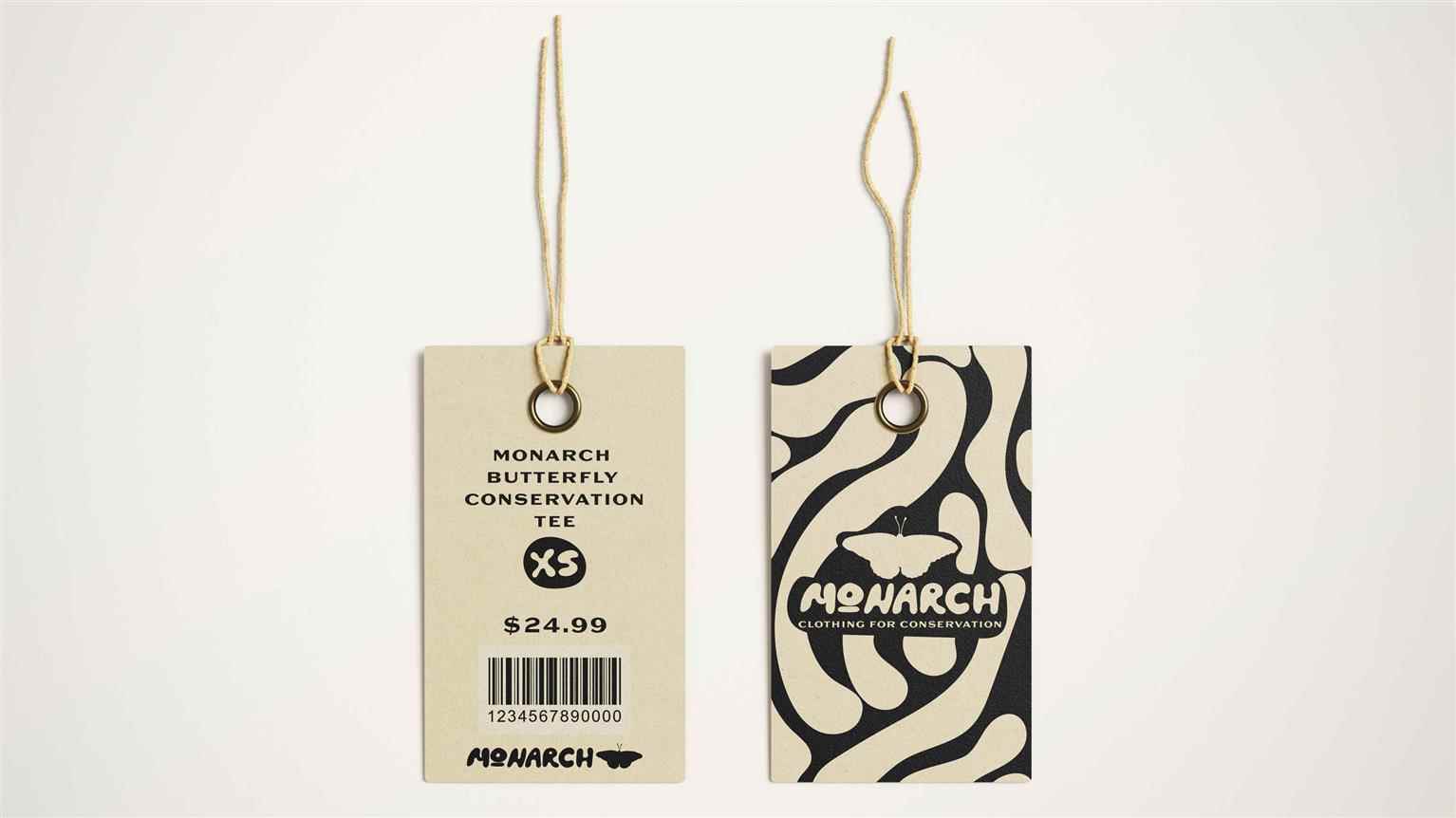
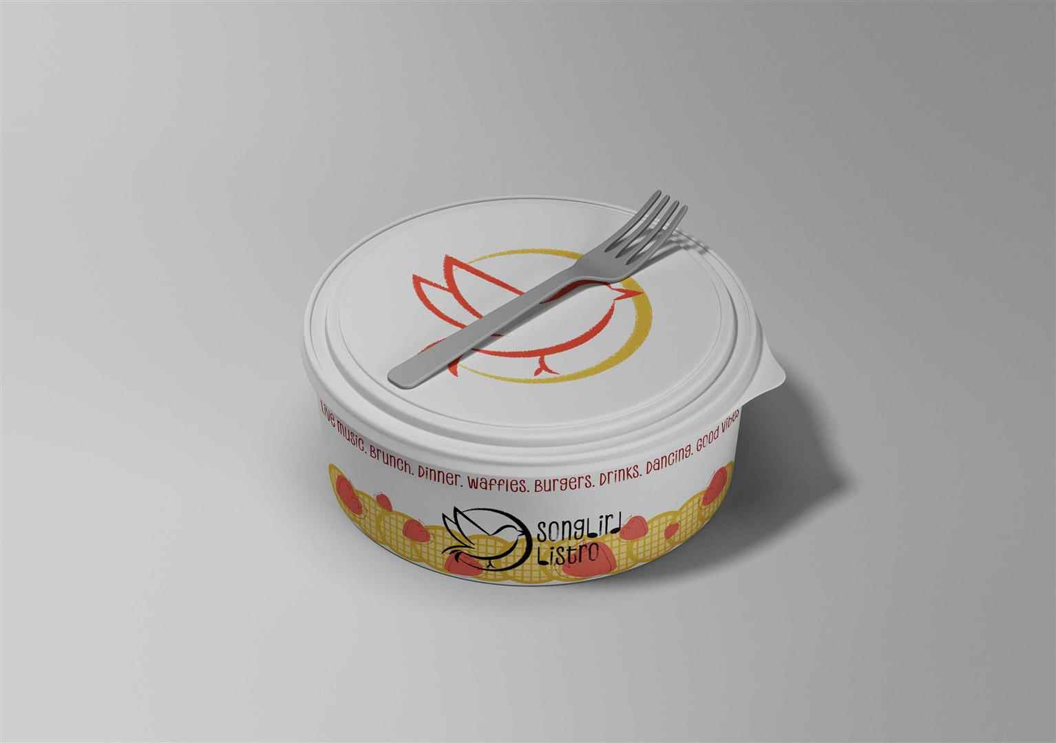
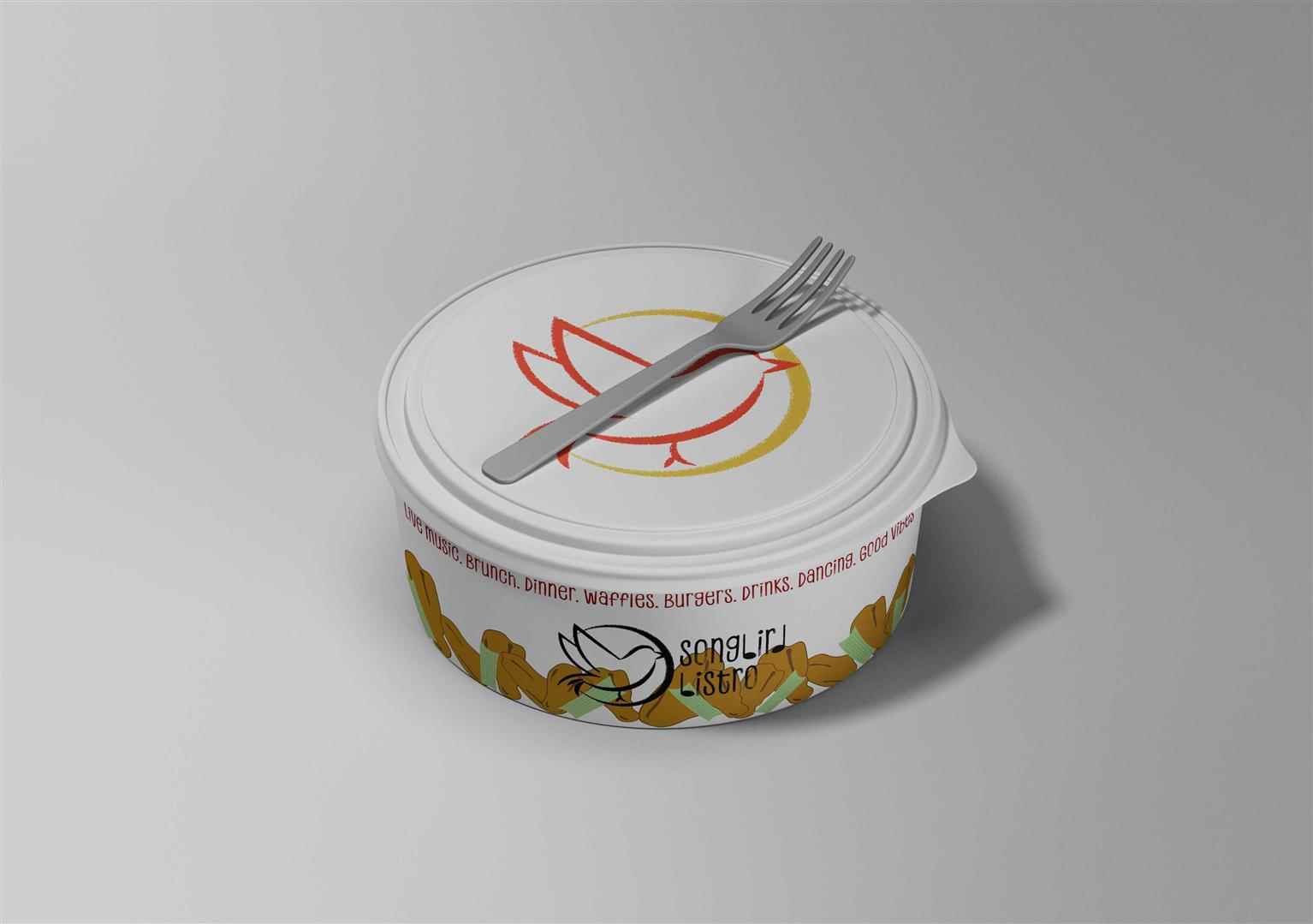
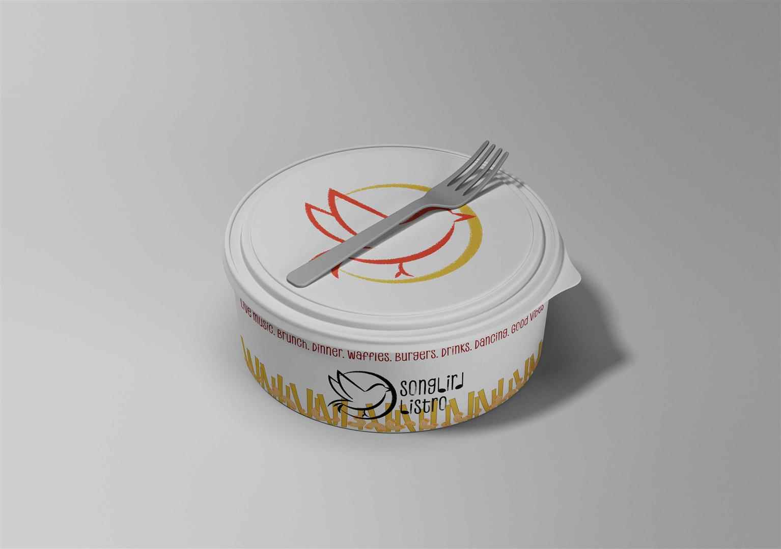
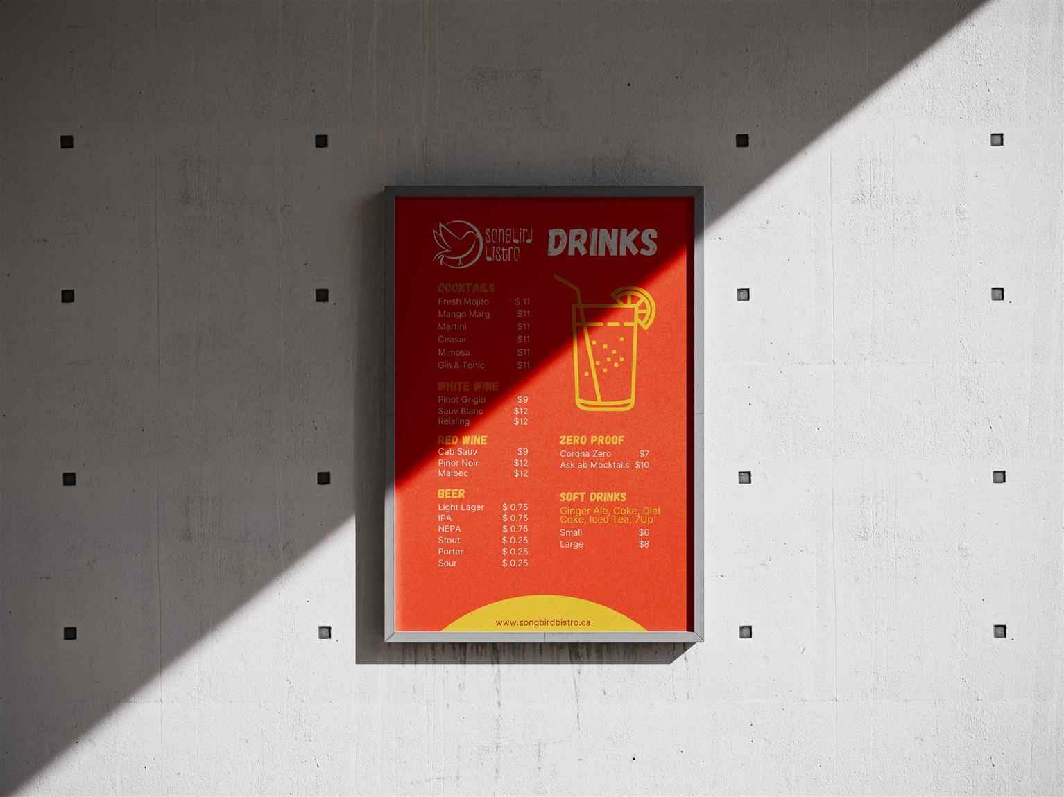
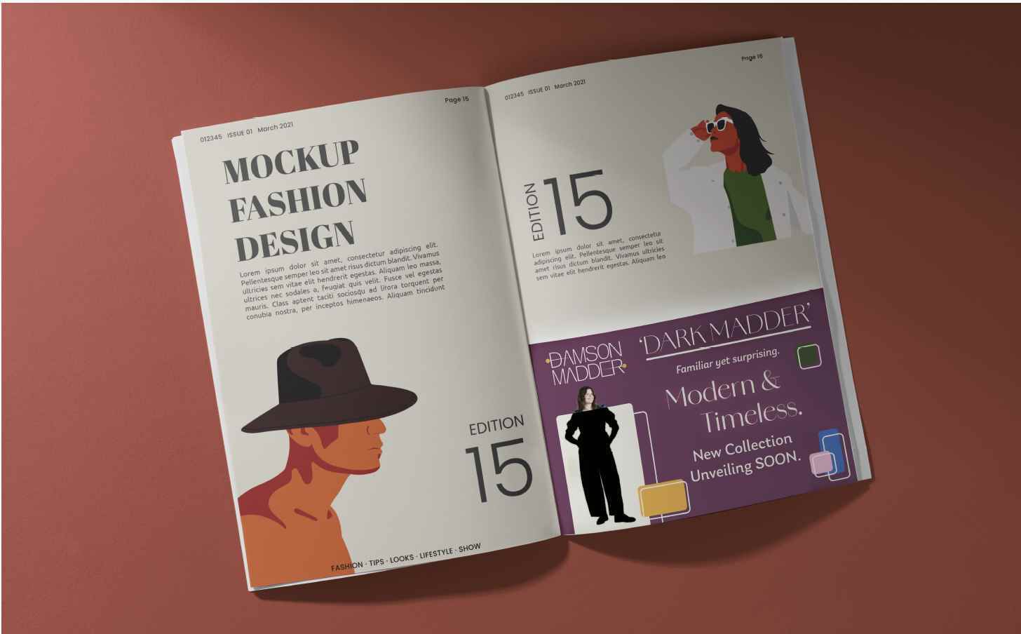
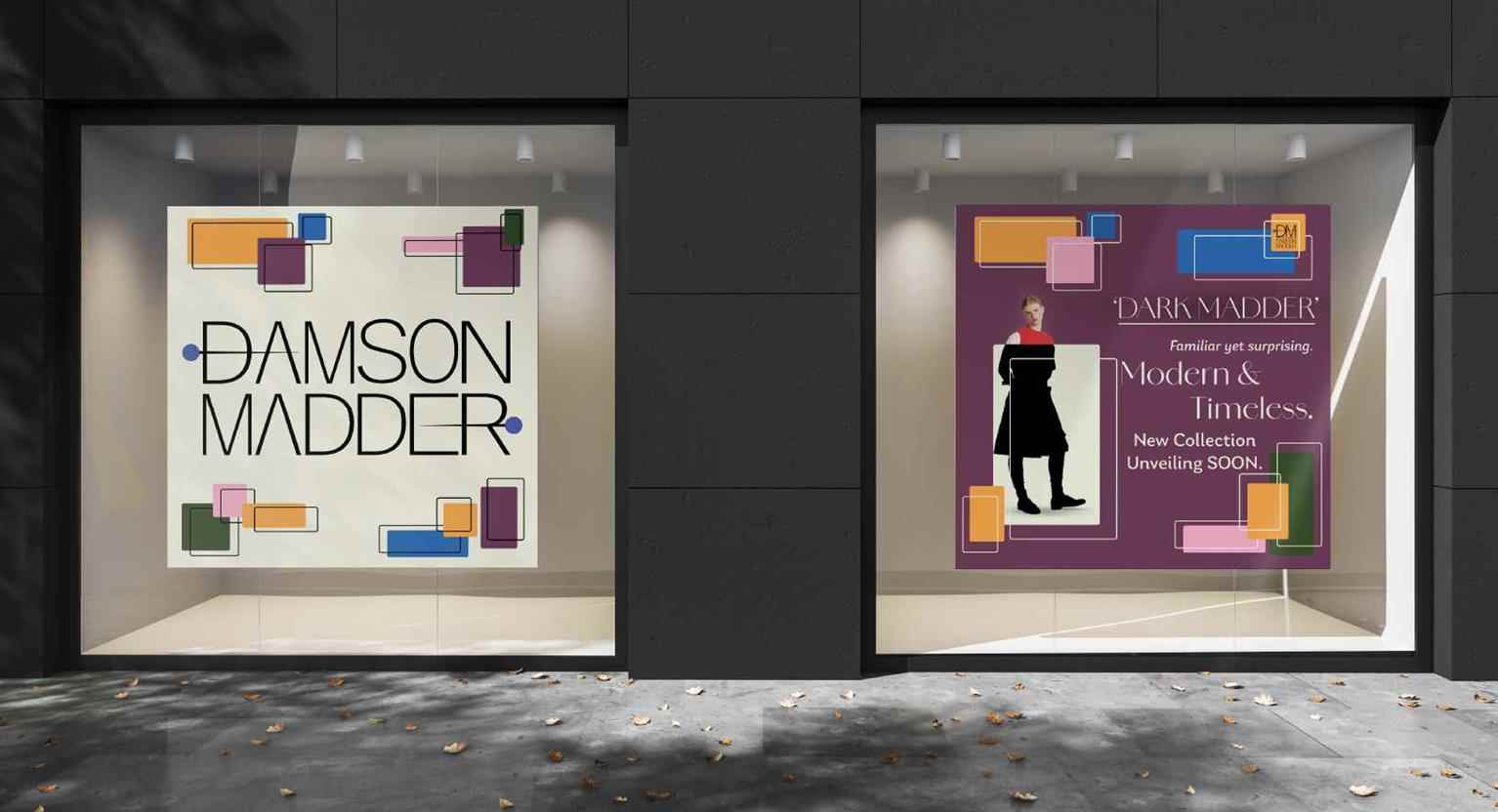
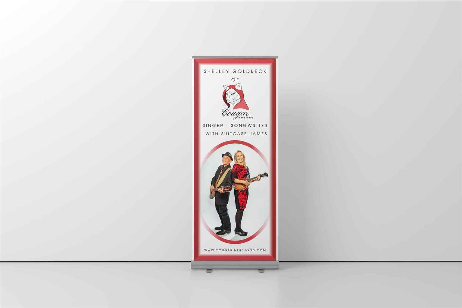
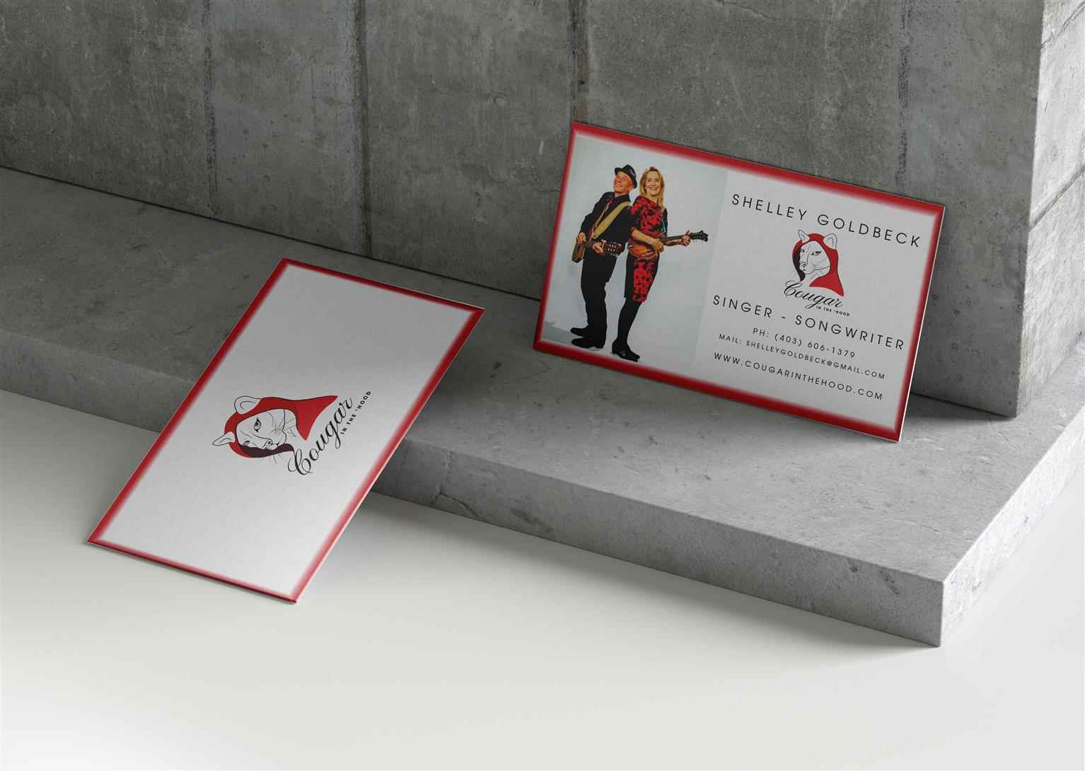
Explore the creative possibilities at VCAD—browse alumni portfolios to see what our graduates achieved.
Events
Stay connected with upcoming and past events, from grad exhibitions to open houses and more.
Student Success Stories
Explore our graduates’ success stories through testimonials, videos, and exhibition highlights.
Industry Speaker Series
Hear directly from industry leaders and gain insights through our exclusive speaker series.
Admissions Requirements
Discover what you need to kickstart your creative career.
Program Pathways
Upgrade your degree with our University Program Pathways.
International Students
Looking to study abroad? Find out what you will need to succeed.
Student Finance
Explore financial options and resources to support your studies at VCAD.
Student Policies
Understand the policies that support and guide your experience at VCAD.
Scholarships
Start your journey without limits—see if you qualify for a scholarship.
About VCAD
Learn more about why VCAD is right for you.
Instructors
Meet our experienced instructors who inspire and guide your creative journey.
Career Services
Access tailored career support to help you navigate your path to success.
Spotlights
See what is new at VCAD and stay up to date.
Employers
Discover how our industry connections and partnerships enhance your career opportunities.
Student Services
Explore the support services designed to enhance your VCAD experience.
Contact Us
Looking for more? Get in touch with us for any questions or support you need.