Agamjot (Rene)
Singh (Lamarche)Graphic Design
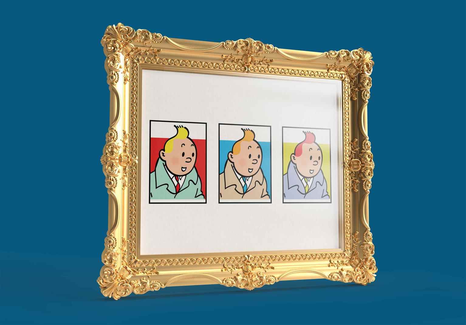
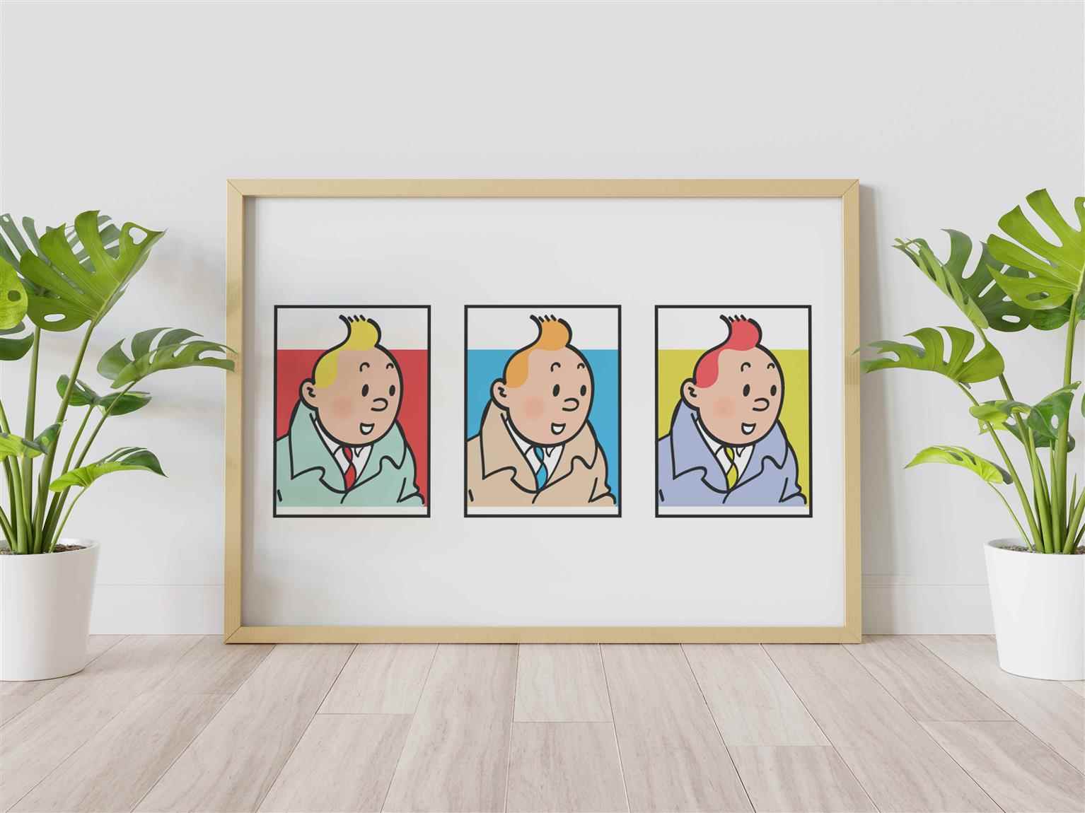
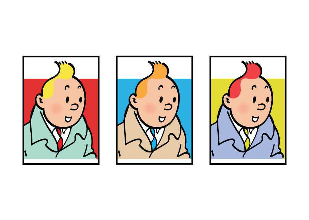
Tintin Remastered
In this project, I set out to honor the iconic, hand-drawn artwork of Tintin, a beloved character who has captured the imagination of readers and designers alike for generations. Using older illustra...
In this project, I set out to honor the iconic, hand-drawn artwork of Tintin, a beloved character who has captured the imagination of readers and designers alike for generations. Using older illustra...
In this project, I set out to honor the iconic, hand-drawn artwork of Tintin, a beloved character who has captured the imagination of readers and designers alike for generations. Using older illustrations as reference points, I recreated Tintin’s iconic look with pixel-perfect precision, blending modern digital techniques with classic design principles. Beyond just faithful recreations, I also explored creative liberties—adding modern art-inspired variations, playing with color schemes, and even incorporating text-based backgrounds for one of the black-and-white designs. The idea was to blend the nostalgic charm of Tintin’s simple, clean lines with a fresh, contemporary twist that feels vibrant and relevant to today’s audience. This project also serves a practical purpose: to help the company create fully digital, pixel-perfect promotional materials, which have not yet been developed for selling its products and merchandise. By providing these updated and adaptable designs, I hope to contribute to making Tintin’s legacy even more accessible and marketable in the modern era. Georges Remi (Hergé), the creator of Tintin, was a pioneer of his time, and his work continues to inspire many artists with its bold use of color and clean linework. Through these updated versions of Tintin, I aimed to convey how timeless and versatile this style remains in a modern context, keeping the spirit of adventure and exploration alive. This project was an absolute pleasure to create, and I hope it inspires as much joy in others as I felt in paying homage to such a legendary character.


Share:
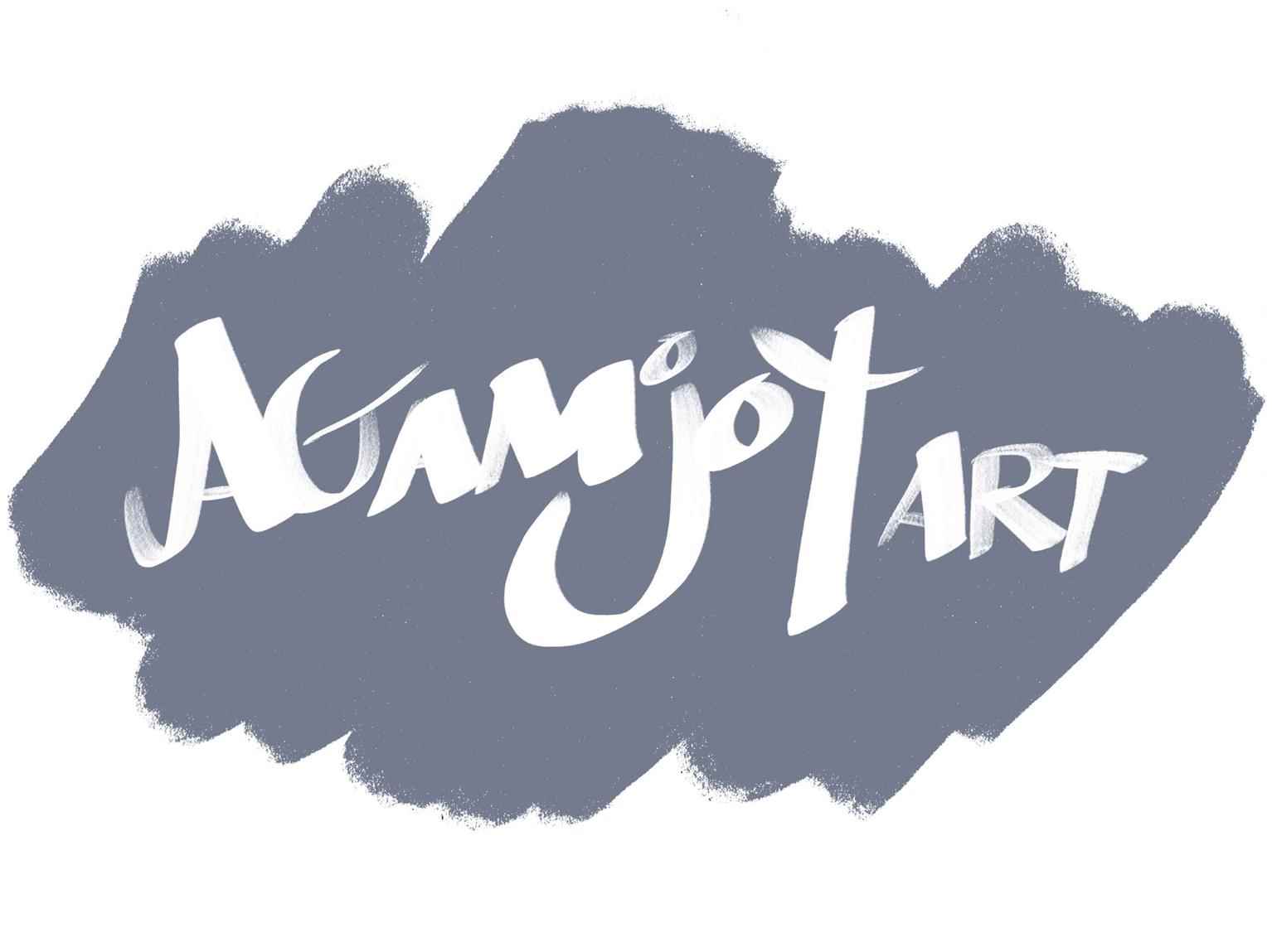
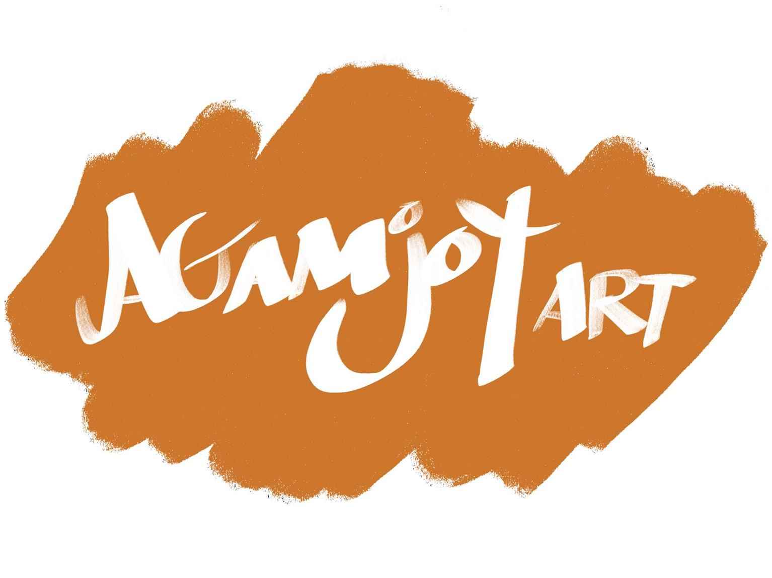
Personal Brand Logo
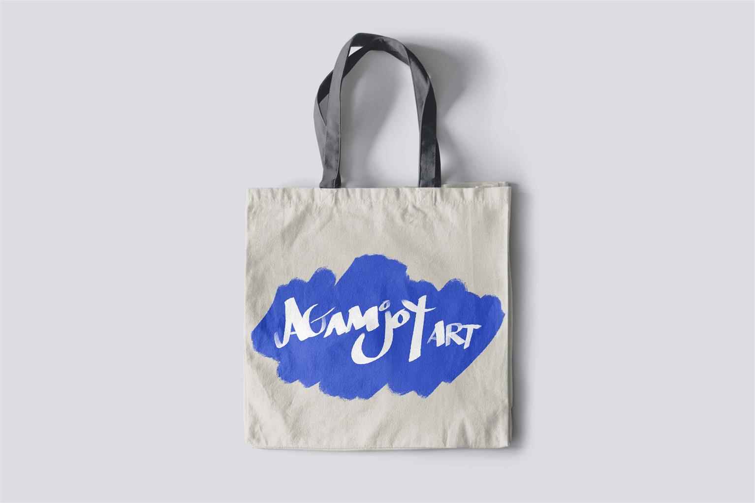
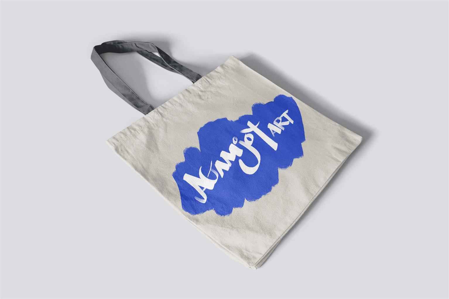
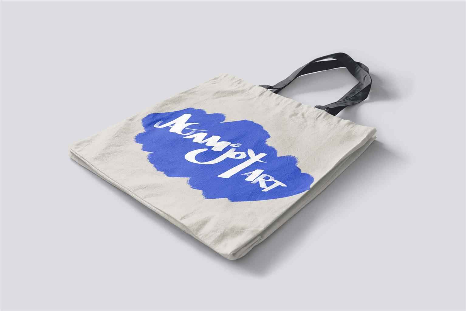
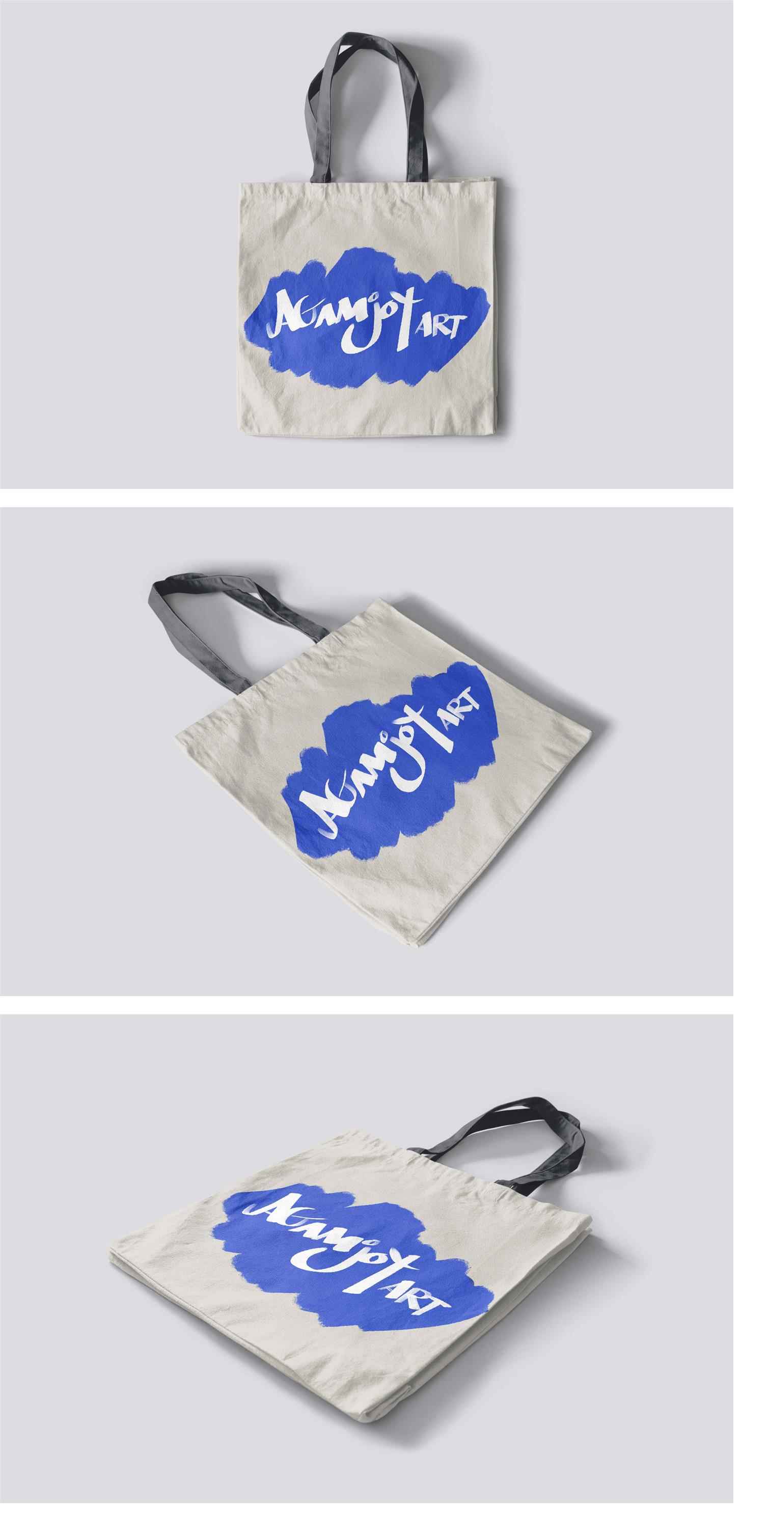
Agamjot Art Logo Design The Agamjot Art logo was designed as the visual identity for my personal brand, which specializes in offering Graphic Design services, custom paintings, and illustrations. Th...
Agamjot Art Logo Design The Agamjot Art logo was designed as the visual identity for my personal brand, which specializes in offering Graphic Design services, custom paintings, and illustrations. Th...
Agamjot Art Logo Design The Agamjot Art logo was designed as the visual identity for my personal brand, which specializes in offering Graphic Design services, custom paintings, and illustrations. The goal was to create a logo that reflects the essence of my creative offerings while showcasing my passion for artistic expression and design. Inspired by the principles of creativity, professionalism, and individuality, the logo features a harmonious blend of modern and artistic elements. Its clean lines and carefully crafted shapes convey a sense of precision and professionalism, while the overall design remains approachable and visually striking. The typography is bold yet refined, reinforcing the brand’s focus on quality and attention to detail. The color palette was chosen to represent the diverse nature of the services I provide—ranging from innovative graphic design projects to bespoke illustrations and custom artwork. The logo is versatile, ensuring it works seamlessly across various platforms, including my website, social media, and physical branding materials. This logo is more than just a design—it encapsulates the story of Agamjot Art and the dedication to delivering personalized, meaningful, and impactful creative solutions. As both the designer and the artist behind this project, this logo symbolizes my commitment to crafting unique visuals that inspire and connect. Visit www.AgamjotArt.com to explore the full range of services and see the brand come to life!


Share:
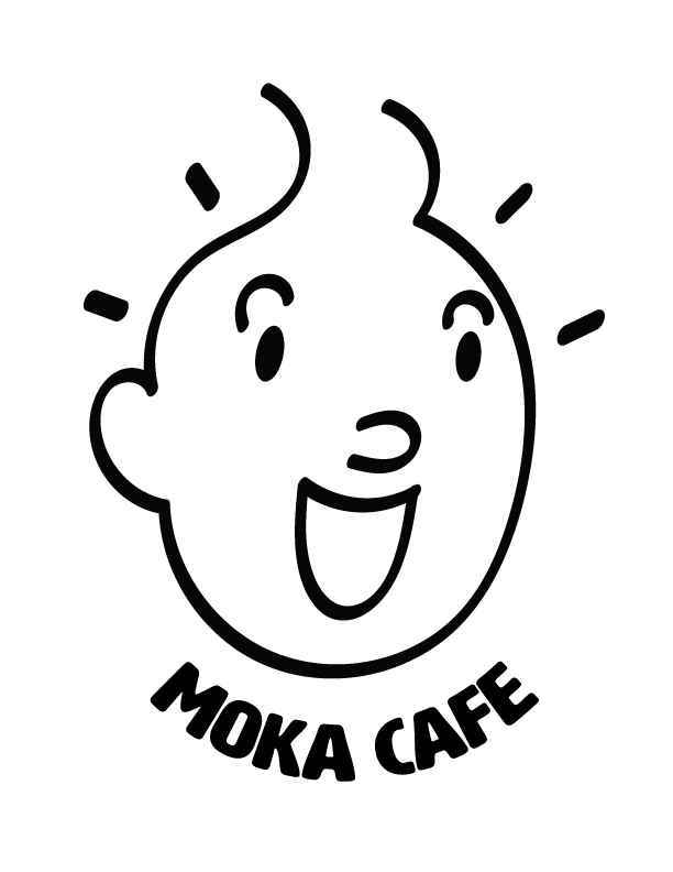
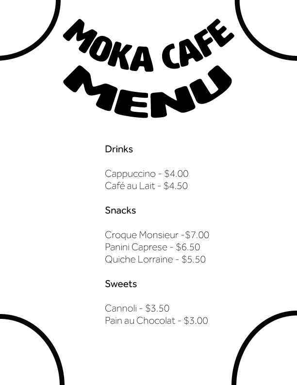
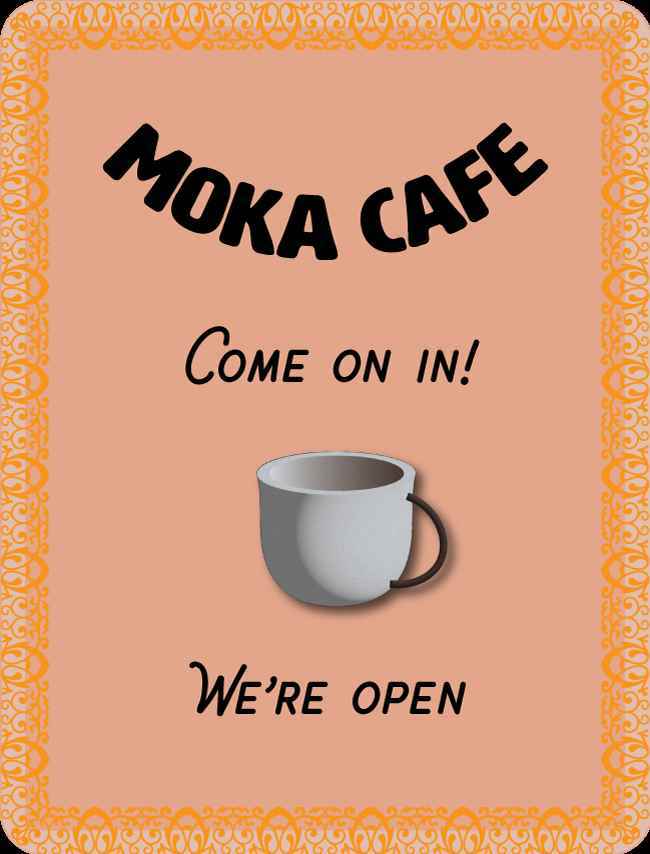
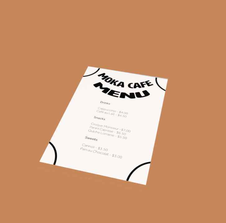
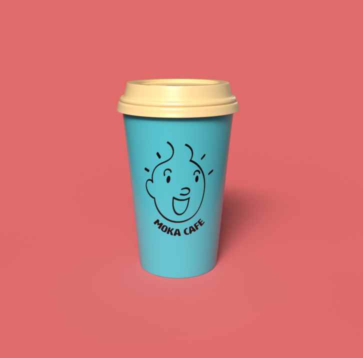
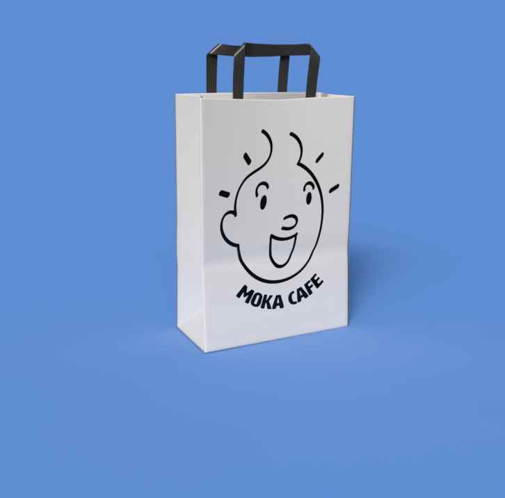
Moka Café Branding Project: An Urban Coffee Experience
For this branding project, I developed a complete visual identity for Moka Café, a modern urban coffee shop looking to create a welcoming yet refined atmosphere. The project included the creation of...
For this branding project, I developed a complete visual identity for Moka Café, a modern urban coffee shop looking to create a welcoming yet refined atmosphere. The project included the creation of...
For this branding project, I developed a complete visual identity for Moka Café, a modern urban coffee shop looking to create a welcoming yet refined atmosphere. The project included the creation of a primary logo, a secondary logo, a menu design, product mock-ups, and storefront signage. Drawing inspiration from iconic illustrations like Tintin, I crafted a logo featuring an alert, cheerful character, symbolizing the energized feeling you get after a great cup of coffee. The clean, modern design is approachable, conveying the café’s mission to serve high-quality coffee in an inviting environment. The branding elements, from the signage to the product packaging, were designed to reflect Moka Café's essence—a blend of sophistication and warmth, perfect for anyone in the bustling city looking to enjoy a superior coffee experience. This project was an exciting opportunity to merge classic design inspirations with a fresh, contemporary twist, resulting in a cohesive and visually engaging brand identity.
Share:
Health Food Store Advertising Campaign
The FoodsForLife marketing project is a comprehensive rebranding initiative aimed at modernizing the company’s identity and increasing its appeal to both younger consumers and ageing baby boomers. Th...
The FoodsForLife marketing project is a comprehensive rebranding initiative aimed at modernizing the company’s identity and increasing its appeal to both younger consumers and ageing baby boomers. Th...
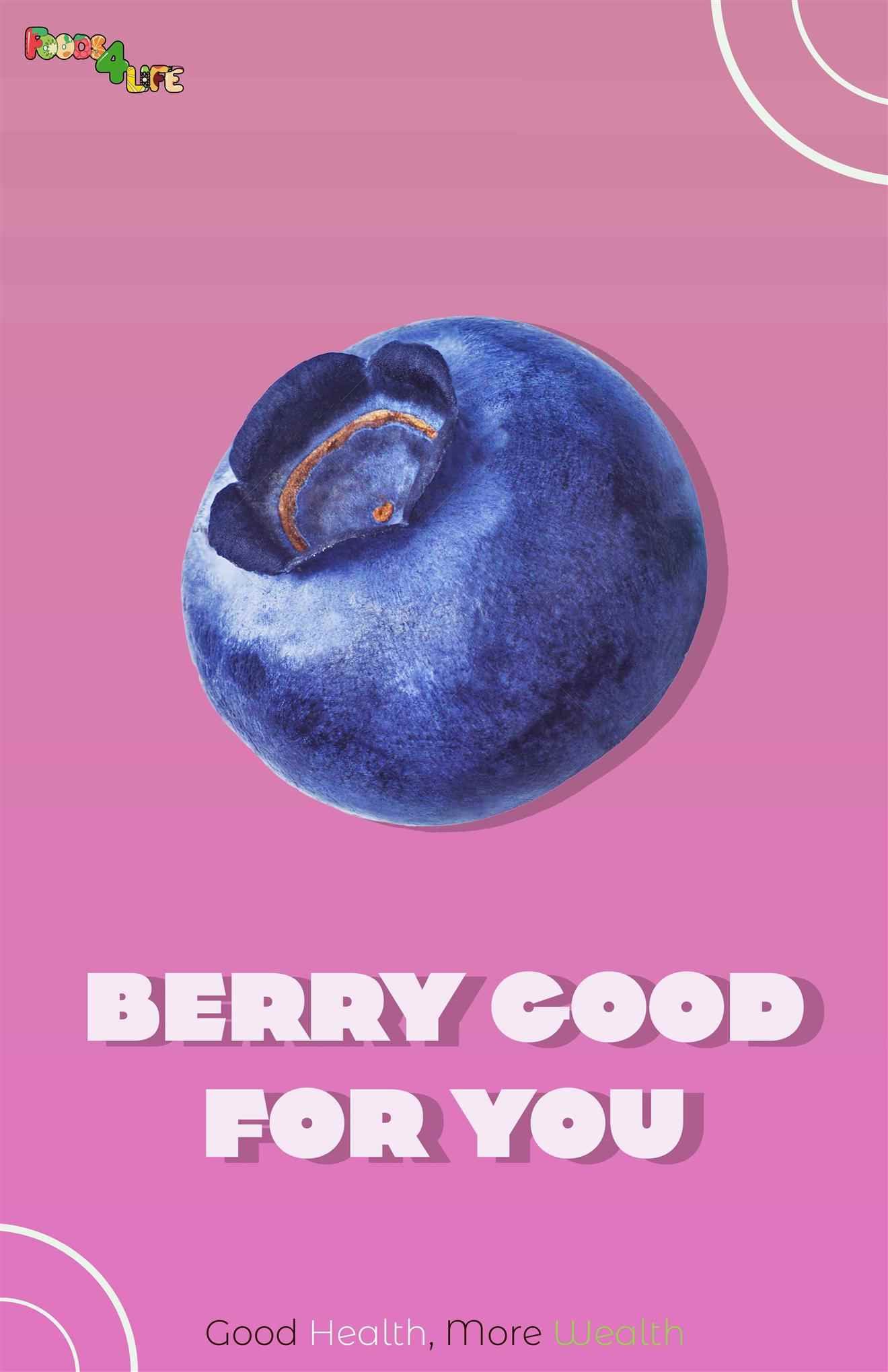
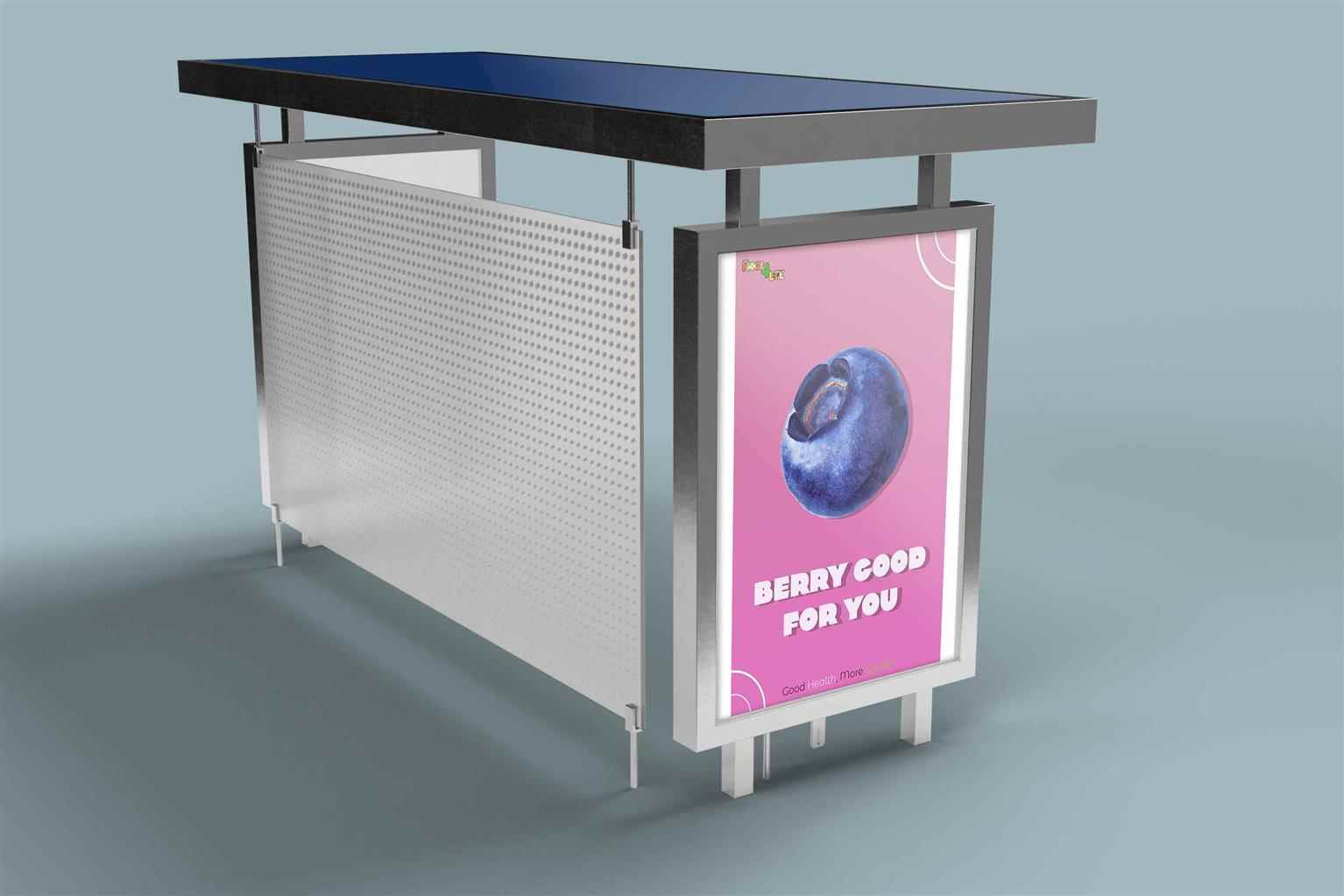
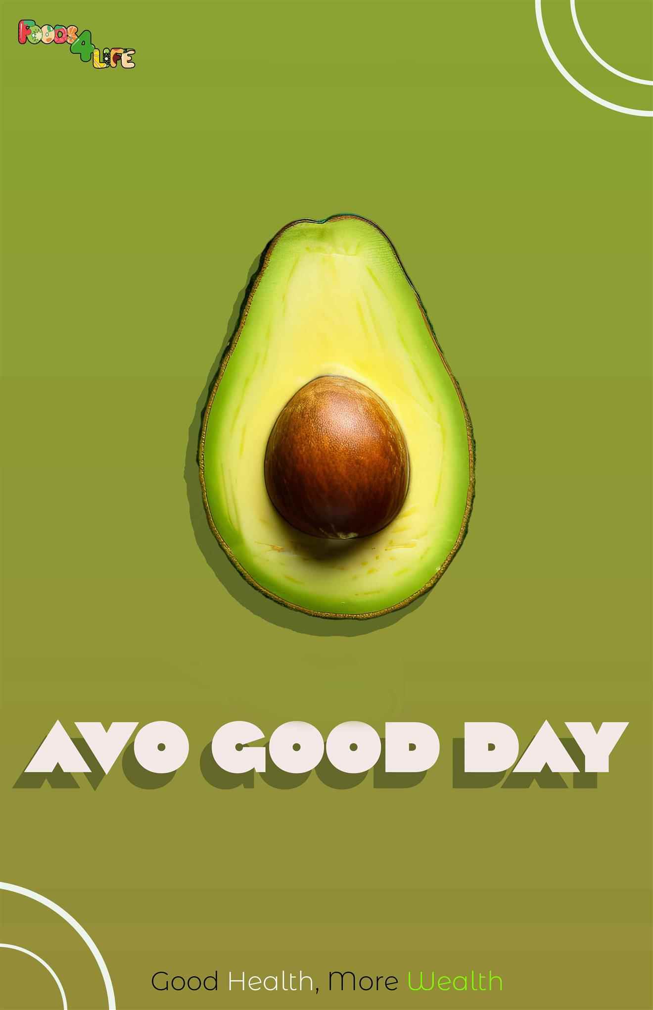
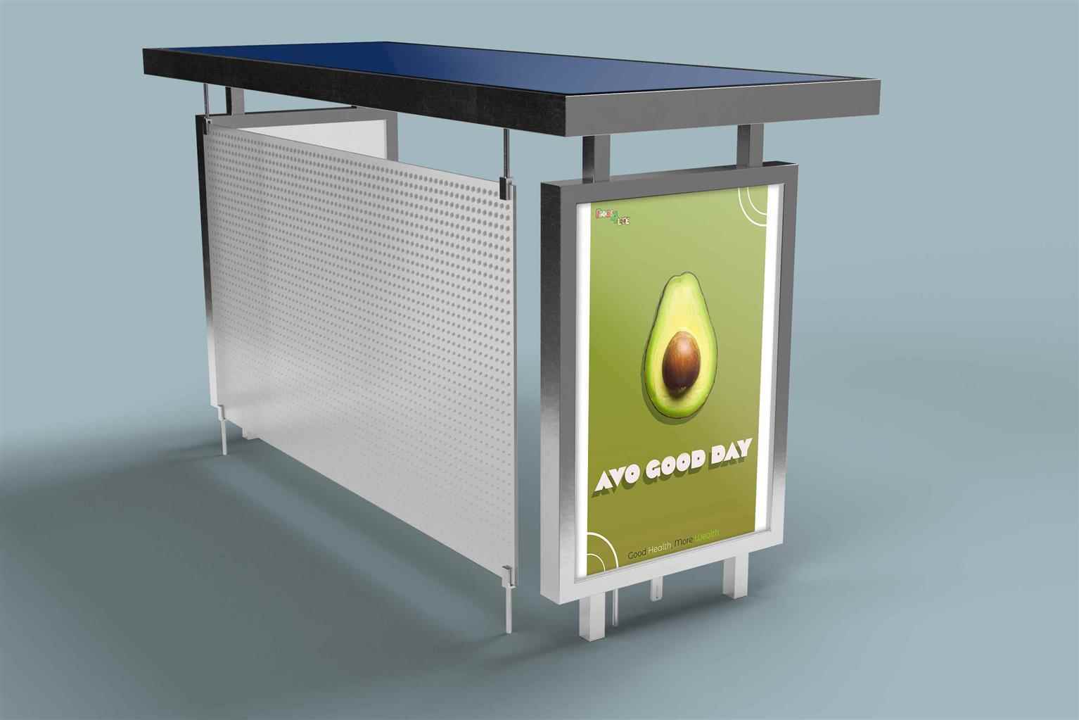
The FoodsForLife marketing project is a comprehensive rebranding initiative aimed at modernizing the company’s identity and increasing its appeal to both younger consumers and ageing baby boomers. The project emphasizes FoodsForLife's mission to provide affordable, high-quality organic health foods, ensuring accessibility and inclusivity for all. Key elements of the project include: Rebranding: Development of a cohesive visual identity featuring a modern logo, earthy and inviting color palettes, and clean typography. This new identity reflects the brand’s values of accessibility, equality, quality, and affordability.
Share:
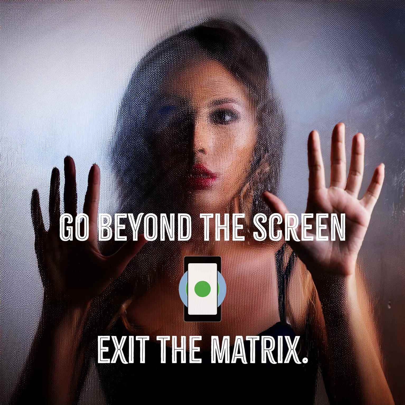
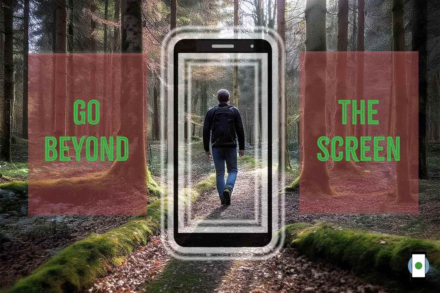
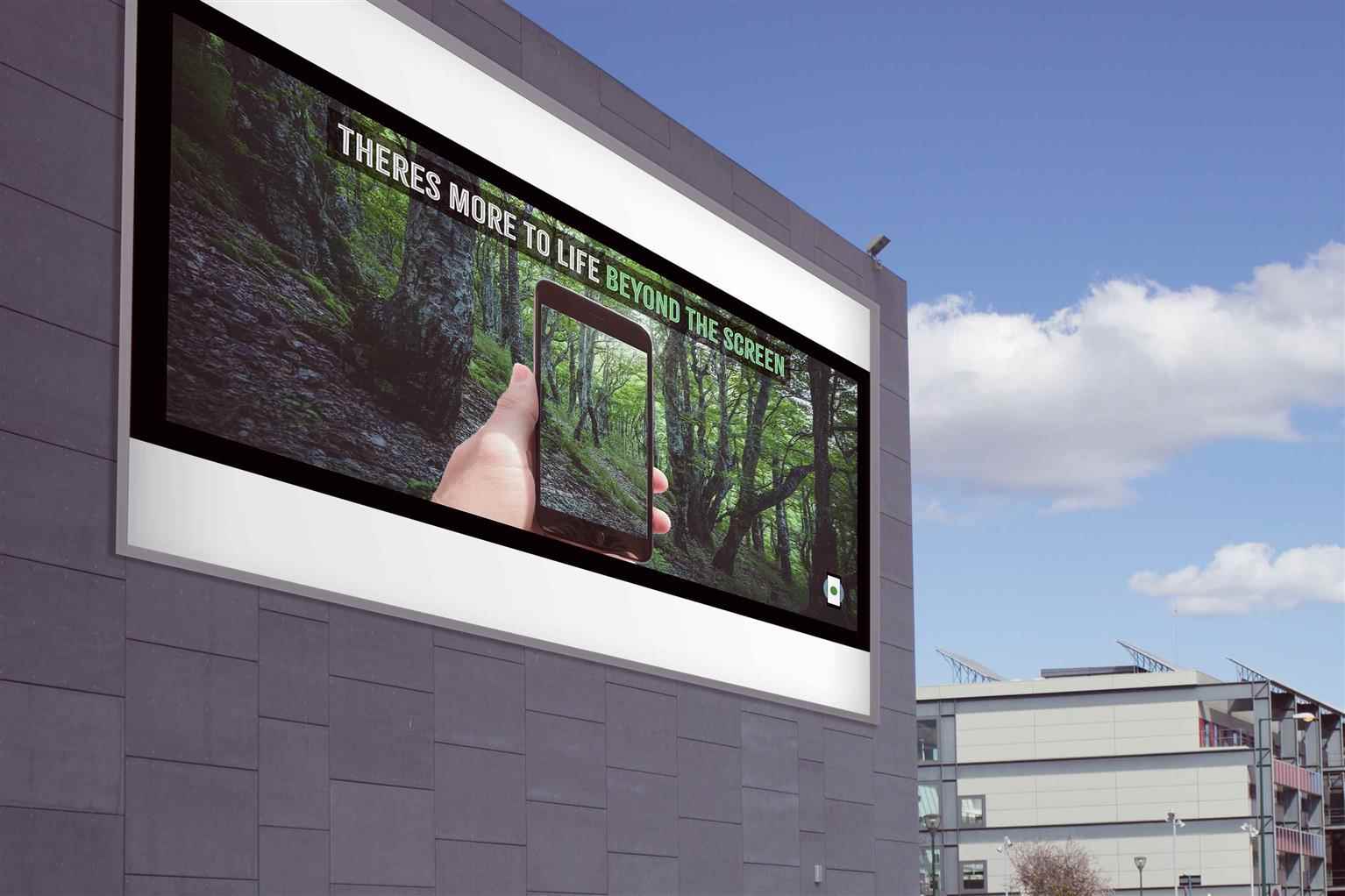
Social Awareness Campaign: Go Beyond The Screen
The Go Beyond the Screen project is a social awareness campaign designed to address the growing issue of digital dependence. Through powerful visuals and thought-provoking messaging, the campaign enc...
The Go Beyond the Screen project is a social awareness campaign designed to address the growing issue of digital dependence. Through powerful visuals and thought-provoking messaging, the campaign enc...
The Go Beyond the Screen project is a social awareness campaign designed to address the growing issue of digital dependence. Through powerful visuals and thought-provoking messaging, the campaign encourages individuals to reconnect with the real world by reducing screen time and exploring meaningful, offline experiences. Featuring imagery that contrasts the confinement of screens with the freedom of nature, the campaign promotes balance and mindfulness in the digital age. By providing an impactful call to action, it raises awareness about the importance of healthier habits and living beyond the digital matrix.

Share:
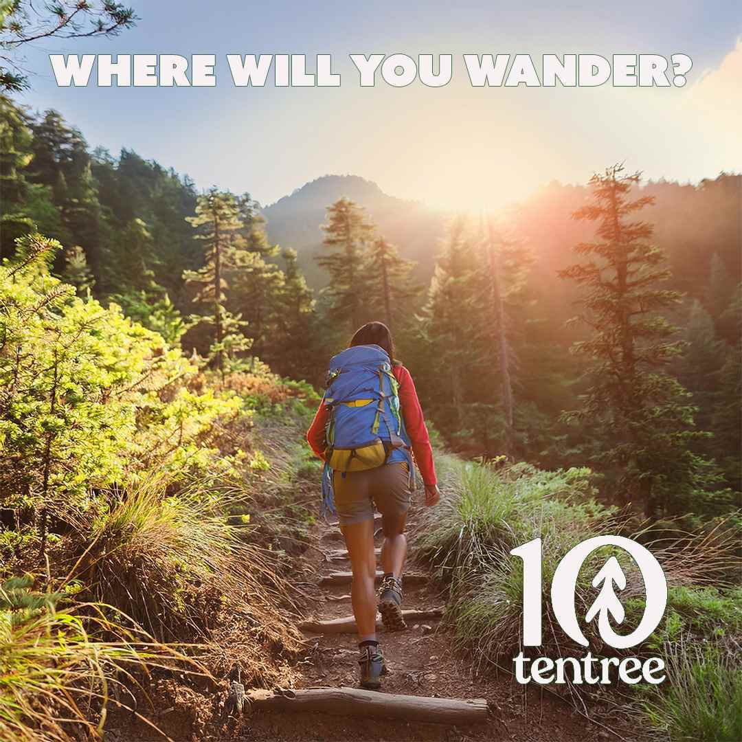
TenTree Brand Campaign
The Tentree Campaign is a visually-driven marketing initiative designed to inspire a love for the outdoors while reinforcing Tentree's sustainability mission. Through stunning imagery of hikers explo...
The Tentree Campaign is a visually-driven marketing initiative designed to inspire a love for the outdoors while reinforcing Tentree's sustainability mission. Through stunning imagery of hikers explo...
The Tentree Campaign is a visually-driven marketing initiative designed to inspire a love for the outdoors while reinforcing Tentree's sustainability mission. Through stunning imagery of hikers exploring breathtaking natural landscapes, the campaign connects emotionally with eco-conscious outdoor enthusiasts. The tagline “Where Will You Wander?” evokes curiosity and adventure, aligning perfectly with Tentree's promise to plant 10 trees for every product purchased. This campaign not only highlights the brand’s environmental commitment but also motivates customers to make sustainable choices that positively impact the planet.


Share:
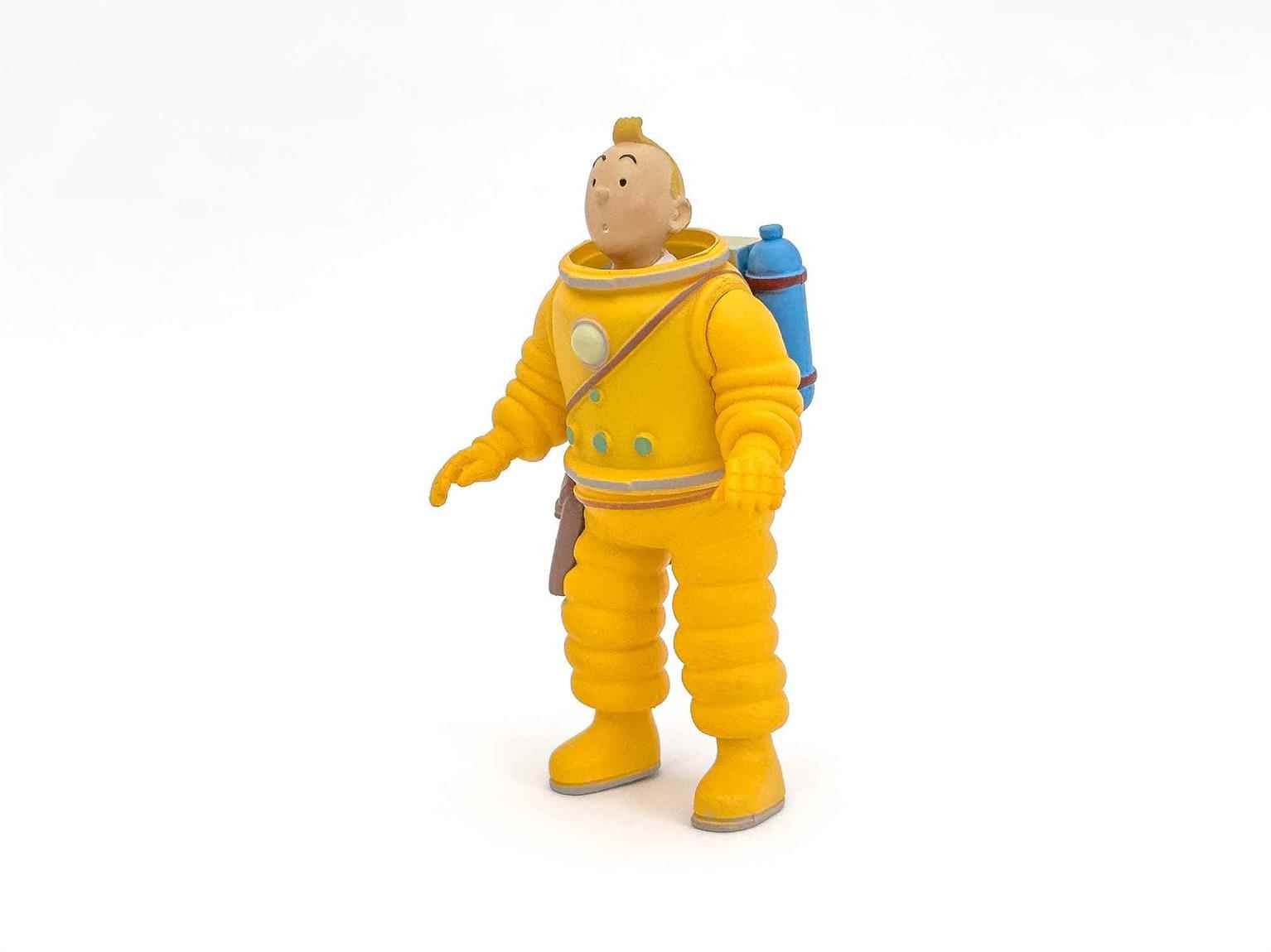
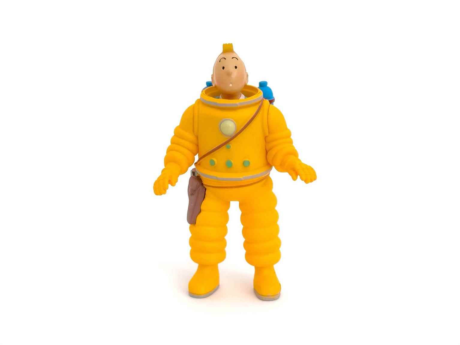
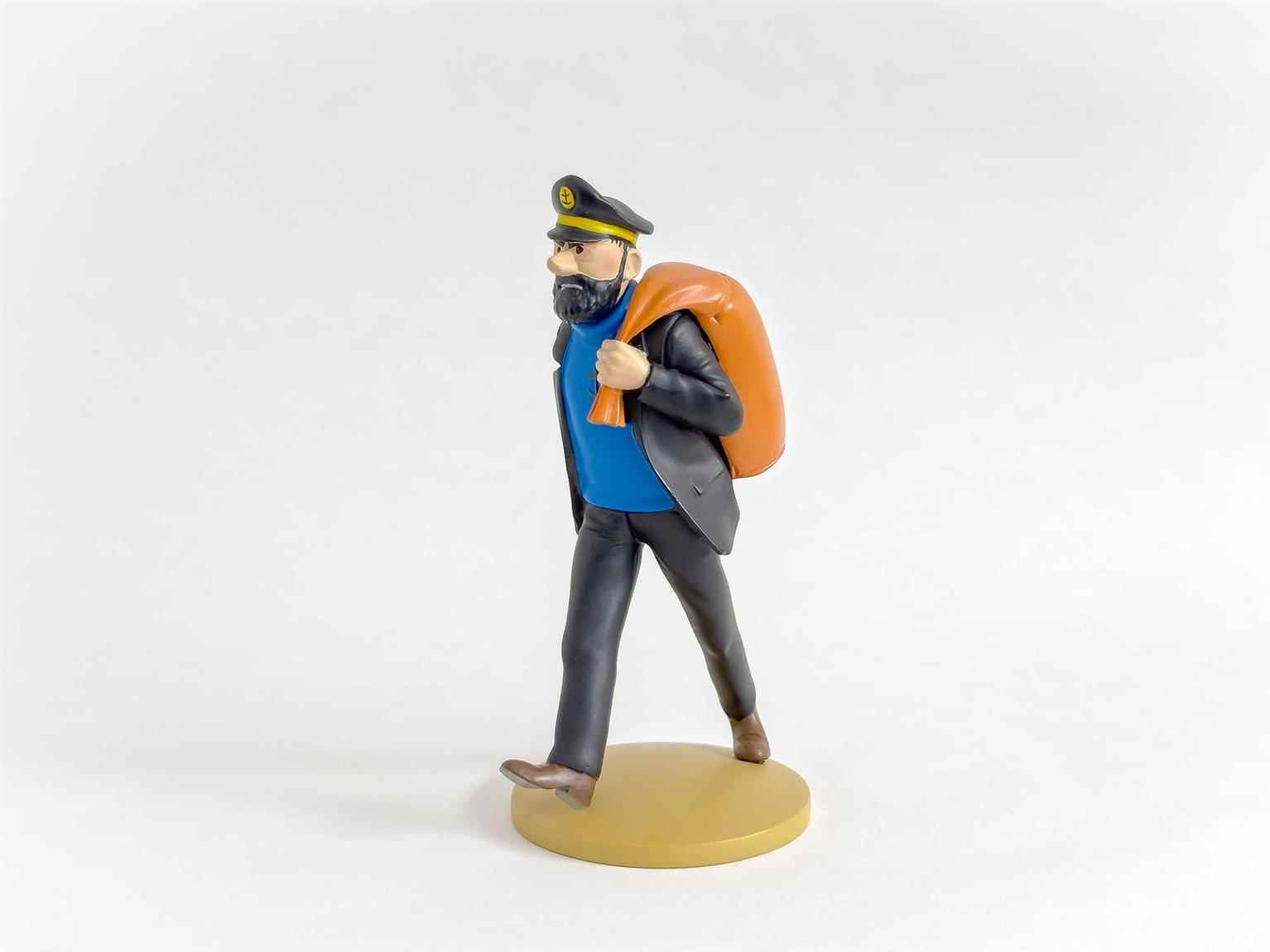
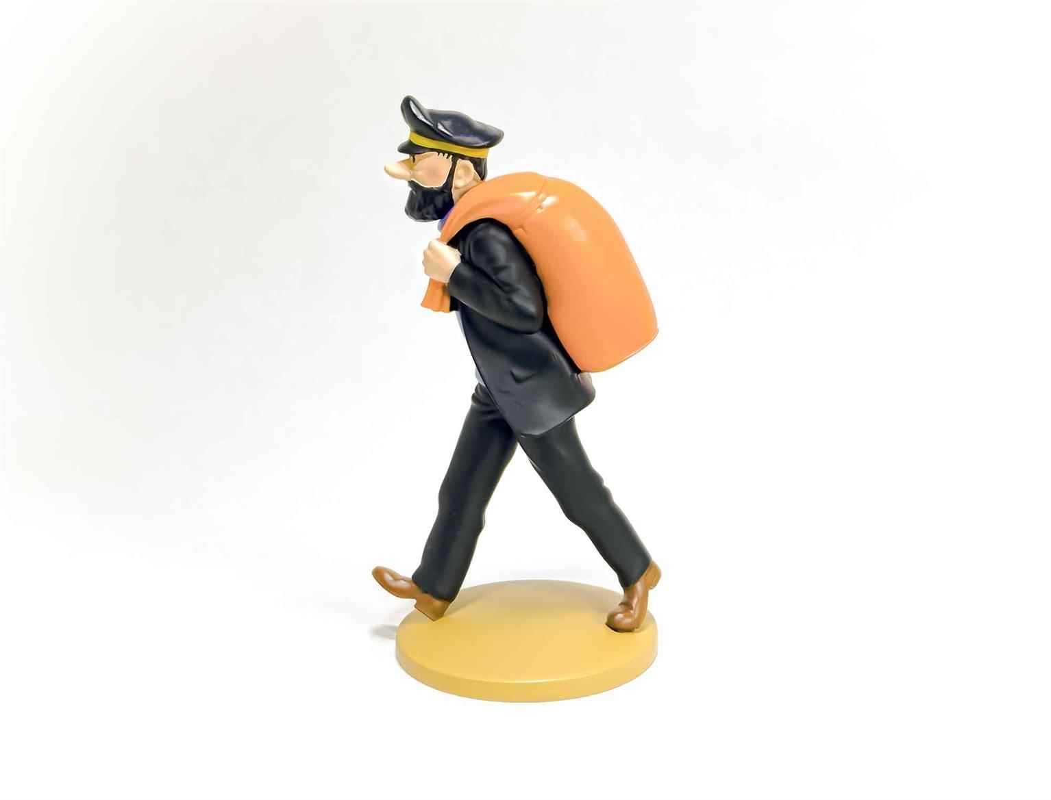
Product Photography for Tintin Brand
I captured high-quality product images for the Tintin brand's collectible figurines, using natural light, LED lighting, and a clean infinity slope backdrop. Shot on an iPhone 14 Pro in RAW format and...
I captured high-quality product images for the Tintin brand's collectible figurines, using natural light, LED lighting, and a clean infinity slope backdrop. Shot on an iPhone 14 Pro in RAW format and...
I captured high-quality product images for the Tintin brand's collectible figurines, using natural light, LED lighting, and a clean infinity slope backdrop. Shot on an iPhone 14 Pro in RAW format and edited in Photoshop, the images highlight the vibrant details and craftsmanship of the figurines, providing professional visuals for e-commerce and marketing purposes.
Share:
Canada Dry Marketing Campaign
This project features two advertisements for Canada Dry, each tailored to distinct audiences. The Canadian market ad, "Some Things Were Meant to Stay Wild," highlights the brand's natural purity by d...
This project features two advertisements for Canada Dry, each tailored to distinct audiences. The Canadian market ad, "Some Things Were Meant to Stay Wild," highlights the brand's natural purity by d...
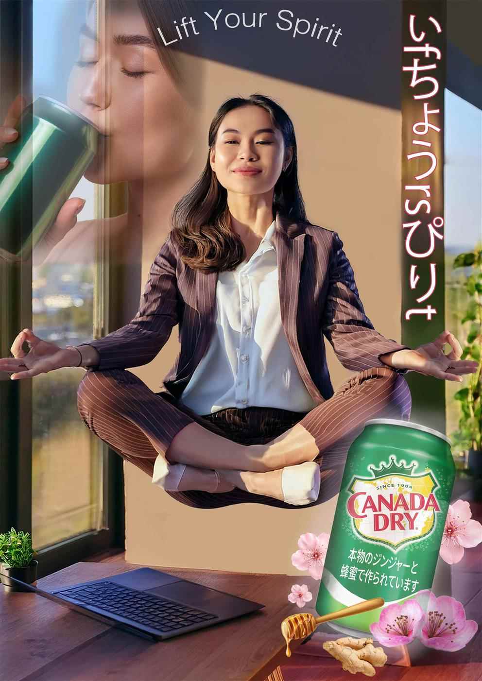
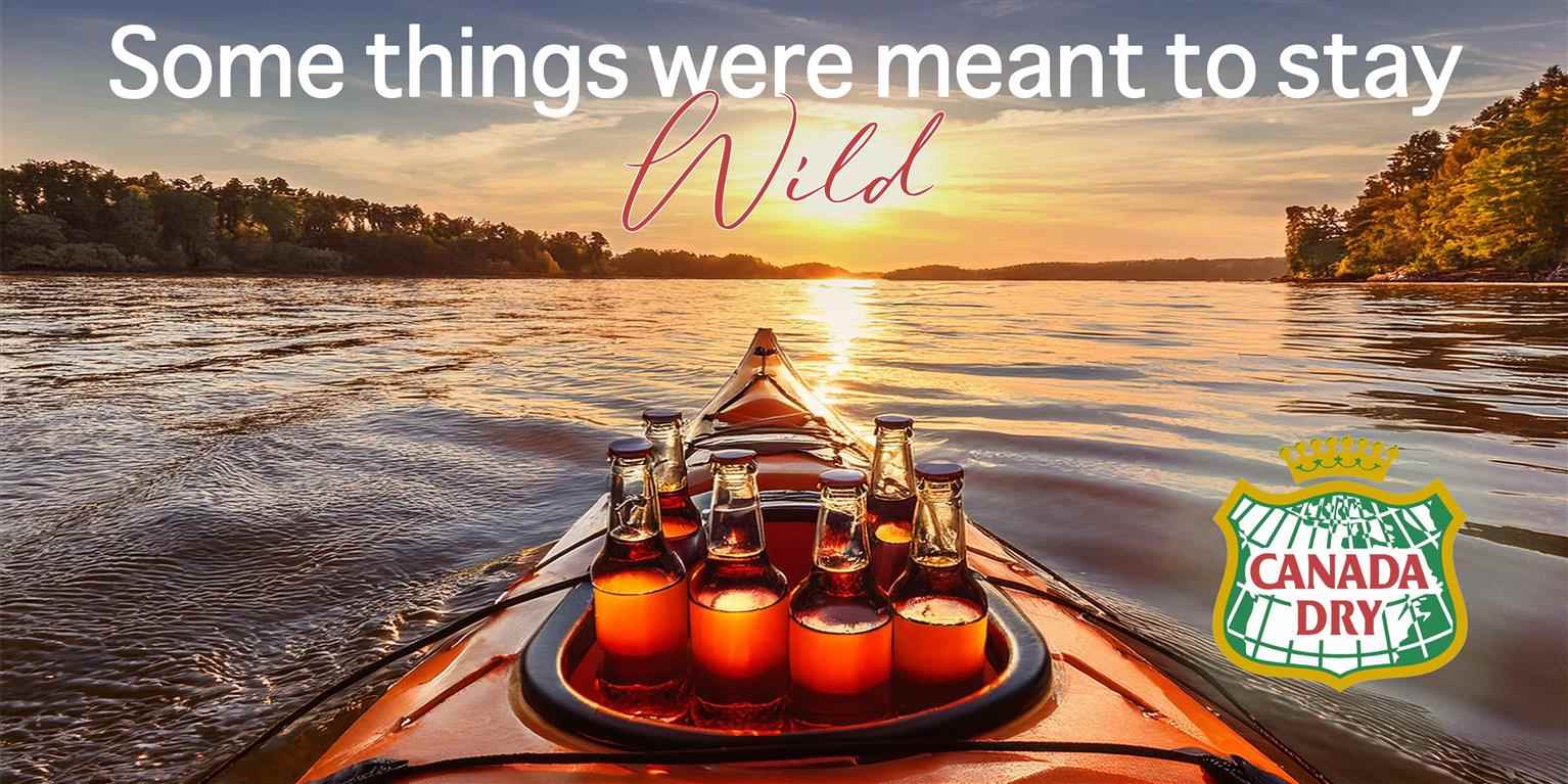
This project features two advertisements for Canada Dry, each tailored to distinct audiences. The Canadian market ad, "Some Things Were Meant to Stay Wild," highlights the brand's natural purity by depicting a serene kayaking scene on a sunset-lit lake, connecting the product with outdoor adventure and exploration. The Japanese market ad, "Lift Your Spirit," appeals to wellness-focused consumers with a tranquil office setting, cherry blossoms, and a meditative figure, emphasizing balance and natural ingredients. Both ads combine AI and Photoshop to create visually compelling and culturally relevant narratives that align with Canada Dry's brand identity.
Share:
People Magazine Cover: Photo Compositing
For this project, I created a polished mock magazine cover for People Magazine, utilizing advanced photo compositing techniques. The subject's facial features were meticulously refined in Adobe Photo...
For this project, I created a polished mock magazine cover for People Magazine, utilizing advanced photo compositing techniques. The subject's facial features were meticulously refined in Adobe Photo...
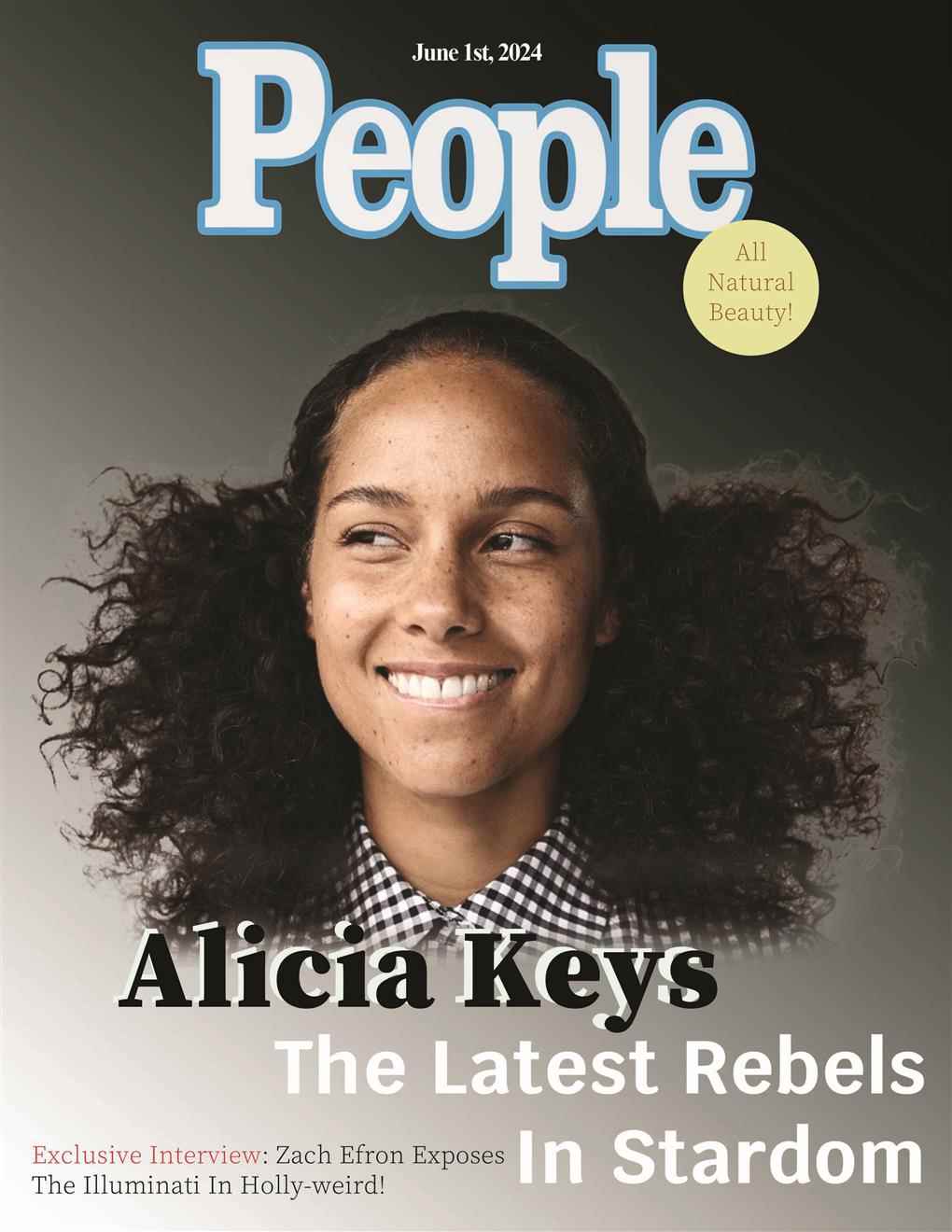
For this project, I created a polished mock magazine cover for People Magazine, utilizing advanced photo compositing techniques. The subject's facial features were meticulously refined in Adobe Photoshop to remove imperfections while preserving a natural and authentic look, aligning with the cover's theme of "All Natural Beauty." The composition showcases balanced typography, cohesive design elements, and a harmonious color palette, demonstrating industry-standard editorial aesthetics. This project underscores my ability to merge creative vision with technical expertise, resulting in a visually striking and professional-quality cover design.
Share:
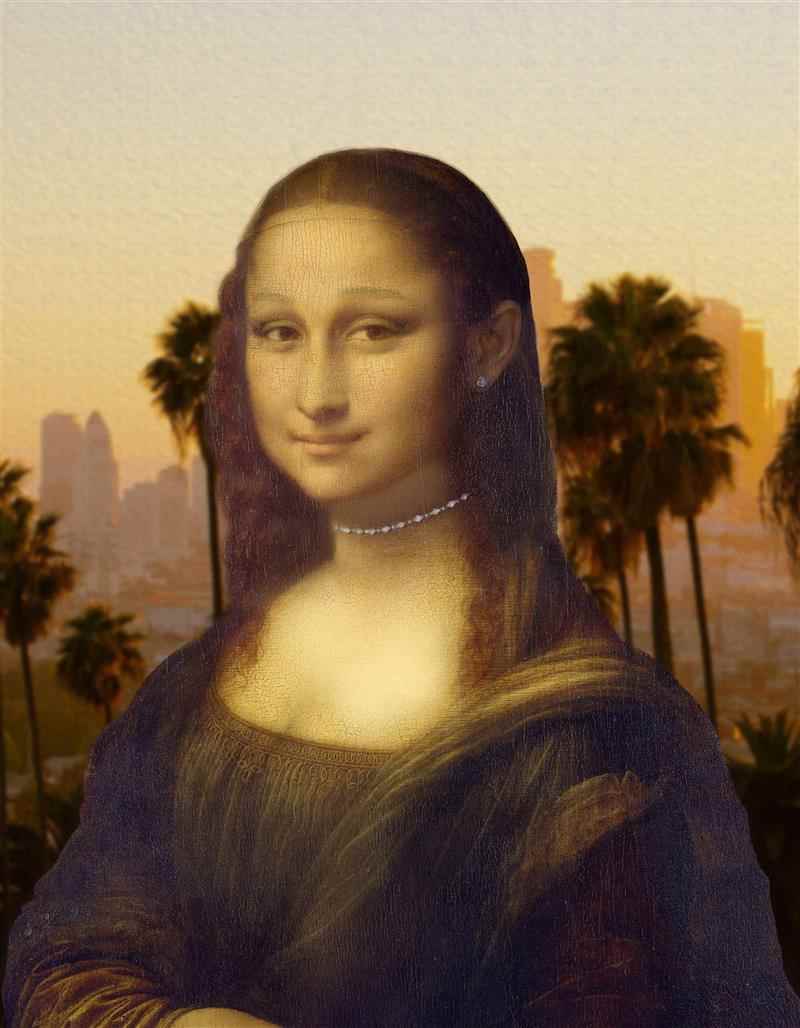
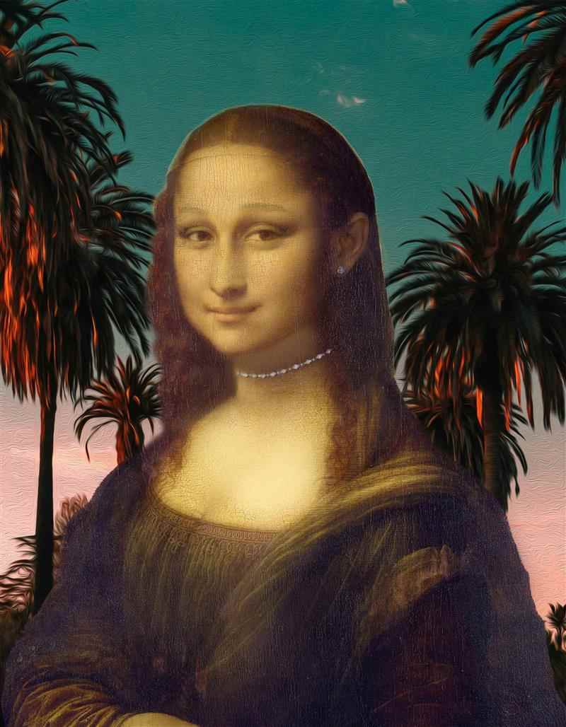
Mona Grande: Photo Compositing
This photo compositing project reimagines the iconic Mona Lisa through the lens of modern beauty and celebrity culture by blending her features with those of Ariana Grande. Utilizing advanced Photosh...
This photo compositing project reimagines the iconic Mona Lisa through the lens of modern beauty and celebrity culture by blending her features with those of Ariana Grande. Utilizing advanced Photosh...
This photo compositing project reimagines the iconic Mona Lisa through the lens of modern beauty and celebrity culture by blending her features with those of Ariana Grande. Utilizing advanced Photoshop techniques, the artwork merges Renaissance elegance with contemporary aesthetics, symbolizing the intersection of timeless art and current pop culture. The carefully chosen backgrounds of serene palm-lined sunsets and cityscapes enhance the theme of beauty in both classical and modern contexts. The piece invites viewers to reflect on how societal ideals of beauty and fame have evolved while maintaining a connection to historical artistry.
Share:
Robba Da Matti: Marketing Campaign
The Robba Da Matti campaign, "Home is Where the Sauce Is," highlights the warmth of family traditions, authentic Italian flavors, and the comfort of sharing meals in a cozy setting. Through a consist...
The Robba Da Matti campaign, "Home is Where the Sauce Is," highlights the warmth of family traditions, authentic Italian flavors, and the comfort of sharing meals in a cozy setting. Through a consist...
The Robba Da Matti campaign, "Home is Where the Sauce Is," highlights the warmth of family traditions, authentic Italian flavors, and the comfort of sharing meals in a cozy setting. Through a consistent visual theme featuring the red and white checkered tablecloth and quality ingredients, the ads across magazine, SkyTrain, and newspaper formats emphasize the restaurant’s inviting atmosphere and dedication to tradition. Robba Da Matti becomes your Italian home away from home.


Share:
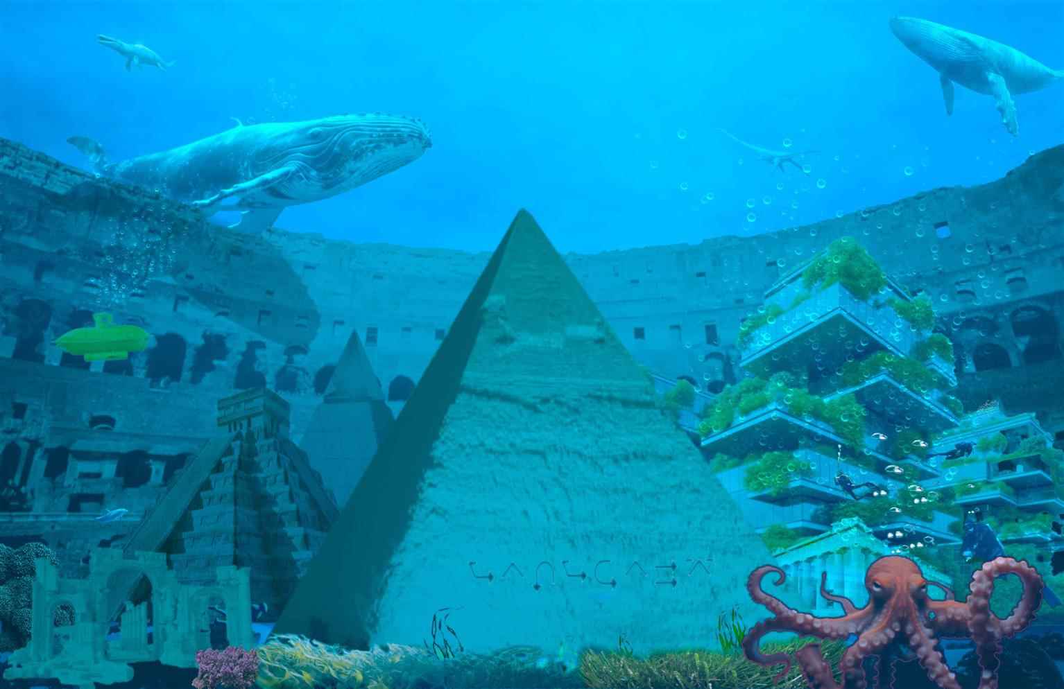
Atlantis: Photo Compositing
This photo composite, created using Adobe Photoshop, envisions a vibrant underwater city of Atlantis. It merges iconic landmarks such as the Great Pyramid, Chichen Itza, and the Roman Colosseum subme...
This photo composite, created using Adobe Photoshop, envisions a vibrant underwater city of Atlantis. It merges iconic landmarks such as the Great Pyramid, Chichen Itza, and the Roman Colosseum subme...
This photo composite, created using Adobe Photoshop, envisions a vibrant underwater city of Atlantis. It merges iconic landmarks such as the Great Pyramid, Chichen Itza, and the Roman Colosseum submerged in a dynamic marine ecosystem. The scene integrates marine life like whales, octopuses, and fish, alongside a futuristic, green architectural design that emphasizes a harmonious blend of historical and modern elements. The blue oceanic hues, realistic textures, and creative layering showcase the intricate craftsmanship of photo compositing. The work is a creative interpretation of Atlantis, symbolizing a submerged world of history and biodiversity.
Share:
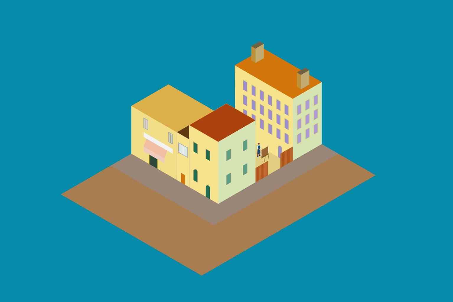
The Yellow House: An Isometric Illustration
This project presents an isometric illustration of The Yellow House, the iconic residence of Vincent van Gogh in Arles, France. The artwork reimagines the house through a clean, modern design while p...
This project presents an isometric illustration of The Yellow House, the iconic residence of Vincent van Gogh in Arles, France. The artwork reimagines the house through a clean, modern design while p...
This project presents an isometric illustration of The Yellow House, the iconic residence of Vincent van Gogh in Arles, France. The artwork reimagines the house through a clean, modern design while preserving its historical essence. The isometric style lends a dynamic, three-dimensional perspective, combining precise geometric forms with a vibrant color palette inspired by Van Gogh’s own works. Bold yellows and blues evoke the warmth and creativity that defined the artist’s time at the house. Created for a museum’s website, this graphic serves as both a visually engaging and educational asset, bridging Van Gogh’s artistic legacy with contemporary design techniques.
Share:
Would you like to request more information?
Click on the button below and we'll get back to you as soon as possible.
Get in Touch with Us
