Karla
RiskeGraphic Design
Oceaware
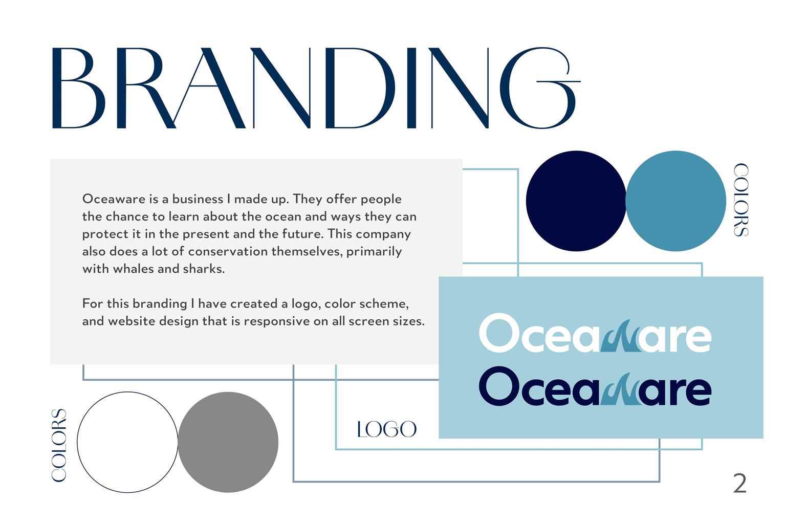
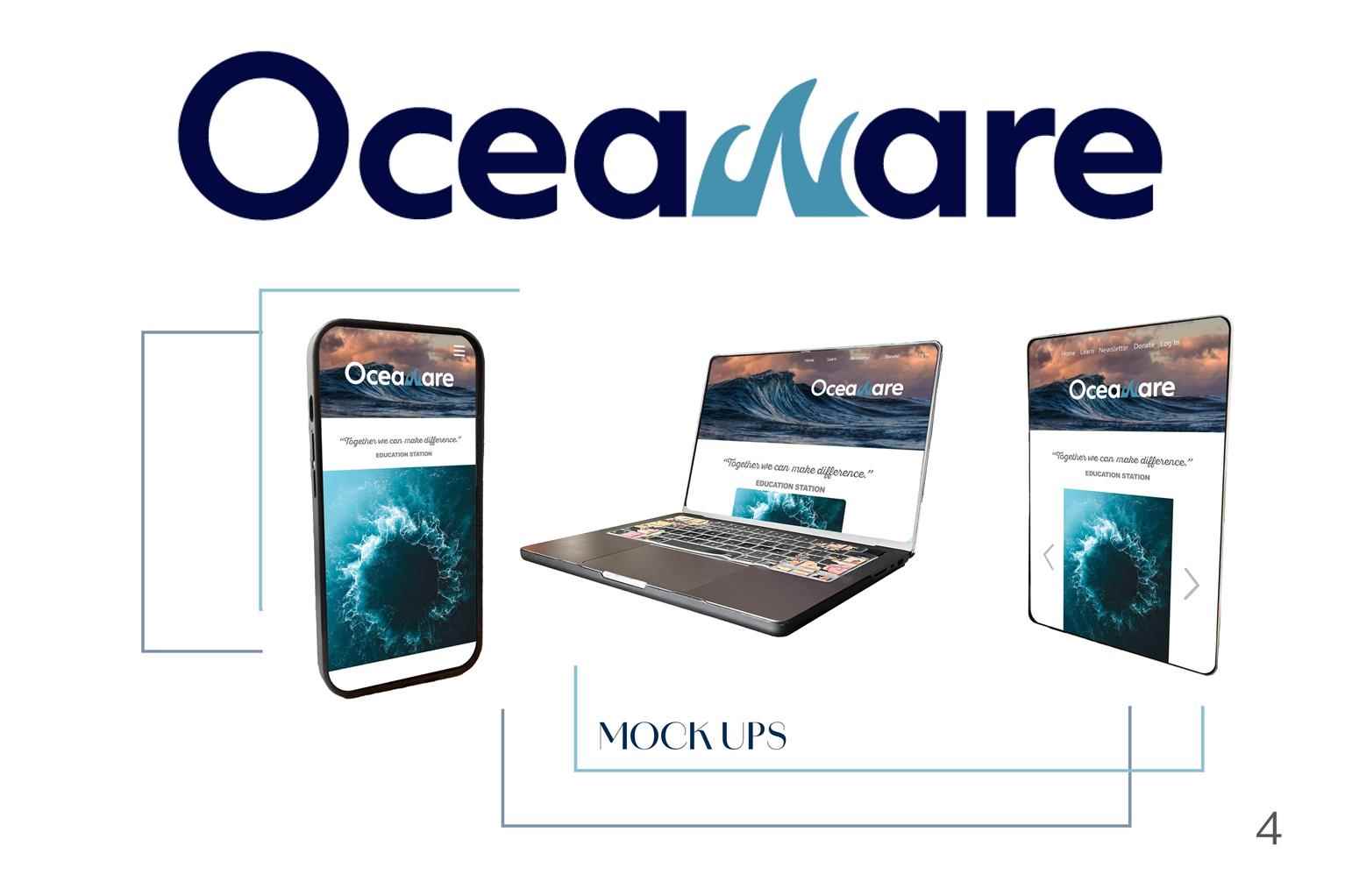
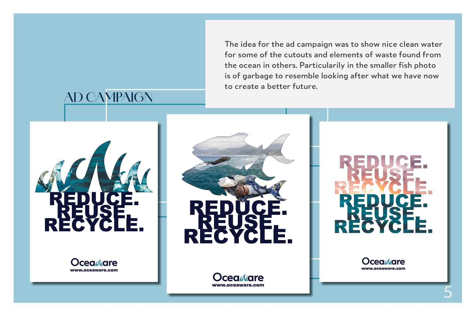
Oceaware is a business I made up. They offer people the chance to learn about the ocean and ways they can protect it in the present and the future. This company also does a lot of conservation themse...
Oceaware is a business I made up. They offer people the chance to learn about the ocean and ways they can protect it in the present and the future. This company also does a lot of conservation themse...
Oceaware is a business I made up. They offer people the chance to learn about the ocean and ways they can protect it in the present and the future. This company also does a lot of conservation themselves, primarily with whales and sharks. For this branding I have created a logo, color scheme, and website design that is responsive on all screen sizes.

Share:
Magazine Covers
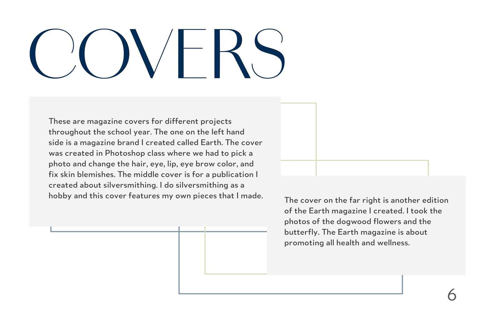
These are magazine covers for different projects throughout the school year. The one on the left hand side is a magazine brand I created called Earth. The cover was created in Photoshop class where w...
These are magazine covers for different projects throughout the school year. The one on the left hand side is a magazine brand I created called Earth. The cover was created in Photoshop class where w...
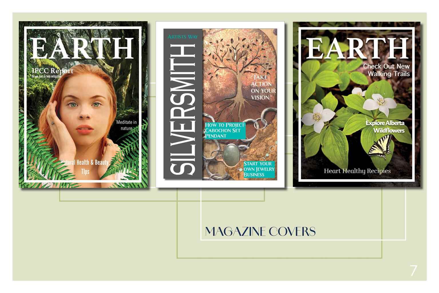
These are magazine covers for different projects throughout the school year. The one on the left hand side is a magazine brand I created called Earth. The cover was created in Photoshop class where we had to pick a photo and change the hair, eye, lip, eye brow color, and fix skin blemishes. The middle cover is for a publication I created about silversmithing. I do silversmithing as a hobby and this cover features my own pieces that I made. The cover on the far right is another edition of the Earth magazine I created. I took the photos of the dogwood flowers and the butterfly. The Earth magazine is about promoting all health and wellness.
Share:
Theatre Advertising Posters
I created these theatre posters for an Illustrator project. The first one I created was for The Little Shop Of Horrors. The object was to create a theatre poster for a performance that has happened i...
I created these theatre posters for an Illustrator project. The first one I created was for The Little Shop Of Horrors. The object was to create a theatre poster for a performance that has happened i...
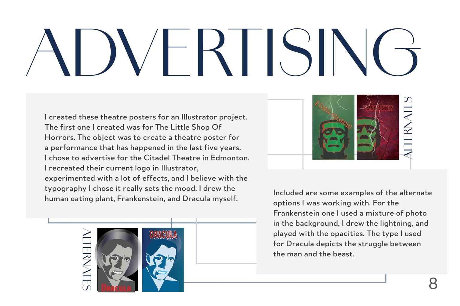
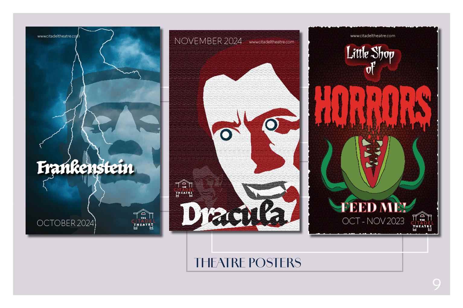
I created these theatre posters for an Illustrator project. The first one I created was for The Little Shop Of Horrors. The object was to create a theatre poster for a performance that has happened in the last five years. I chose to advertise for the Citadel Theatre in Edmonton. I recreated their current logo in Illustrator, experimented with a lot of effects, and I believe with the typography I chose it really sets the mood. I drew the human eating plant, Frankenstein, and Dracula myself. Included are some examples of the alternate options I was working with. For the Frankenstein one I used a mixture of photo in the background, I drew the lightning, and played with the opacities. The type I used for Dracula depicts the struggle between the man and the beast.
Share:
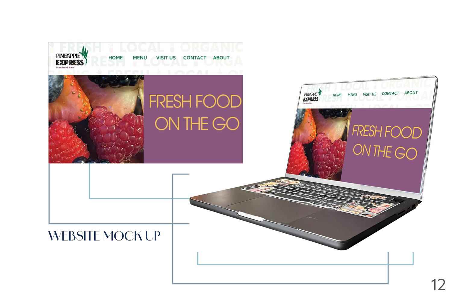
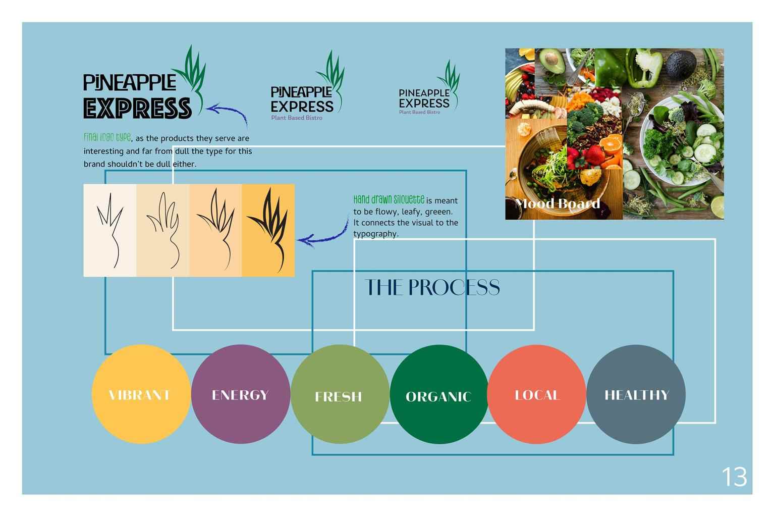
Pineapple Express Branding, Ads, Web Design
Pineapple Express is a local plant based bistro, located inside the Eat Good Market. Through my research I could see they didn’t have any website advertising, no online presence, and very plain brand...
Pineapple Express is a local plant based bistro, located inside the Eat Good Market. Through my research I could see they didn’t have any website advertising, no online presence, and very plain brand...
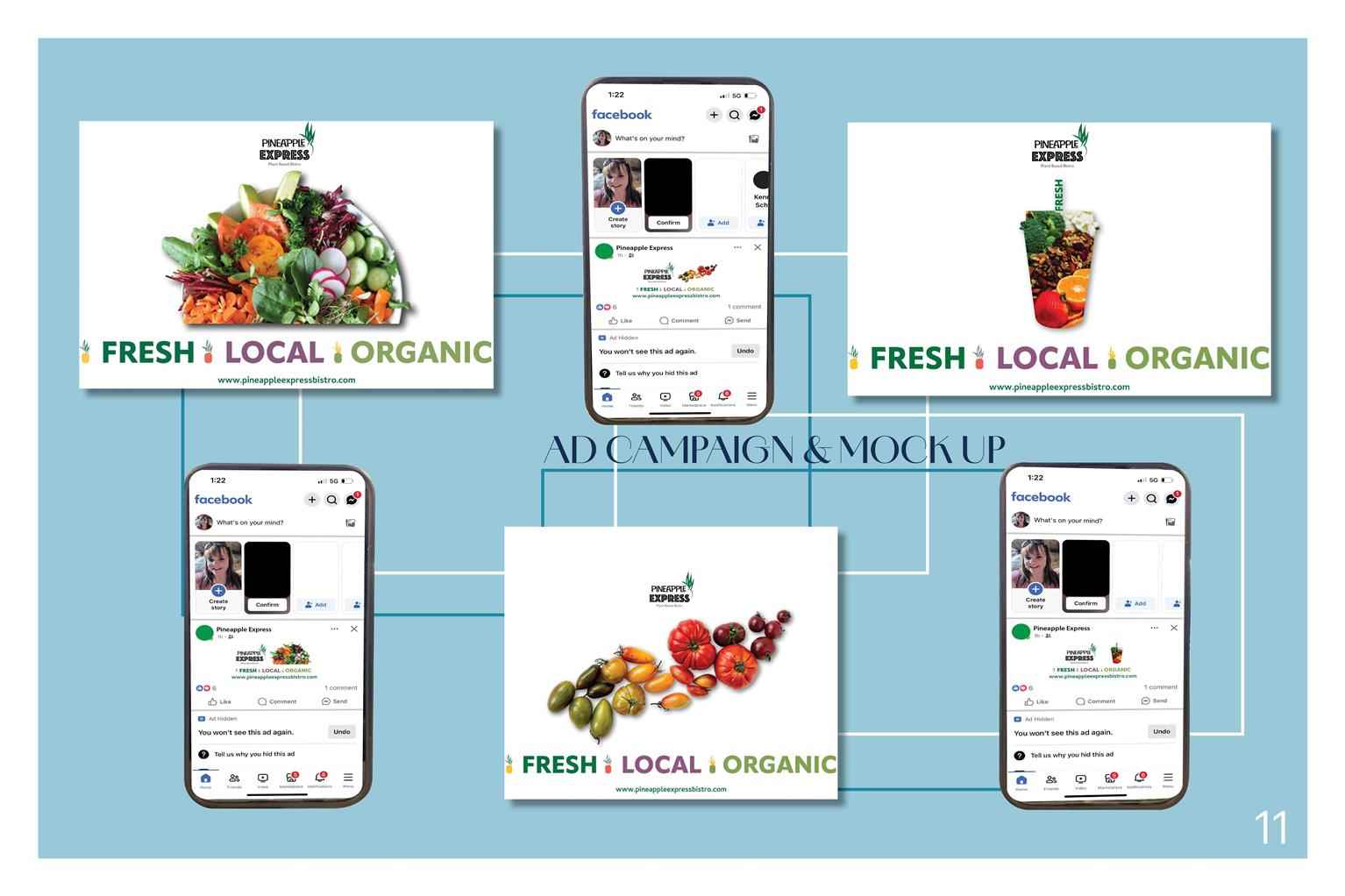
Pineapple Express is a local plant based bistro, located inside the Eat Good Market. Through my research I could see they didn’t have any website advertising, no online presence, and very plain branding. I created a new logo, color scheme, digital ads on facebook, print ads, and website home page, and mock up. For this brand we went for a variety of brighter colours to match the fresh fruits and vegetables you can find in the products served at Pineapple Express. For the logo of this brand it made sense to go with the Pineapple icon as their current logo has the pineapple in it. The color green also made sense as it says fresh and planty. For the logo type we have something that is visually interesting as plant based food doesn’t have to be dull either.

Share:
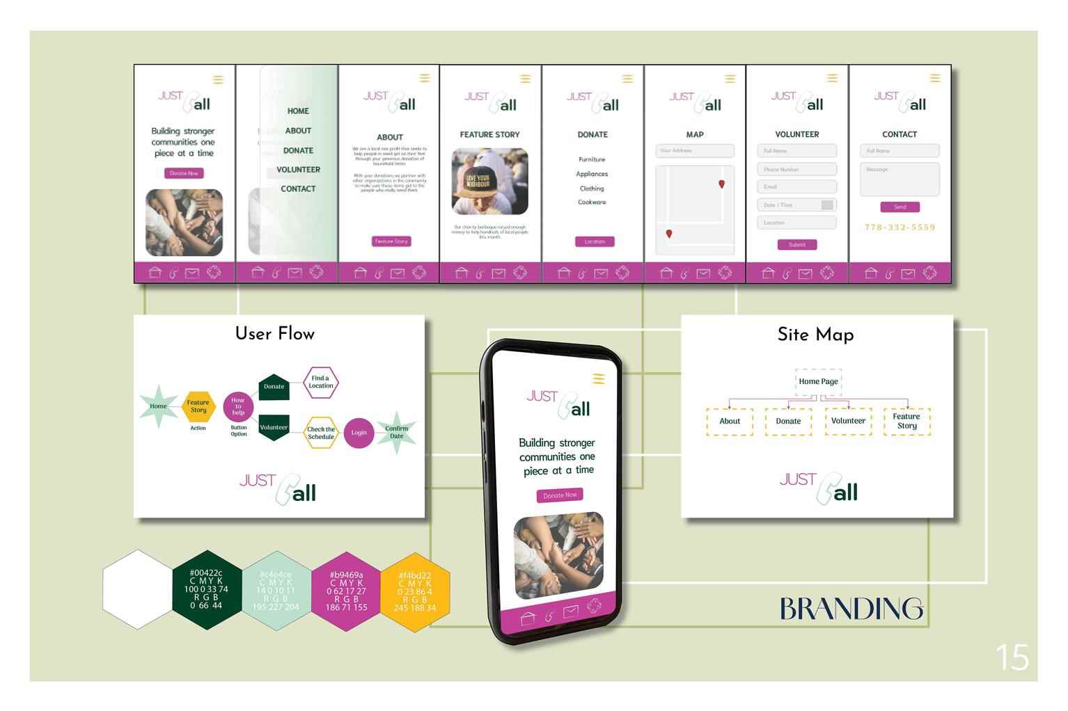
Just Call Web Design
Just Call is a non for profit that collects furniture and household items and distributes them to people in need at no cost. This is a company I made up for a Web Development class. In downsizing one...
Just Call is a non for profit that collects furniture and household items and distributes them to people in need at no cost. This is a company I made up for a Web Development class. In downsizing one...
Just Call is a non for profit that collects furniture and household items and distributes them to people in need at no cost. This is a company I made up for a Web Development class. In downsizing ones possessions it can be very time consuming and difficult dealing with people on such platforms as Facebook marketplace. I think it would be nice to donate your items knowing that they will be helping people who really need it. This company is named after the James Taylor song You’ve Got a Friend. The goal of this website is to have a clean, not cluttered look, modern, and minimal, as the people checking this interface will be decluttering their own homes. I would like there to be a little warmth in the colour scheme as giving to people in need is a heartwarming gesture.
Share:
Advertising Suite
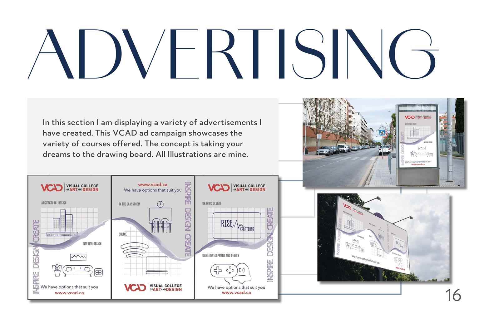
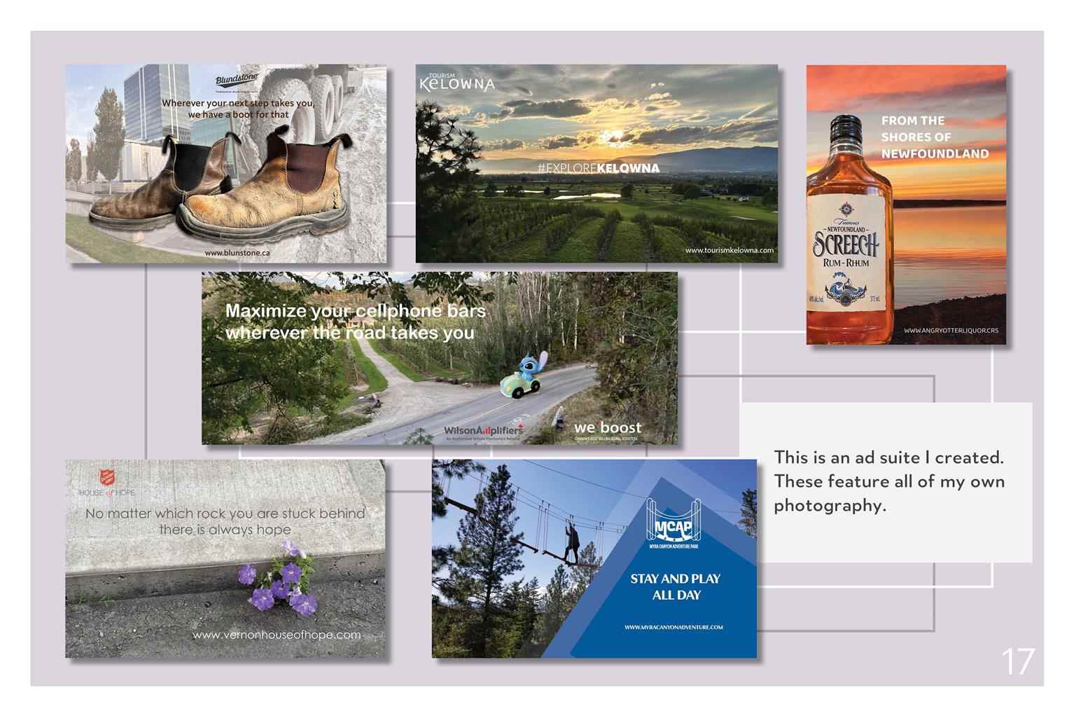
In this section I am displaying a variety of advertisements I have created. This VCAD ad campaign showcases the variety of courses offered. The concept is taking your dreams to the drawing board. All...
In this section I am displaying a variety of advertisements I have created. This VCAD ad campaign showcases the variety of courses offered. The concept is taking your dreams to the drawing board. All...
In this section I am displaying a variety of advertisements I have created. This VCAD ad campaign showcases the variety of courses offered. The concept is taking your dreams to the drawing board. All Illustrations are mine.
Share:
Motion Graphics
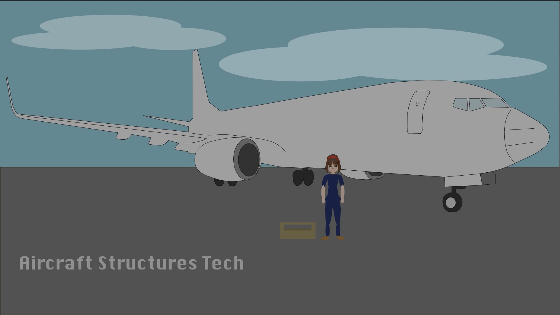
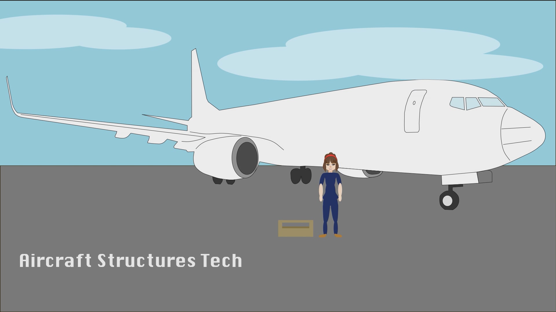
This short motion graphic is a fun way to show the viewer my past work history. Out of high school I was an Aircraft Structures Technician. After several years in the industry I got my class one driv...
This short motion graphic is a fun way to show the viewer my past work history. Out of high school I was an Aircraft Structures Technician. After several years in the industry I got my class one driv...
This short motion graphic is a fun way to show the viewer my past work history. Out of high school I was an Aircraft Structures Technician. After several years in the industry I got my class one drivers license. Now I have completed my diploma program for Graphic Design. I am ready to get into the industry and have a career I am passionate about.
Share:
Would you like to request more information?
Click on the button below and we'll get back to you as soon as possible.
Get in Touch with Us
