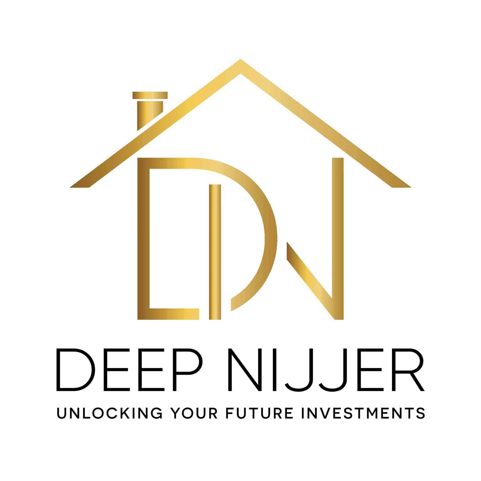
Deep
BainsGraphic Design
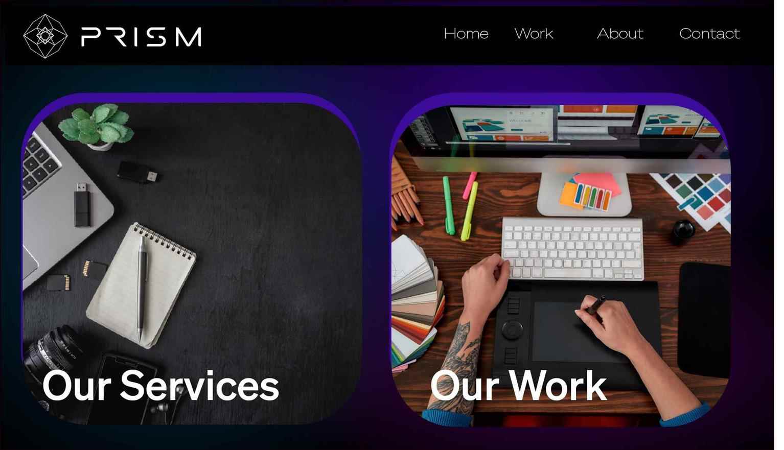
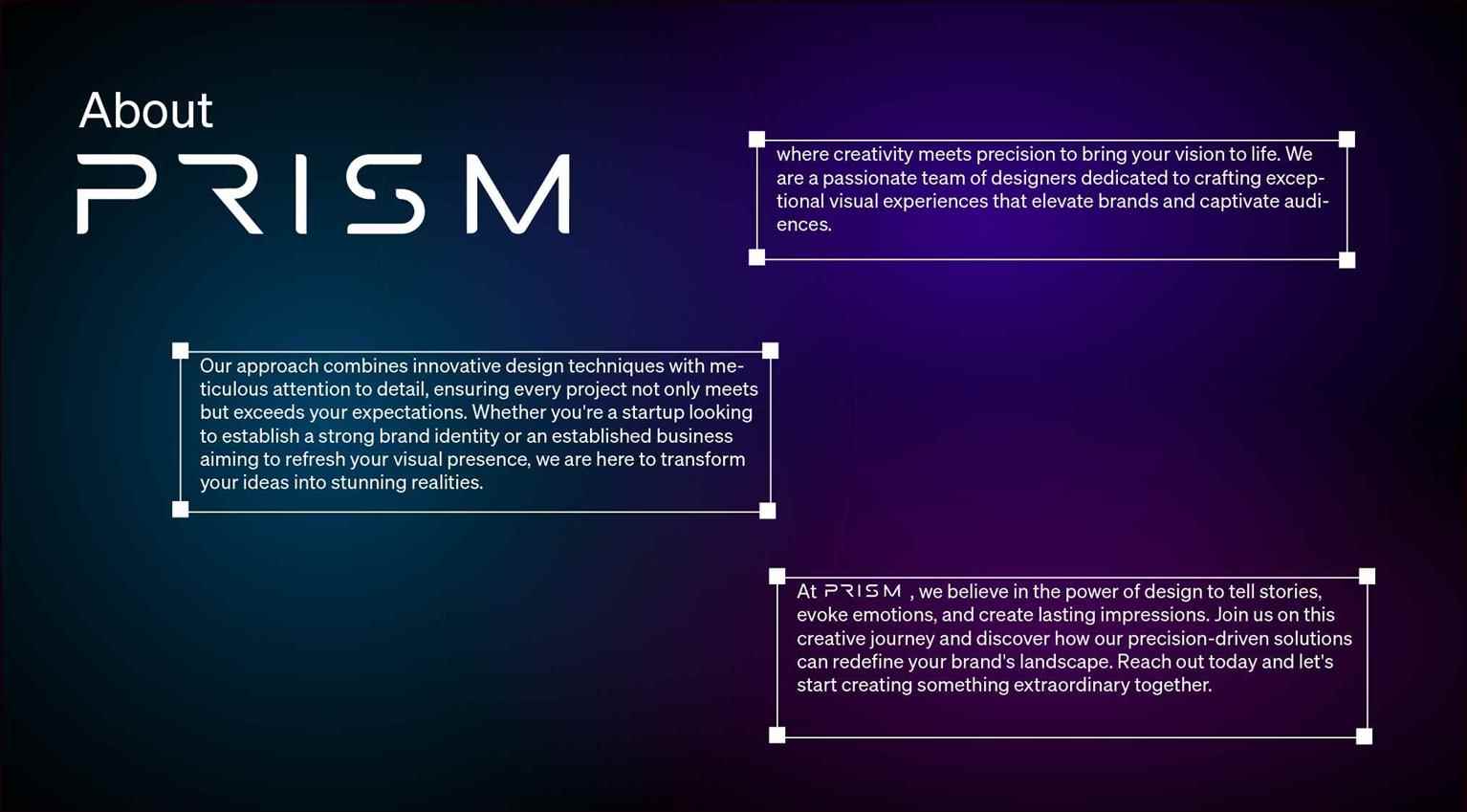
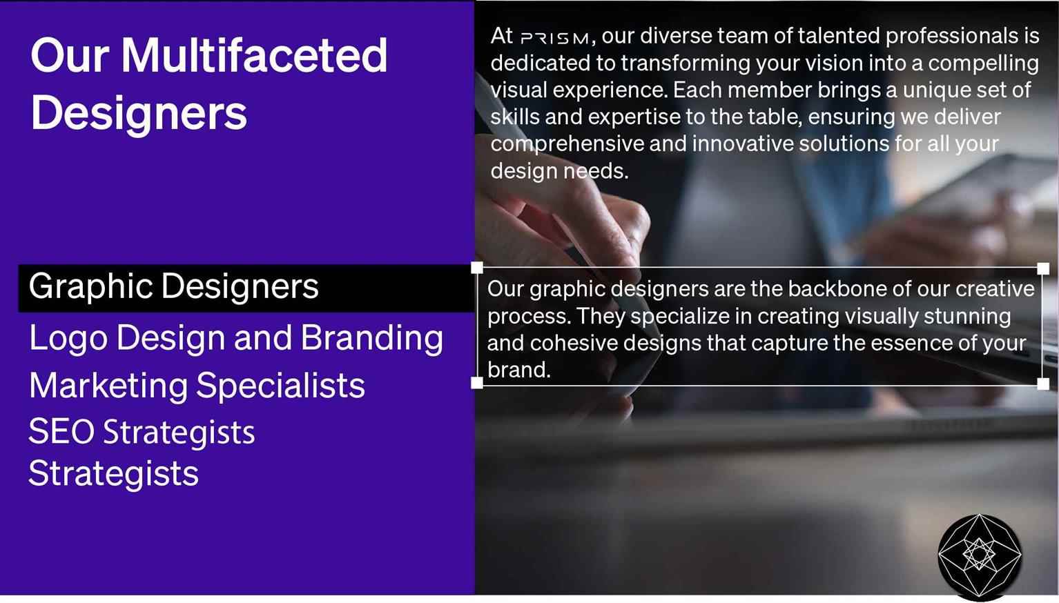
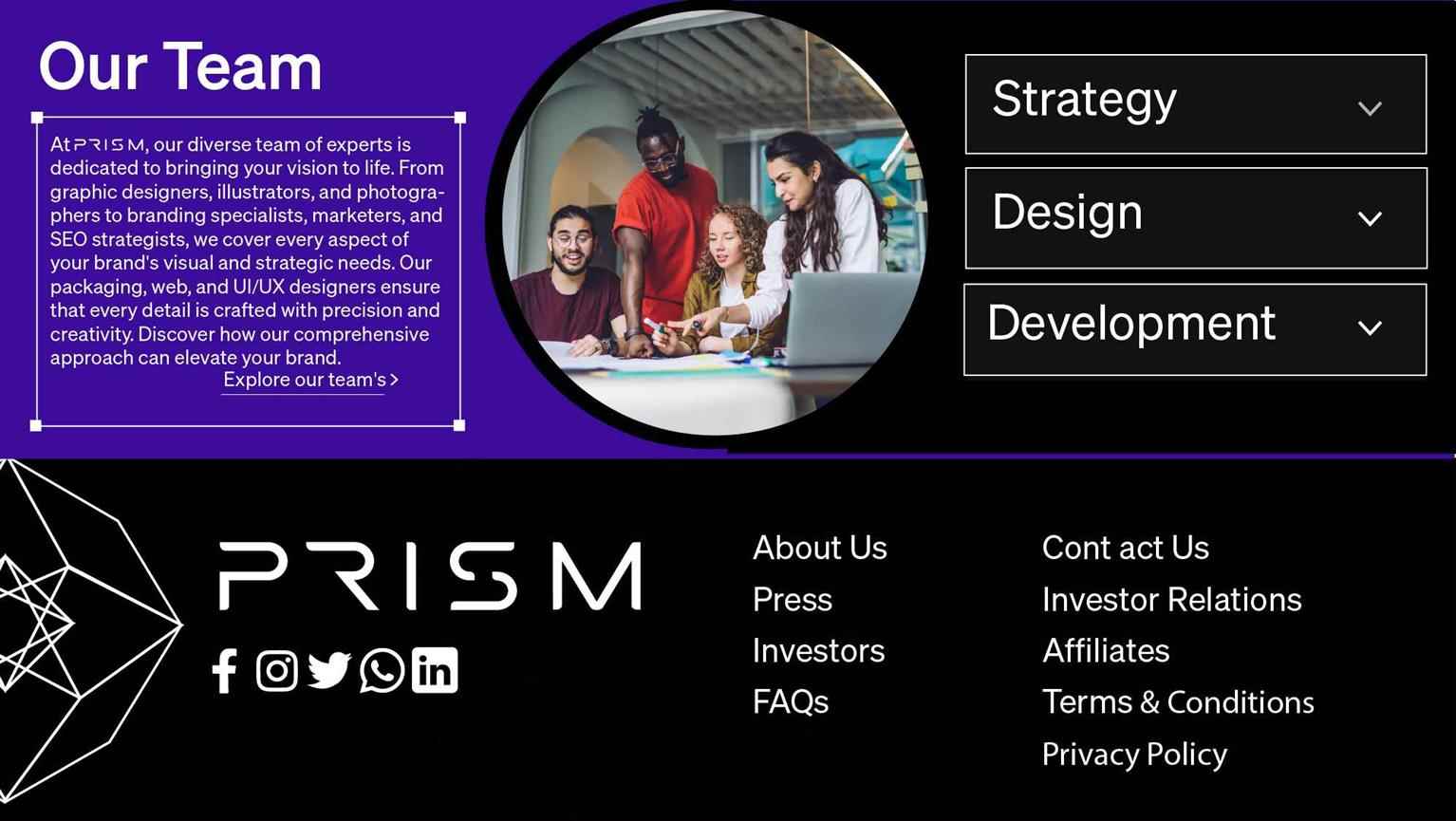
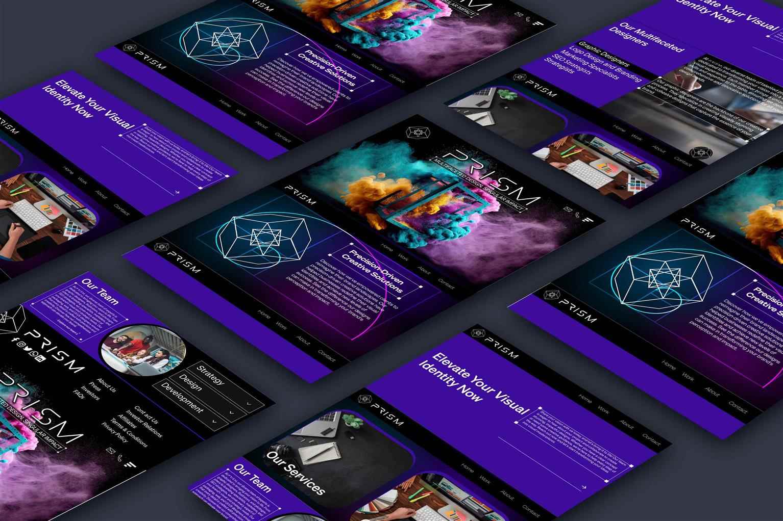
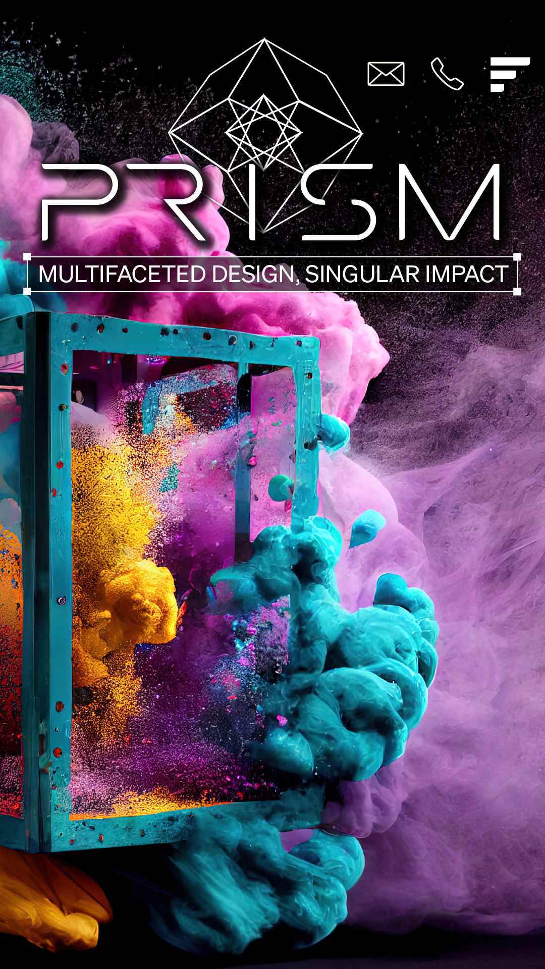
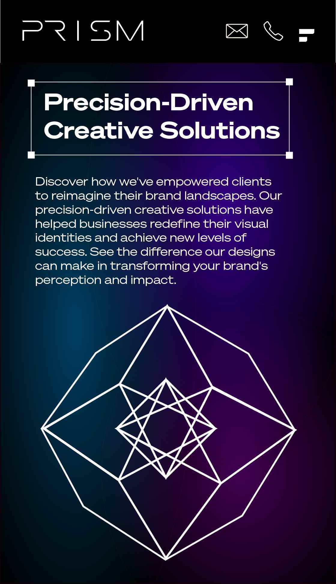
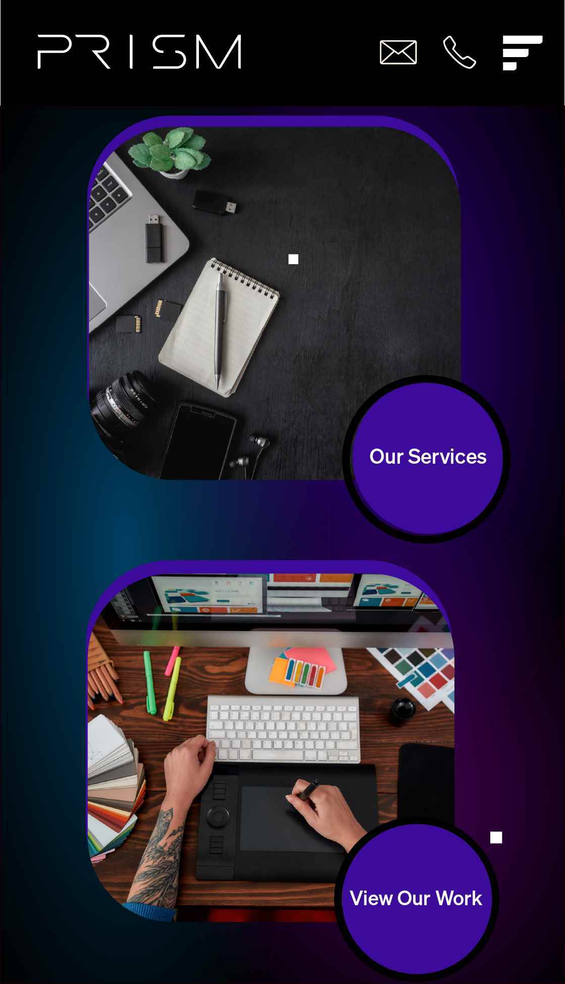
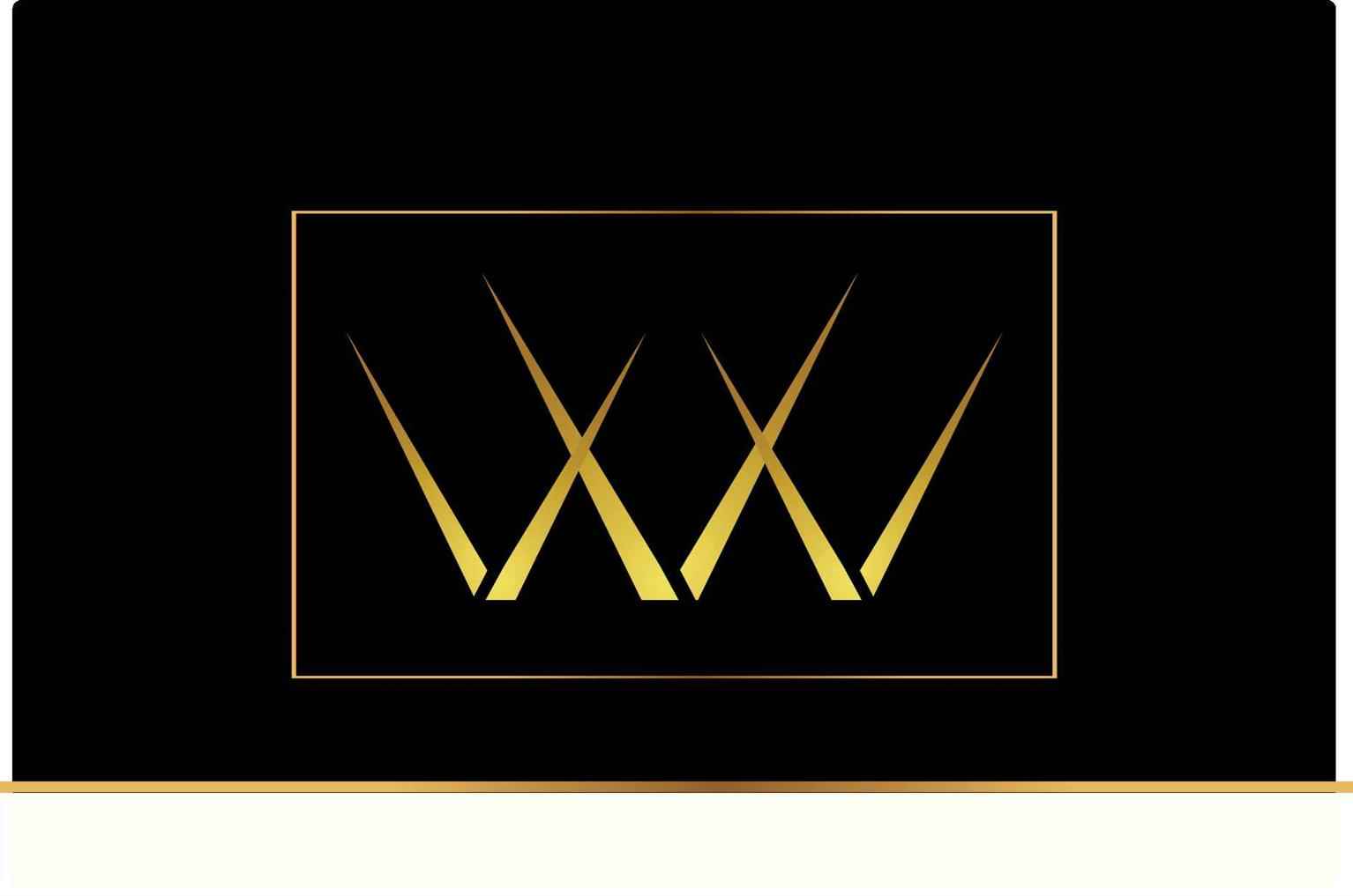
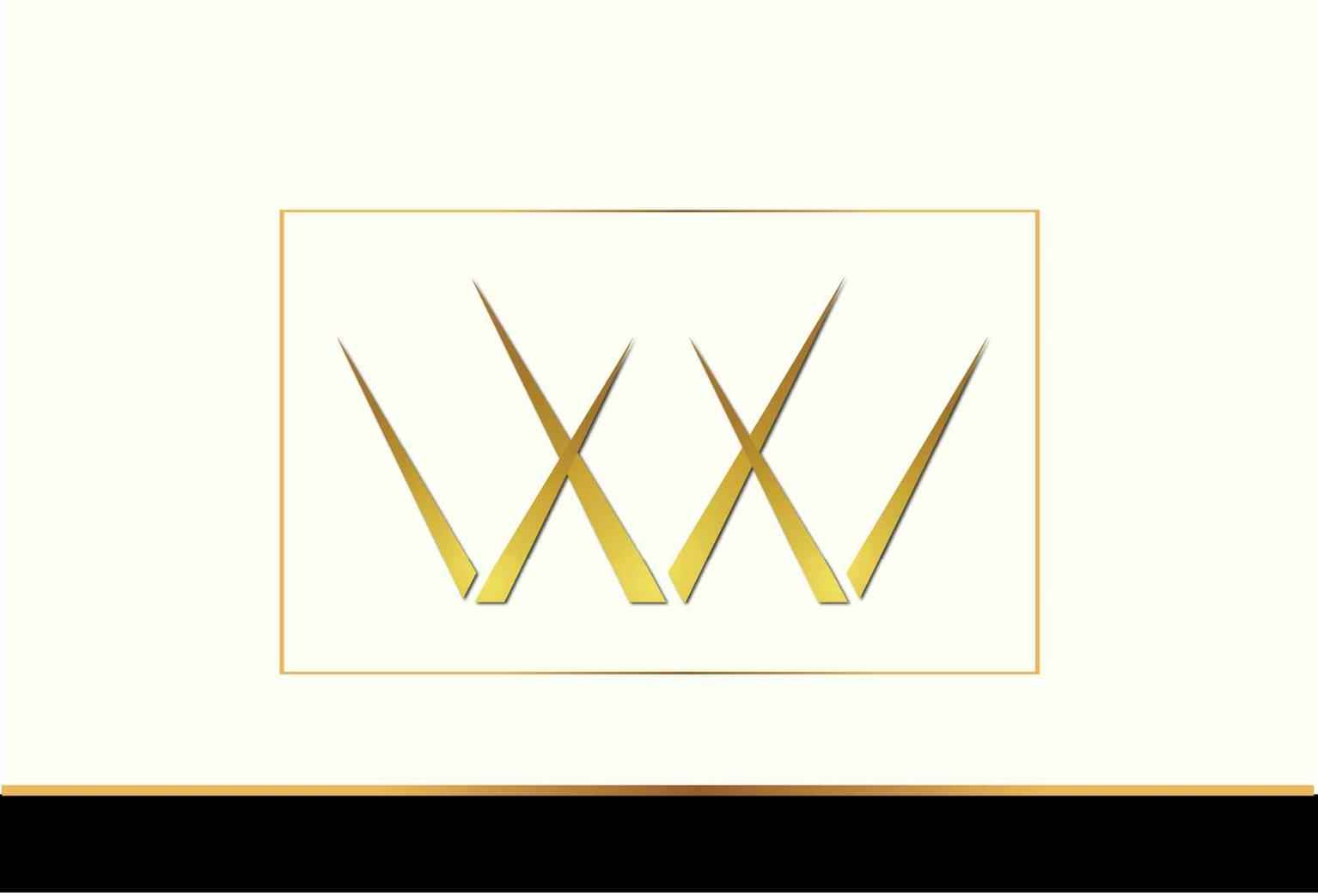
Prism Vancouver
Prism Vancouver is designed with a profound conceptual foundation rooted in the principles of the golden ratio. The triangles, which represent this ratio, are not just geometric shapes but symbols of...
Prism Vancouver is designed with a profound conceptual foundation rooted in the principles of the golden ratio. The triangles, which represent this ratio, are not just geometric shapes but symbols of...
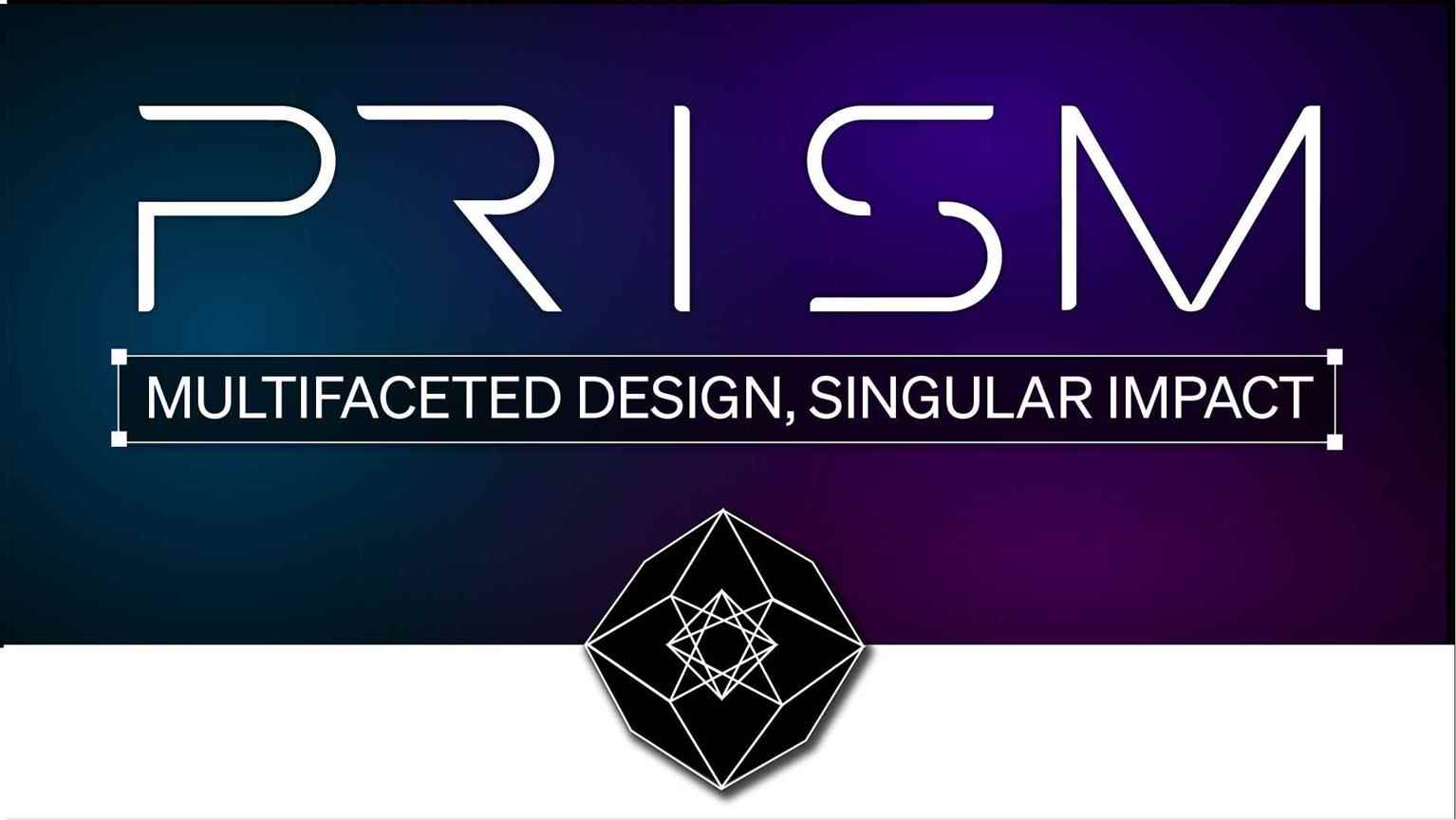
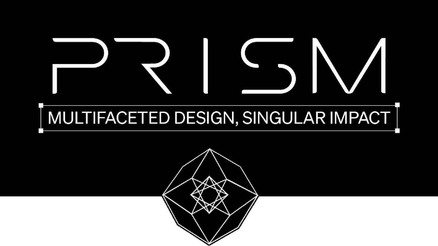
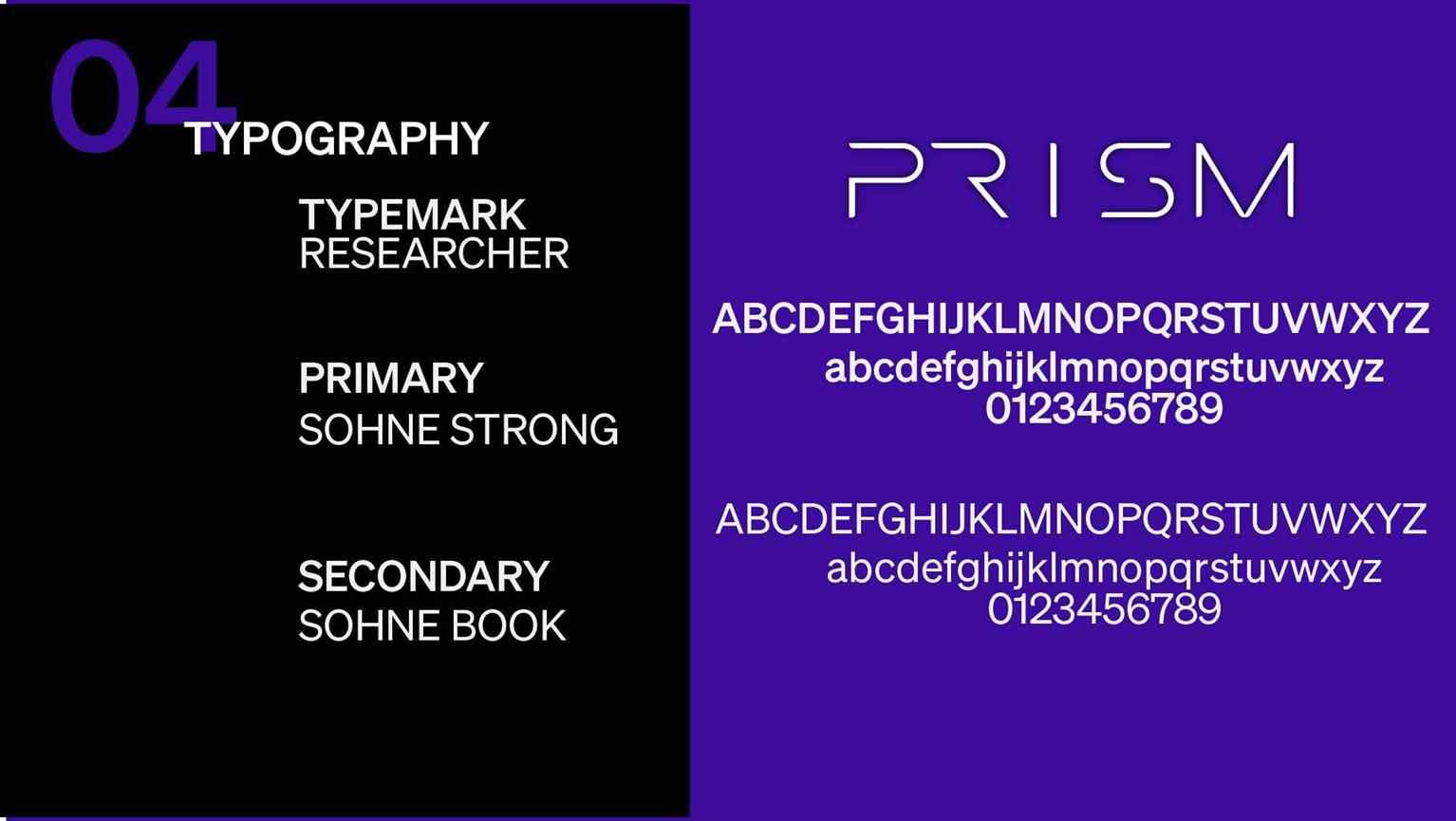
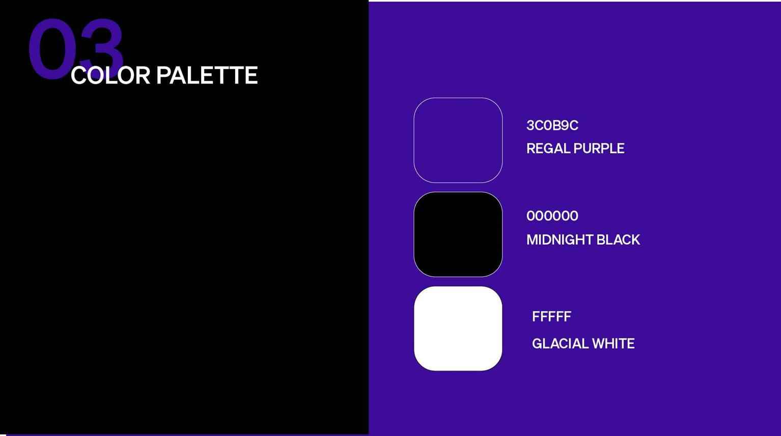
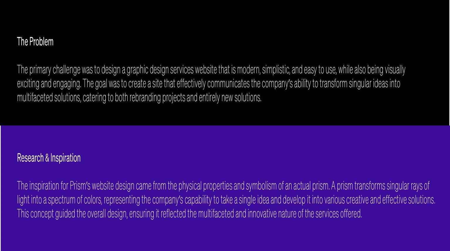
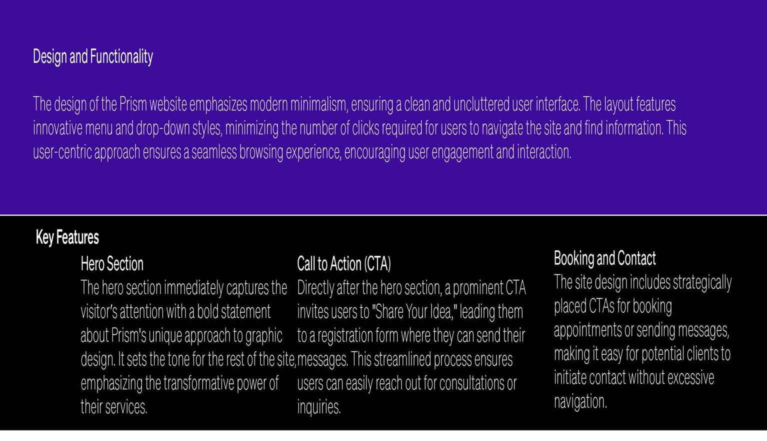
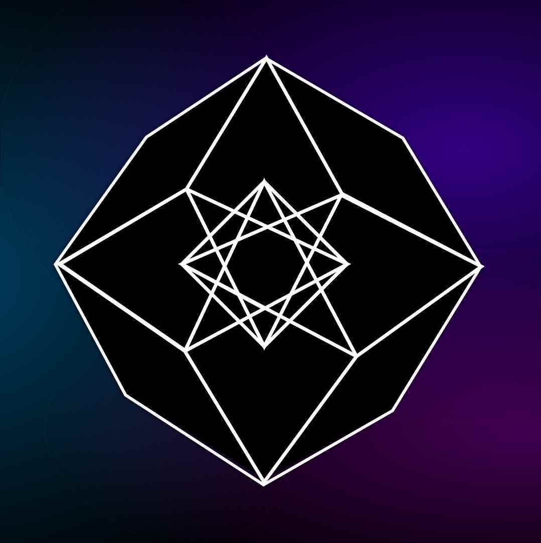
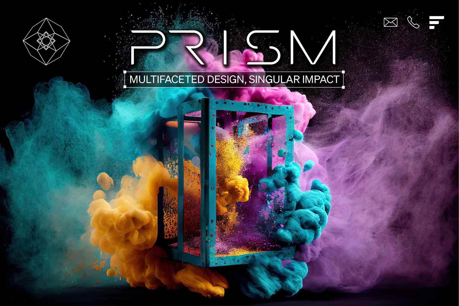
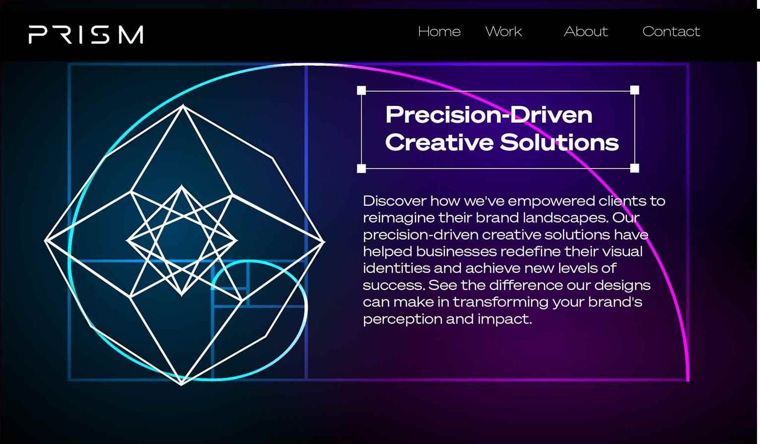
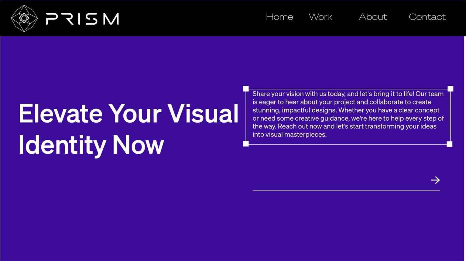
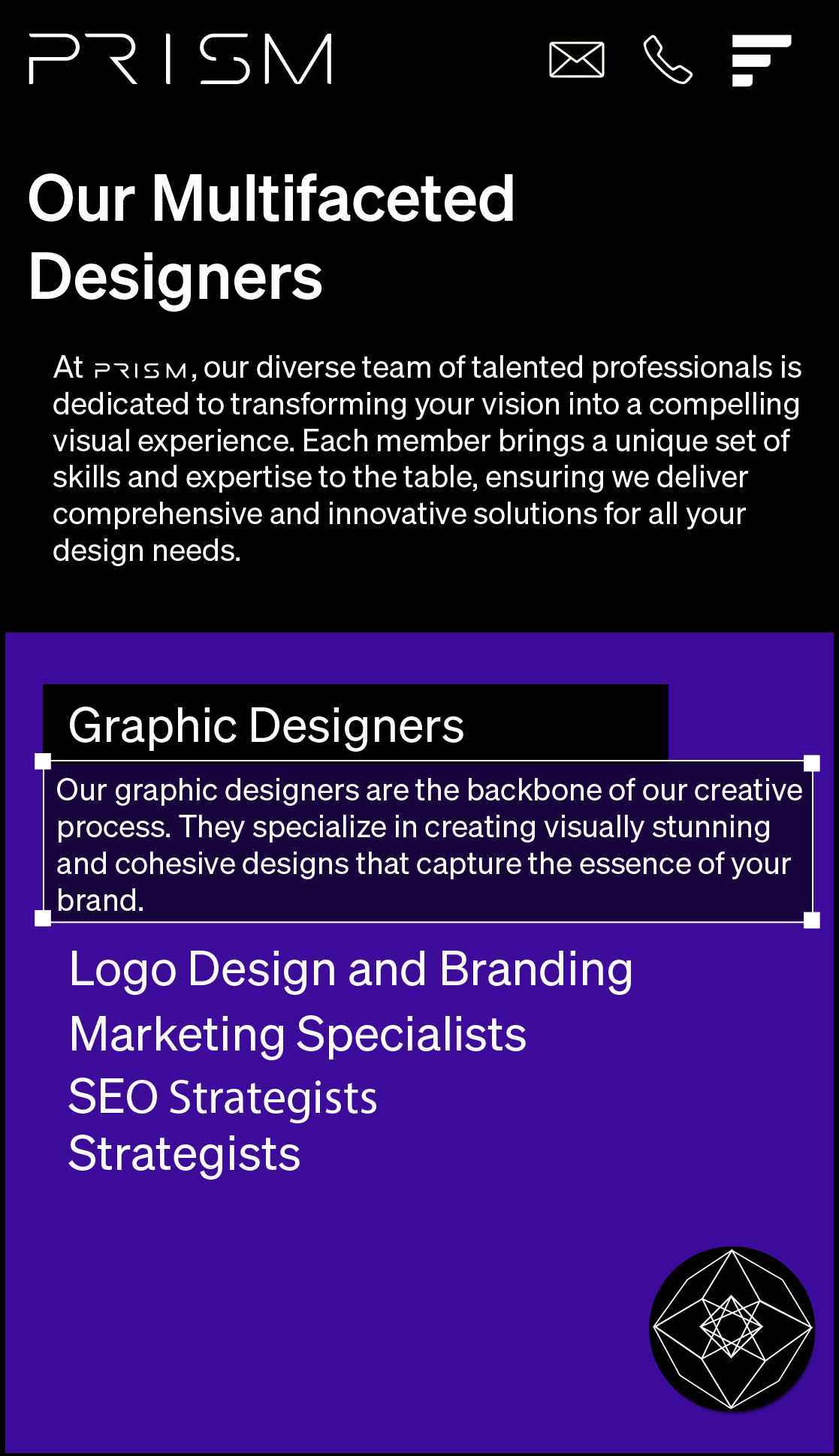
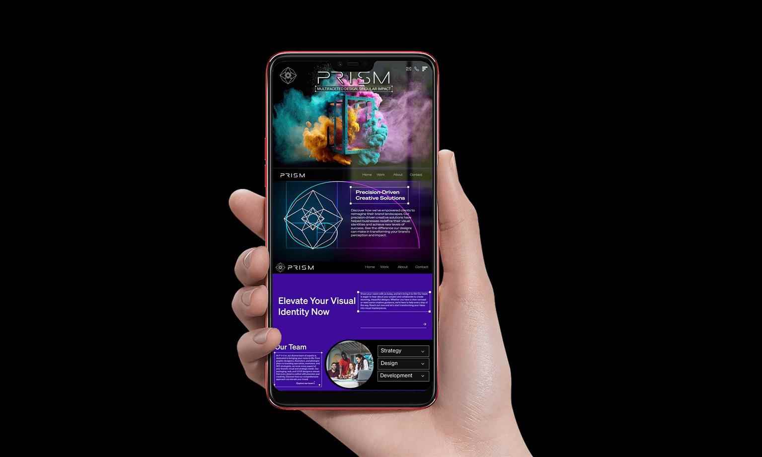
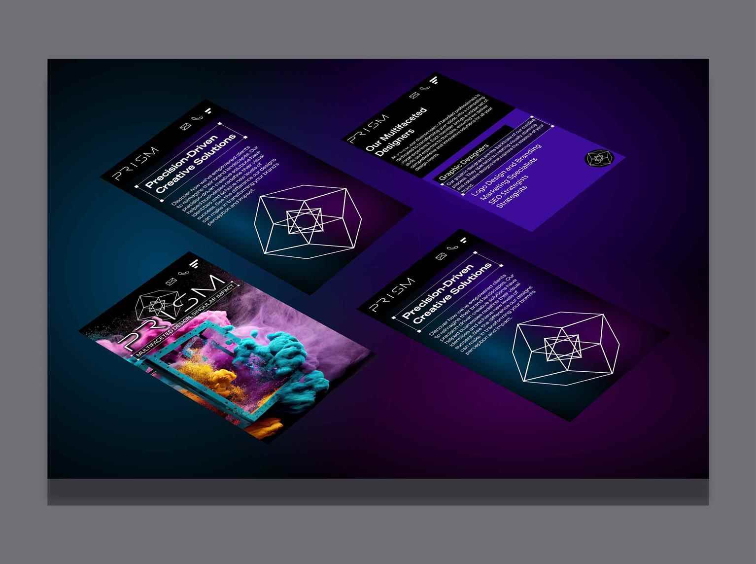
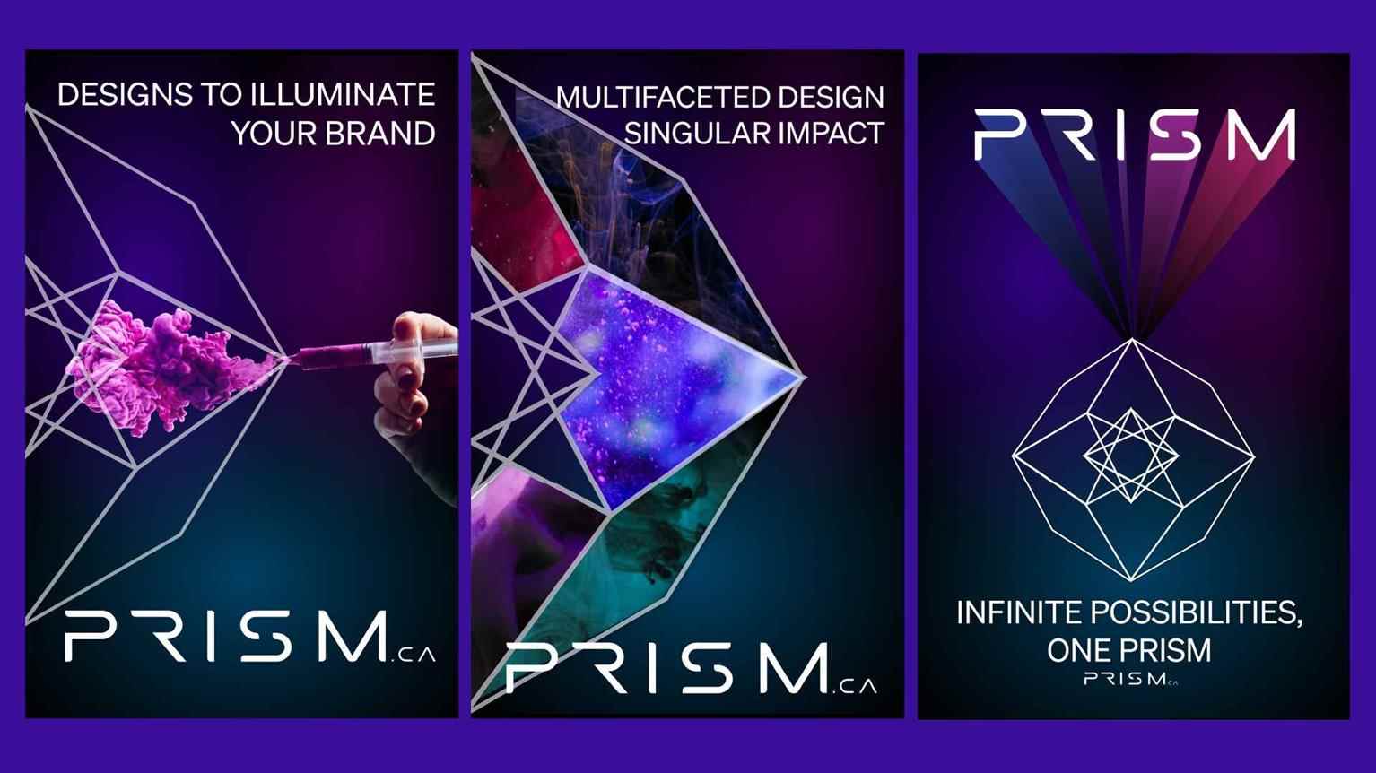
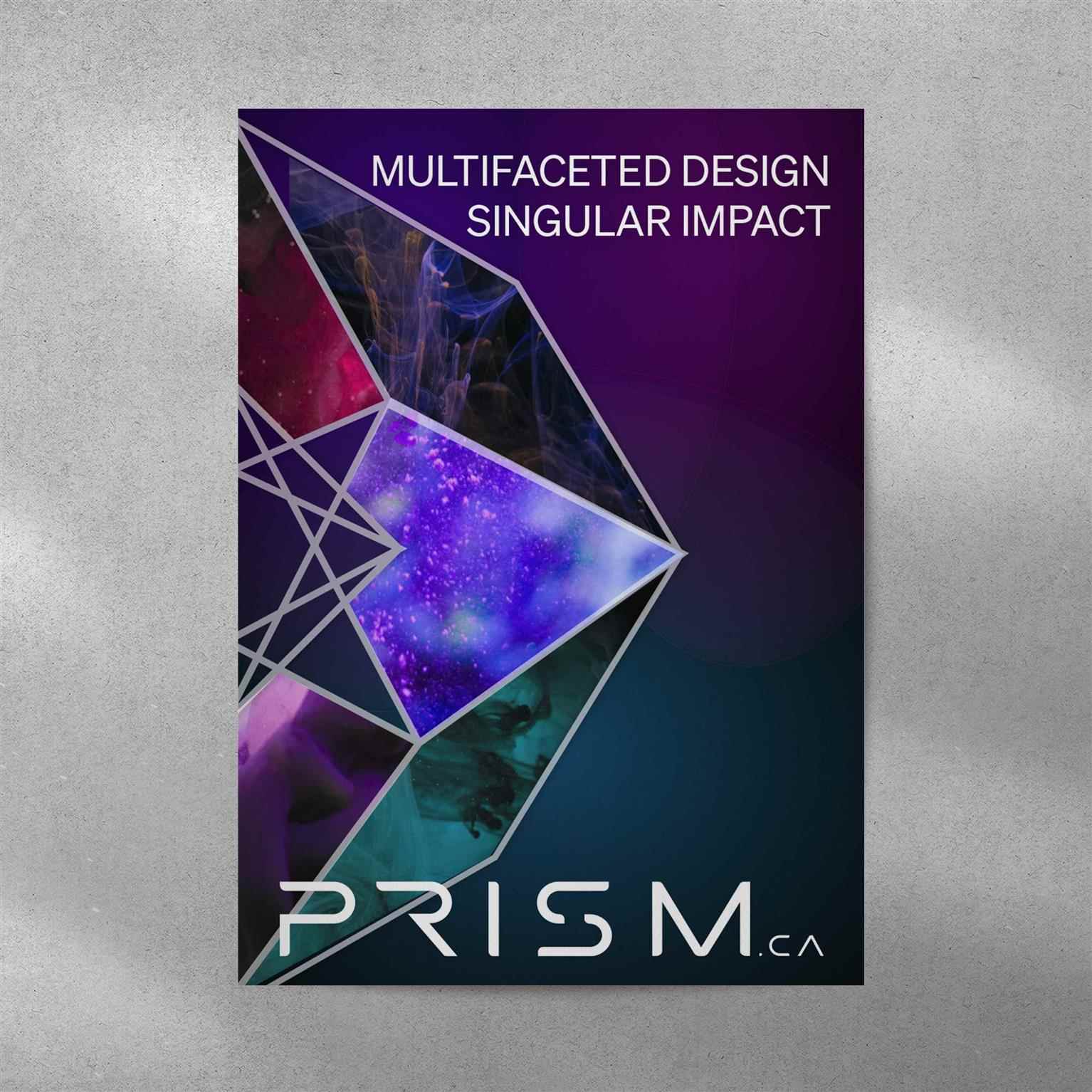
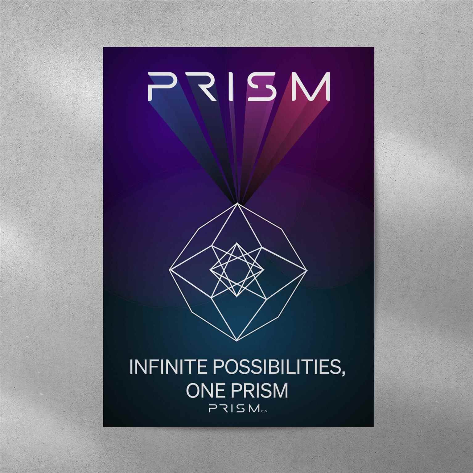
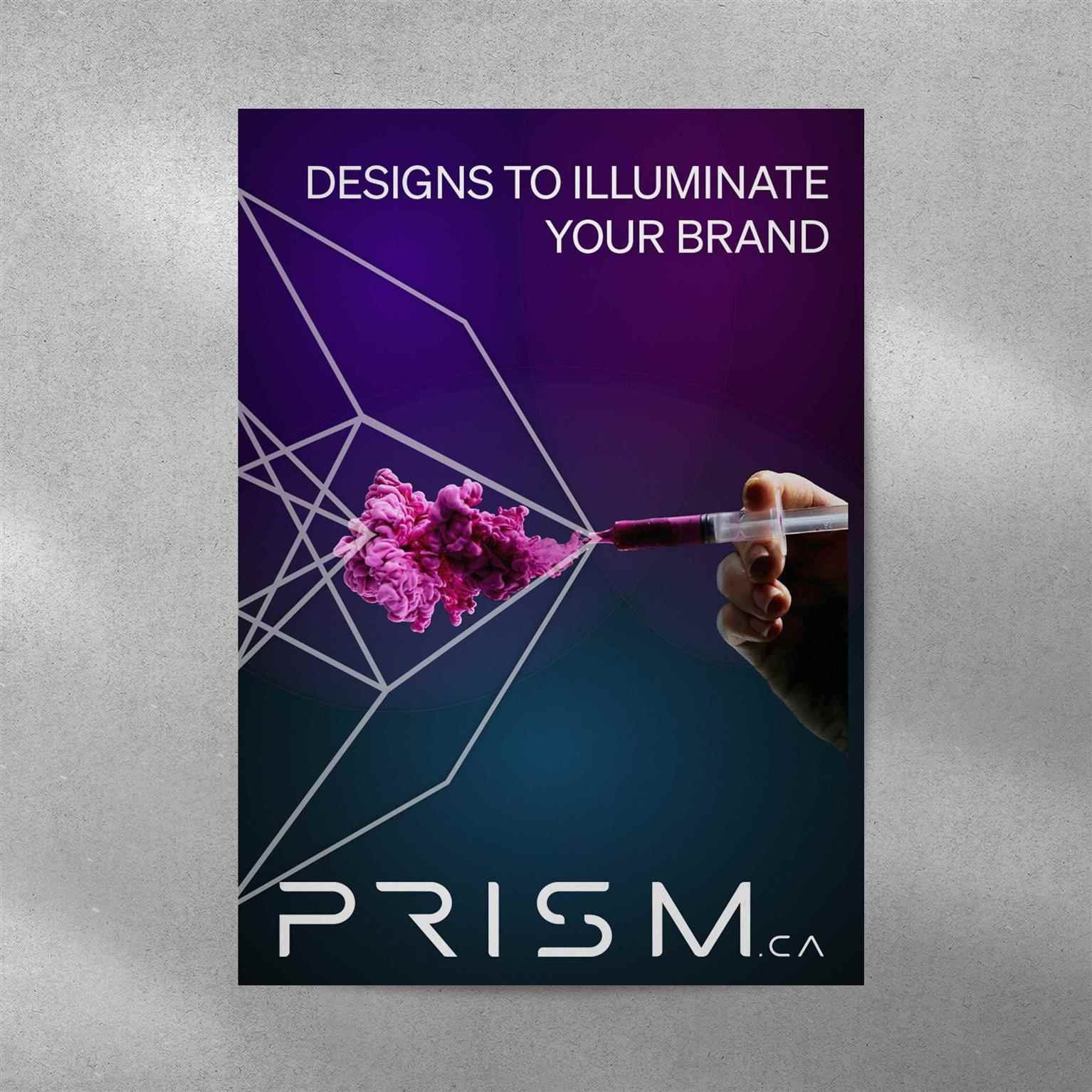
Prism Vancouver is designed with a profound conceptual foundation rooted in the principles of the golden ratio. The triangles, which represent this ratio, are not just geometric shapes but symbols of infinite possibilities and perspectives in graphic design. By incorporating these triangles, we emphasize the idea of multifaceted perspectives, much like the refraction and dispersion of light through a prism. This creates a visual metaphor for the endless creative solutions and viewpoints we offer. Logo Design Our logo embodies the concept of fractal design, reflecting the core values of our brand—complexity and simplicity working in harmony. The colors chosen for the logo and website are: Black (000000): Signifying elegance, sophistication, and authority. Regal Purple (3C0B9C): Representing creativity, luxury, and ambition. White (FFFFFF): Symbolizing purity, simplicity, and clarity. Typography The typefaces used are Researcher: For a scholarly and authoritative feel. Sohne (Book and Bold): Offering a balance of modernity and readability. These fonts contribute to a simple yet elegant look, enhancing the overall aesthetic of the site. Design and Functionality The Prism website is crafted with a modern, minimalistic design approach. This ensures that the site is visually appealing while remaining functional and user-friendly. Key features include Innovative Menu and Dropdown Styles These are designed to be intuitive, reducing the number of clicks needed to navigate the site. This not only enhances the user experience but also makes it easier to funnel traffic towards key actions. Streamlined User Journey The design minimizes distractions, focusing the user's attention on important actions such as booking an appointment or sending a message. User Engagement Hero Section The second section after the hero is a call-to-action prompting users to share their ideas. This interactive element leads to a registration form, encouraging user engagement and facilitating communication. Summary The Prism website stands as a testament to the seamless blend of aesthetic beauty and functional efficiency. By incorporating the golden ratio, innovative design elements, and a strategic user journey, we ensure that the site not only captivates visitors visually but also guides them effortlessly towards meaningful interactions.
Share:
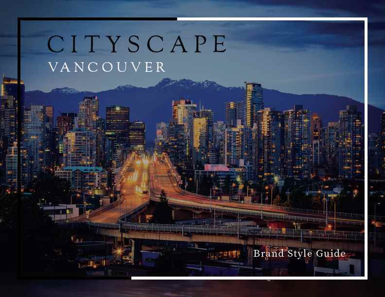
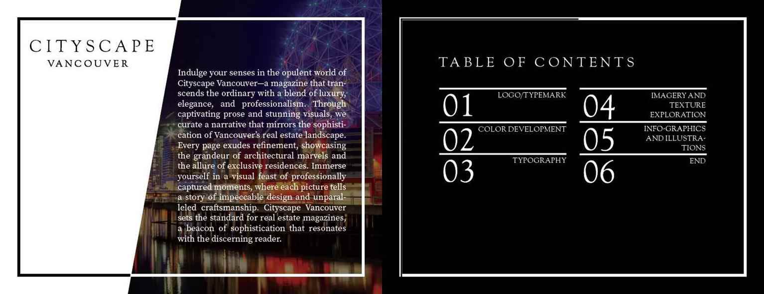
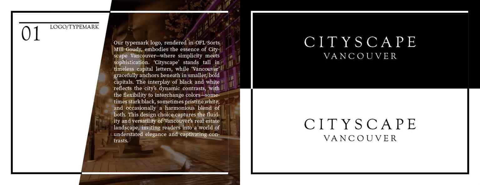
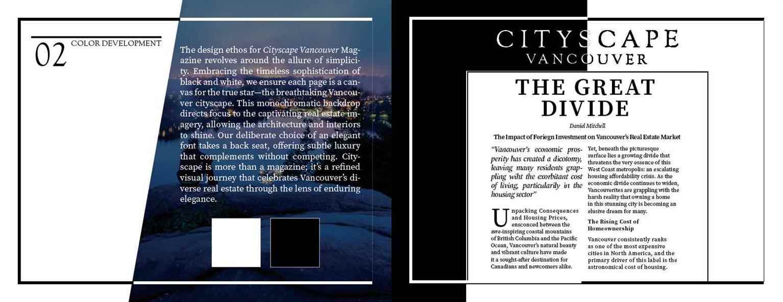
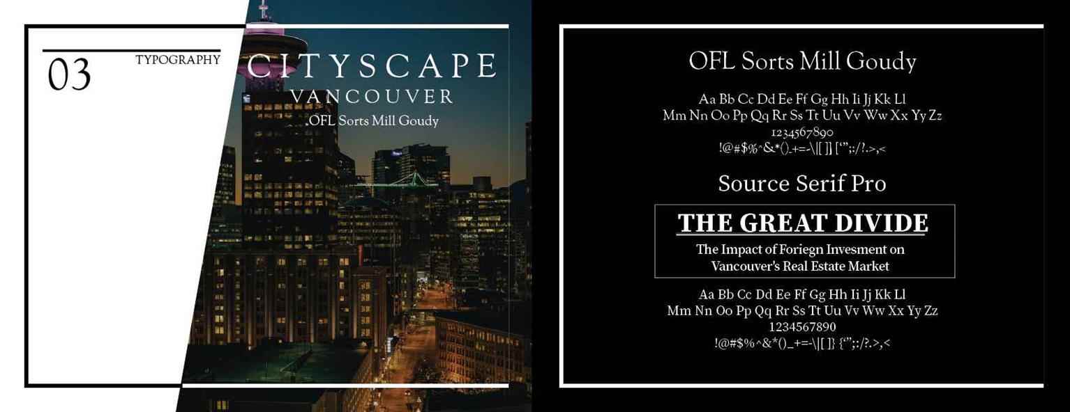
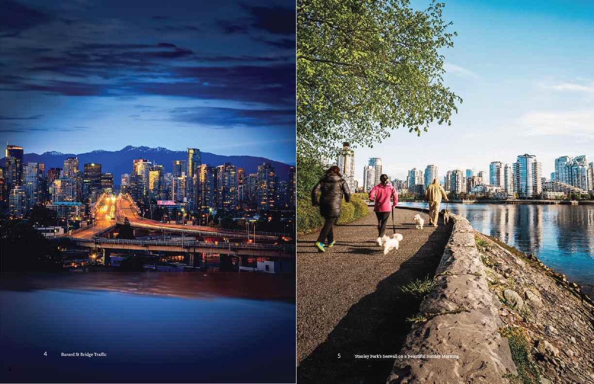
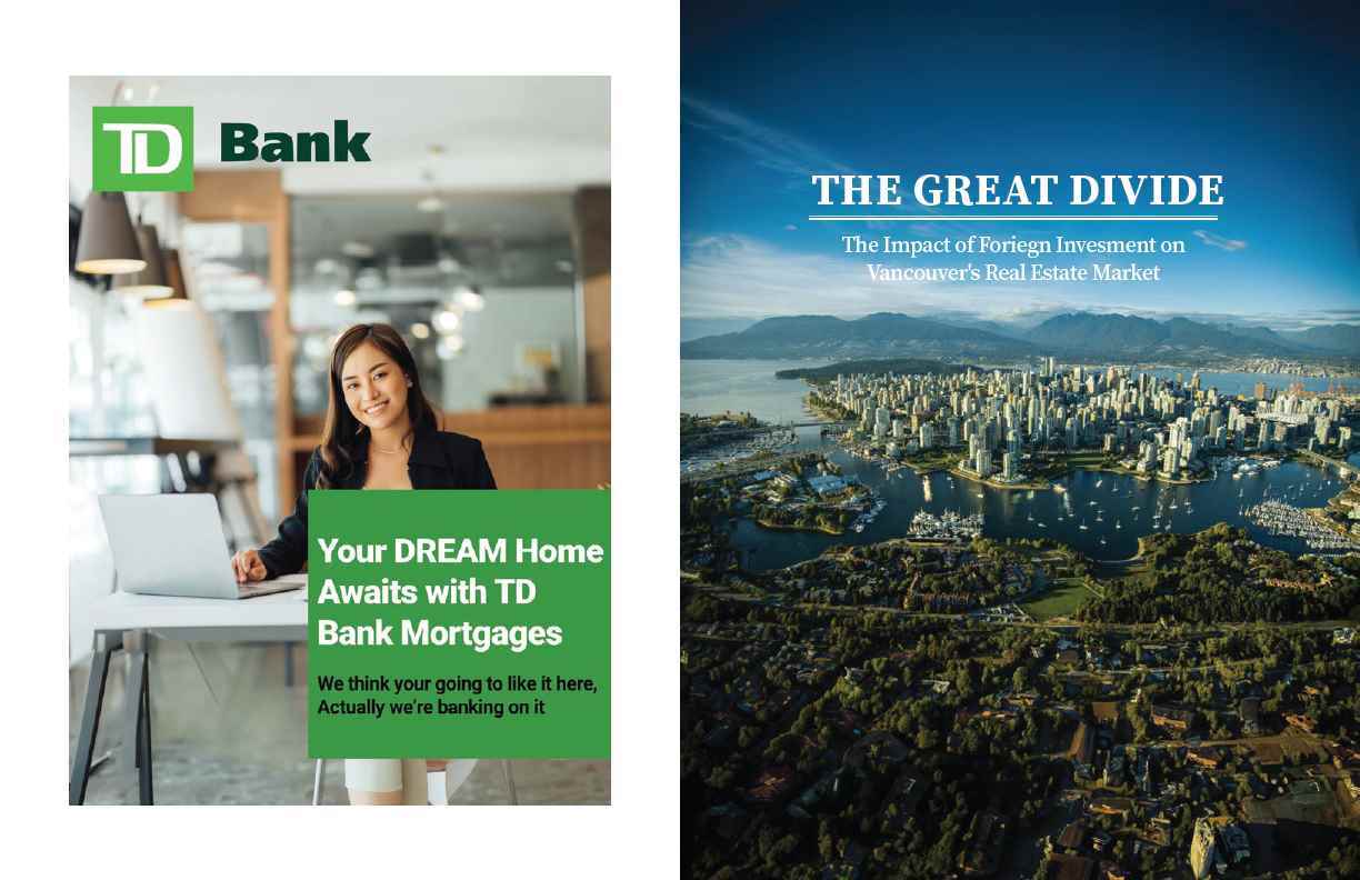
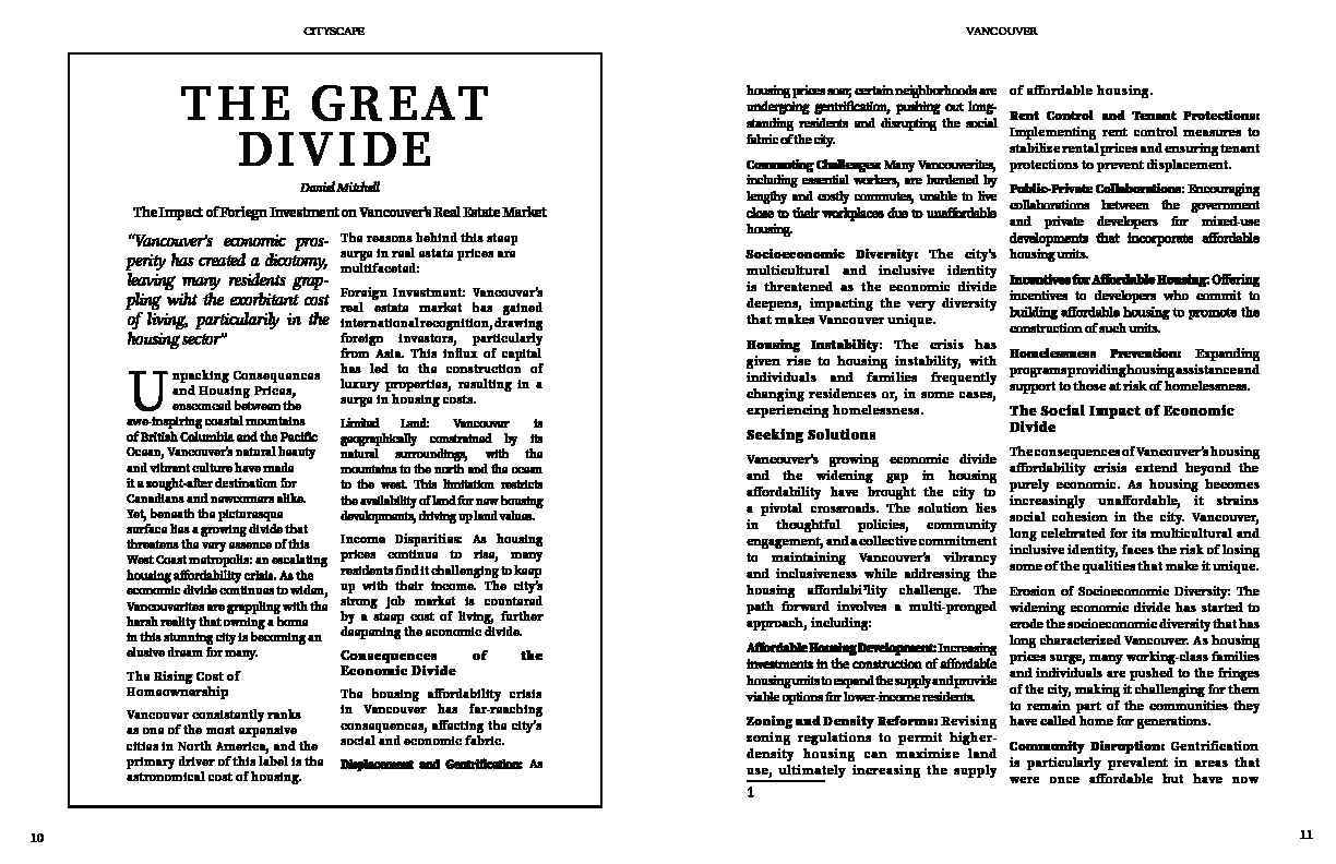
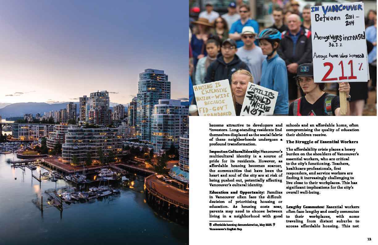
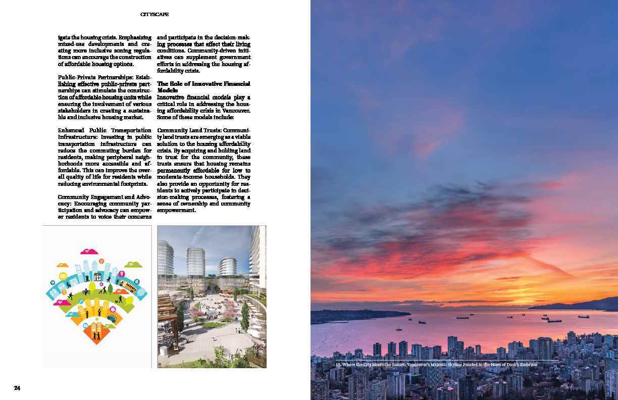
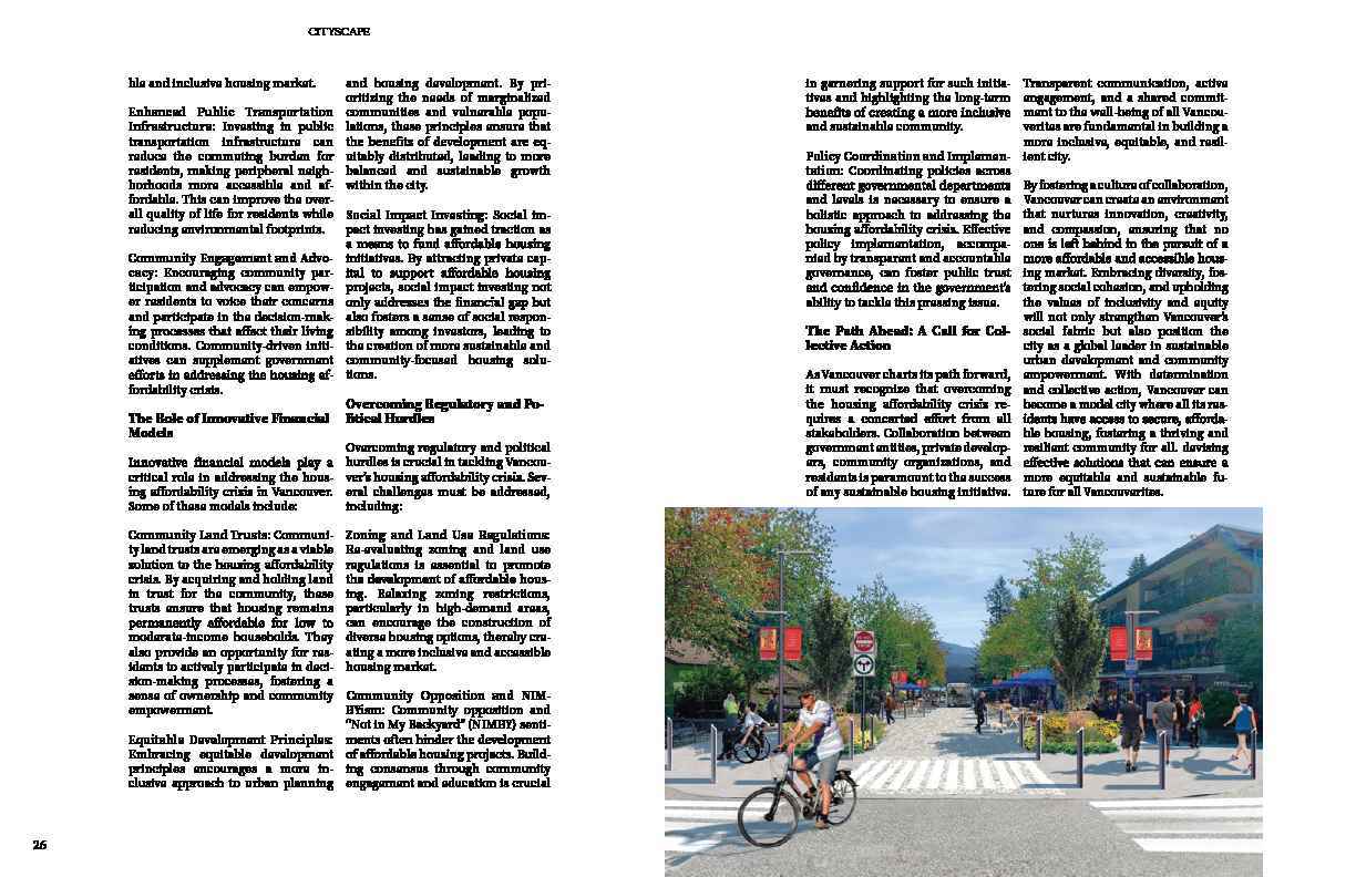
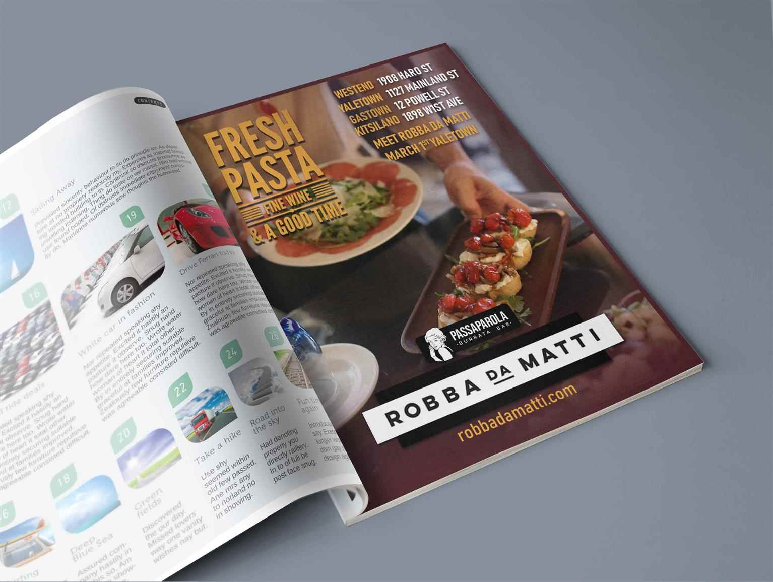
CityScape Vancouver
Vancouver-Based Real Estate Publication. Indulge your senses in the opulent world of Cityscape Vancouver-a magazine publication that transcends the ordinary with a blend of luxury, elegance, and prof...
Vancouver-Based Real Estate Publication. Indulge your senses in the opulent world of Cityscape Vancouver-a magazine publication that transcends the ordinary with a blend of luxury, elegance, and prof...
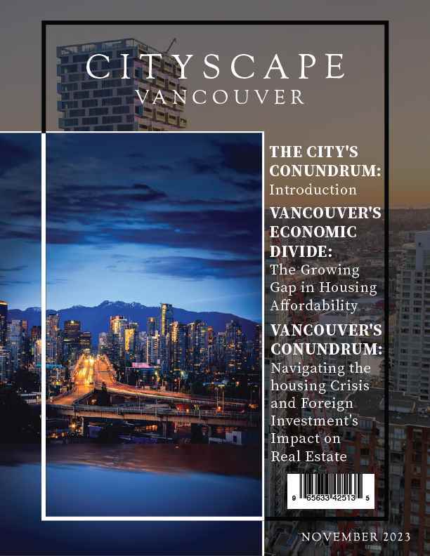
Vancouver-Based Real Estate Publication. Indulge your senses in the opulent world of Cityscape Vancouver-a magazine publication that transcends the ordinary with a blend of luxury, elegance, and professionalism. Through captivating prose and stunning visuals, we curate a narrative that’s both entertaining and sophisticated, mirroring Vancouver’s real estate landscape and its residents. Clear, direct insights to guide you in making financial choices in Vancouver's ever-competitive market. Every page exudes refinement, showcasing the grandeur of architectural marvels and the allure of exclusive residences. Immerse yourself in a visual feast of professionally captured moments, where each picture tells a story of impeccable design an unparalleled craftsmanship. CityScape Vancouver sets the standard for real estate publications, not only in its city, but to the world. A beacon of sophistication that resonates with its discerning readers worldwide.
Share:
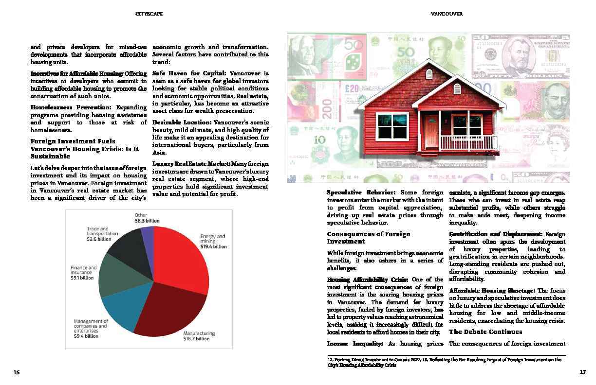
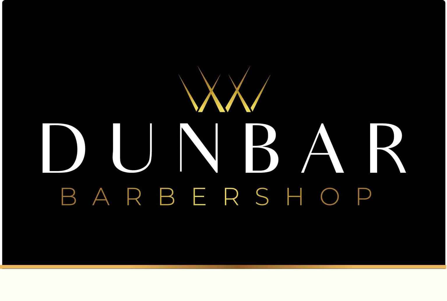
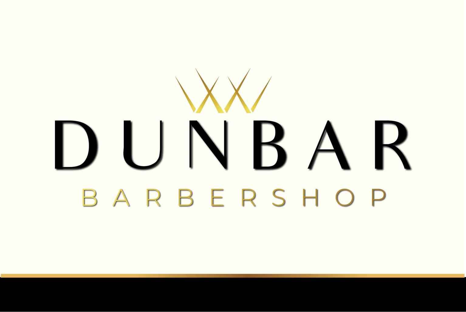
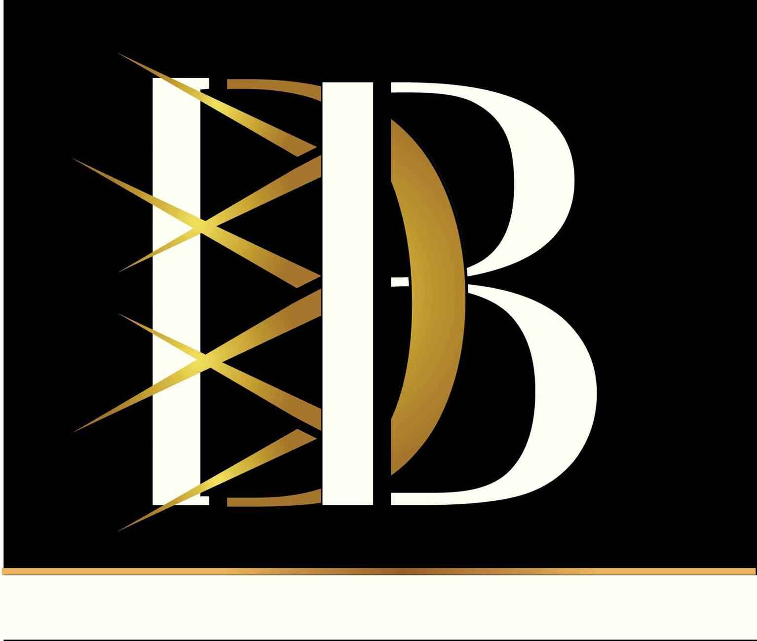
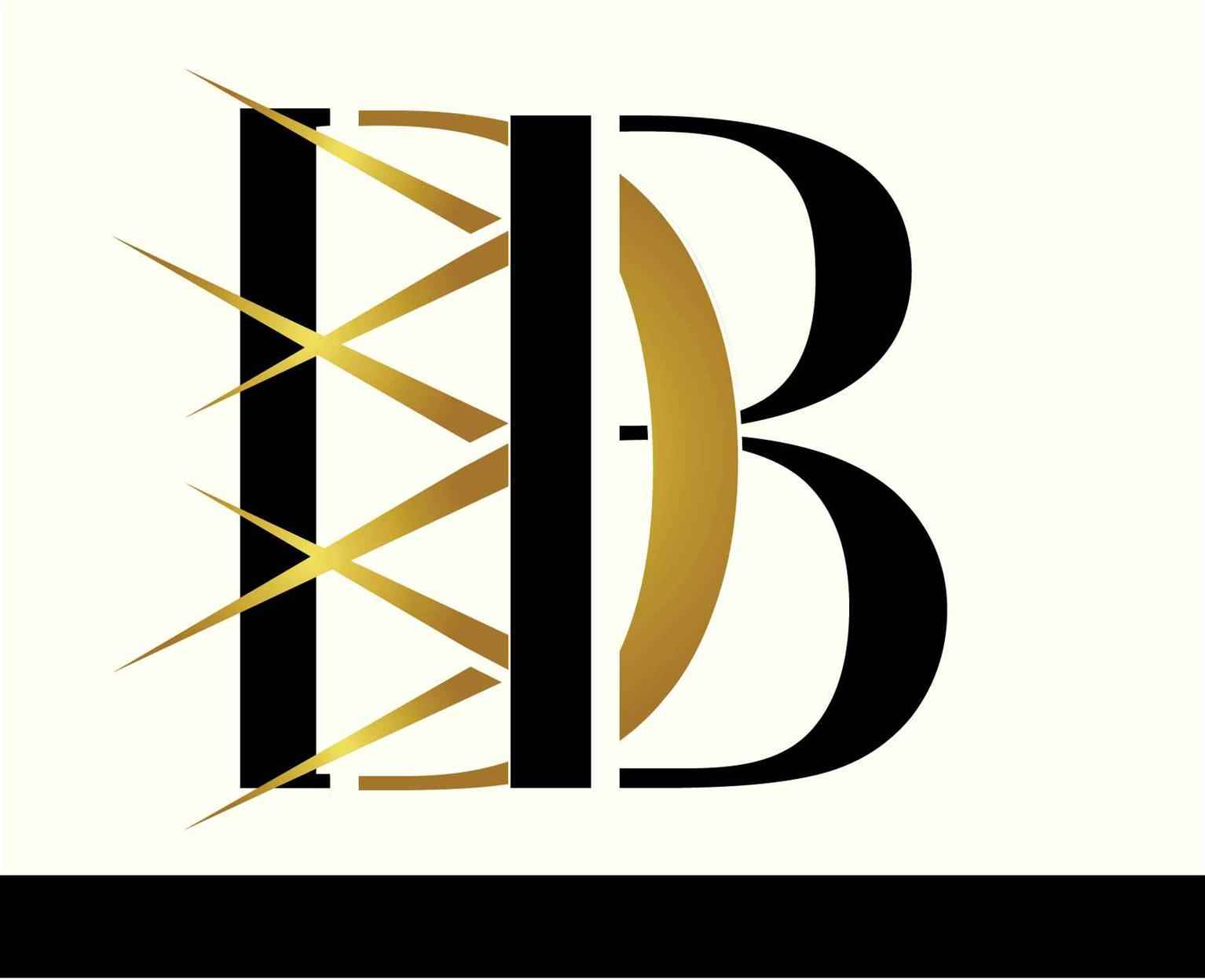
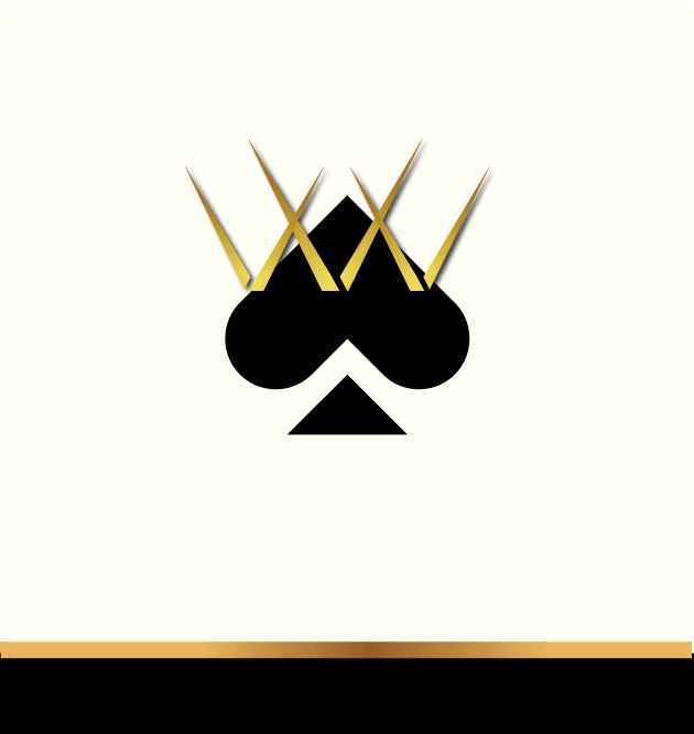
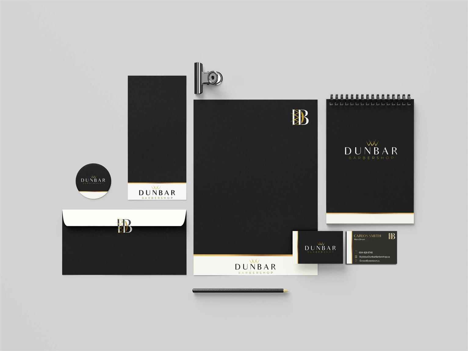
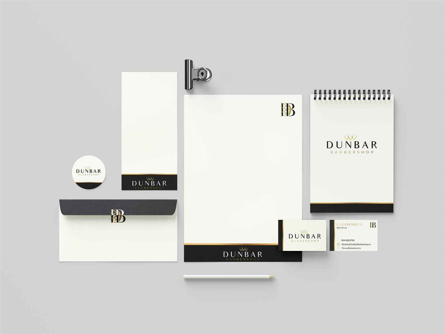
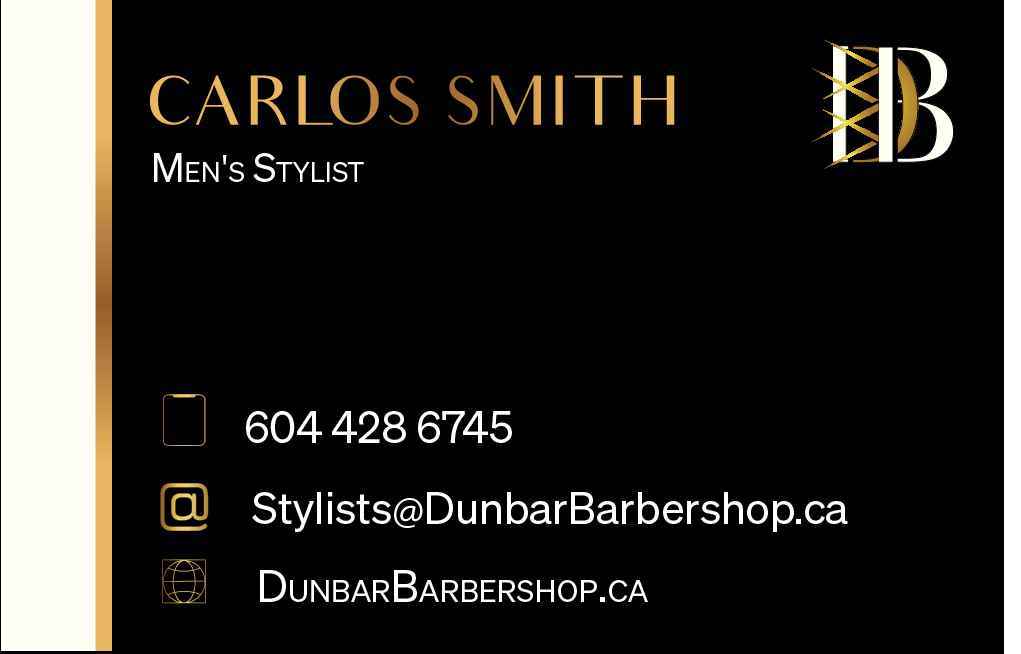
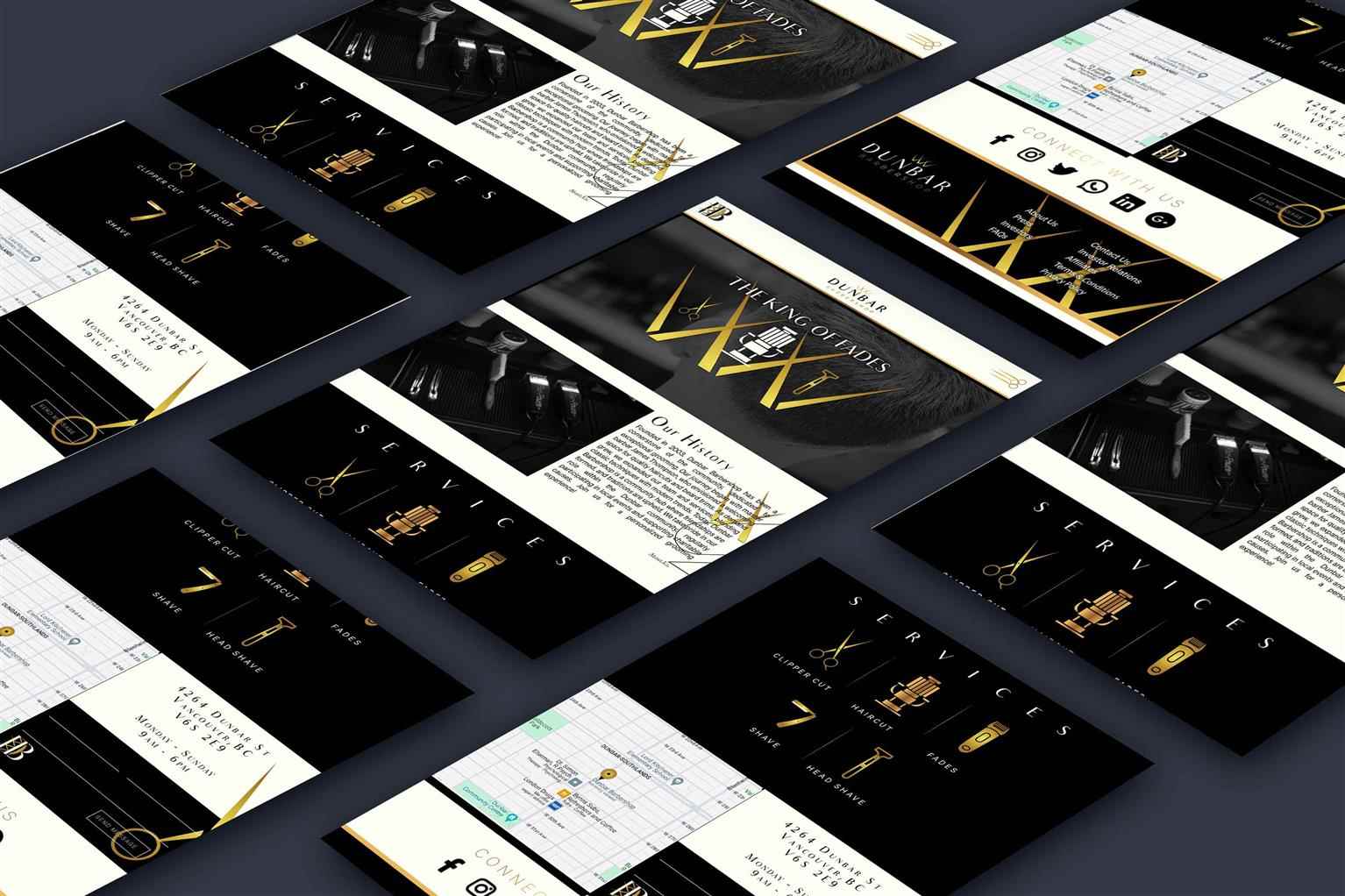
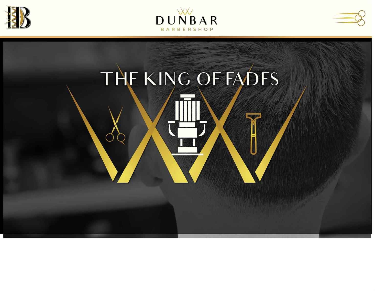
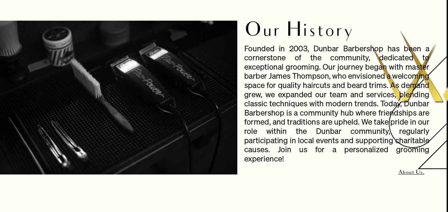
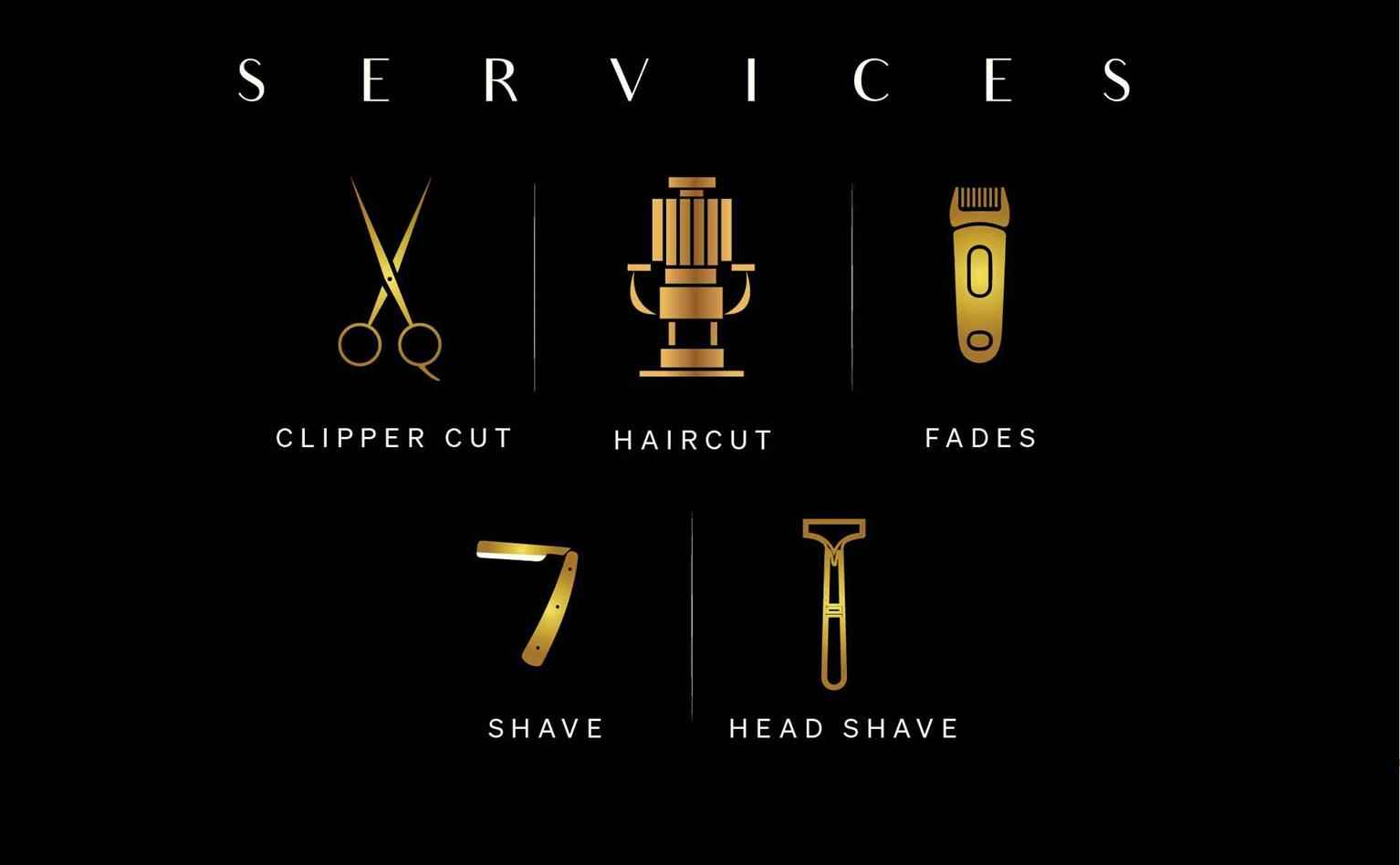
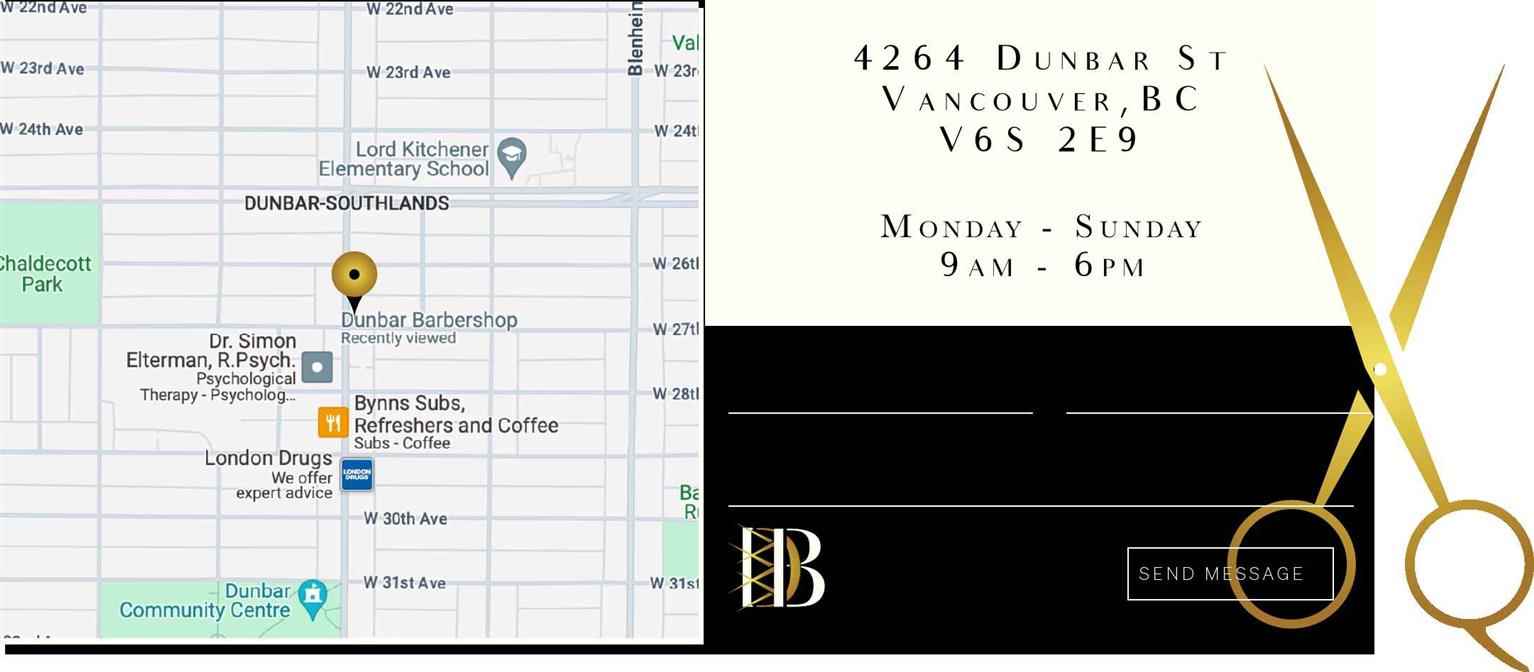
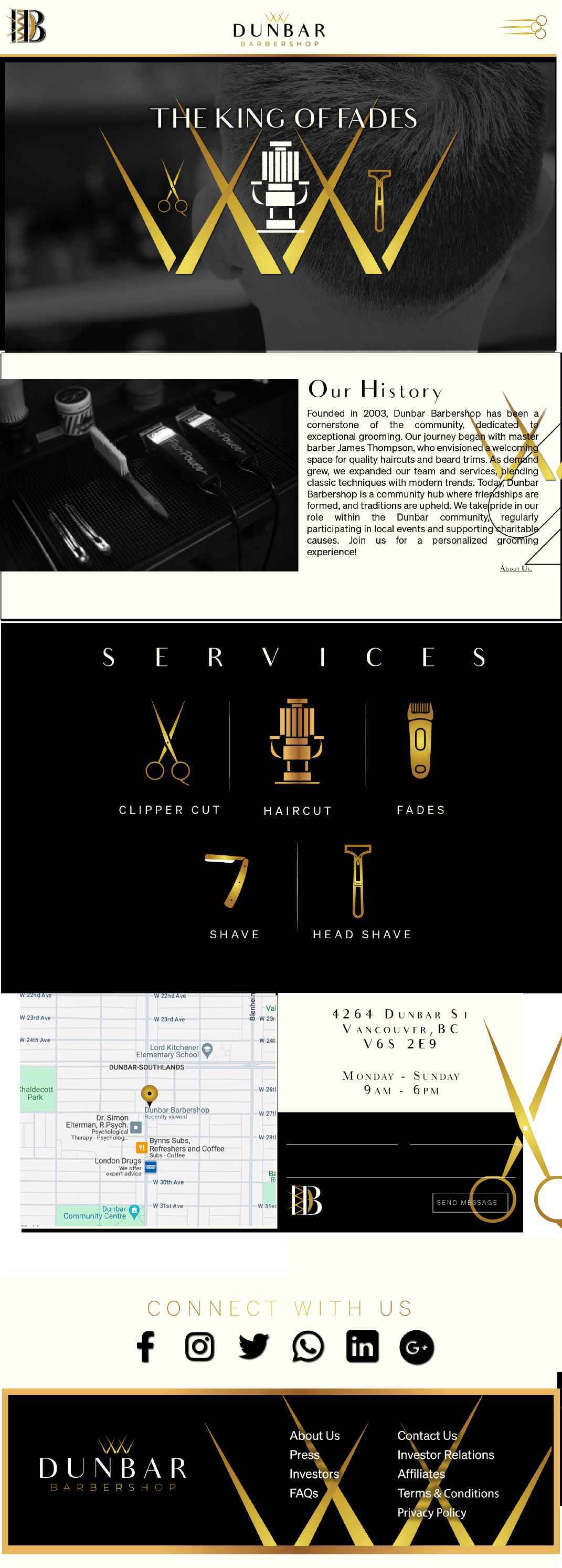
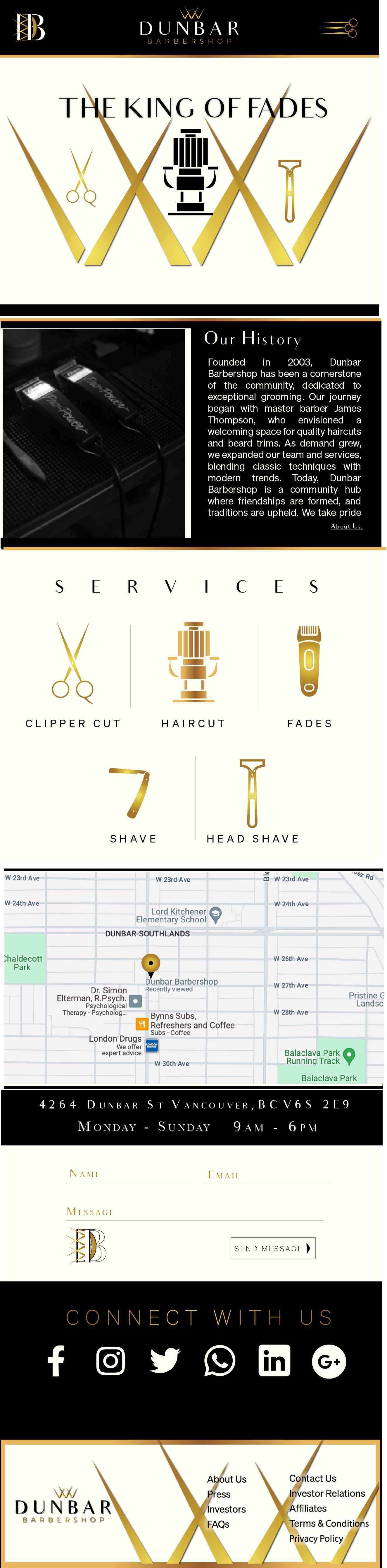
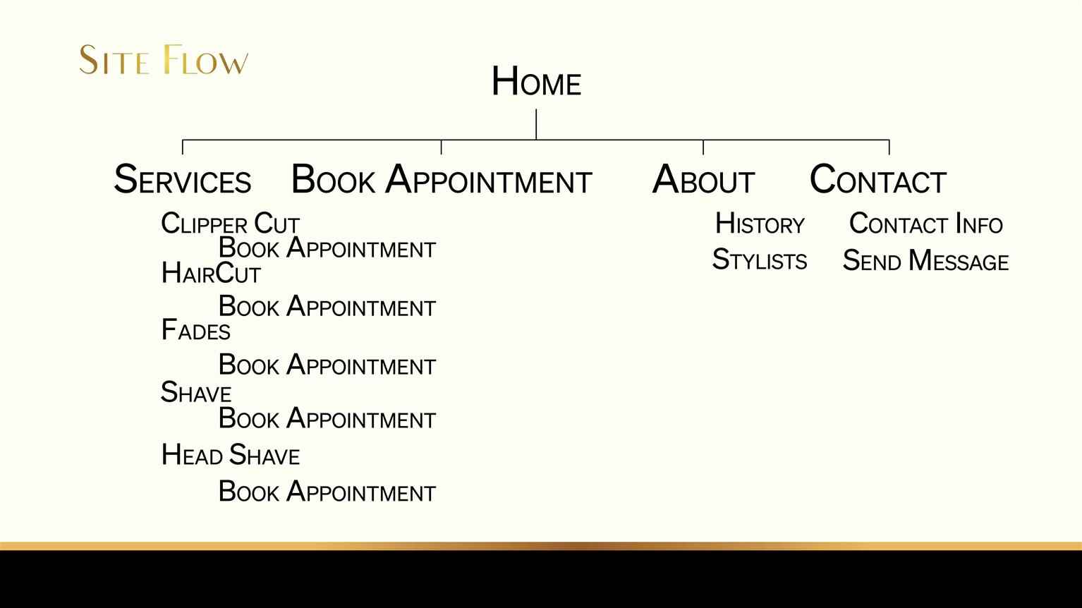
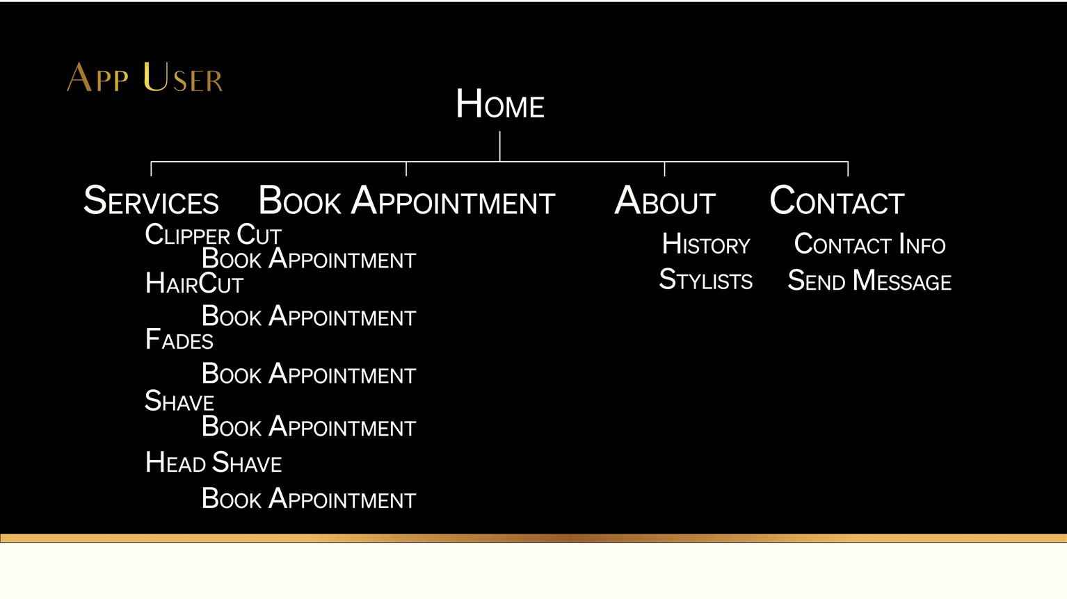
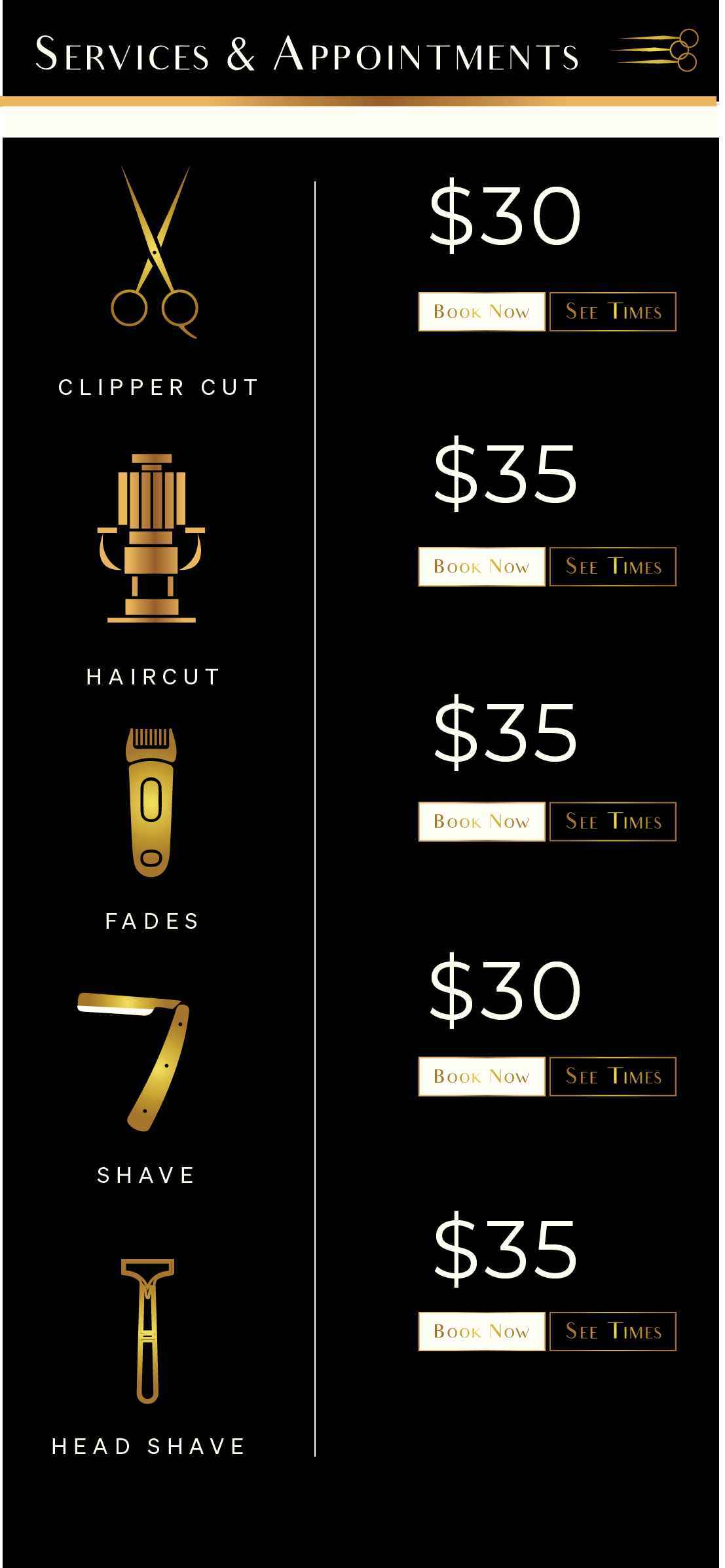
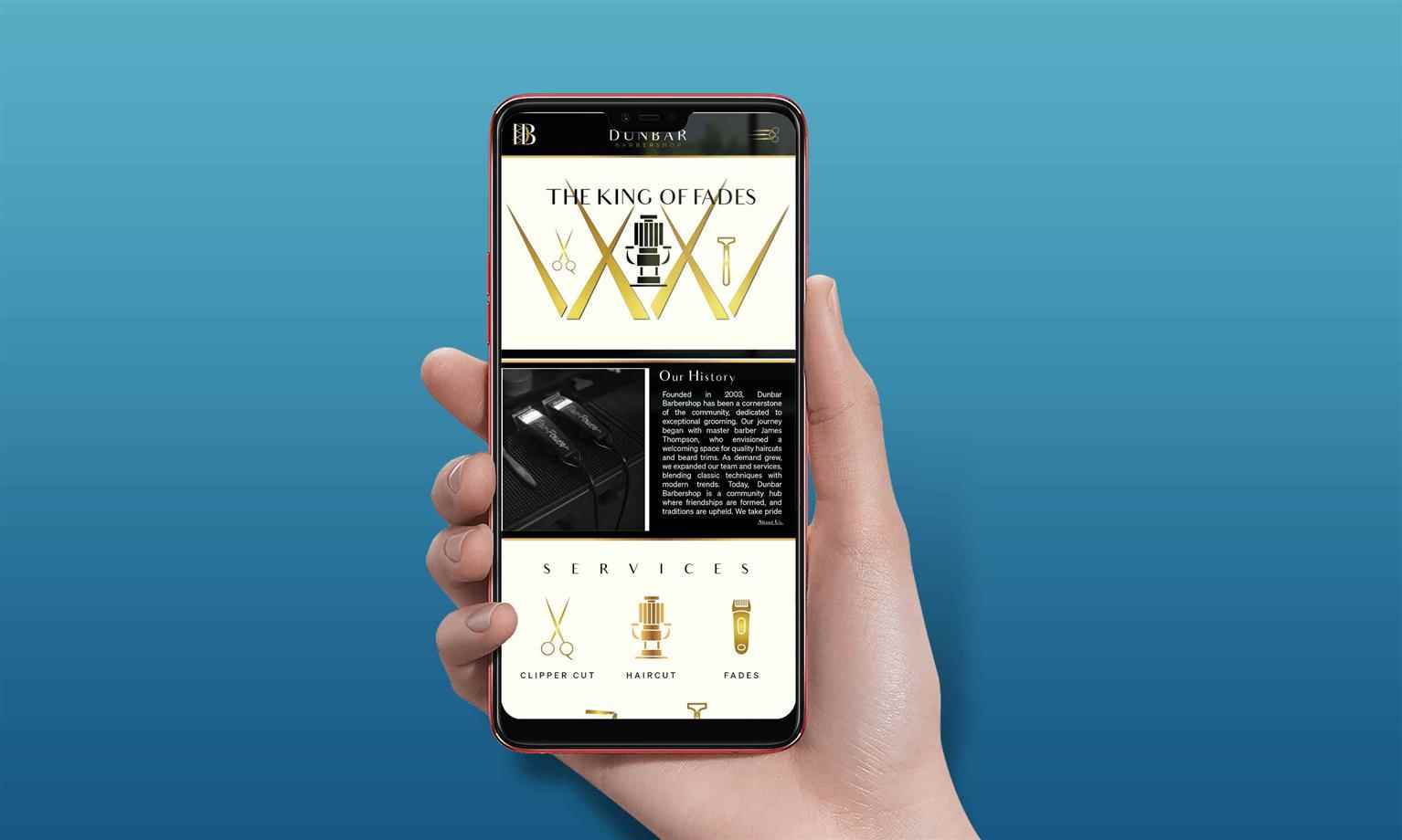
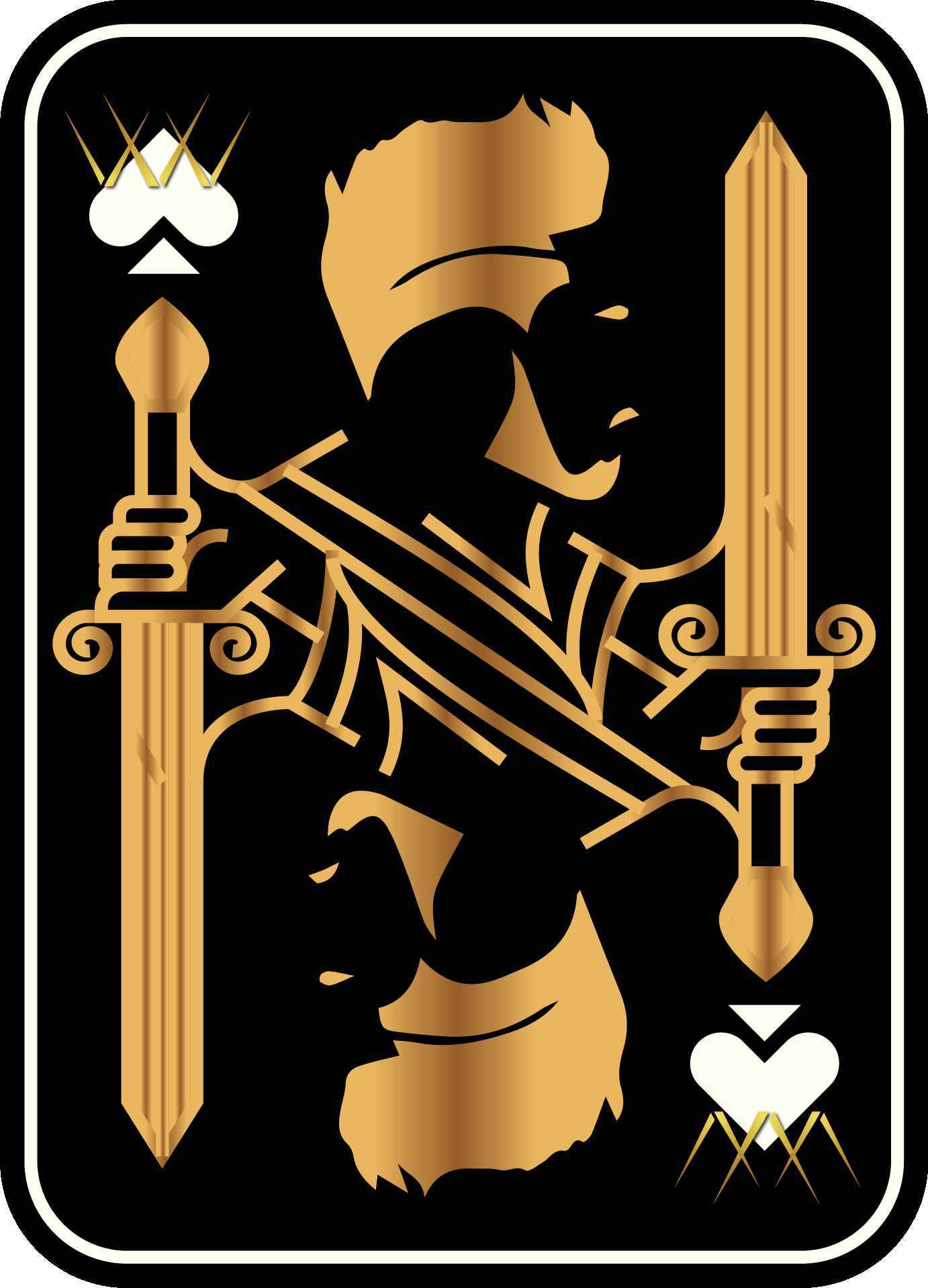
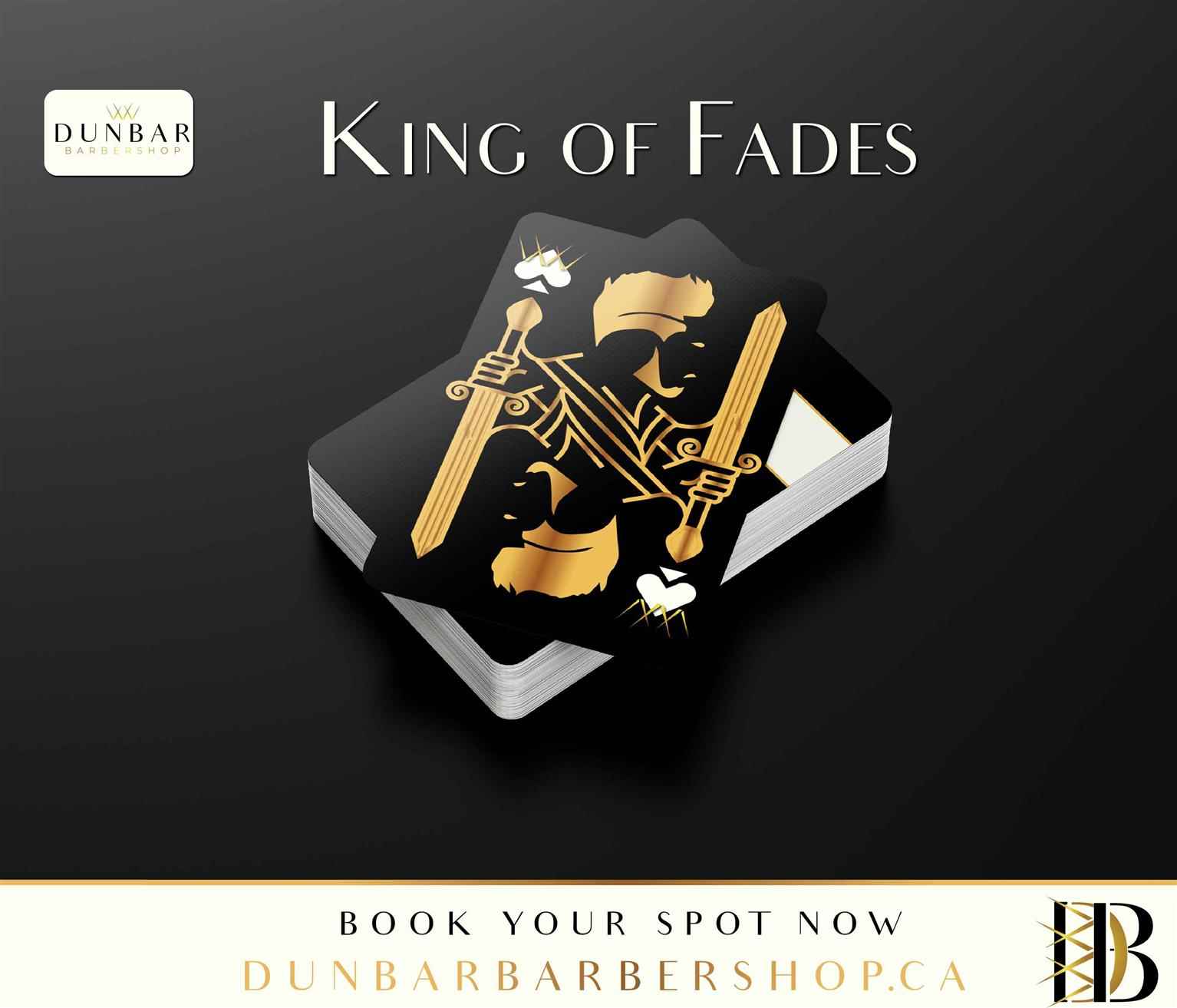
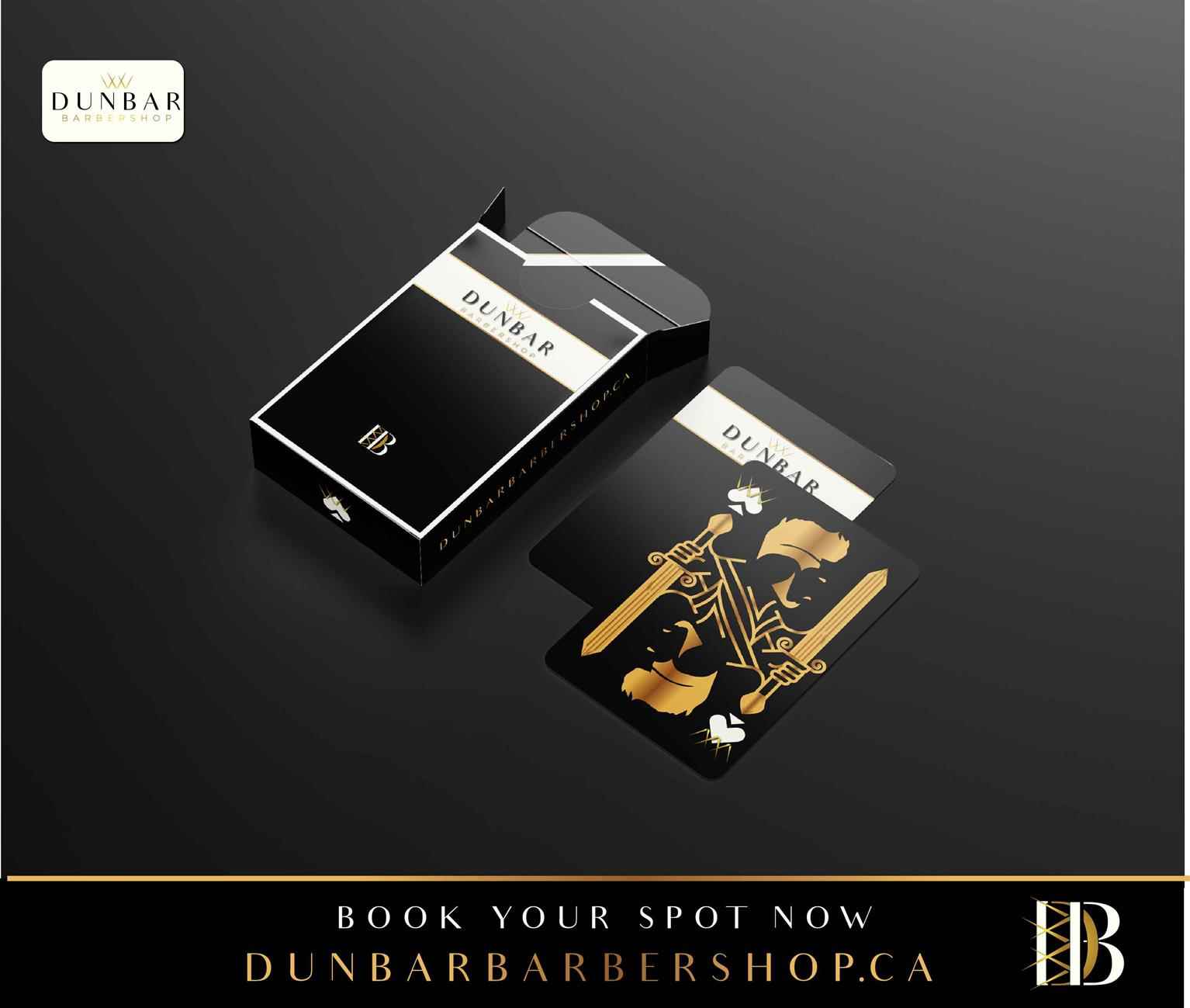
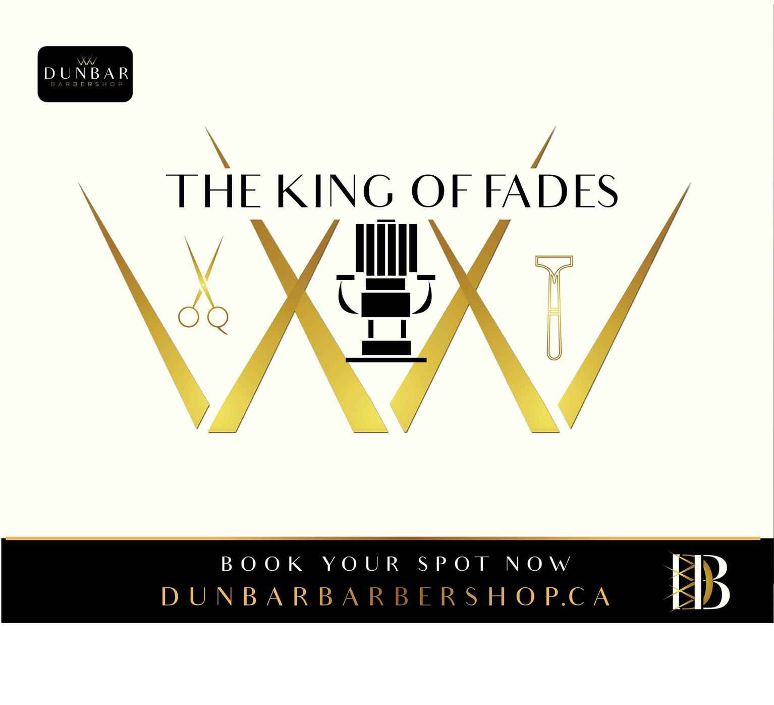
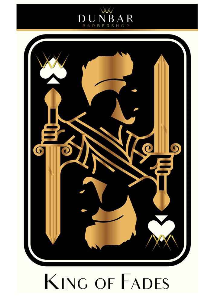
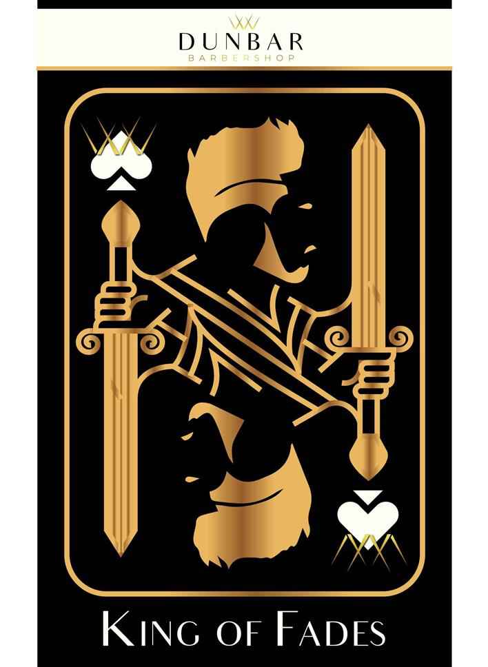
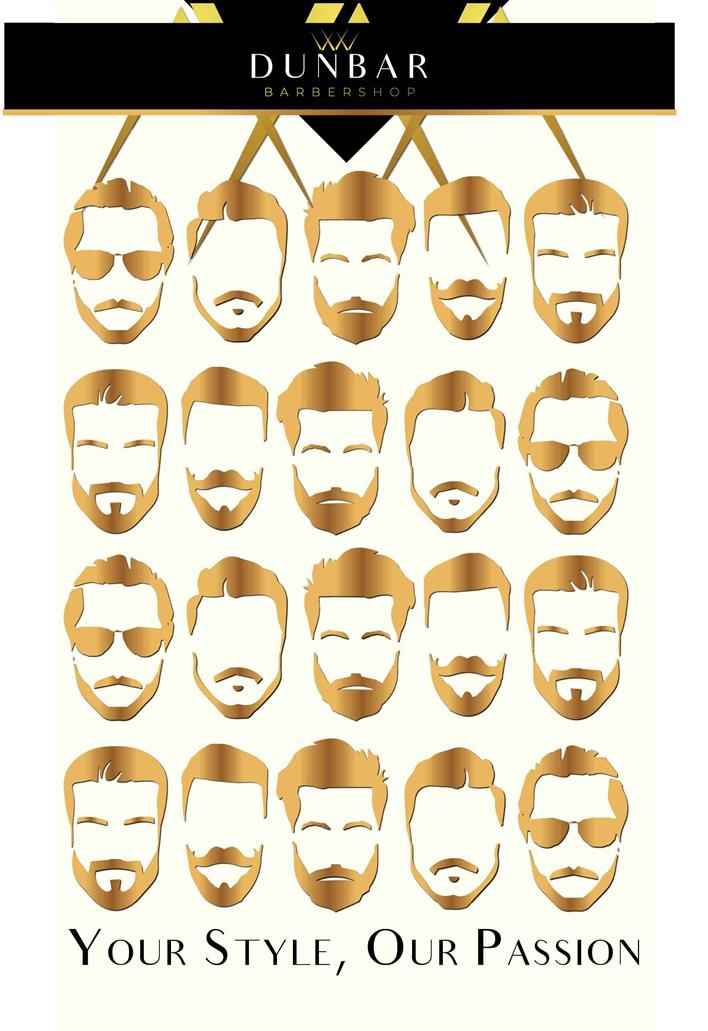
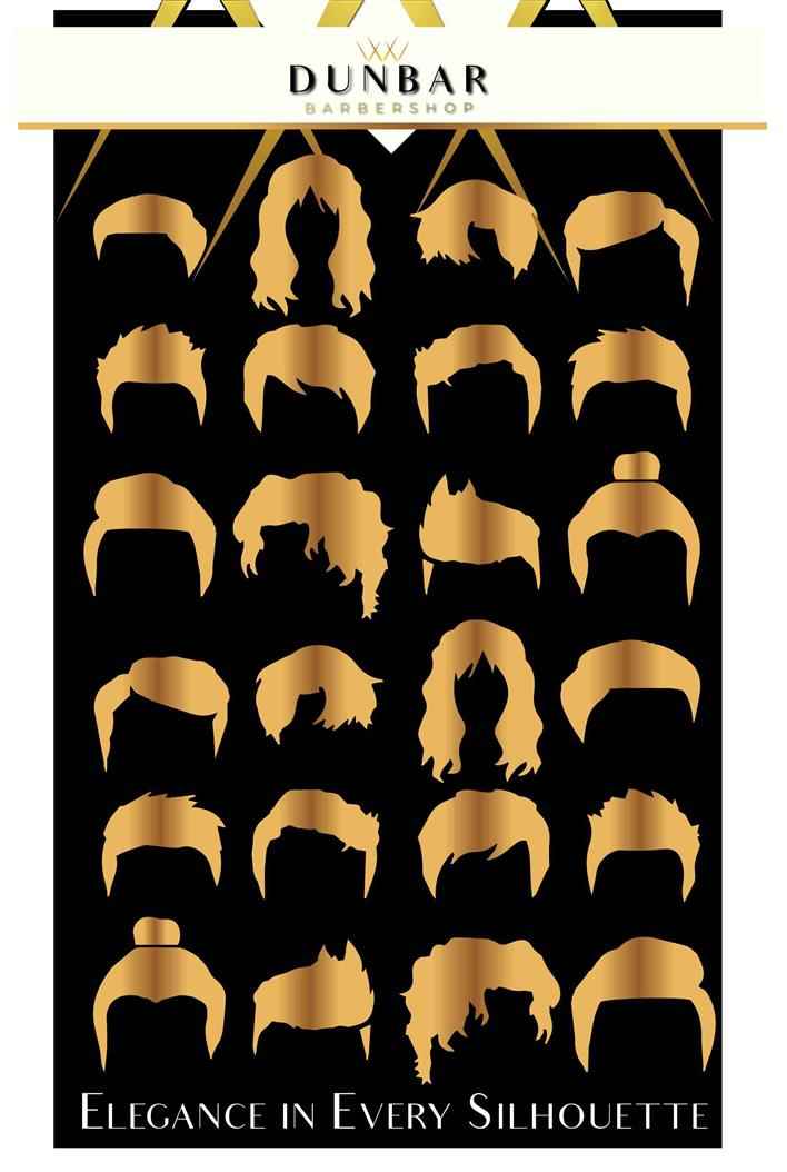
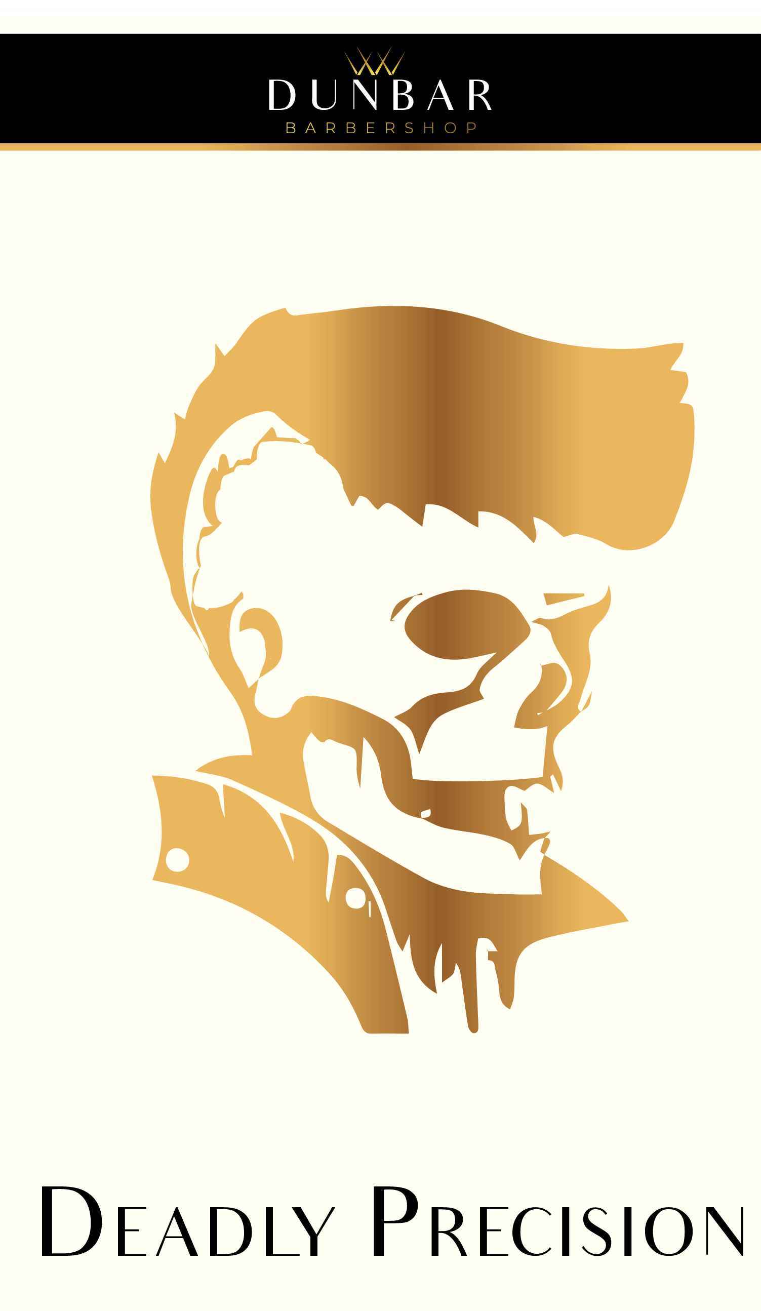
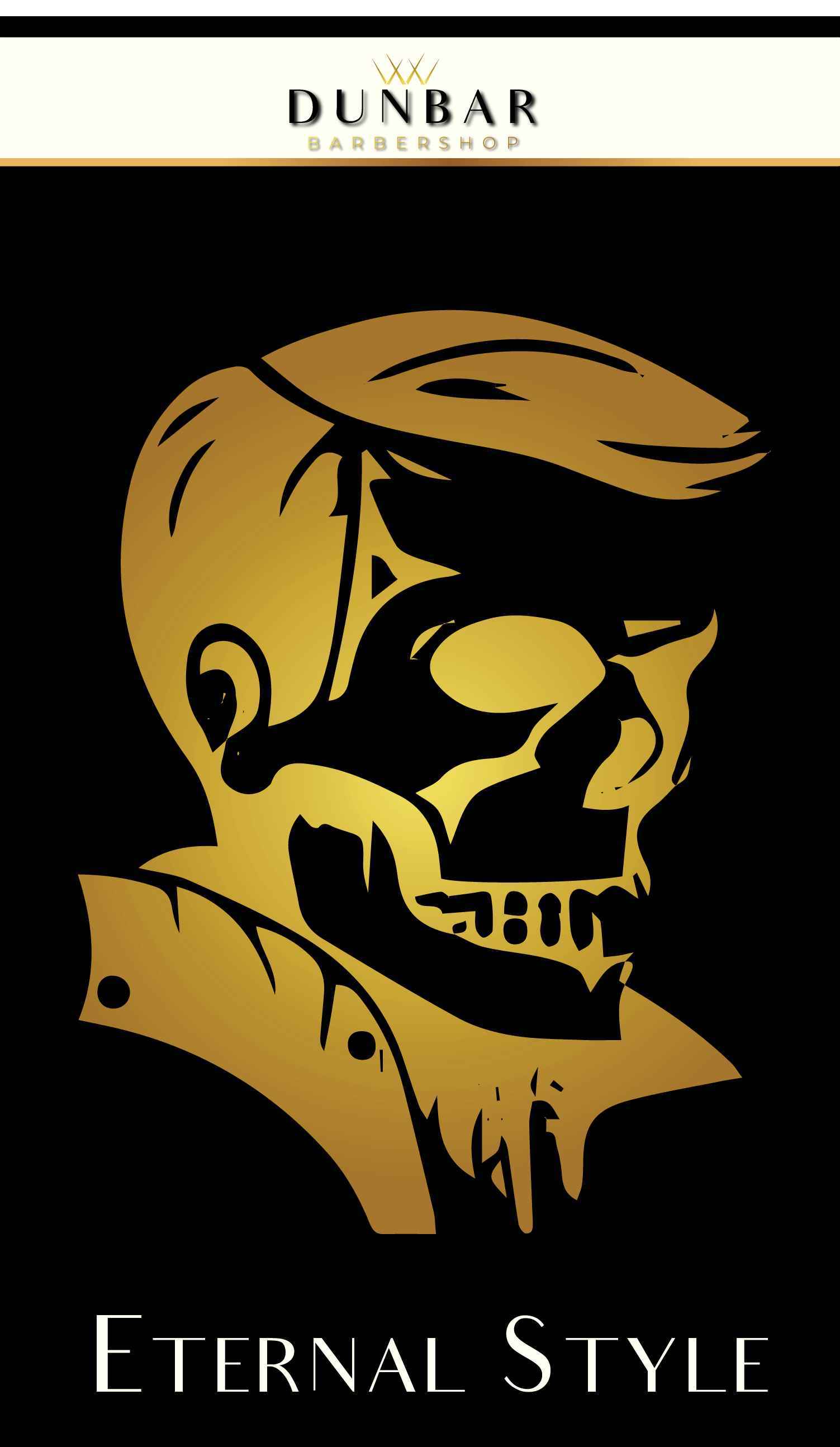
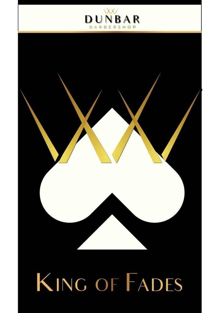
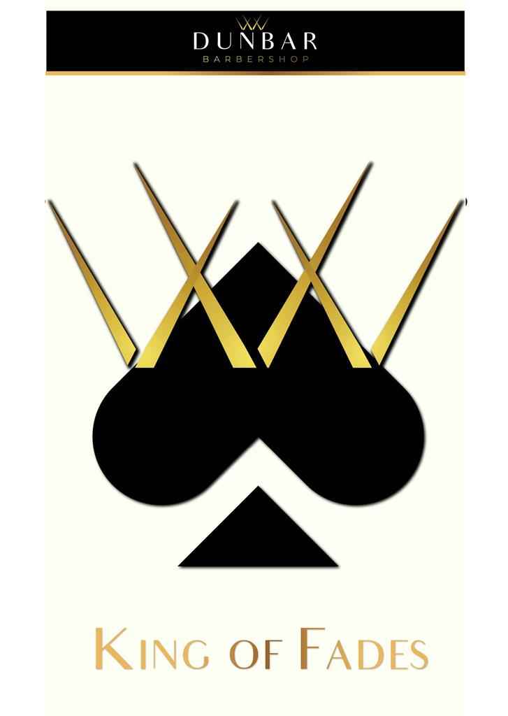
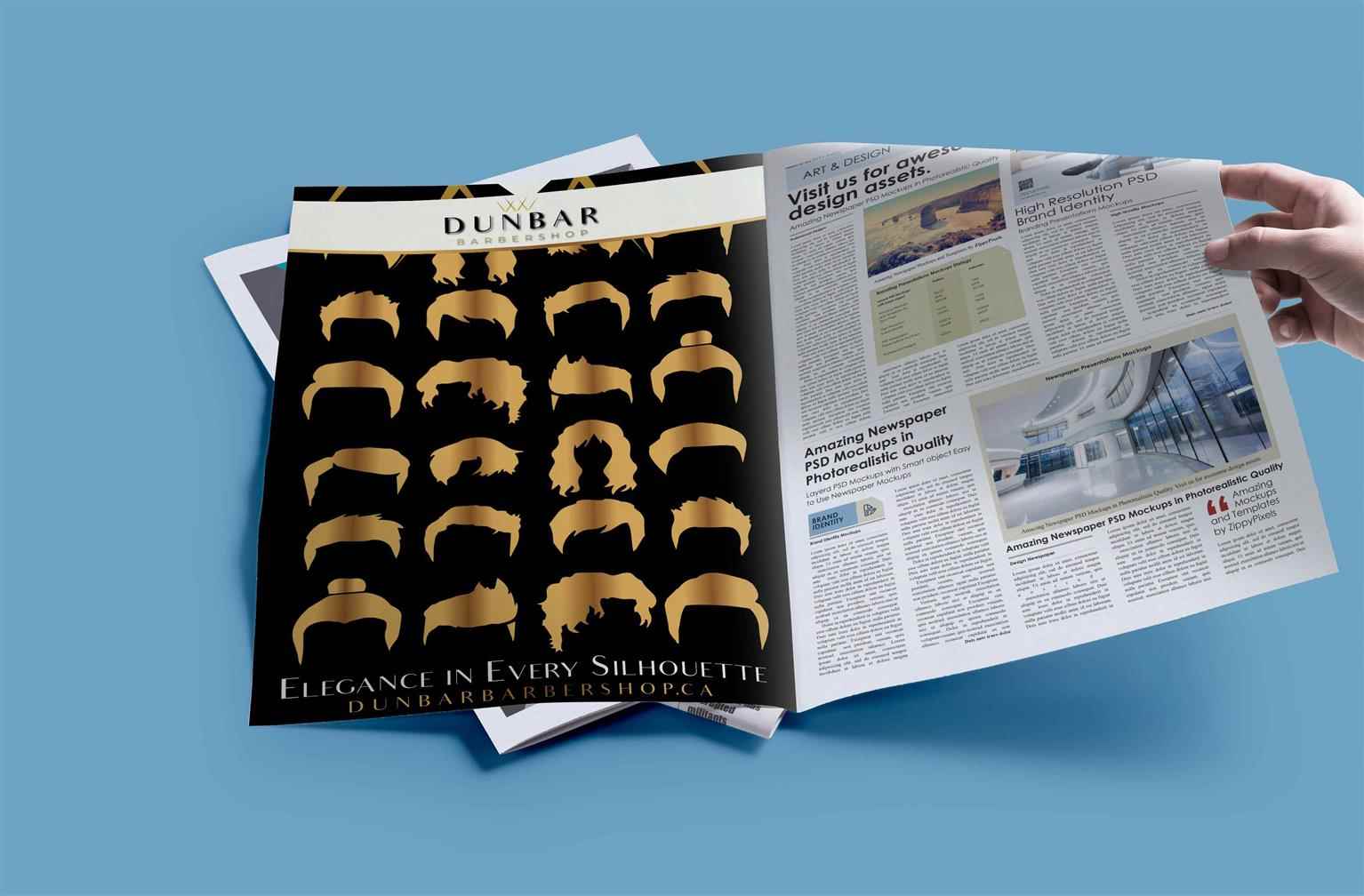
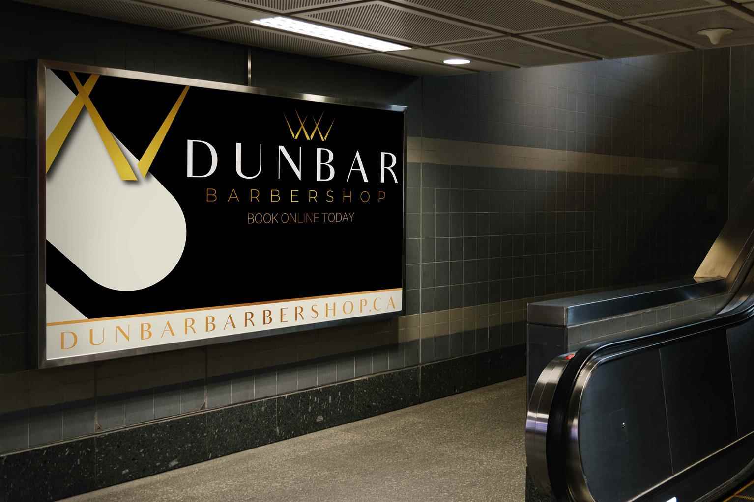
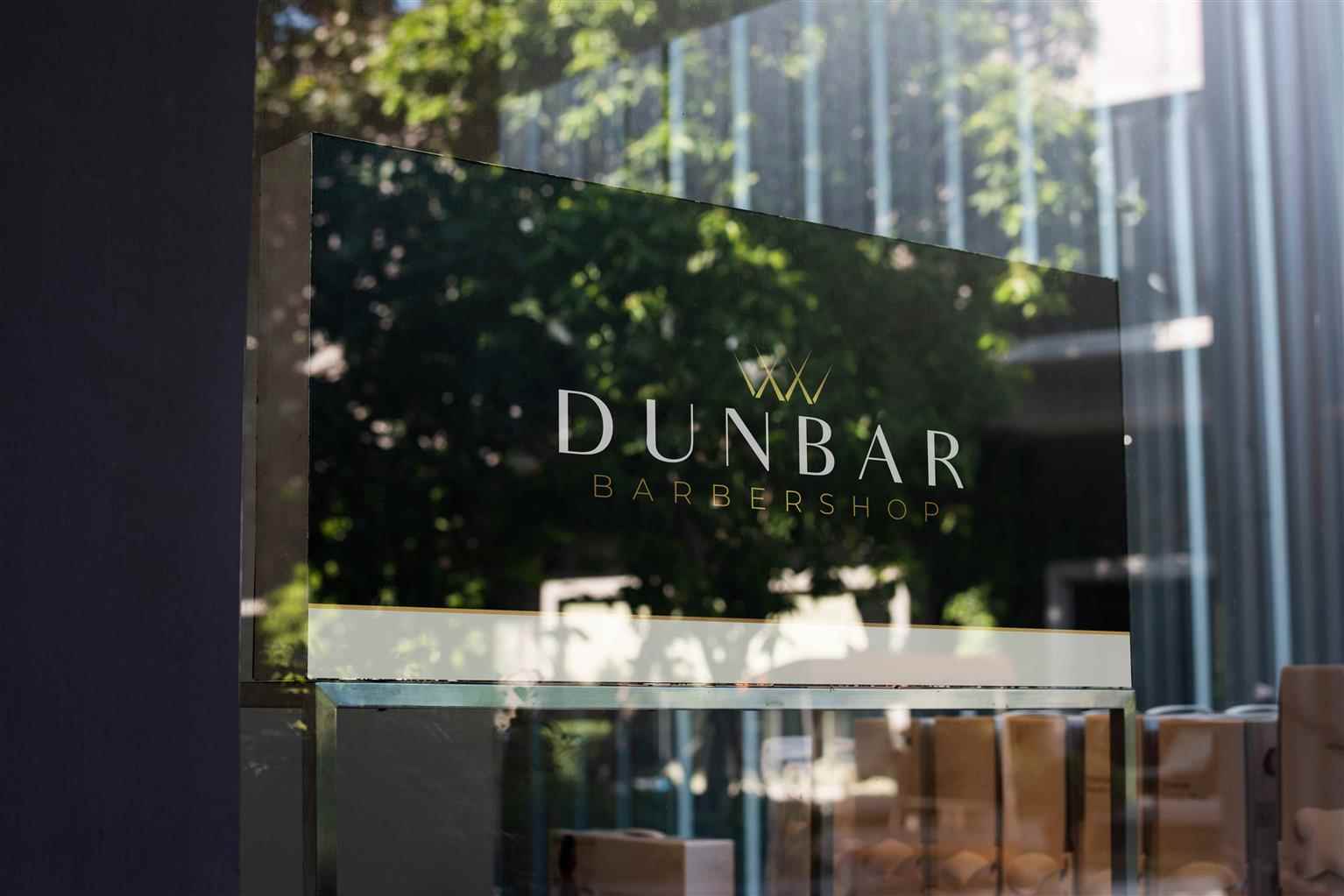
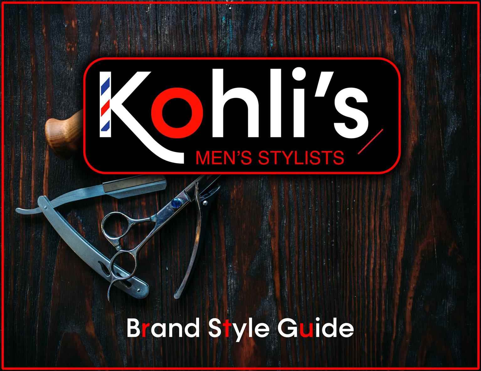
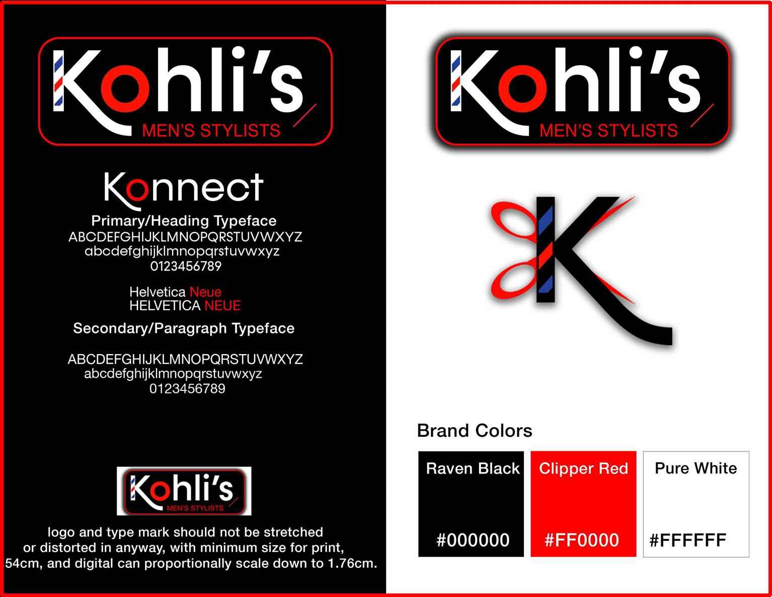
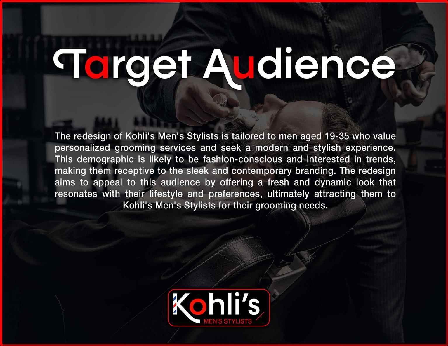
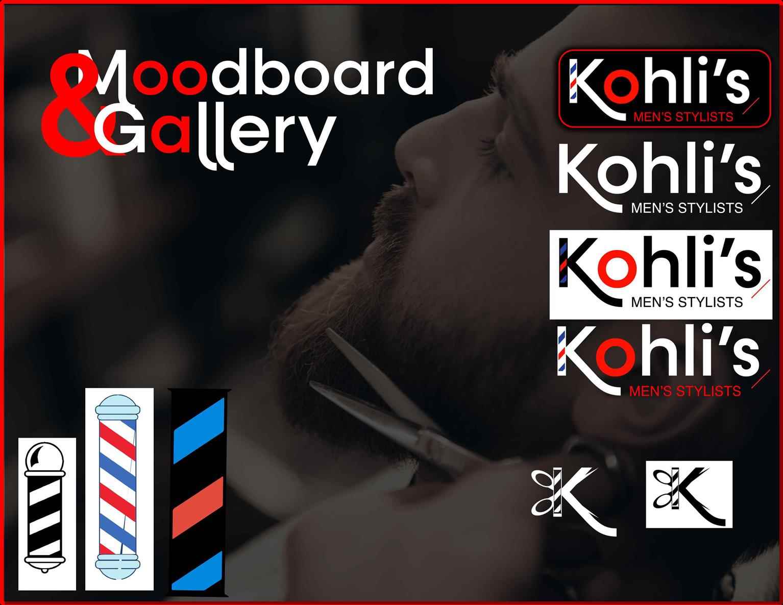
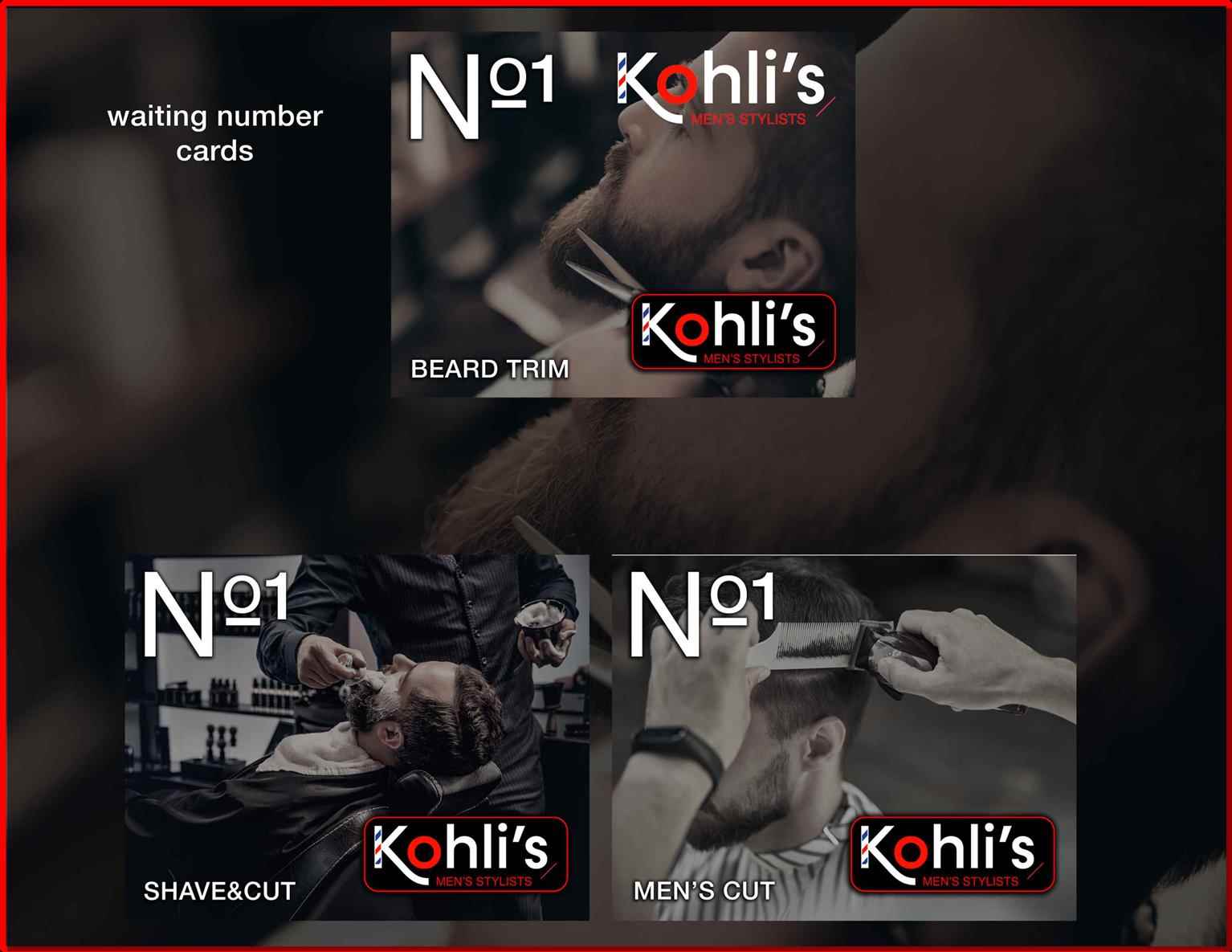
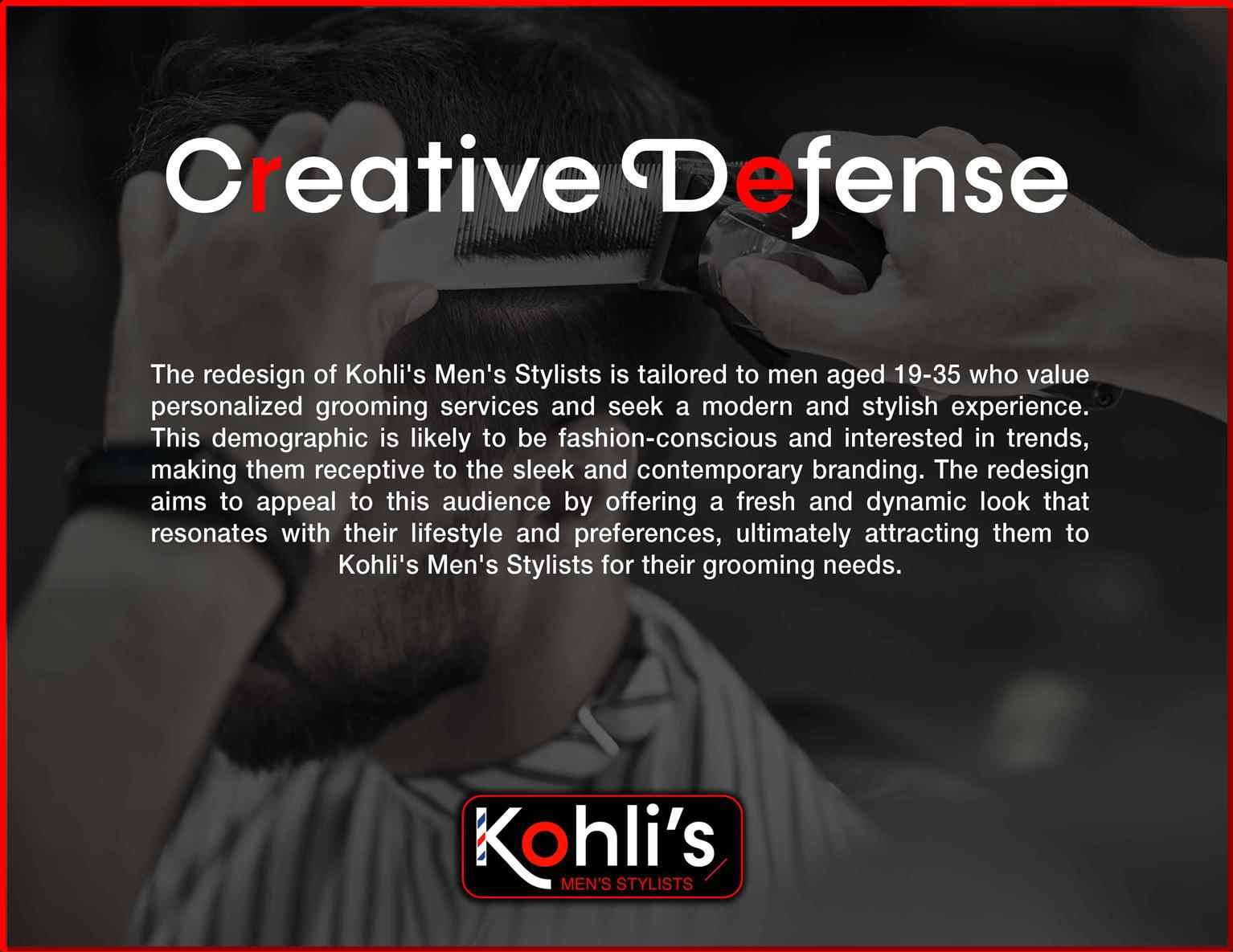
Dunbar Barbershop
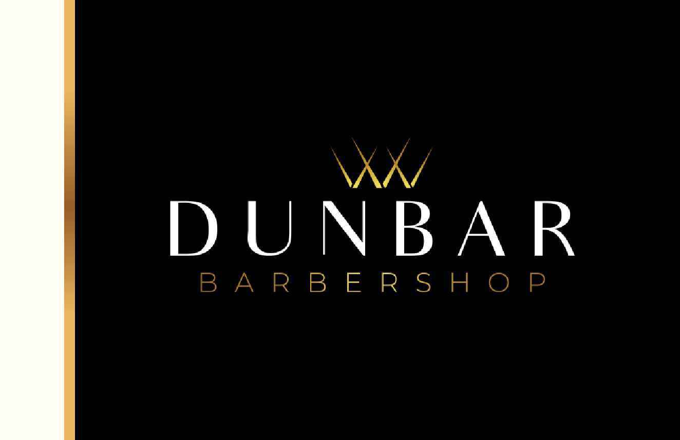
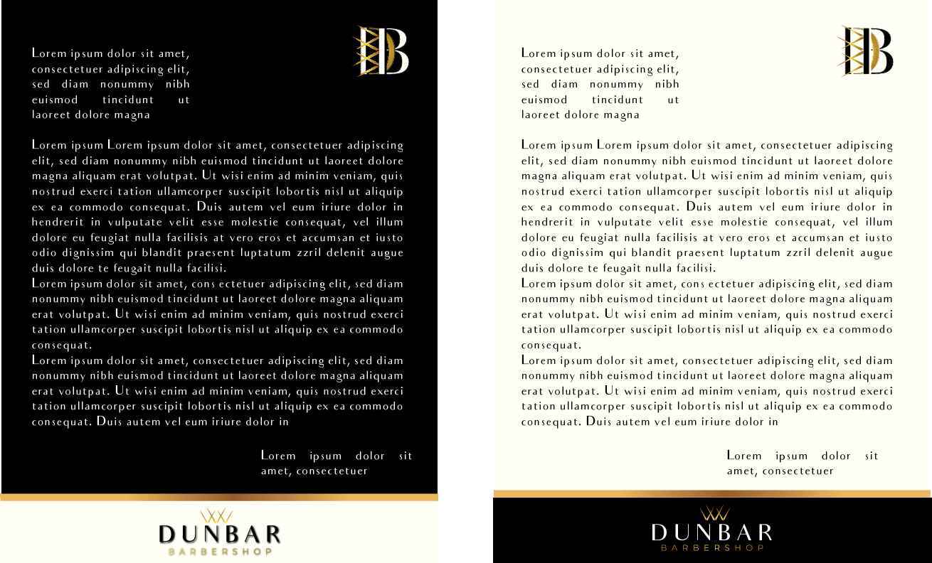
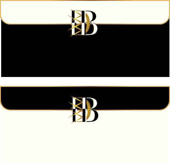
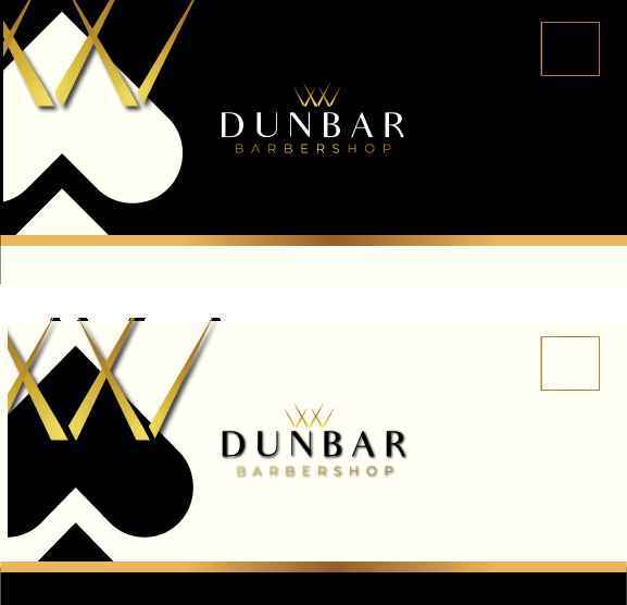
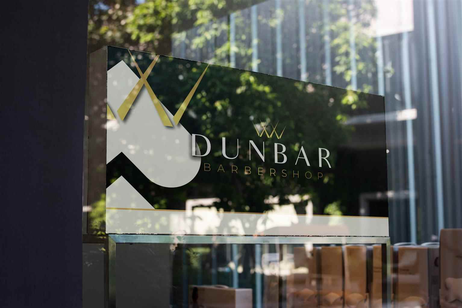
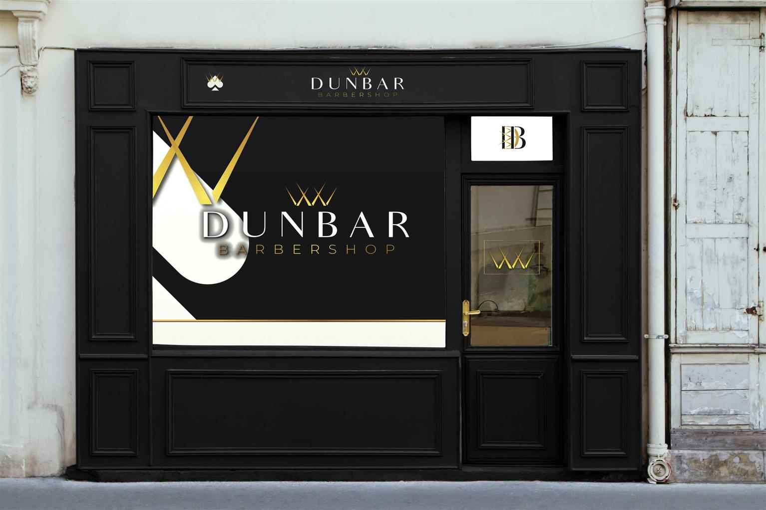
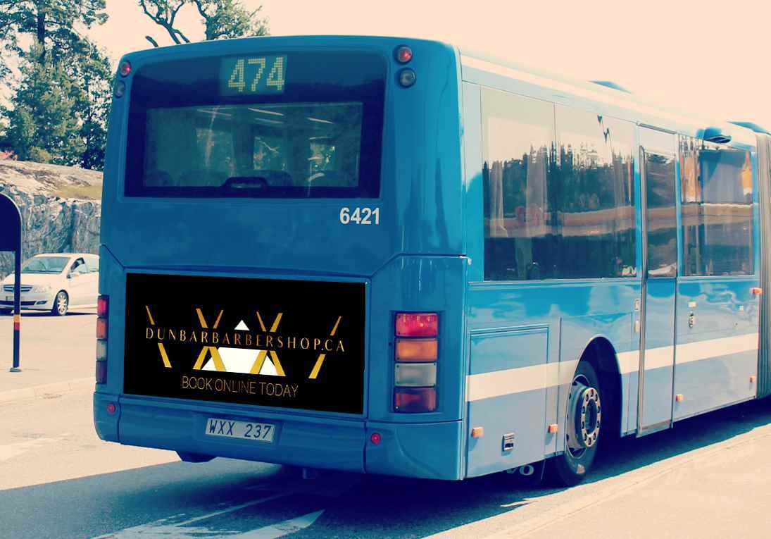
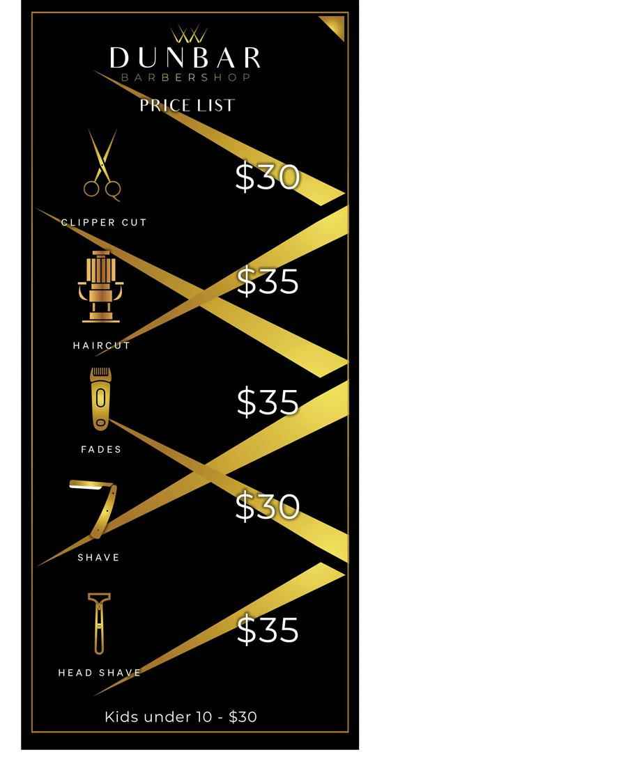
Dunbar Barbershop, located in the Southlands neighborhood on the west side of Vancouver, caters to an upper-middle-class to upper-class clientele. The barbershop distinguishes itself through its prem...
Dunbar Barbershop, located in the Southlands neighborhood on the west side of Vancouver, caters to an upper-middle-class to upper-class clientele. The barbershop distinguishes itself through its prem...
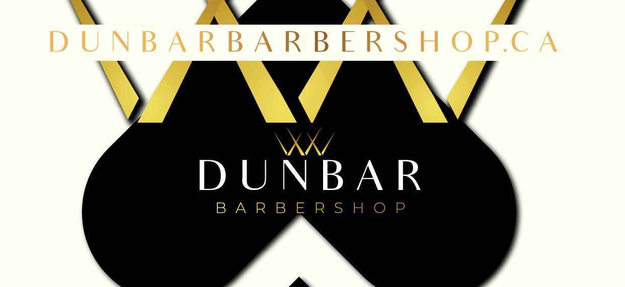
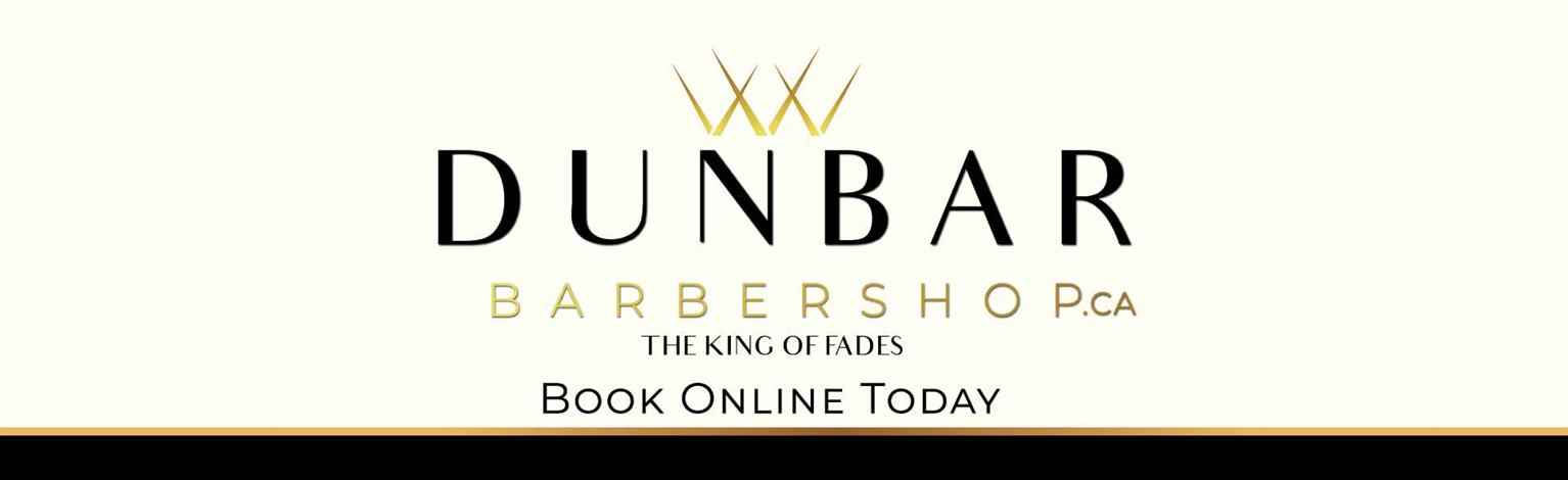
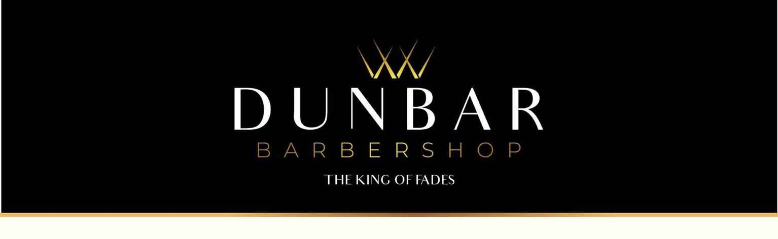
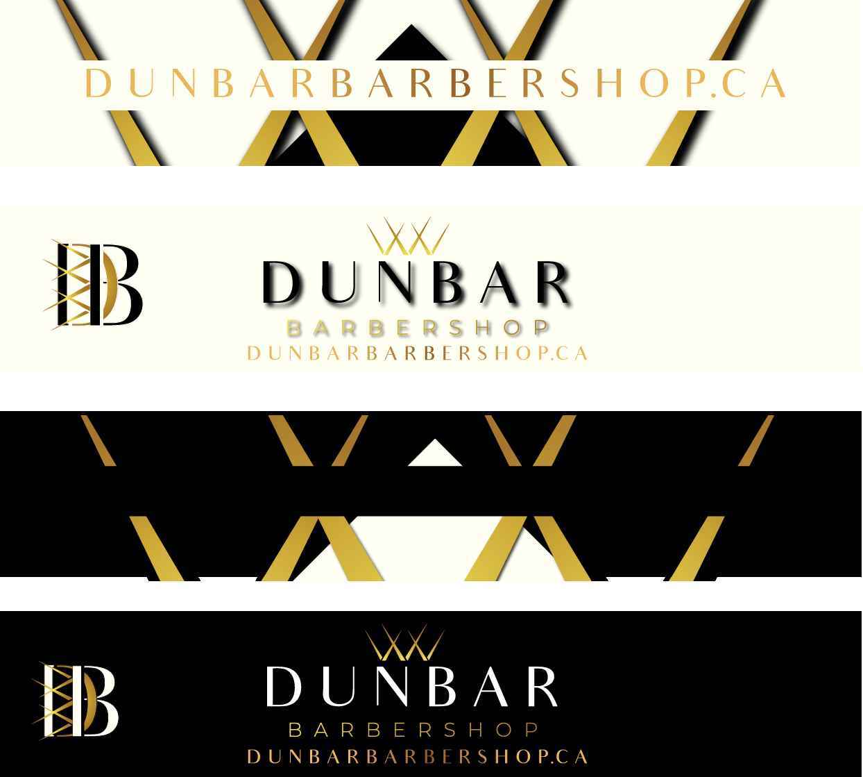
Dunbar Barbershop, located in the Southlands neighborhood on the west side of Vancouver, caters to an upper-middle-class to upper-class clientele. The barbershop distinguishes itself through its premium branding, reflecting an upscale and refined experience. The branding strategy incorporates a timeless aesthetic, combining classic black (000000) and off-white (fffff2) with custom gold accents, to create an atmosphere of elegance and sophistication.

Share:
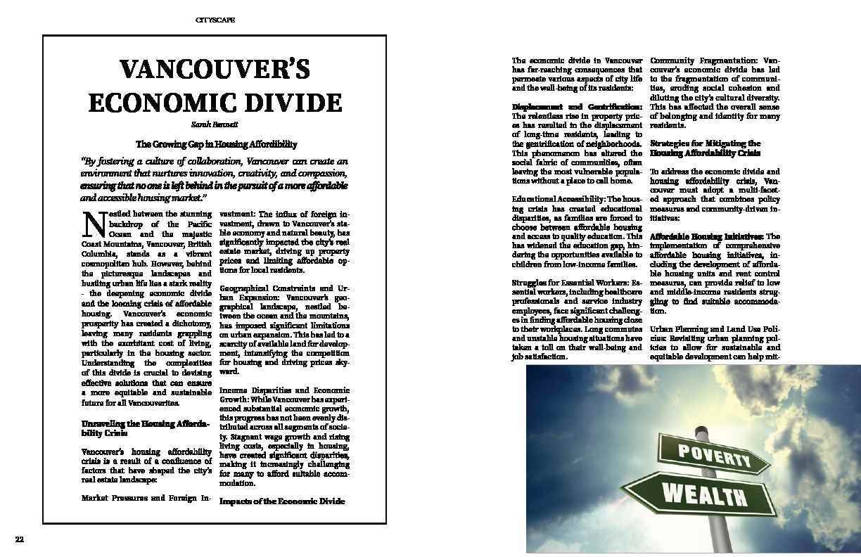
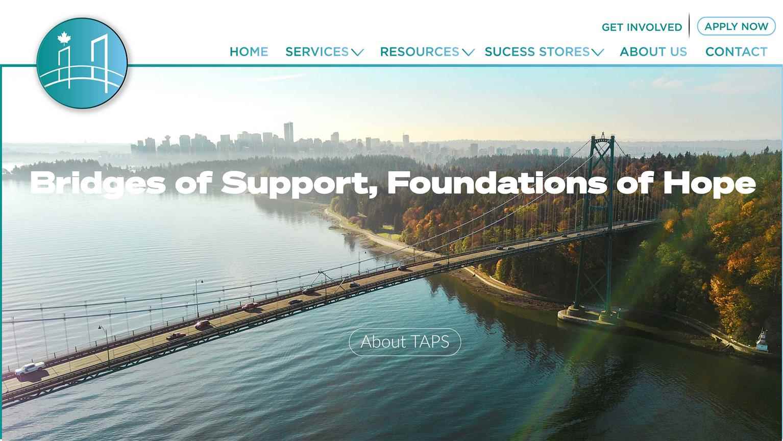
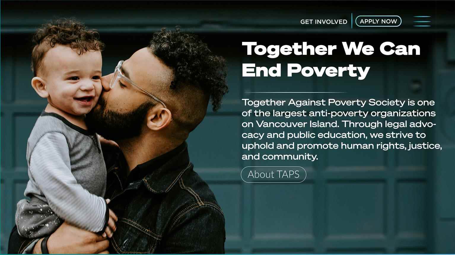
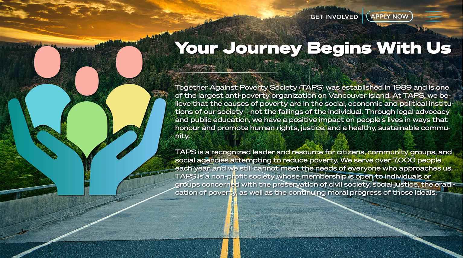
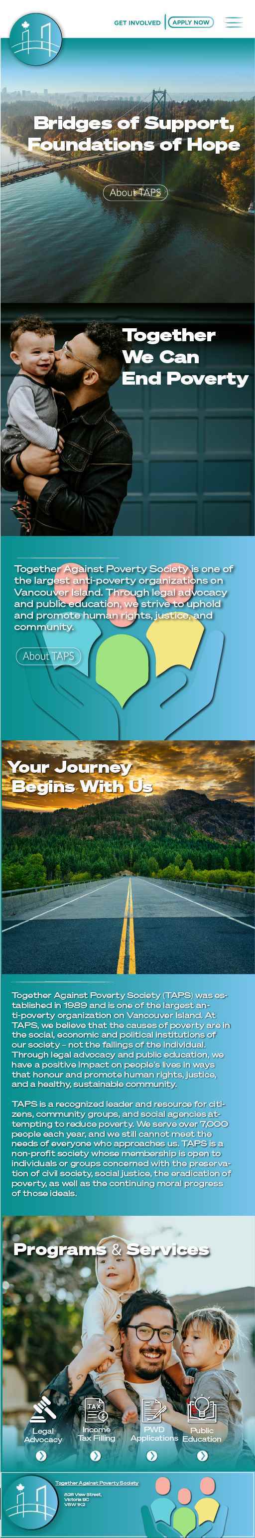
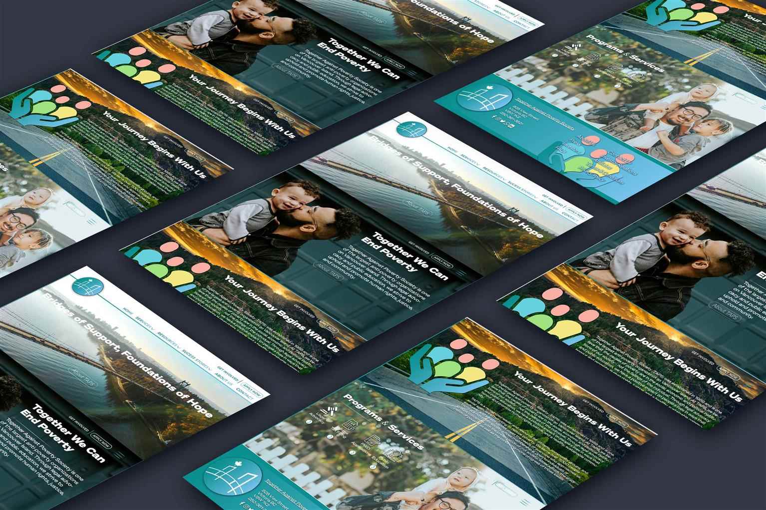
Together Against Poverty Society (TAPS)
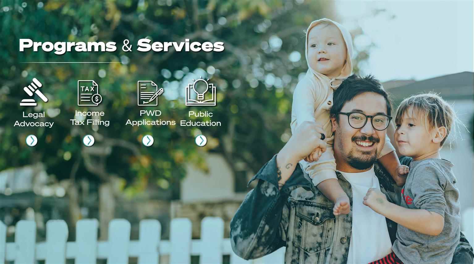
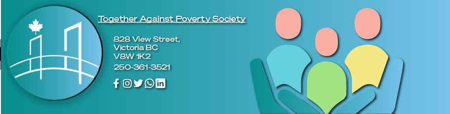
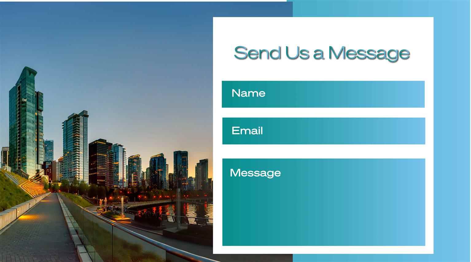
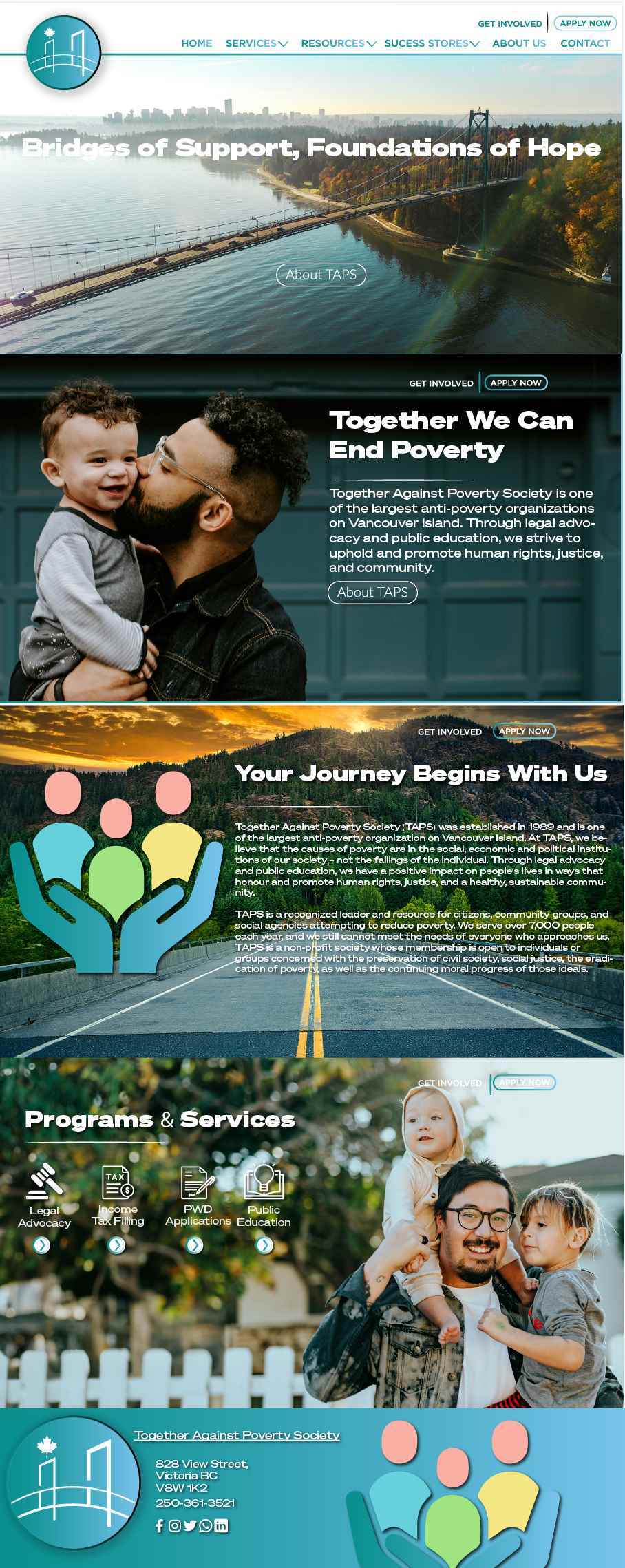
The Together Against Poverty Society BC website combines thoughtful design elements with a clear and supportive message. The dual bridges in the logo, the warm and encouraging imagery, the modern Soh...
The Together Against Poverty Society BC website combines thoughtful design elements with a clear and supportive message. The dual bridges in the logo, the warm and encouraging imagery, the modern Soh...
The Together Against Poverty Society BC website combines thoughtful design elements with a clear and supportive message. The dual bridges in the logo, the warm and encouraging imagery, the modern Sohne typography, and the meaningful color scheme all work together to create an inviting and empowering online presence. The user-friendly design ensures that visitors can easily access the resources they need, while the overall theme of the bridge reinforces the journey of positive change and self-improvement.
Share:
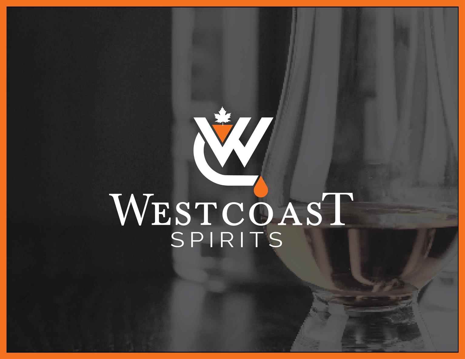
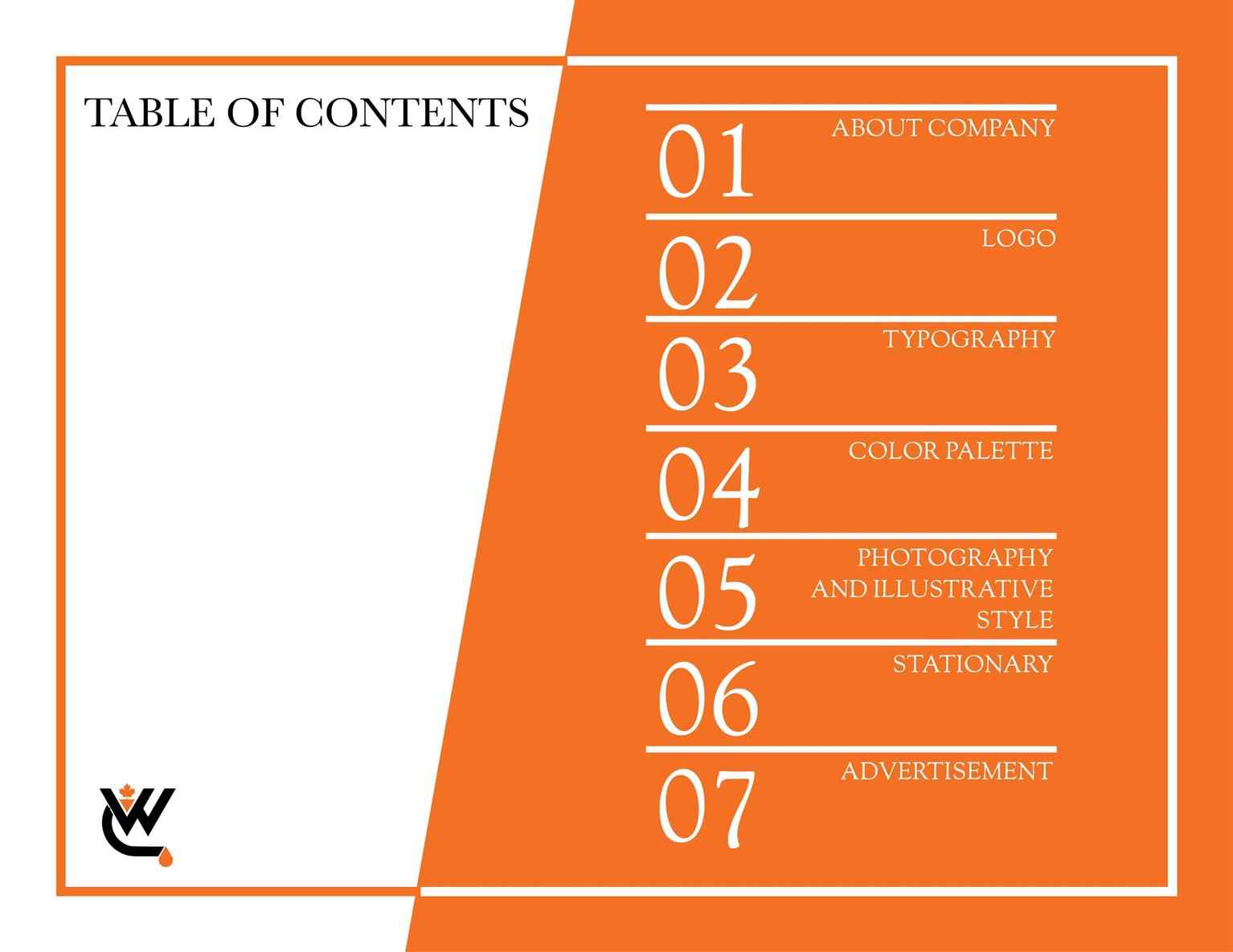
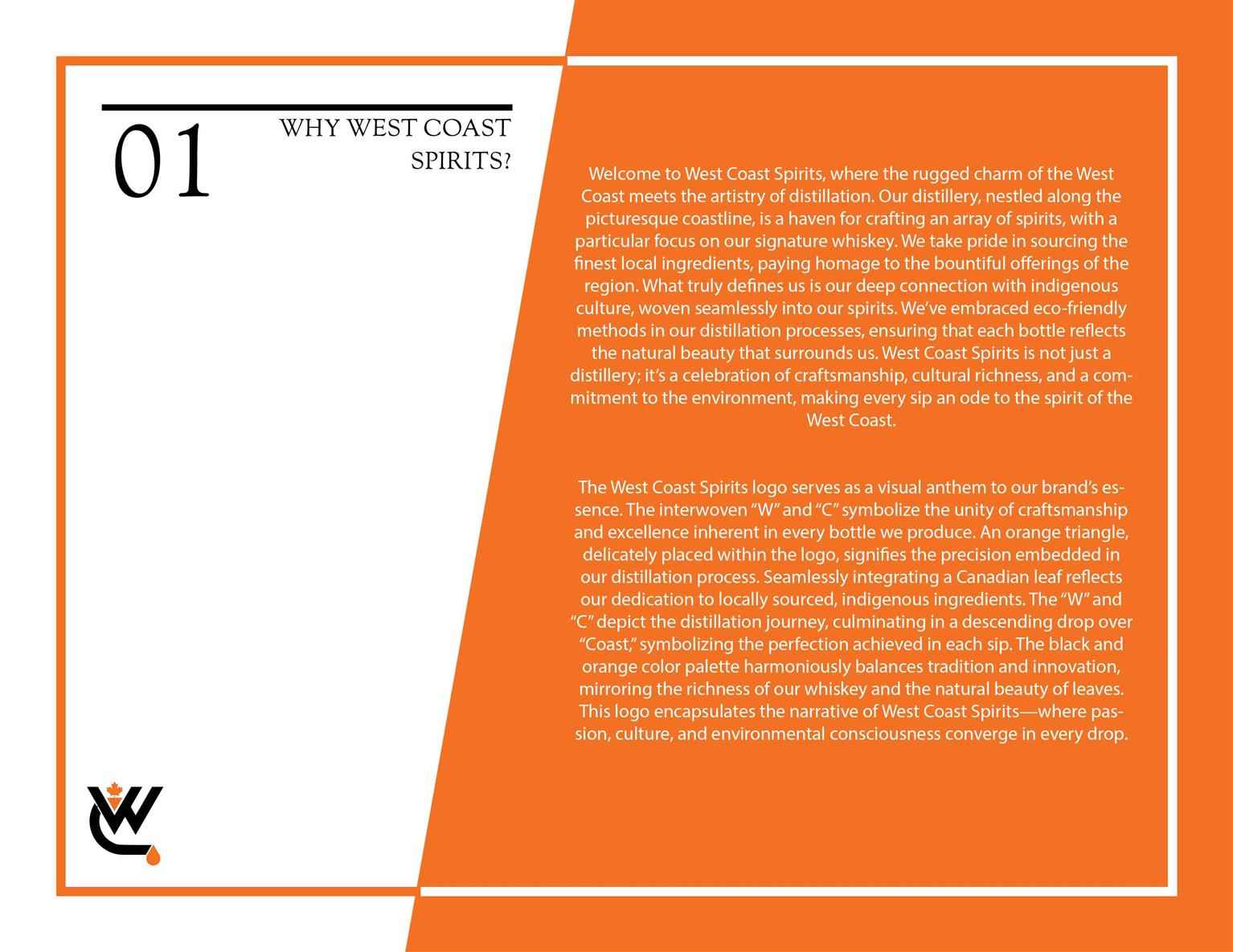
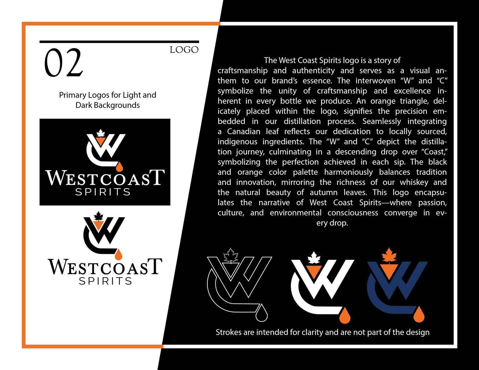
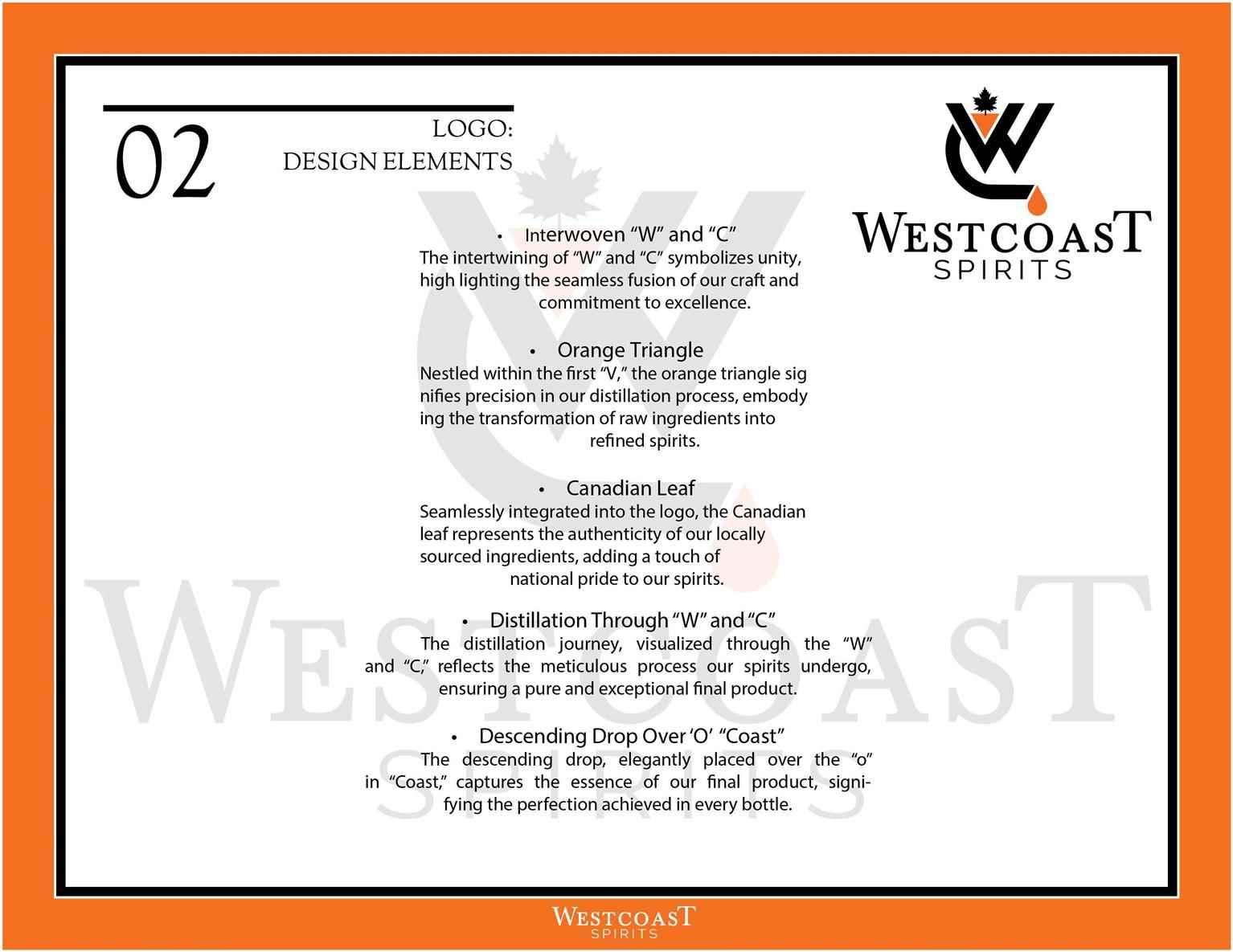
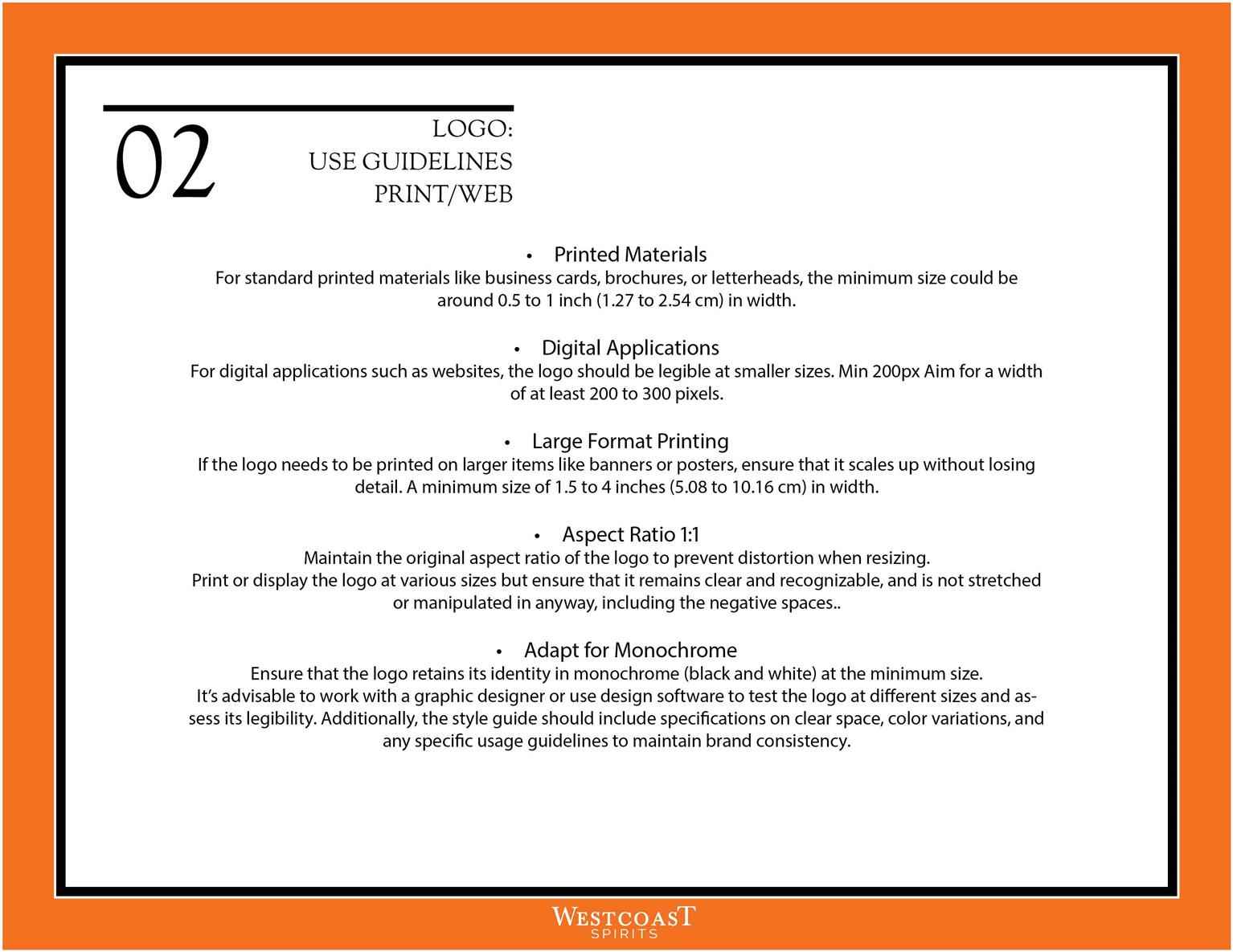
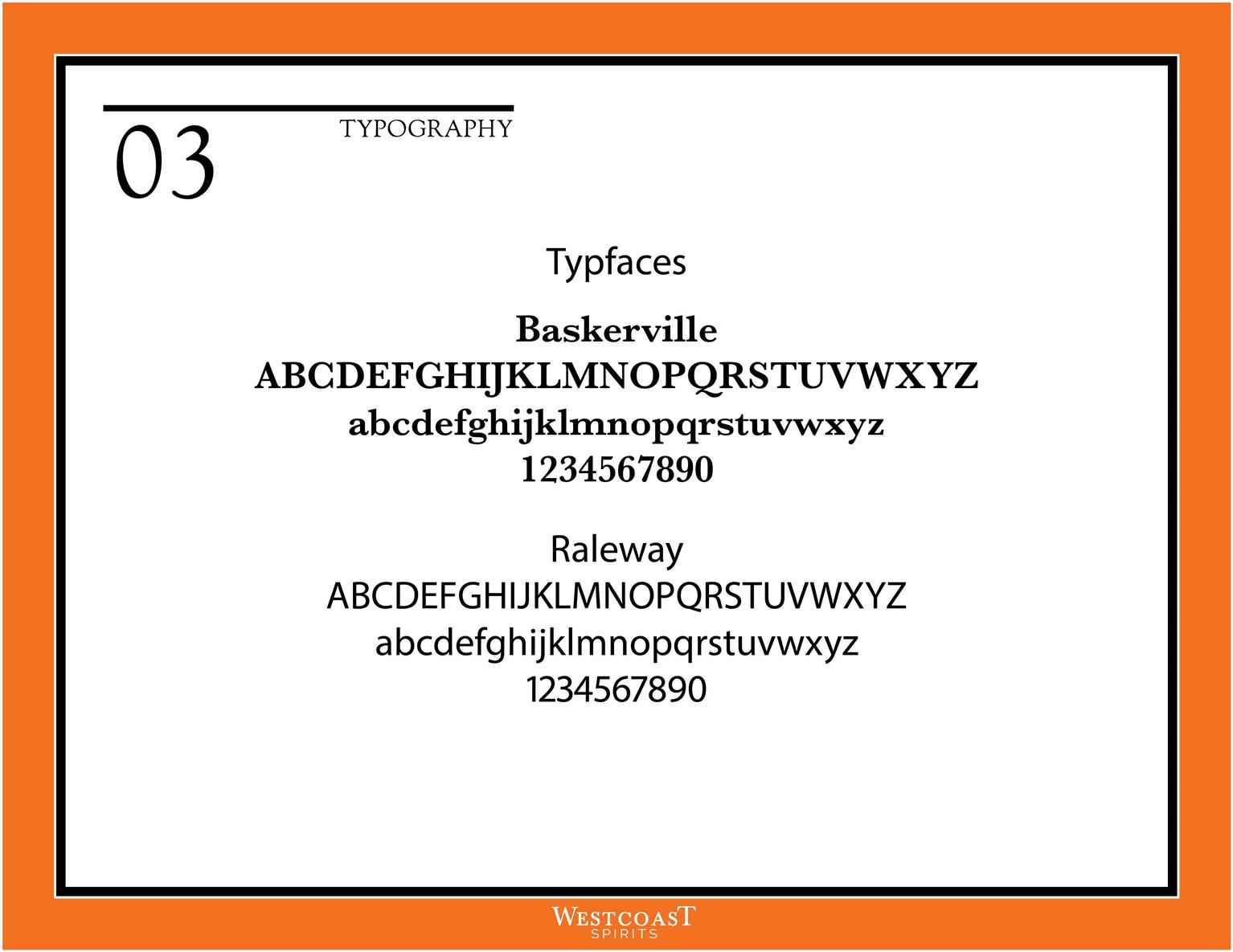
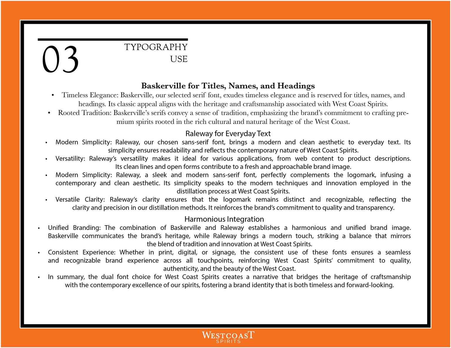
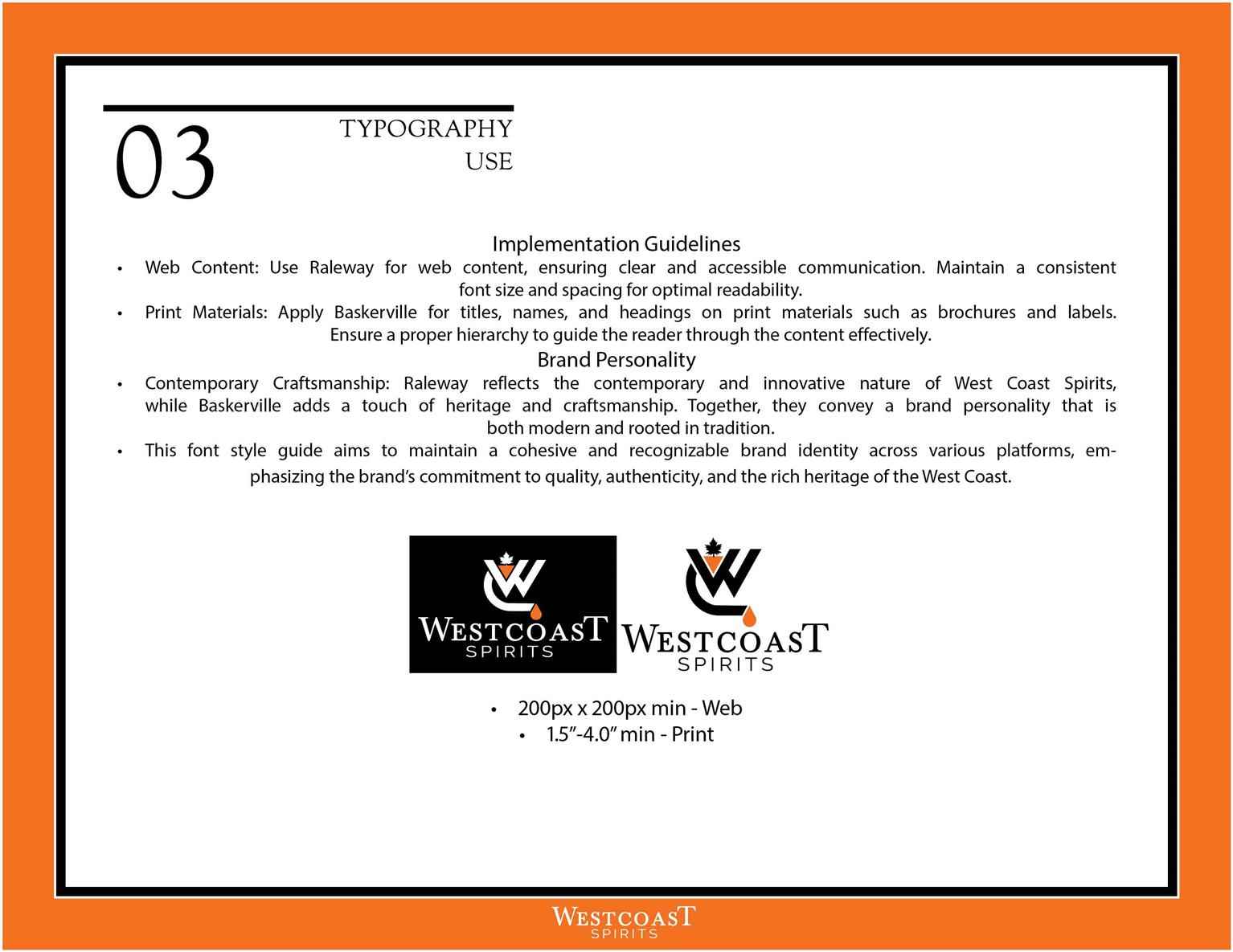
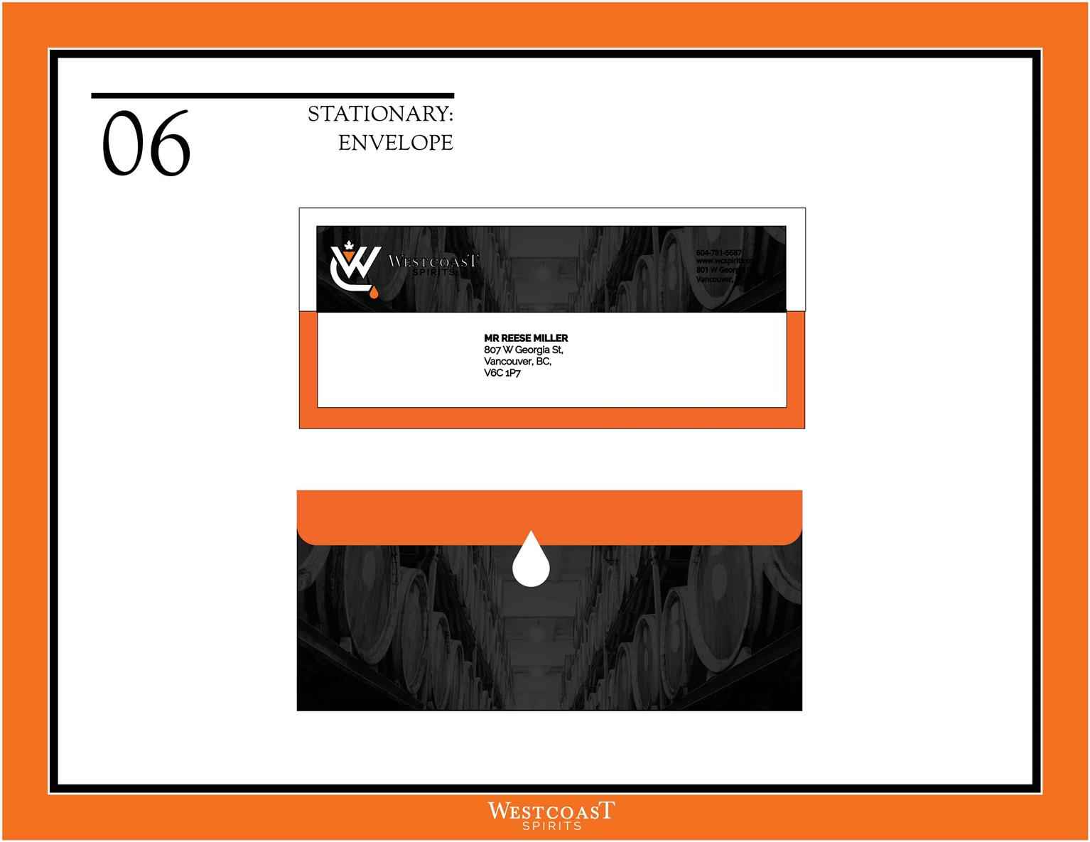
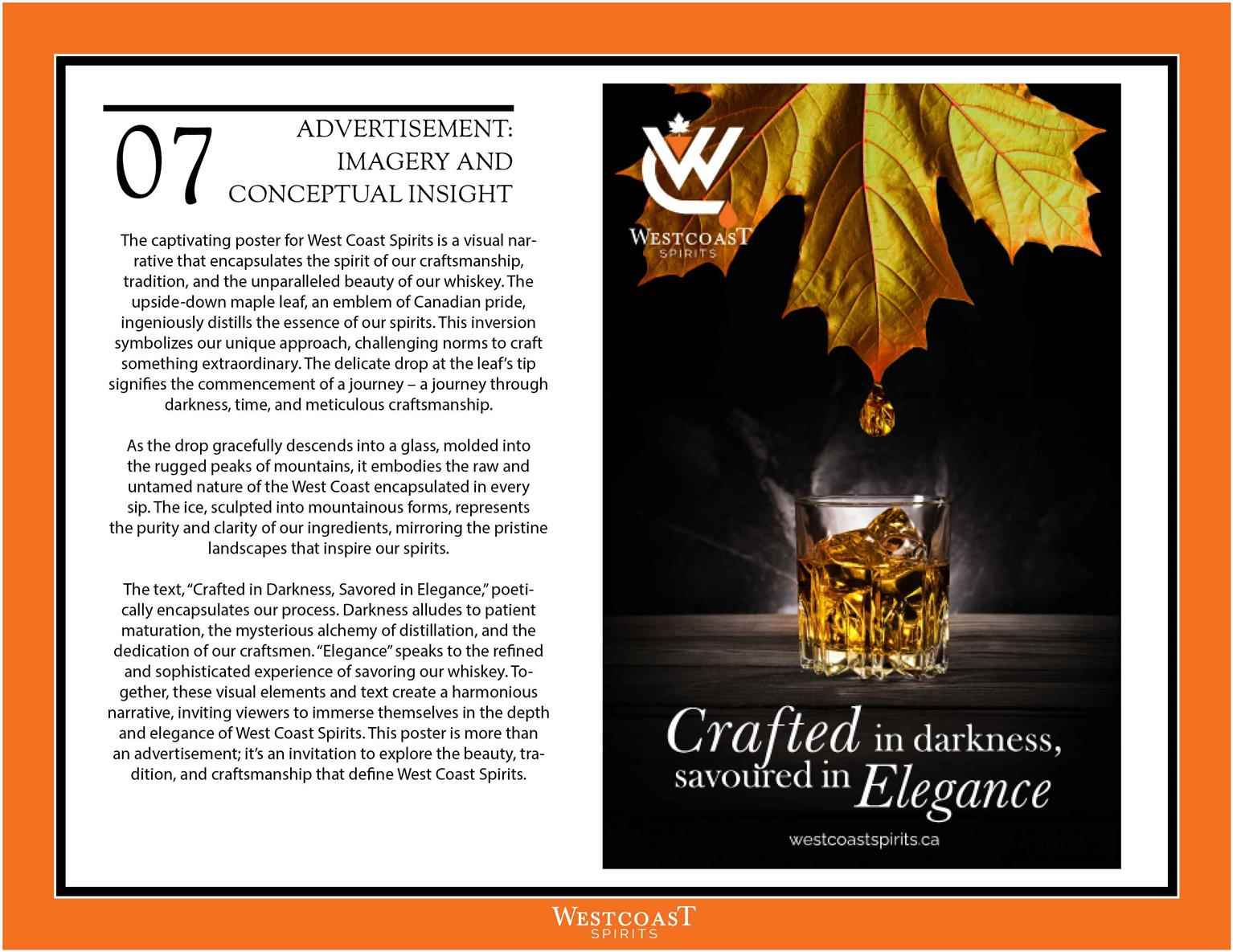
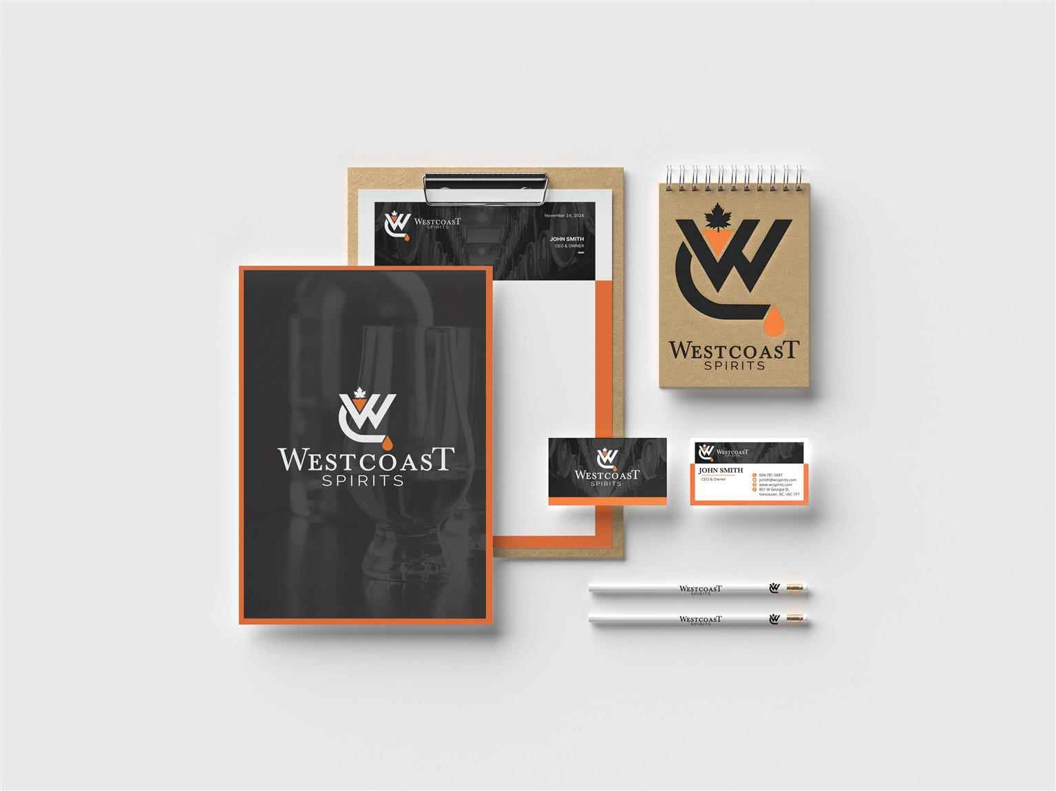
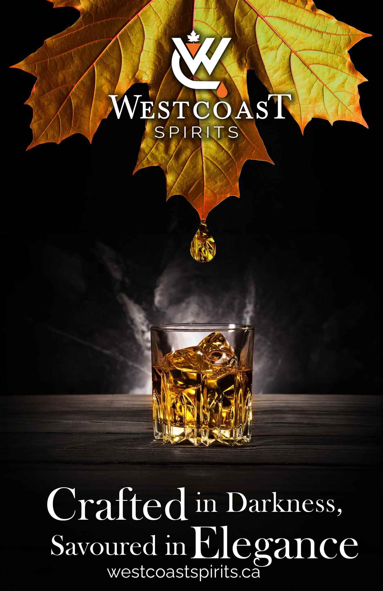
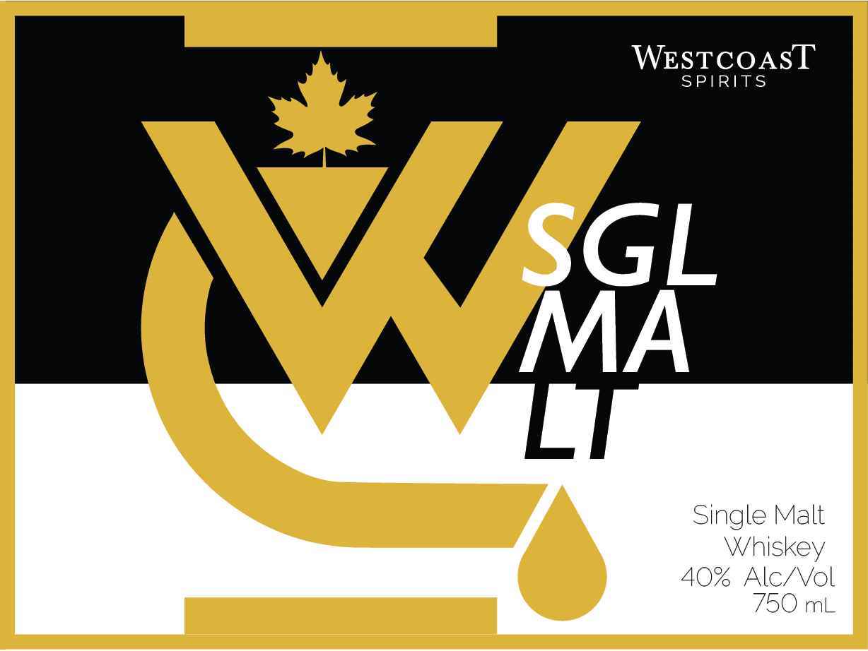
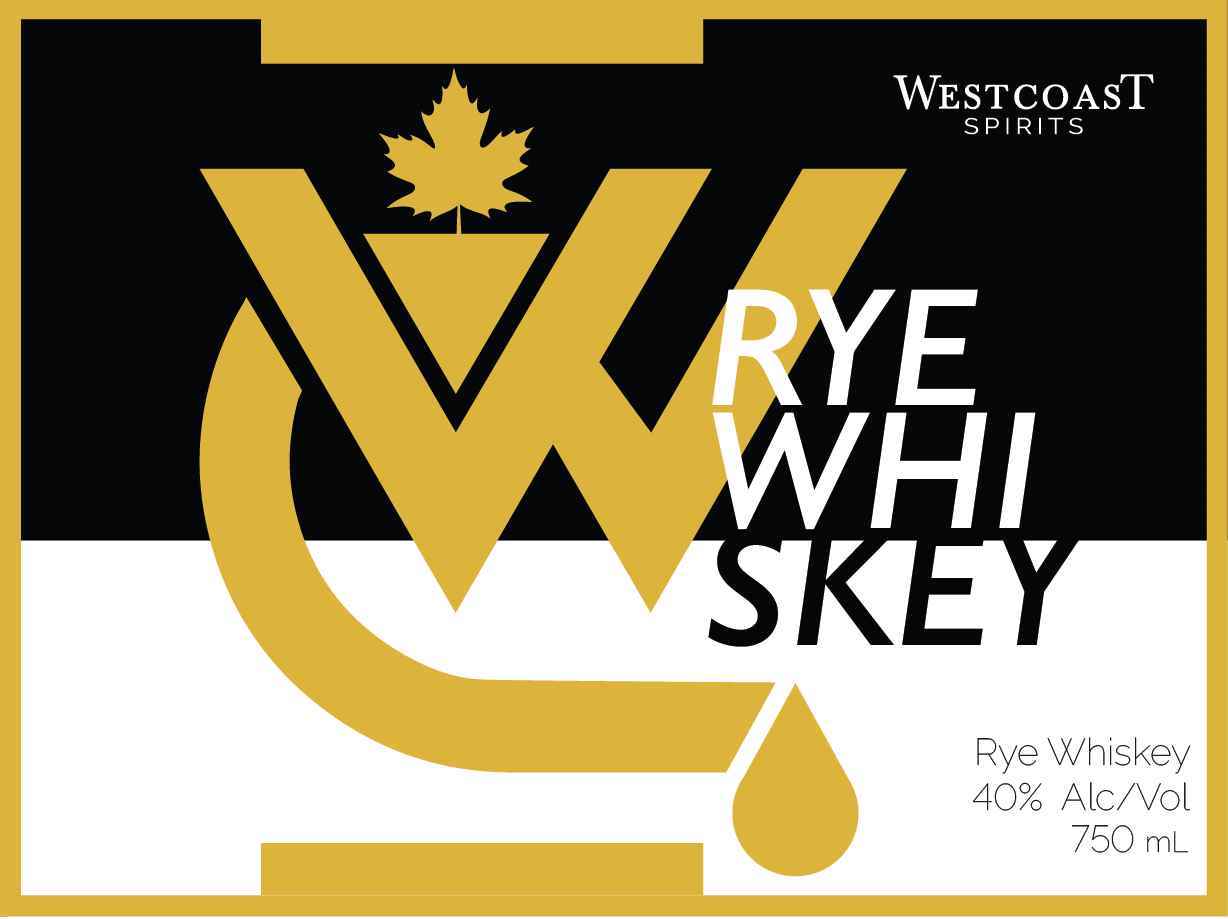
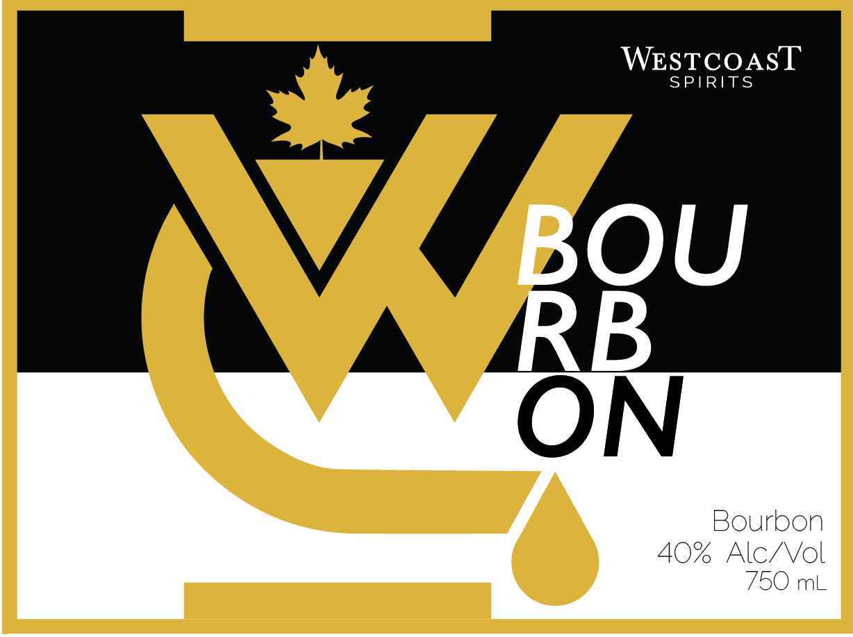
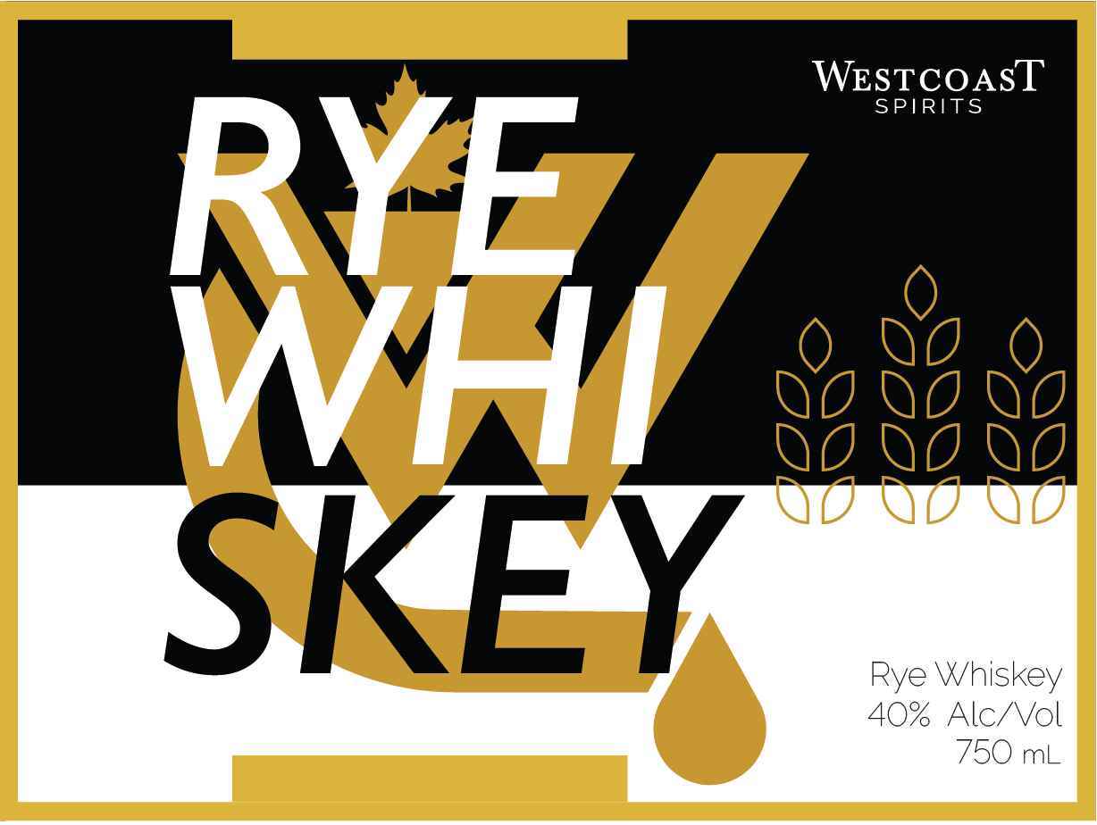
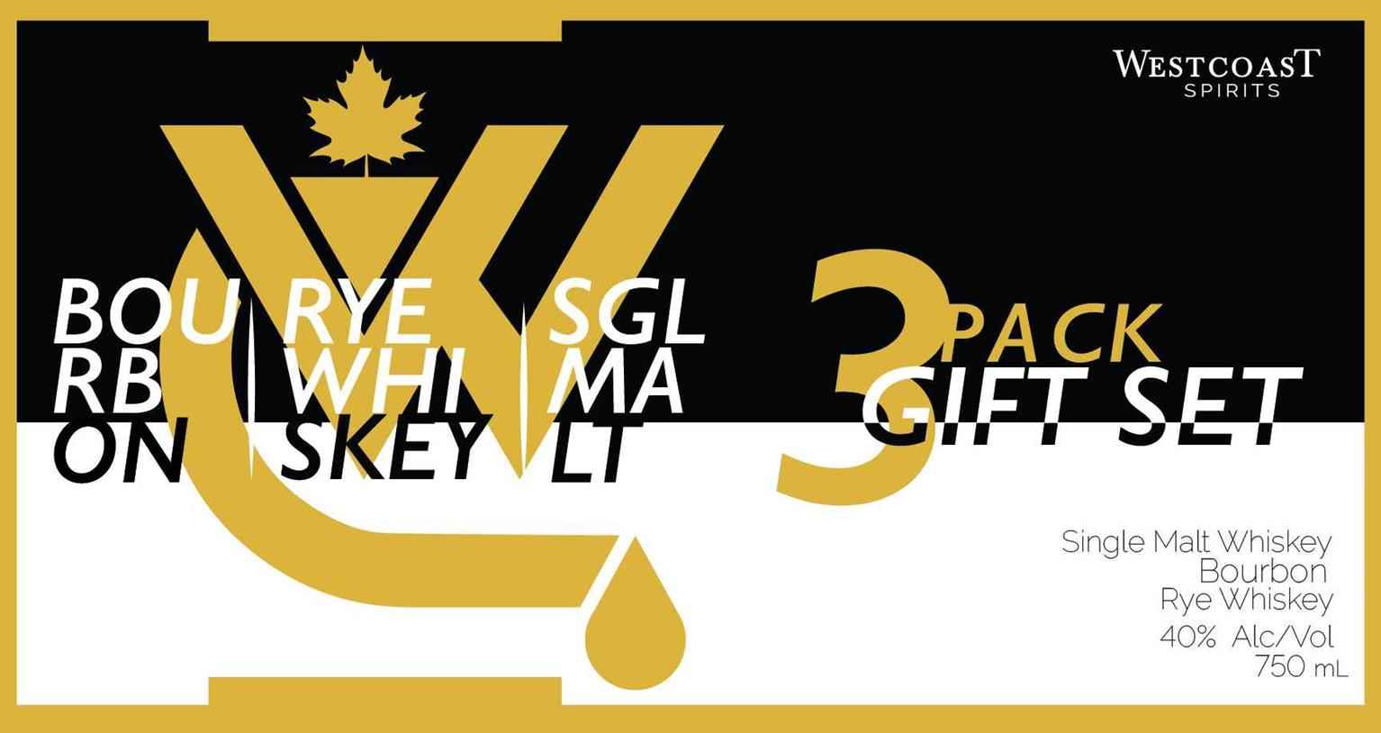
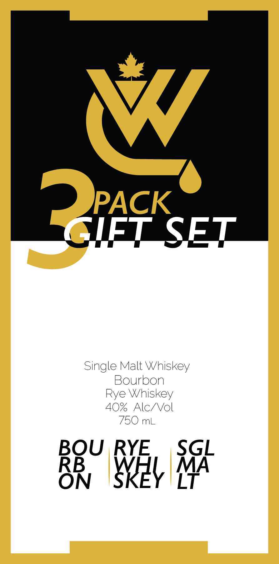
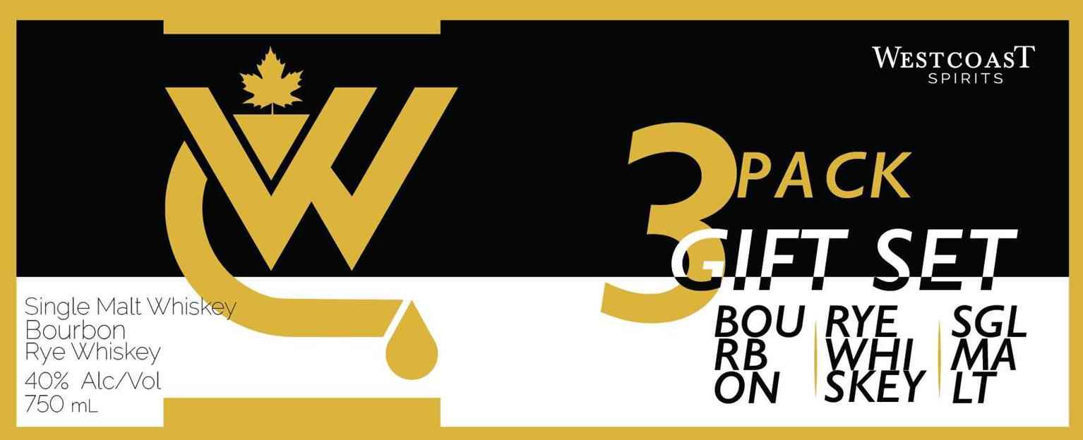
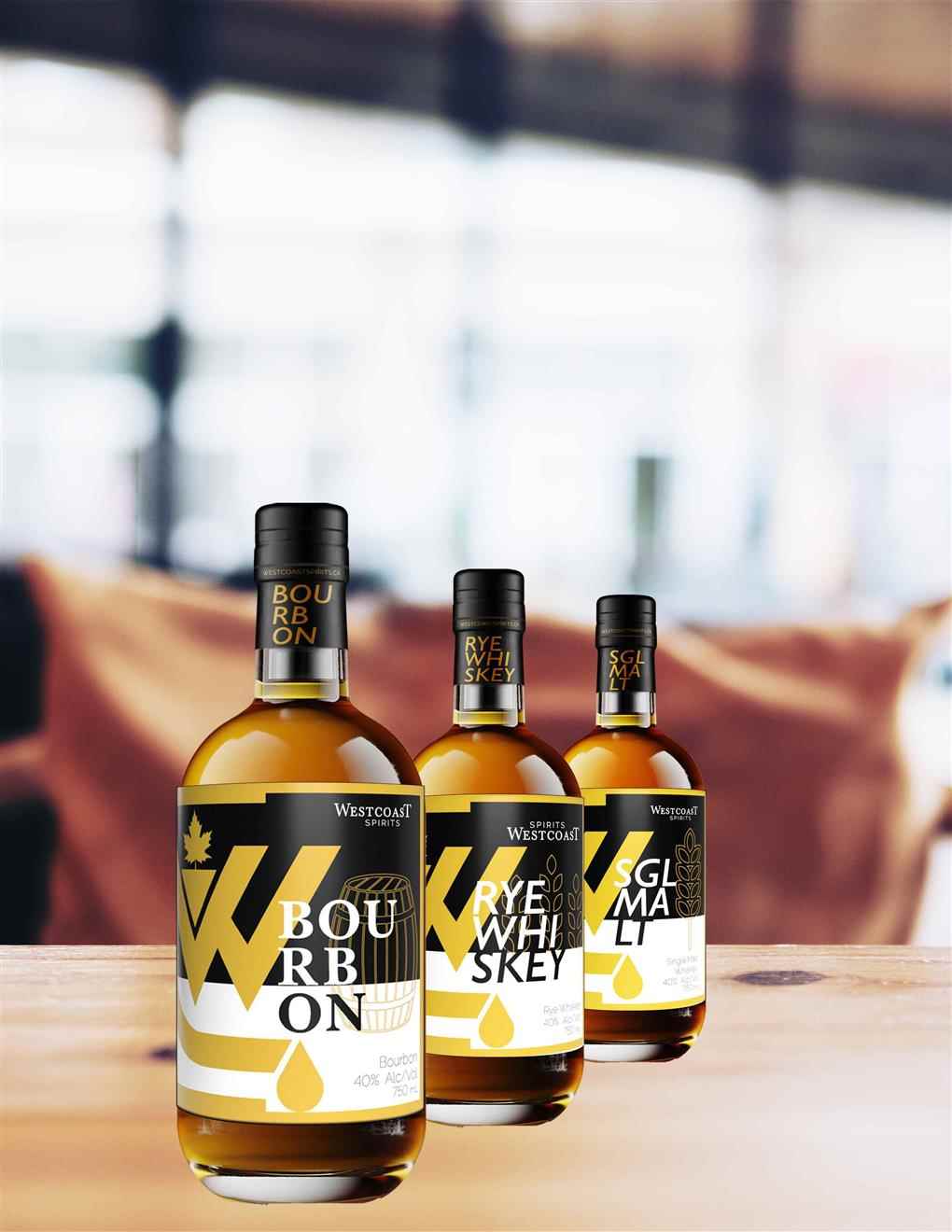
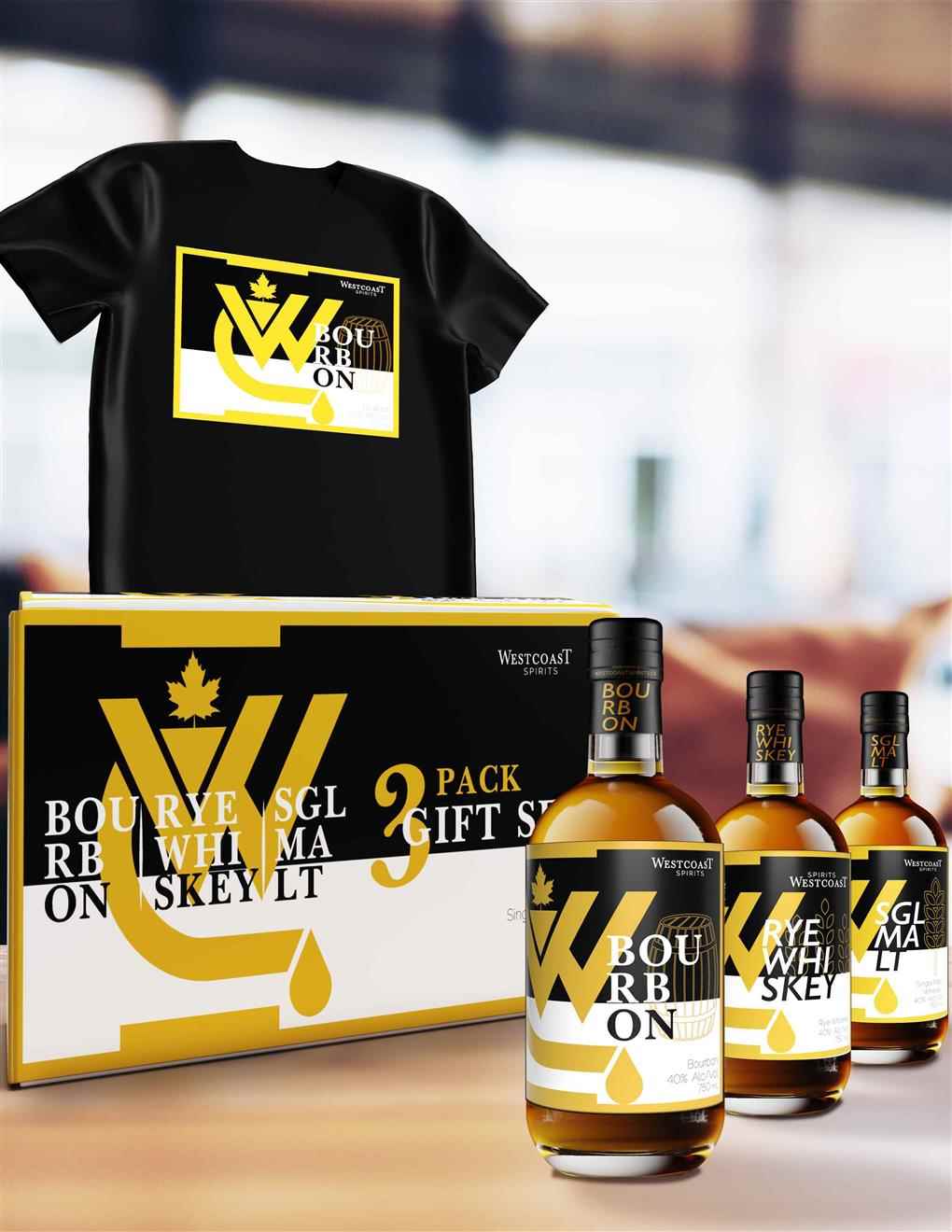
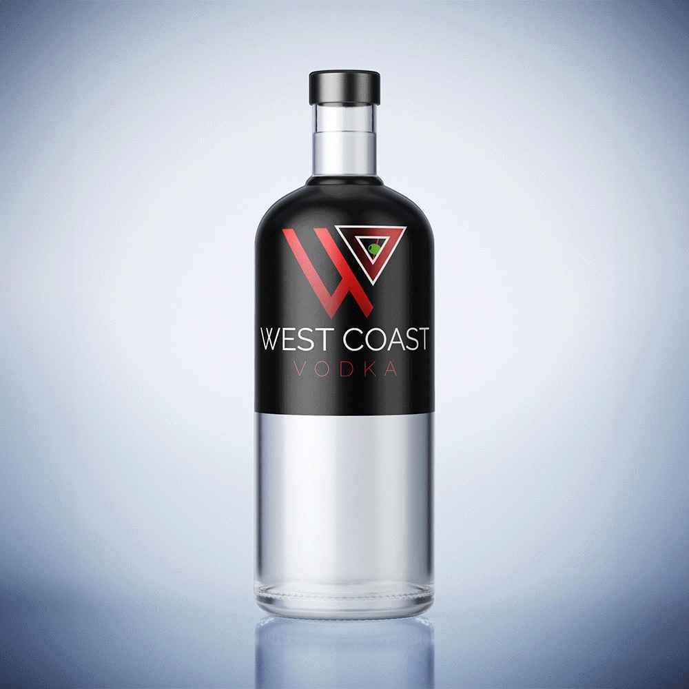
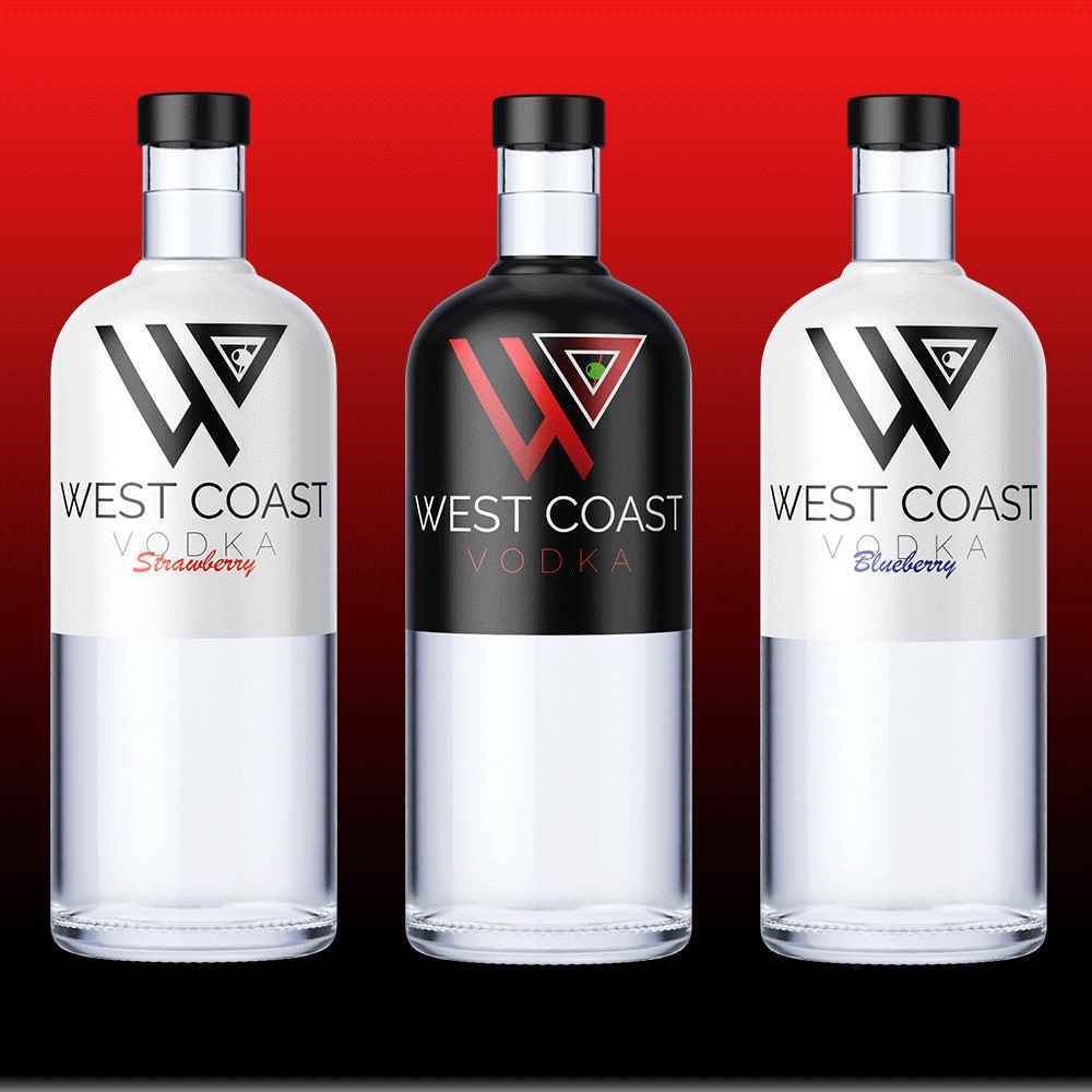
WestCoast Spirits
Welcome to West Coast Spirits, where the rugged charm of the West Coast meets the artistry of distillation. Our distillery, nestled along the picturesque coastline, is a haven for crafting an array o...
Welcome to West Coast Spirits, where the rugged charm of the West Coast meets the artistry of distillation. Our distillery, nestled along the picturesque coastline, is a haven for crafting an array o...
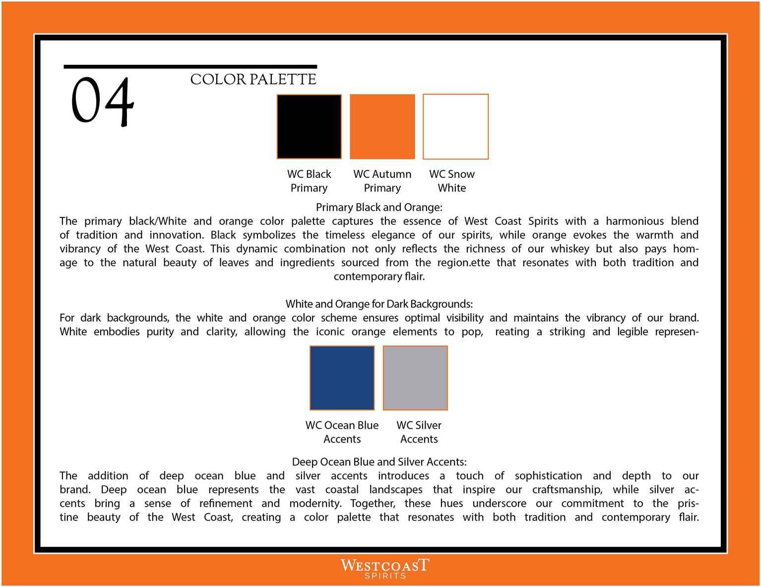
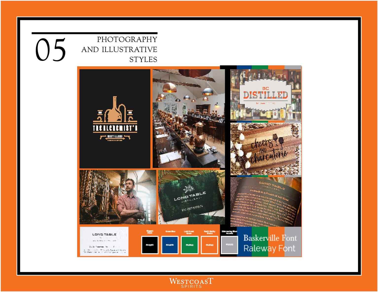
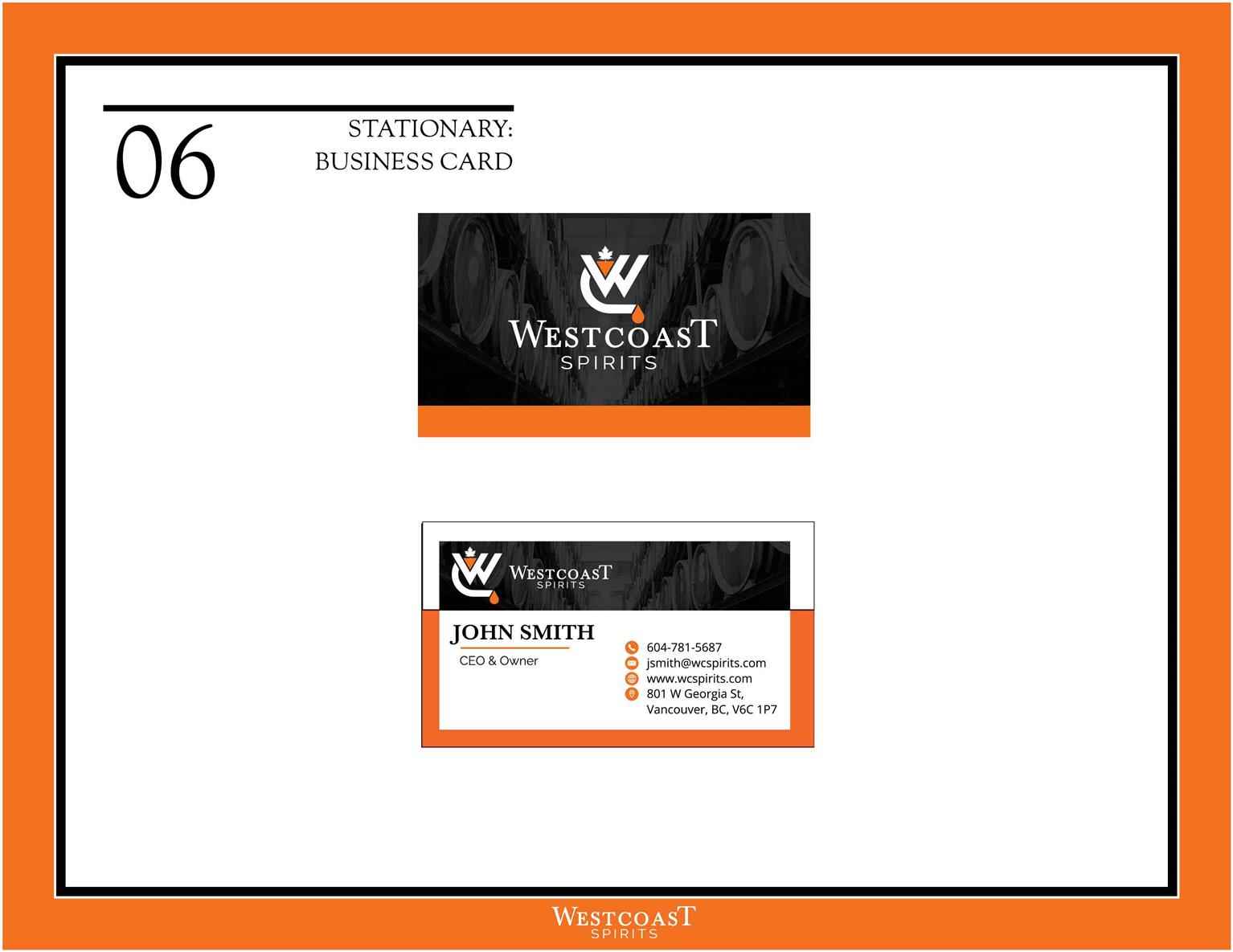
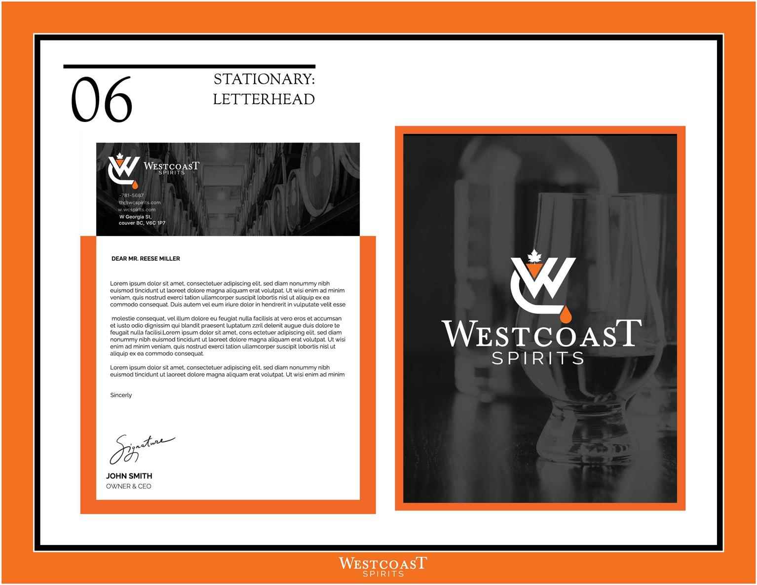
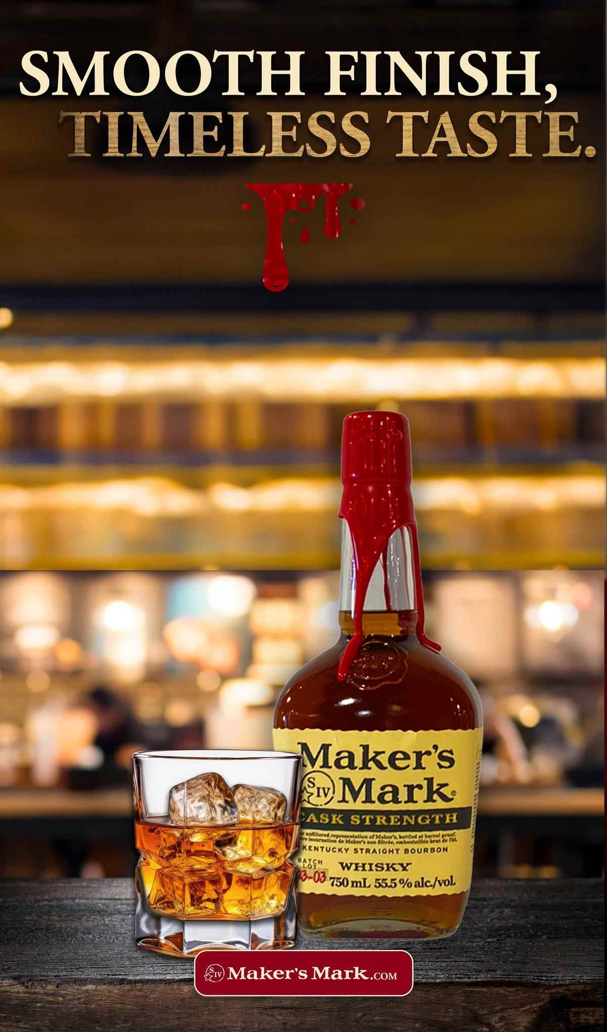
Welcome to West Coast Spirits, where the rugged charm of the West Coast meets the artistry of distillation. Our distillery, nestled along the picturesque coastline, is a haven for crafting an array of spirits, with a particular focus on our signature whiskey. We take pride in sourcing the finest local ingredients, paying homage to the bountiful offerings of the region. What truly defines us is our deep connection with indigenous culture, woven seamlessly into our spirits. We’ve embraced eco-friendly methods in our distillation processes, ensuring that each bottle reflects the natural beauty that surrounds us. West Coast Spirits is not just a distillery; it’s a celebration of craftsmanship, cultural richness, and a commitment to the environment, making every sip an ode to the spirit of the West Coast.
Share:
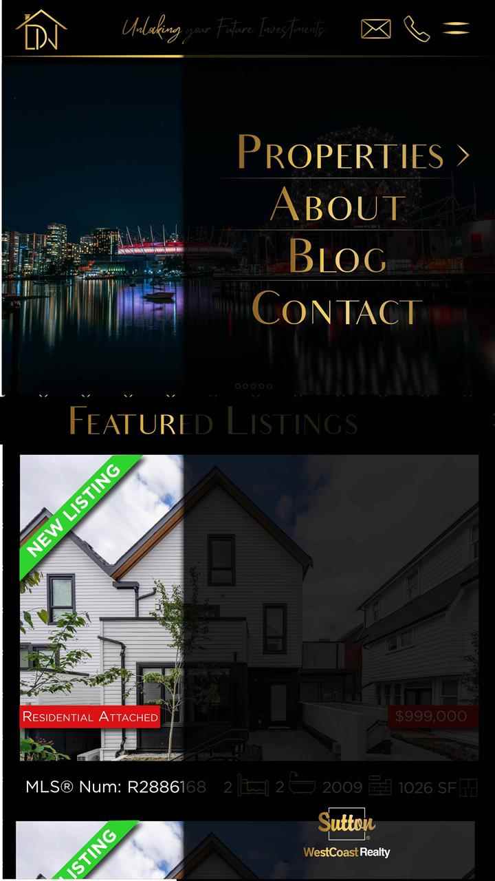
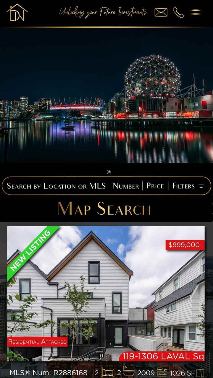
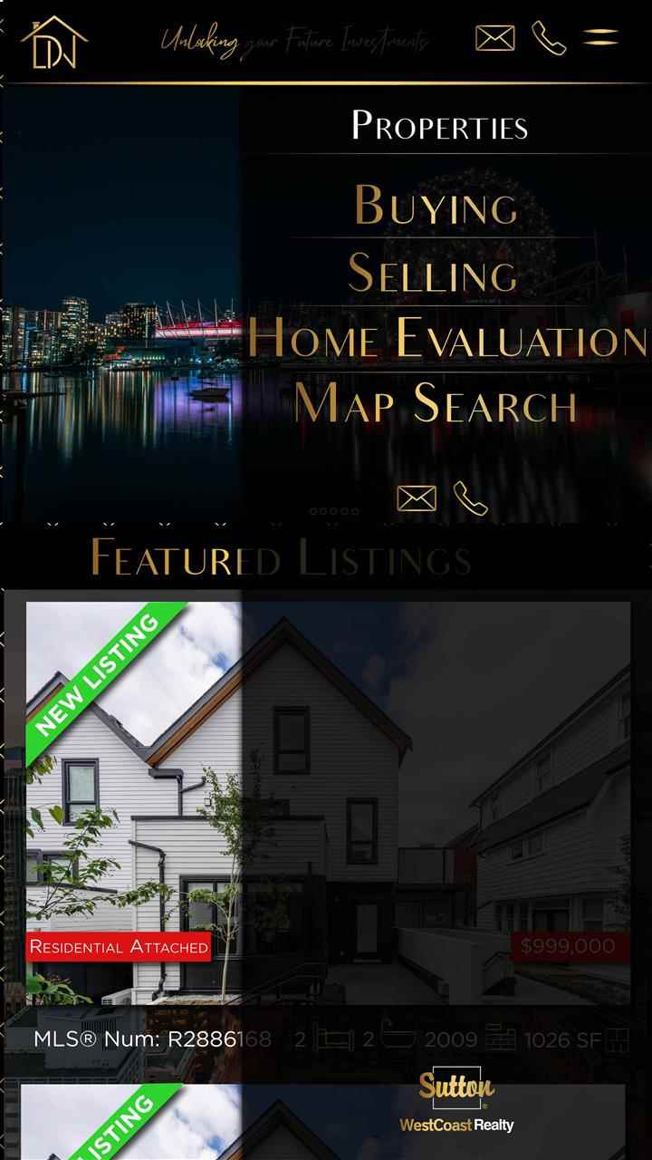
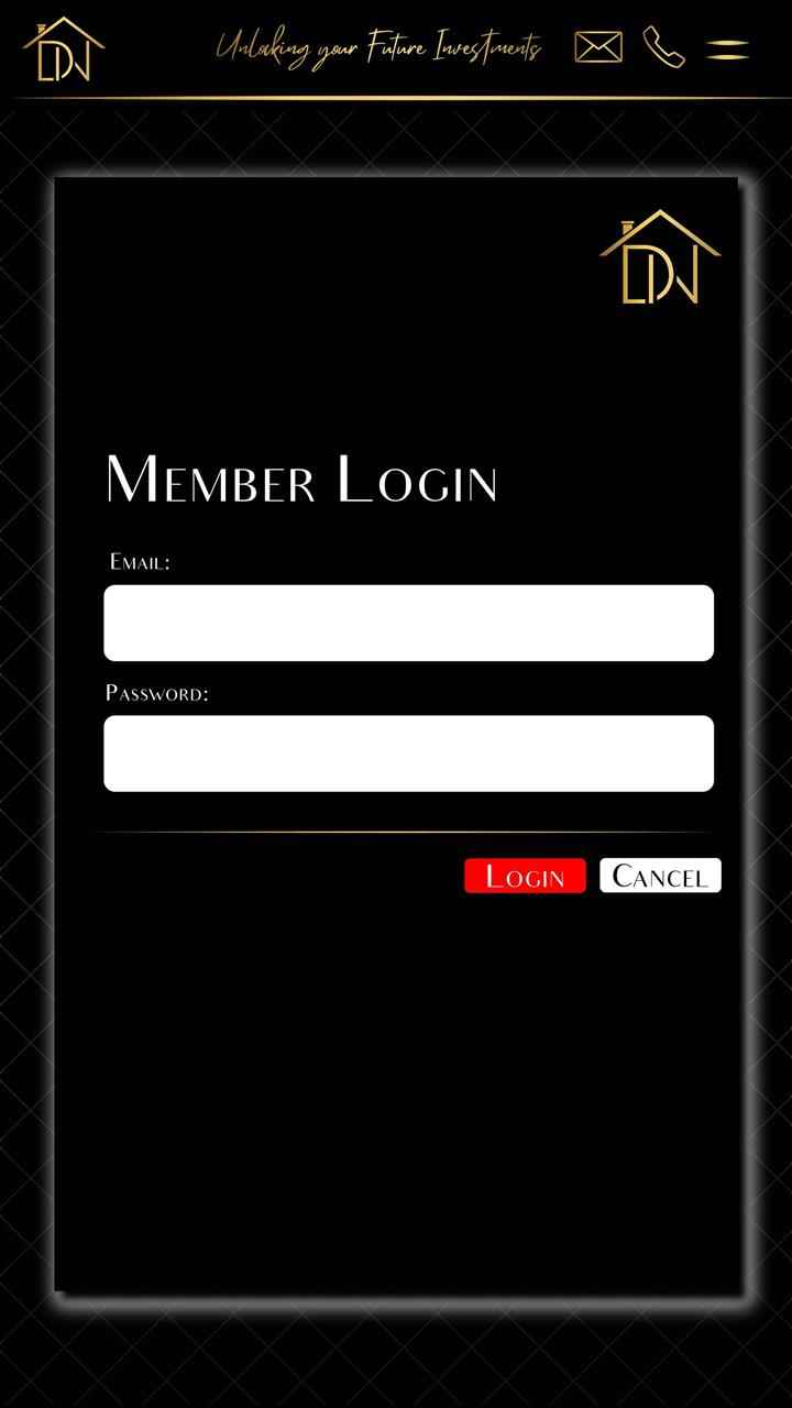
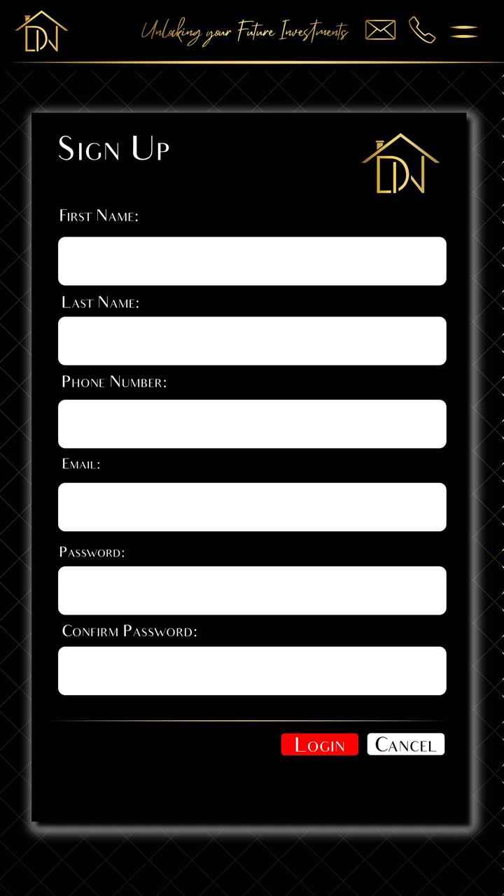
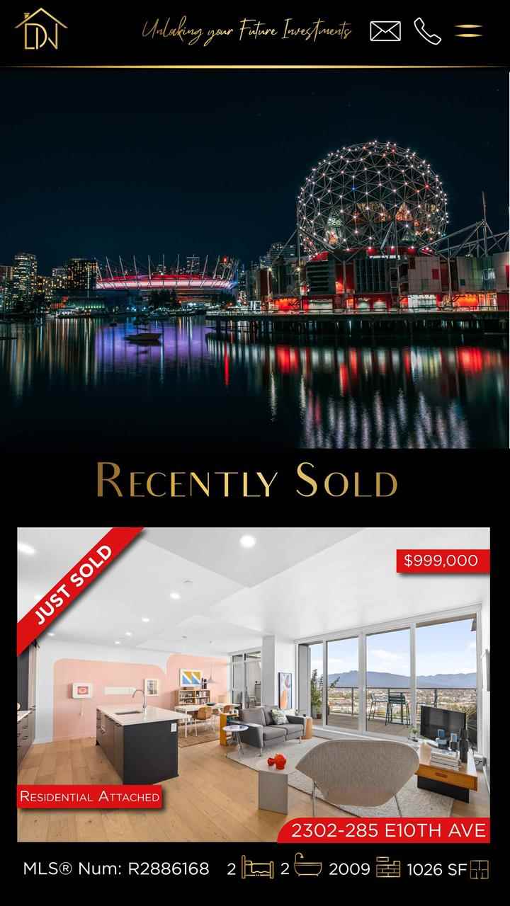
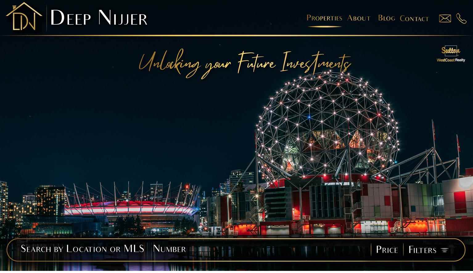
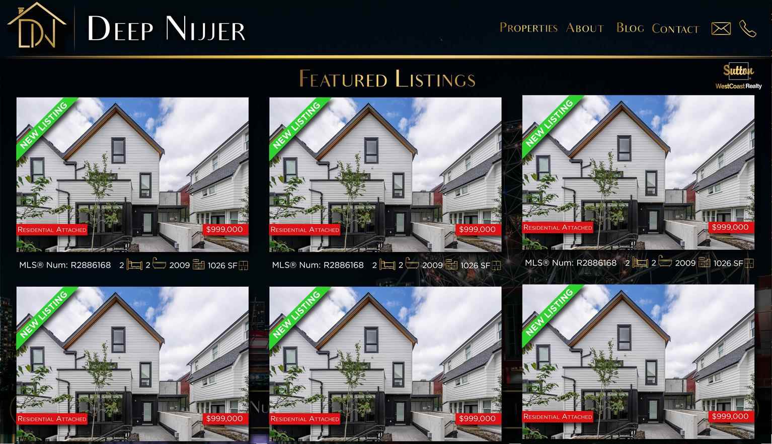
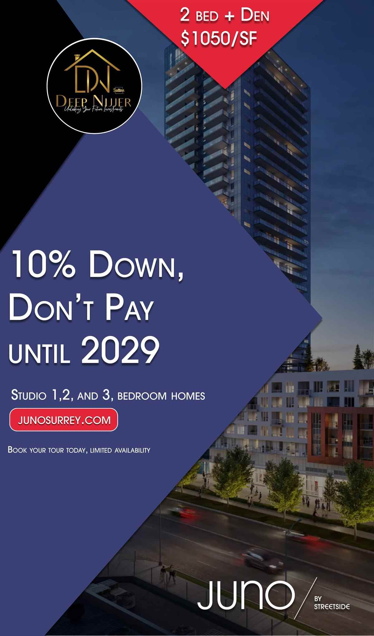
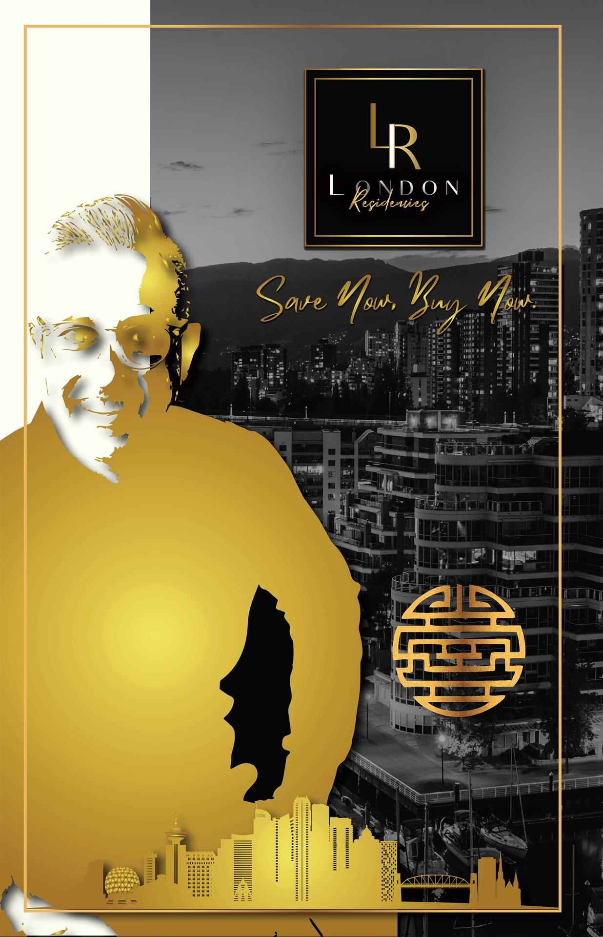
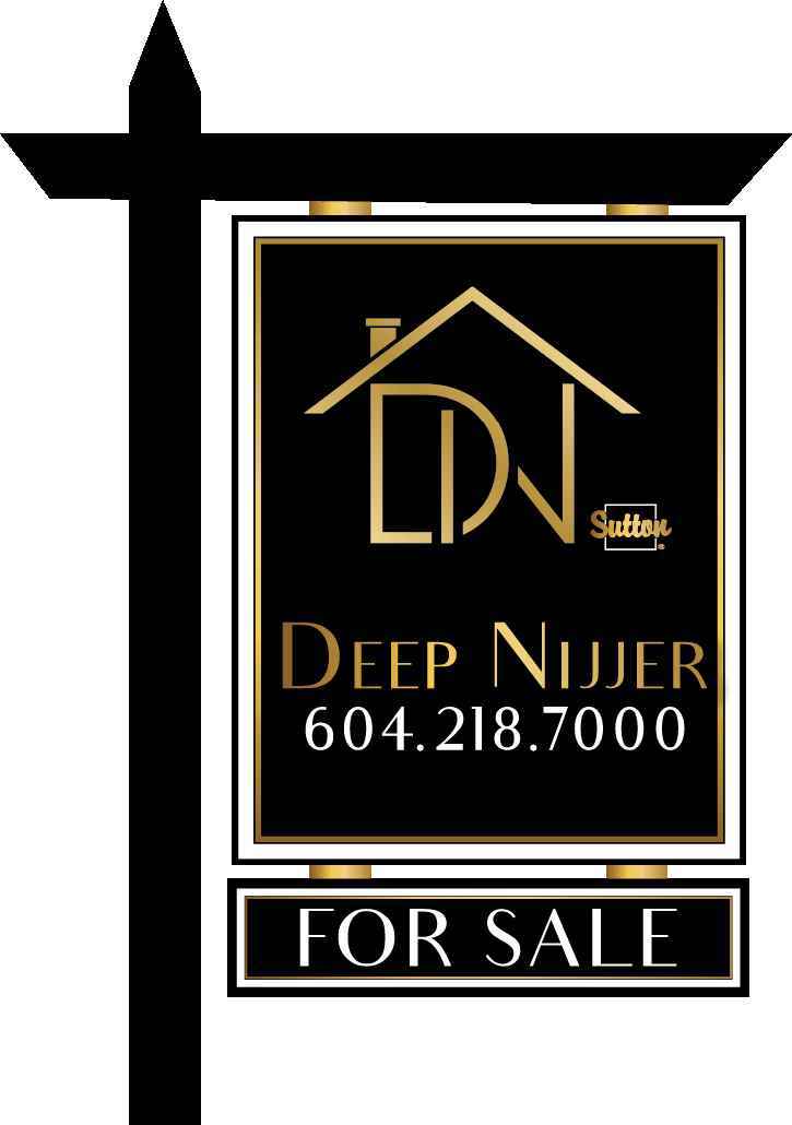
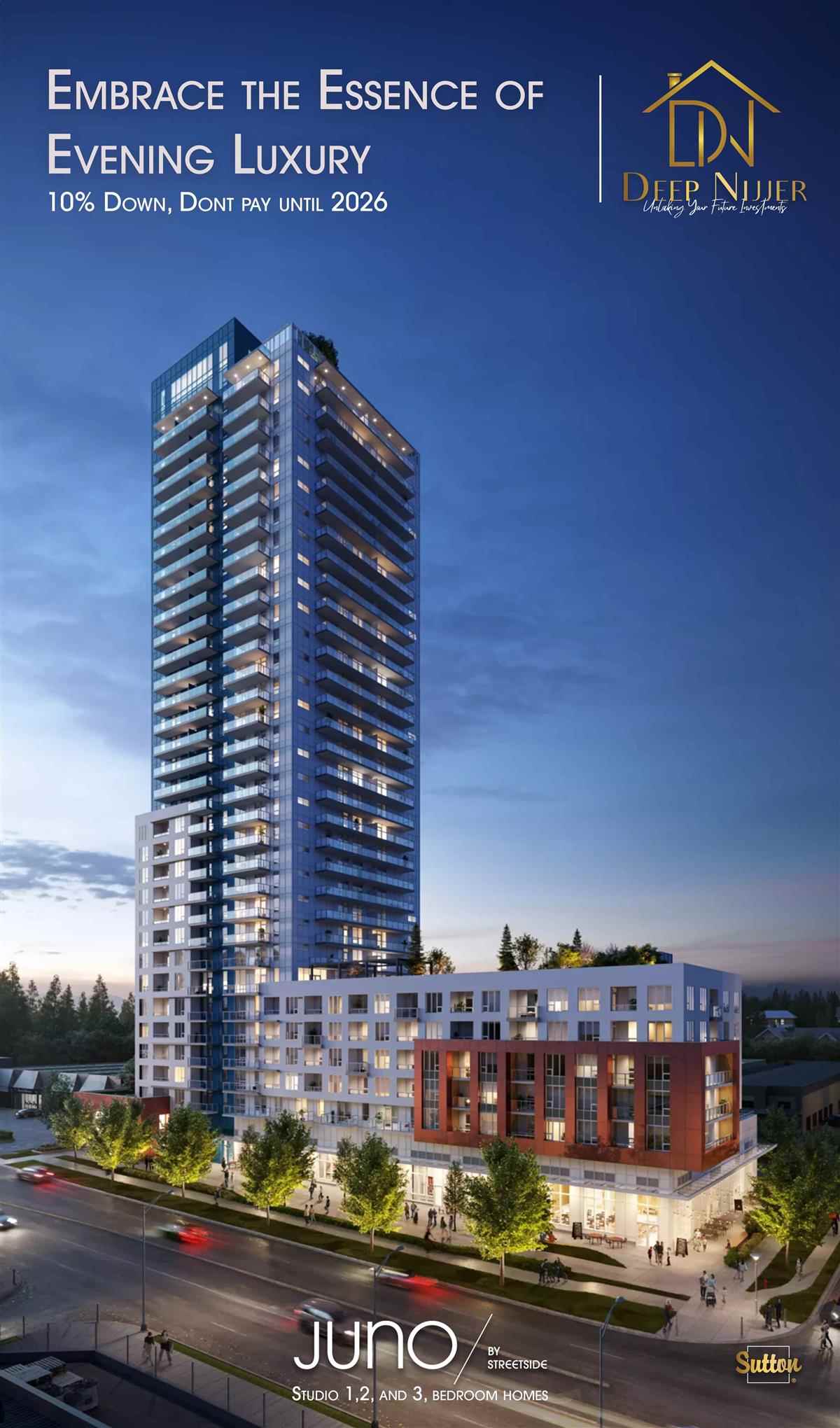
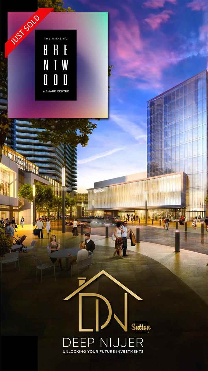
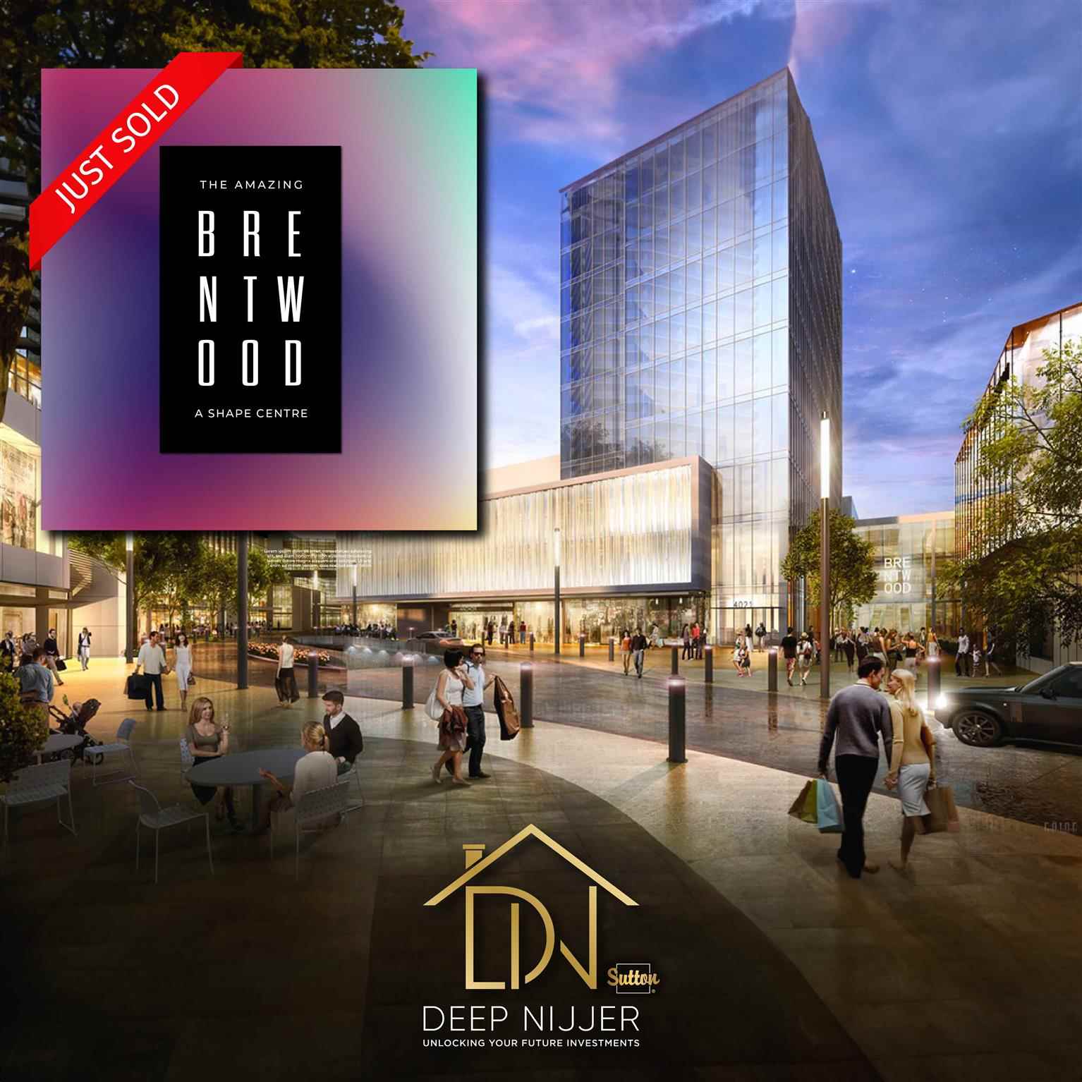
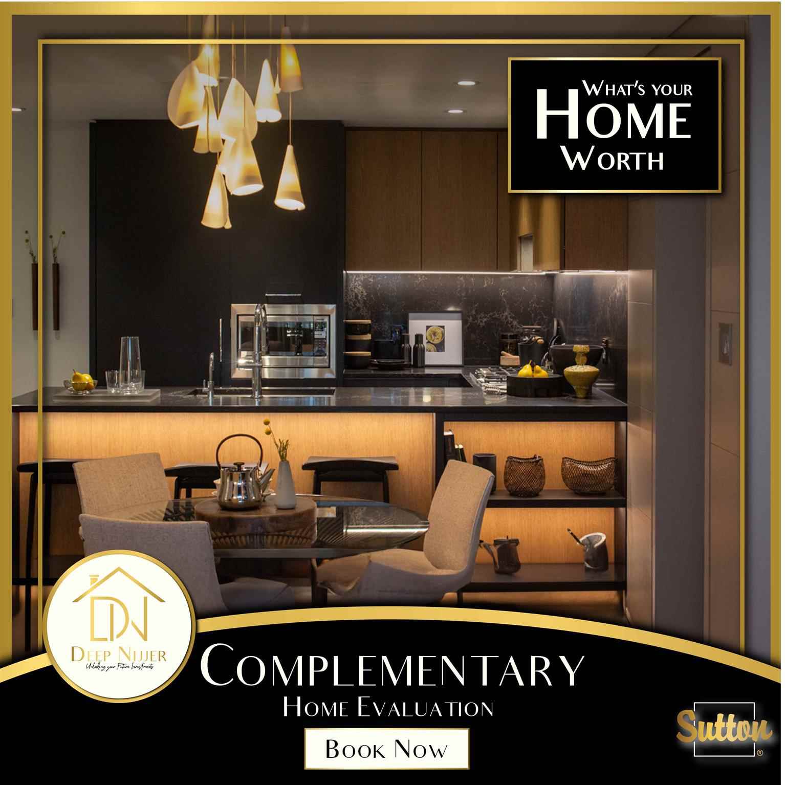
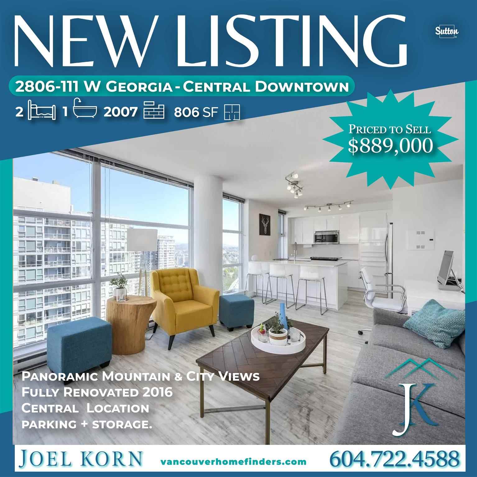
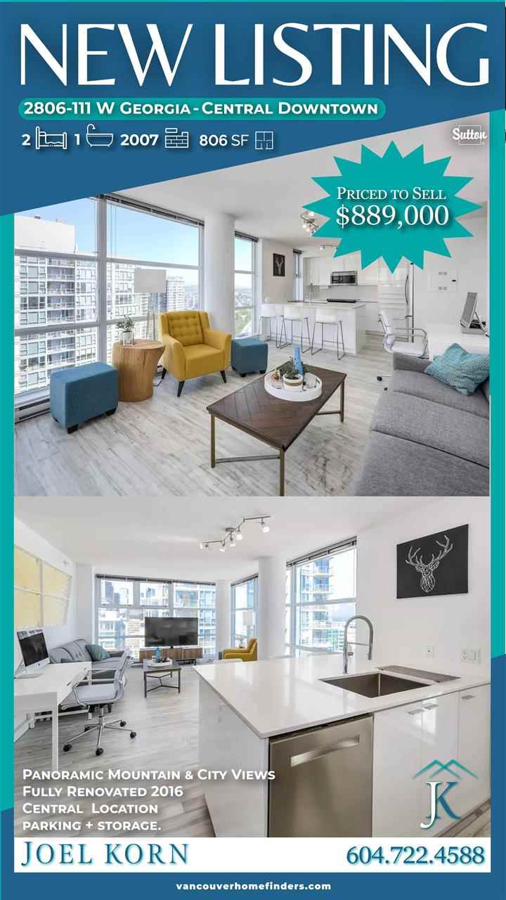
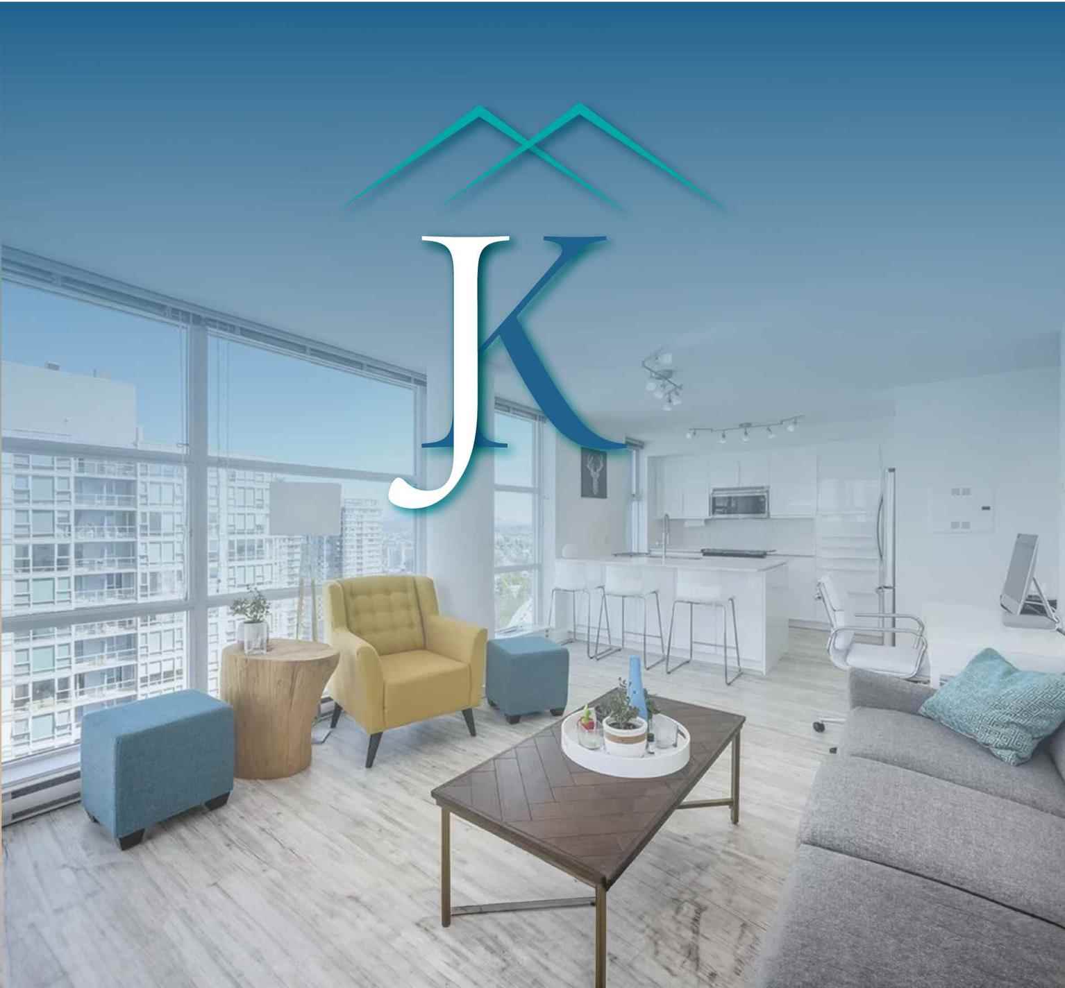
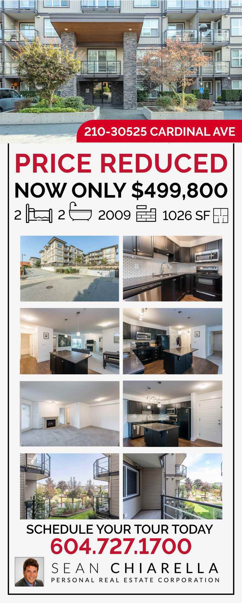
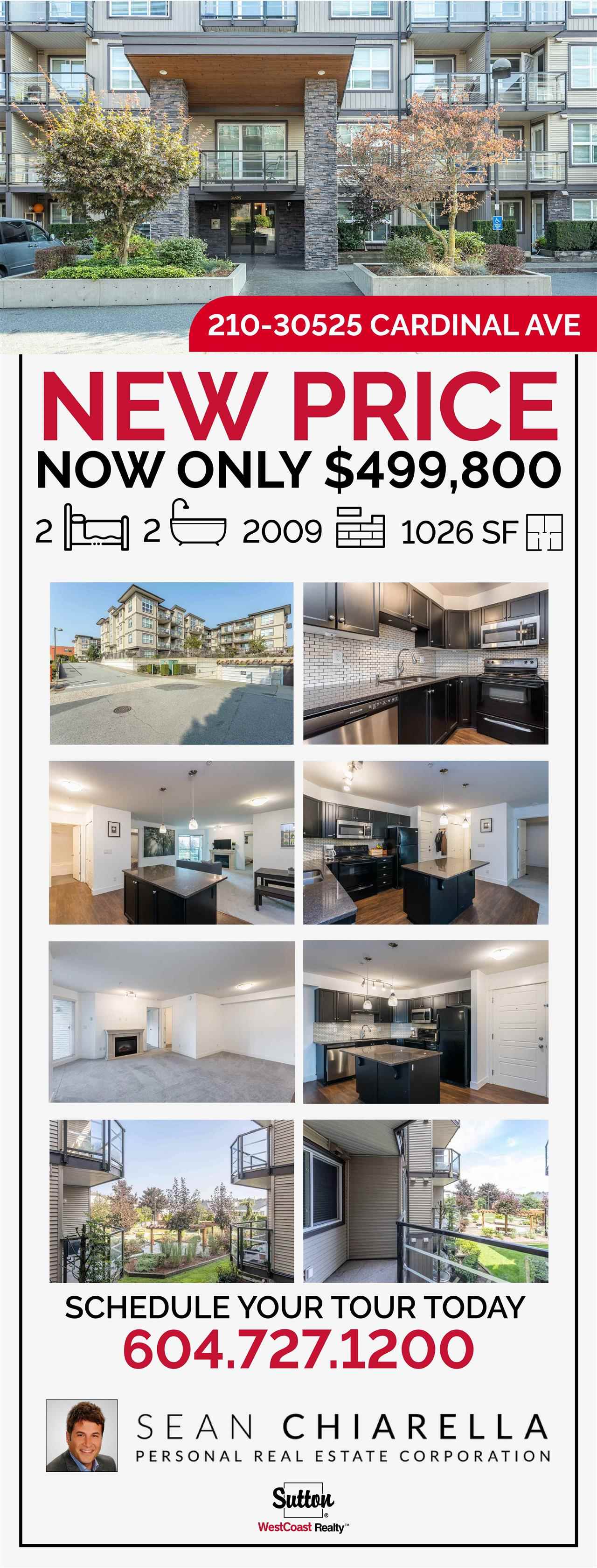
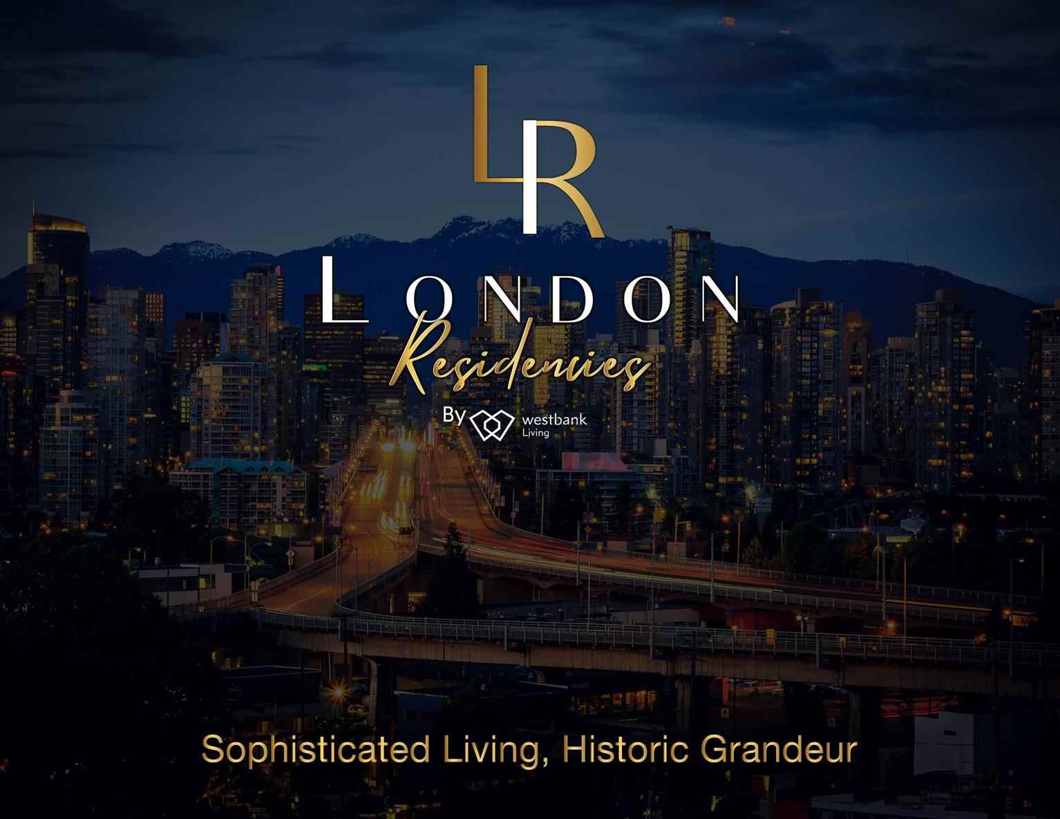
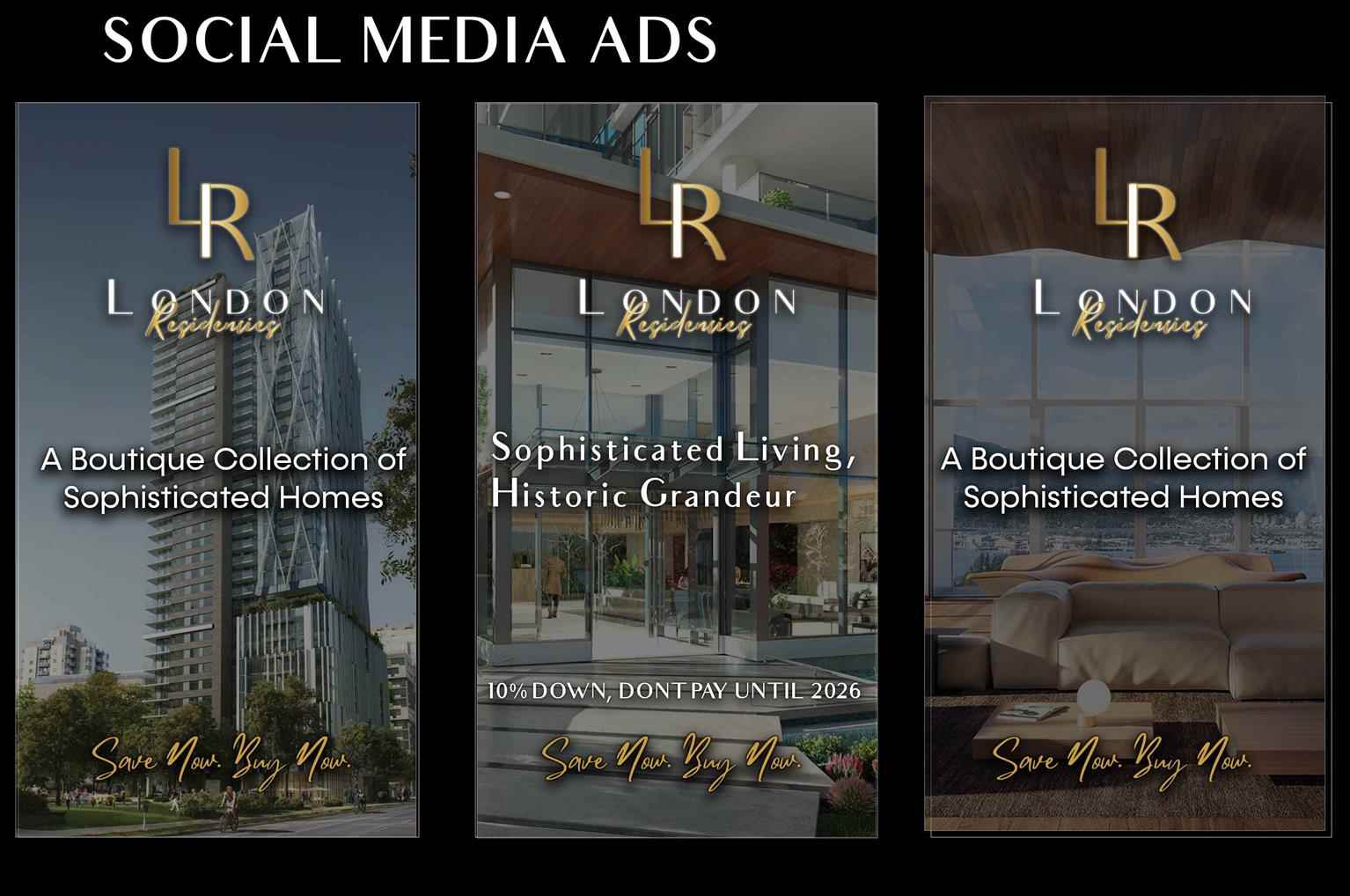
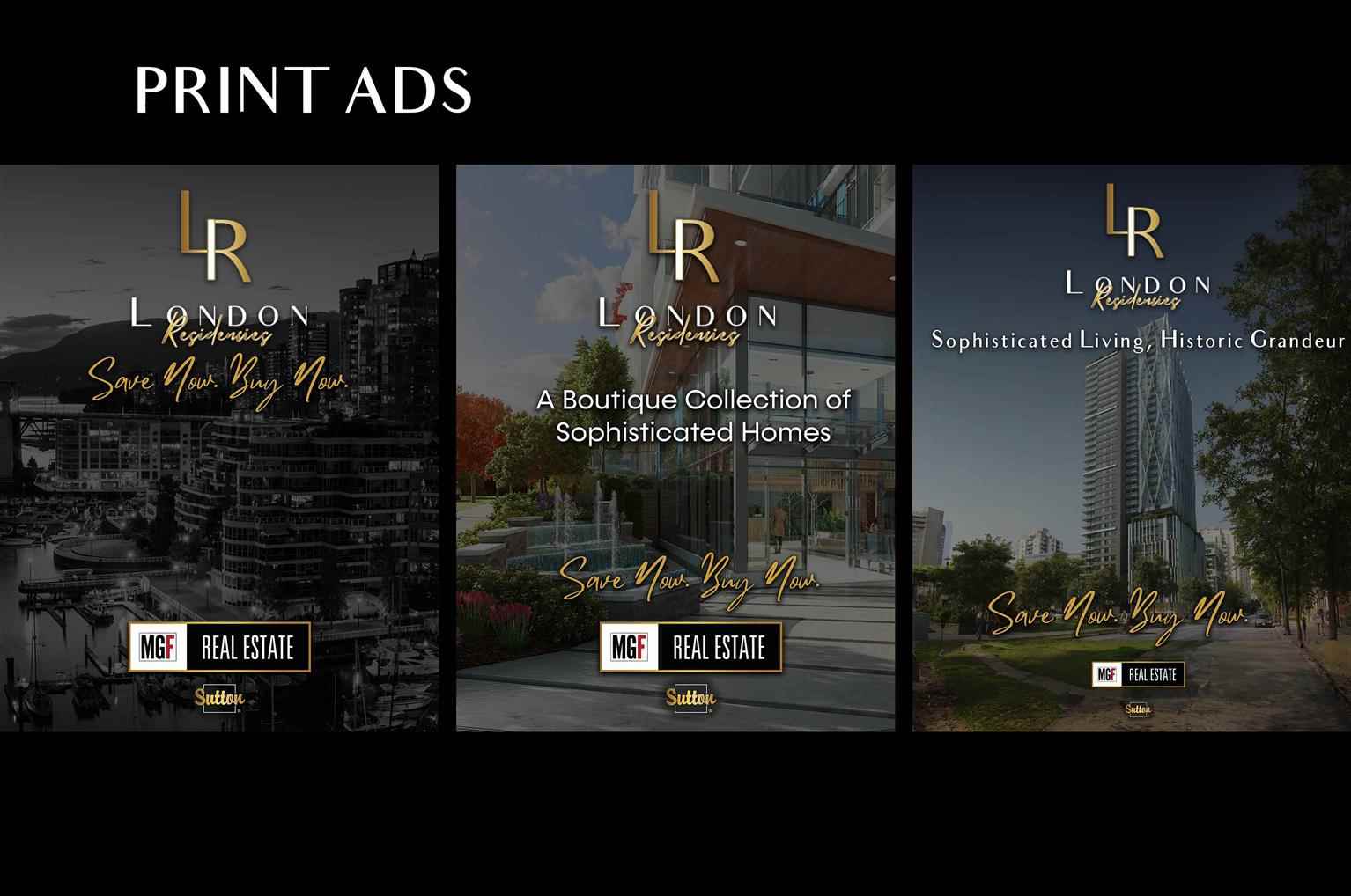
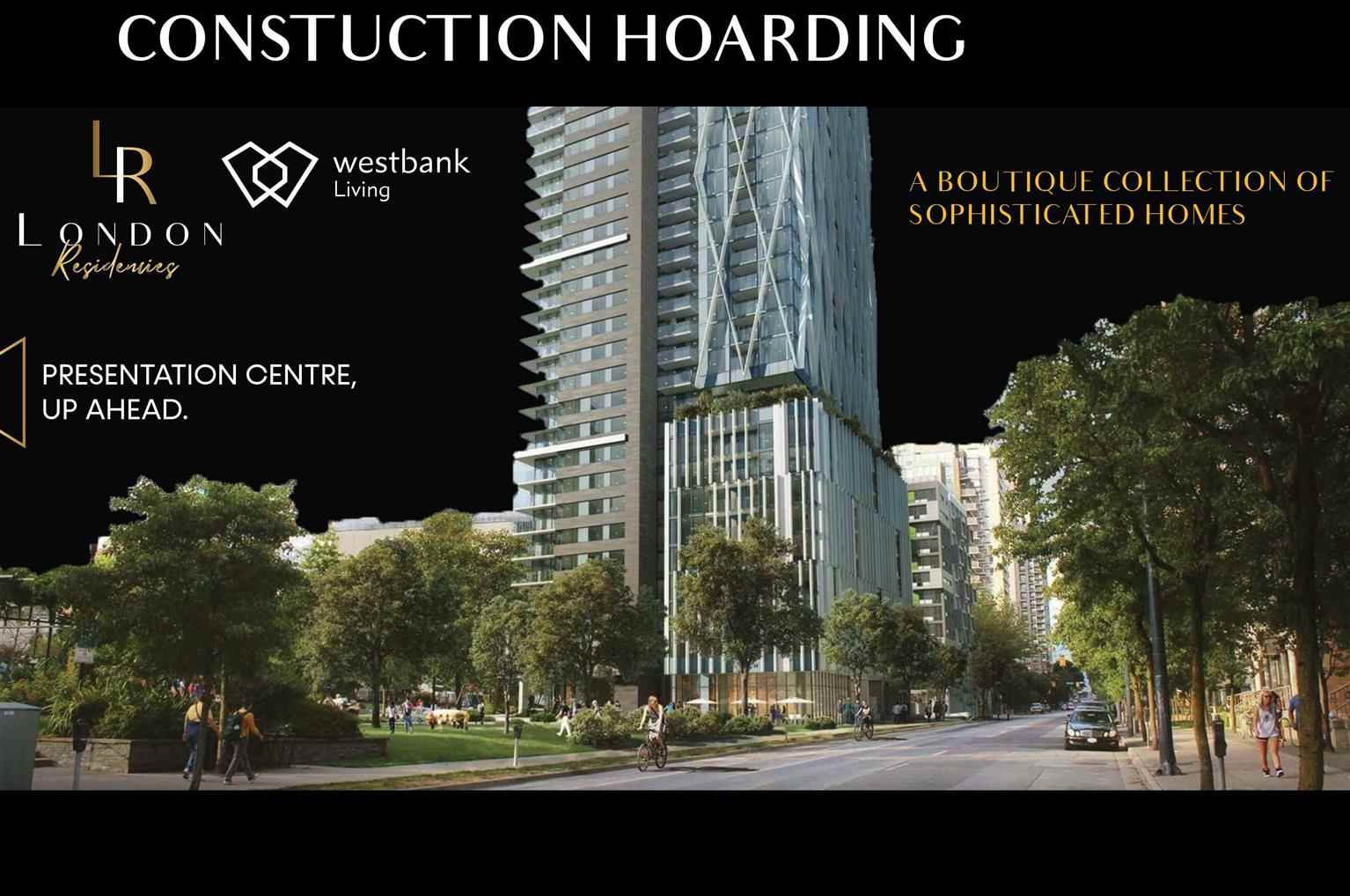
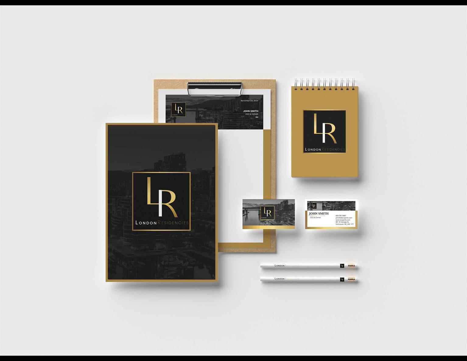
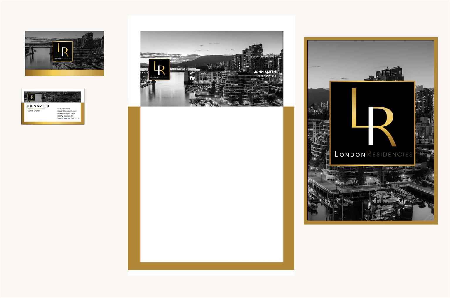
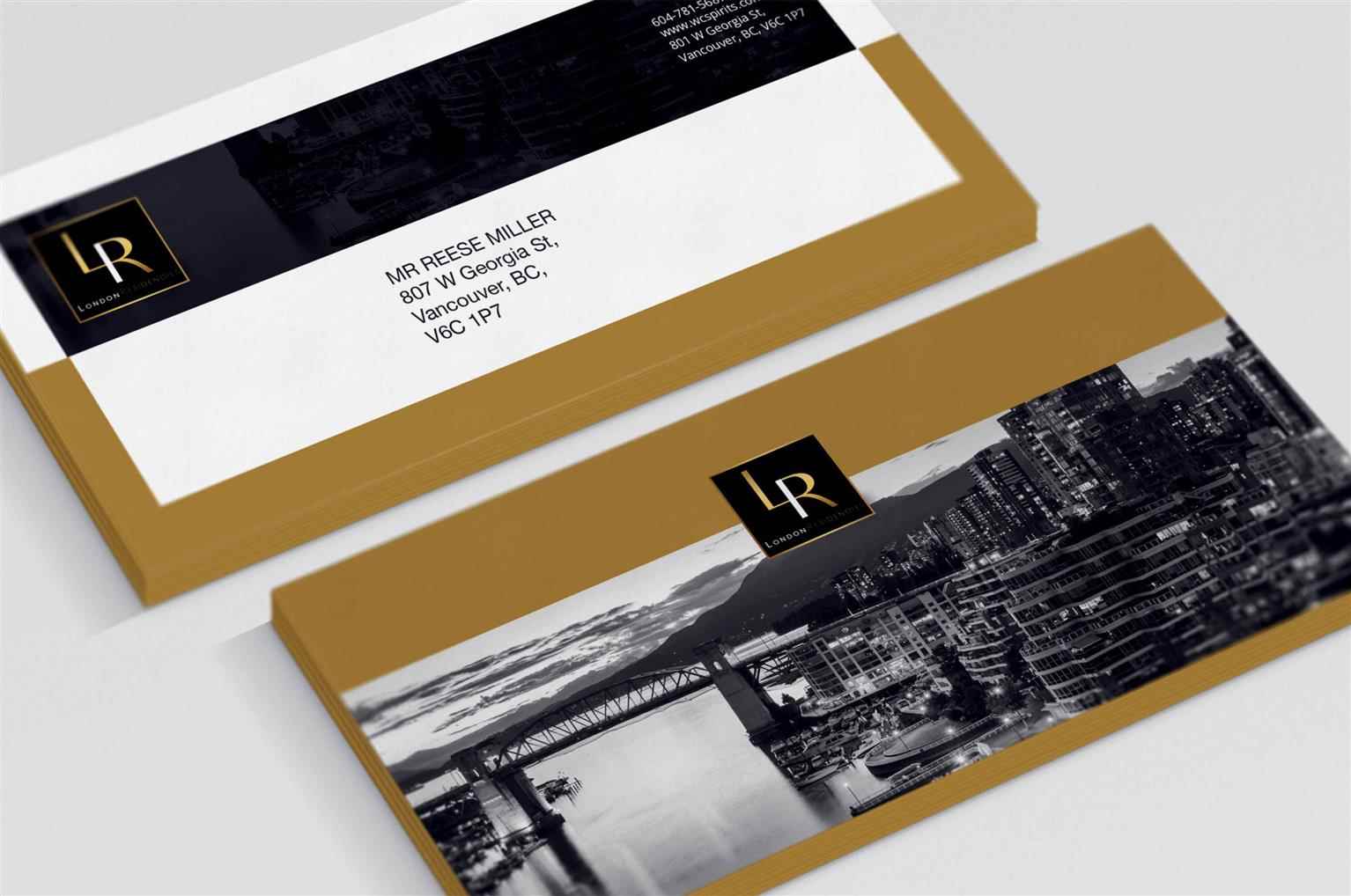
Real Estate
A student of Graphic Design at VCAD. Explore the projects of VCAD's talented alumni from below and get a first-hand look at their original work.


Share:


Would you like to request more information?
Click on the button below and we'll get back to you as soon as possible.
Speak To A Staff
